rgriswol_LookingOutwards-07

Disk Inventory X is a program for Mac OS X that visualizes the data on your computer. It shows you how much size each of your files/programs/etc takes up, as well as organizing them by color. You can even click on each of the rectangles (which represent your data) which will tell you exactly what they are and how much space they take up. What’s neat about this program is it shows you literally everything on your computer, and it puts them all together so you can see them relative to each other.

An example of someone's disk space visualized with Disk Inventory X
An example of someone’s disk space visualized with Disk Inventory X

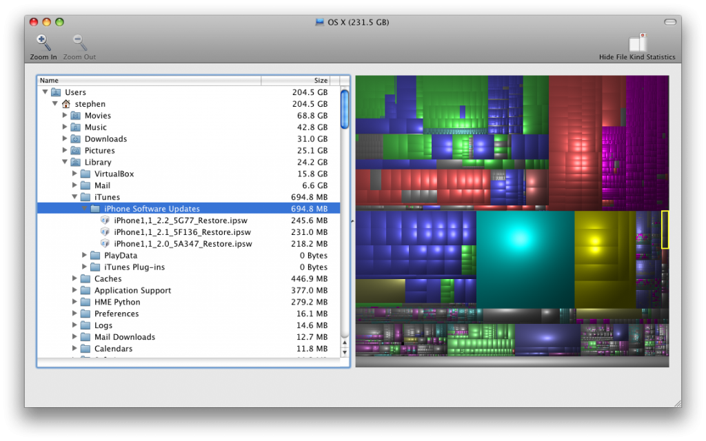
Disk Inventory X was released in March 2004 by Tjark Derlien as a “disk space manager” program. It was inspired by WinDirStat, which is essentially the same thing but for Windows. Disk Inventory X “shows the sizes of files and folders in a graphical treemap.” It is also completely free, and you can download it here.

macbreak_minute_2005-10-14_disk_inventory_x_1-0b

Looking Outwards-07

Kim Rees was asked by Google in July of this year to create the “Data and Motion Graphics Project,” a visualization of a grid that would provide them with 100% renewable energy at their headquarters. She asked someone to make an audio that would vary from dissonant to harmonic, and used this audio to influence the 3D objects in their model.  She wanted this to emulate the energy flow over time. I admire this project because it is a really unique and creative way to advocate for renewable energy and show its impact.

http://www.periscopic.com/news/5698

zhuoyinl-Looking outward

1

This is an app created by Richard Vijgen, called Architecture of Radios. It visualized the network of electric signals around the earth like cell towers, WiFi routers and navigations by using dots to create curves and use density of the dots to represent signal strength. By making the invisible signals visible while hiding the visible buildings, people could interact with the landscape they are located.

2

I found this project especially inspiring because the inventor using modern technology and data visualization to change the way people usually think of architecture. With in such trend, the concept of architecture would profoundly change into a brand new data information field and from that, I see the future.

mreyes-lookingOutwards-Syncro Mail – Unconscious Collective

screen-shot-2016-10-14-at-11-07-30-pm

Syncro Mail – Unconscious CollectiveLisa Javbratt, 2003

Lisa Javbratt’s Syncro Mail Unconscious Collective, is a website witch allows the user to send an email with a randomly generated image and word from the internet. The website also plots the data of how many emails were sent, when they were sent, who sent them, who receive them, and even the words and even pictures themselves.

screen-shot-2016-10-14-at-11-07-06-pm

Instructions on how to read data from website. 

What initially made me curious of this site was the fact that although it was made in 2003 there was a very “shitpost”-esque sense of humor to it. While this may seem like a shallow read I admire art that is fun to interact with and uses humor to allow the to potentially audience to access more complex ideas. Additionally the website is simple and easy to use. While the artist’s intent is not explicitly clear, what I find most interesting about the piece is the data collection of interaction between people(or themselves) over the web. Additionally the thought of letting the internet communicate for people but still fining the interaction relatable with one another is also interesting.

I assume the algorithm for generating the word and image searches through either all online pages or just google and randomly picks on. The data (belive) assigns a random color for each addressed entered and then places a square or that color accordingly on the chart witch there is an a function to calculate the x and y coordinates depending on the week it was sent.

looking outwards 7

Nand.io is a design studio that specializes in information visualization and new media art. They are interested in displaying data on a large scale, as well as interactions between analog and digital media.

This collection was created for the 14th Poetry on the Road Festival, in Bremen Germany, and is a visualization of the origins of participating poets and the links in their creative processes.

This is a visualization of some of the work necessary to create this map projection (I don’t really understand it). I believe that there are probably two primary algorithms at play in these pieces, one to map the location of the poets, and one to create the map projection.

I like these designs because I really like maps, and the projection they used reminds me of the Waterman Butterfly projection. Nand.io’s interest in large scale visualization clearly comes across in this display of the world poetry scene.

A link to the project can be found here.

Liu Xiangqi-Looking Outwards-07

The project “Flight Patterns” was created by Aaron Koblin, Scott Hessels and Gabriel Dunne. It visualized the paths of air traffic over North America in different colors. It created some interesting celestial patterns through intersections of different paths. And those intersections are where the big cities lie. It never occurred to me that aggregation of these paths can be a reflection of positions of celestial bodies. It seems that our planet is wrapped by layers of these nets consisting of paths. A billions of light year away, or right above our head in the stratosphere. The man-made sky map is just amazing.

Flight Pattern, Aaron Koblin

Hannah K-Looking Outwards-07

This week for my Looking Outwards, I found a visualization of information of relations in the Middle East created by David McCandless, developed in collaboration with Univers Labs. David McCandless is the creator of informationisbeautiful.net.

Below is a screenshot of what this infographic looks like (You can click directly on the image or use the “Middle East” hyperlink above to use the infographic—it was not directly embeddable).

This graphic shows the key players in Middle East relations and the notable relationships that exist between countries.

I really liked this graphic because it displays a variety of complex information and relationships, and being an international relations primary major, this information especially interest me personally. Not only is the graphic beautiful to look at, but it also has a very functional purpose too.

There was no information available on how this was made, other than the fact that this infographic is powered by VizSweet. I suppose that there would have been algorithms used to repeat the same behavior of expanding one dot into a “web,” but I do not think any algorithms would have been used to come up with the data that this infographic displays.

Alison Hoffman – Looking Outwards 7

screen-shot-2016-10-14-at-10-15-54-pm

(still of interactive piece Project Ukko)

This is interactive data visualization, entitled Project Ukko, was created by Moritz Stefaner as a representation of the wind patterns across the world. What I find rather amazing about this piece is predictive power. In addition to being a easy to follow visualization of the wind patterns it can also predict future wind patterns based on the data set. I also appreciate how intuitive and simple the design is. The thickness of the lines represents strength while color and tilt represent increase/decrease in speed.  It is very user friendly, which when looking at other visualizations wasn’t always the case. This visualization has practical applications for energy farmers and others in the energy sector, and I think when it comes to these types of data visualizations, practicality translates well into ease of use. For less practical data sets I think artists can make the visualizations a little more abstract.

Looking Outwards 7 Lydia Jin

selfiexploratory

Selfiecity analyzing selfies using different categories

Selfiecity is created by a group of 8 members starting in 2014 and this visualization technique investigates selfies using a mix of theoretic, artistic and quantitative methods. Rich media visualizations or image plots put together thousands of photos to reveal selfies’ patterns in 5 different demographic groups based on cities. The team then reports the patterns found in this experiment by writing essays relating to the history of selfies and how it is influencing social media. I find this idea particularly interesting because it uses creative methods to analyze a common phenomenon (taking selfies) and shows patterns of these phenomenon. The program uses an algorithm that identifies age, gender, position of face, position of eye, mood, and glasses. This project shows that the team are very innovative and are willing to investigate in depth of an activity that is commonly practiced in the modern world. Please click here for more information Selfiecity.


Looking Outwards 7

Santiago Oritz’s Ross Spiral curriculum visualizes the “history of humankind and all its interconnections.” The screen is split into three distinct sections: the leftmost third being the visual spiral itself, the thin middle third is reveal timeline, panel, and units, the rightmost third is the description. The information is broken down and categorized into: subject, grade, course, unit, learning experience. Each piece of information is displayed differently on the spiral; location, ellipse, color, and size all represent different categories. I really like the artistic implications that the spiral’s radius grows as the grade grows suggesting that the implications and breadth of knowledge expands as age and maturity increases. To me, the program looks incredibly complicated: mapping the ellipse and the timeline to moving the image and mapping the zoom to the mouse scrolling.

Link to Work

More of Santiago’s Work