karen-LookingOutwards-1

A New American Picture by Doug Rickard is a project in which he aimed to bridge the gap between art and technology. More specifically, he utilized Google street view images as inspiration, taking images from Google Maps and then digitally manipulating them to create his final project. Ultimately, Rickard was seeking to make social commentary on the state of social classes in America. In his series of photographs, he chose specific locations across America that were “abandoned,” areas with high unemployment rates or low amounts of any type of opportunities. In order to create these manipulated photographs, Rickard first carefully examined the images from Google Maps, composed images on his personal screen, then photographed again.

The algorithms and “code” that already exists within Google Street View already composed most of the photograph, but he manipulated the images further in order to match his vision, purposefully making images low resolution or containing blur. He employed many artistic concepts when manipulating the images existing on the internet, from the resolution of the image, darkness, shadows, etc. Rickard aimed to give his photographs a sense of anonymity at the end, as the subjects in the photos that he selects are often isolated or in desolate locations, trying to develop this idea that the social structure in America is becoming increasingly separated and stratified.

Although this project did not require extensive creation of a custom software or script, or a high level of “technique,” this project sticks out to me because the way Rickard effectively utilized Google Maps, a source that is not usually considered artistic, in order to create his final product.

http://www.dougrickard.com/a-new-american-picture/ 


Project-01-Face

sketch

/*
* Rachel Griswold
* rgriswol@andrew.cmu.edu
* Section B
* Project 01
*
*/

function setup() {
    createCanvas(600, 600);
    background(26, 26, 26);
}

function draw() {
	fill(60, 30, 30);
    rect(100, 0, 400, 600); // hair

    fill(240, 227, 174);
    rect(150, 0, 300, 400); // face

    fill(50, 10, 6);
    arc(220, 75, 100, 100, 0, PI); // eye (left)

    fill(50, 10, 6);
    arc(380, 75, 100, 100, 0, PI); // eye (right)

    fill(237, 210, 155);
    arc(220, 67, 100, 100, 0.14, 3); // eyelid (left)

    fill(237, 210, 155);
    arc(380, 67, 100, 100, 0.14, 3); // eyelid (right)

    fill(140, 0, 0);
    rect(237, 320, 125, 40); // mouth 

    fill(350);
    arc(300, 320, 125, 70, PI, TWO_PI); // teeth

    fill(237, 210, 155);
    quad(295, 90, 305, 90, 350, 240, 250, 240); // nose base

    fill(237, 210, 155);
    rect(260, 190, 80, 60) // nose top

    fill(50, 10, 6);
    arc(280, 250, 20, 20, PI, TWO_PI); // nostril (left)

    fill(50, 10, 6);
    arc(320, 250, 20, 20, PI, TWO_PI); // nostril (right)

    fill(60, 30, 30)
    triangle(280, 25, 170, 50, 170, 40); // eyebrow (left)

    fill(60, 30, 30)
    triangle(320, 25, 430, 50, 430, 40); // eyebrow (right)

    fill(187, 240, 248);
    quad(390, 140, 420, 200, 390, 240, 360, 200); // tear
    
}

I wanted to make look interesting even with my limited knowledge – I’m not sure if I succeeded, but it’s much better than I thought it would be, so I’m happy with it.
I’m not sure why it got all messed up when I published it – the features aren’t supposed to be squished, and obviously the teeth aren’t supposed to be separated from the mouth… I have no idea what happened, but the index.html looks completely normal.

GarrettRauck-LookingOutwards-1

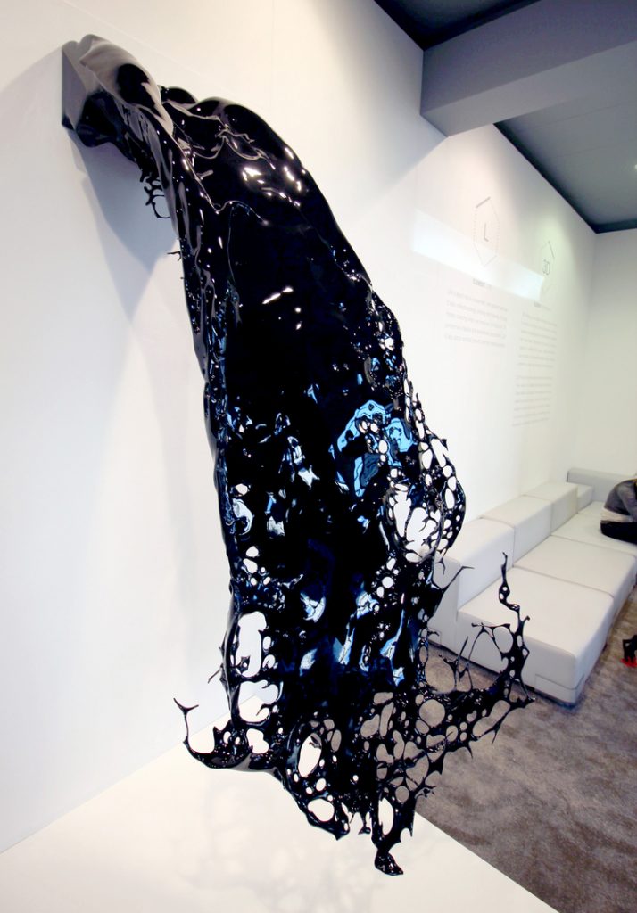
Waterfall

Gever_Waterfall
Waterfall; 3D Print in VeroWhite; 1925 x 999 x 954 mm


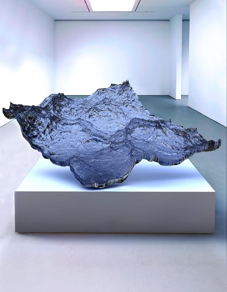
Piece of Ocean

Gever_Piece of Ocean
Piece of Ocean; 3D Print in VeroWhite; 996 x 796 x 149 mm

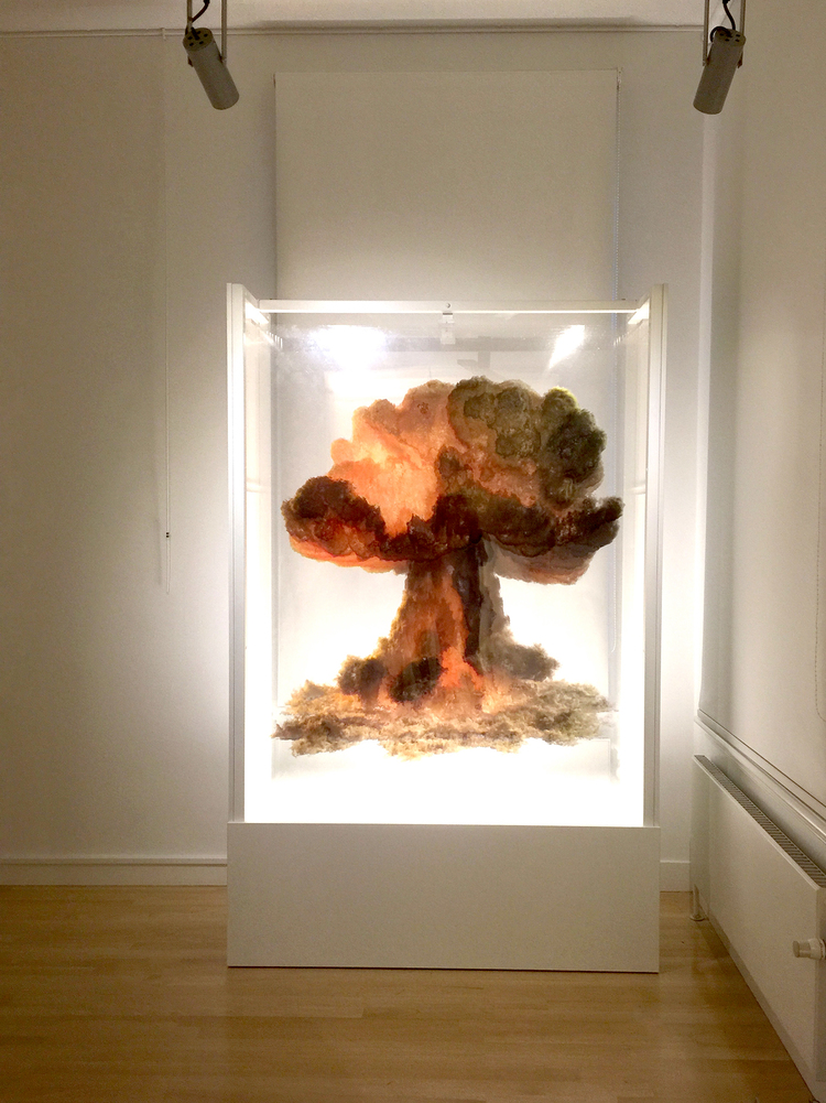
Nuclear Explosion (2012)

Gever_Nuclear Explosion
Nuclear Explosion; 10 Multilayered images, UV LED, prints and acrylic; 1510 x 1800 x 600 mm

Eyal Gever is a contemporary artist studying the fusion of art and technology through the translation of digital simulations to static physical artifacts. He and his team first use programming and complex physics modeling to develop realistic 3-dimensional animations of situations that occur in real life; they then freeze each simulation at a particular moment in time and use 3D printing to bring the situation back into the physical world. The phenomena that Gever chooses to depict and the way in which he freezes them often create a sense of suspense or wonder.

Aside from the shear feat of digitally reproducing complex real-world phenomena, what I find most interesting about Gever’s work is the way in which he captures a specific moment in time that, in the realm of everyday life, passes us by. His selection of the moment and the material/medium he chooses to represent the moment physically causes us to reinterpret the phenomenon and look at our physical world differently thereafter. I find this inspiring and authentic.

Gever’s work is very singular at the moment. Each work follows a similar process of studying a single phenomenon and representing that phenomenon digitally and physically. What I think would add a level of complexity to Gever’s work is if he were to use his digital simulation mastery to begin to create clashes between phenomena, especially if they are situations don’t occur in the real world. This, I think, would yield unexpected results and, again, cause witnesses to reinterpret their physical world.

Project-01-Face

sketch
I tried to use multiple objects to represent the face to show its actual asymmetry. I used the shapes to create the outline and then simply just added differing colors afterwards.

function setup() {
    createCanvas(600, 600);
}

function draw() {
    background(155,22,10);
    //settings
    ellipseMode(CENTER);
    rectMode(CENTER);
    strokeWeight(0);
    //hair
    fill(1, 2, 5);
    rect(300, 200, 450, 300, 80);
    rect(300, 50, 200, 100, 75);
    //neck
    fill(237, 209, 185);
    strokeWeight(1);
    ellipse(300, 300, 480, 520);
    strokeWeight(0);
    rect(300,575,150,100);
    //ears
    ellipse(75, 300, 120, 175);
    ellipse(525, 300, 90, 134);   
    //mouth
    fill(219, 151, 180);
    rect(300, 450, 150, 50, 35,40,32,45);
    //eyes
    fill(123, 150, 186);
    ellipse(200, 230, 125, 160);
    fill(250, 248, 242);
    ellipse(400, 230, 175, 133);
    fill(150, 108, 29);
    ellipse(200, 230, 90, 60);
    fill(105, 145, 107);
    ellipse(400, 230, 70, 90);
    fill(0, 0, 0);
    triangle(200, 240, 220, 215, 180, 215);
    fill(232, 225, 144);
    triangle(400, 215, 420, 240, 380, 240);
    fill(232, 189, 144);
    //nose
    quad(300, 280, 240, 360, 300, 400, 350, 350);
    noFill();
    strokeWeight(1);
    line(300, 300, 300, 375);
    //eyebrows
    arc(150, 100, 200, 100, 0, HALF_PI);
    arc(450, 100, 200, 100, HALF_PI, PI);
}

MaireadDambruch-LookingOutwards-1

Incertitudes is a project created in 2013 by Ying Gao that features two kinetic dresses made from white and silver fabric covered in hundreds of dressmaker pins. These dresses are considered to be Technological Art due to the reaction of the pins to the sound of a spectator’s voice. Using voice activation technology, the pins tesselate in response to a specific human voice frequency. This project was a collaboration between designer Ying Gao with aid from Simon Laroche who helped design the robotics that responded to the voices. This project developed custom software that only allowed the pins to wave in the presence of certain sound frequencies, ironically resulting in the pins not responding to creator Ying Gao’s voice pitch. Gao’s theory behind the project stemmed from Lipovetsky’s “Les Temps Hypermodernes” where he states that when the future is unforeseeable, we must be ready to react- referring to the constantly changing environment of the dresses and how they are flexible to their surroundings through their movement. I admire Gao’s project theory because it influences the spectator to be more adaptable and open to new experiences. This projects points to an exciting age where humans are able to converse with their garments as well as what previously were inanimate objects.

I’m Google (Looking Outwards Week 1)

Dina Kelberman’s ‘I’m google’ is an example of computational and a collective art work.
She gathers various photos that anyone can find from google images and creates a train of connectivity between all the different images. This project is an ongoing project which Kelberman has been working on for about 5 years. Her project utilizes the limitless amount of data that is accessible to anyone and makes the viewers realize the overwhelmingly abundant amount of photos on internet. By using a public source to create a personal train of connectivity, she encourages the viewers to scroll through her seemingly endless tumblr page, which seems to resemble our situation after hours of internet browsing, wondering how we even got there.

http://dinakelberman.tumblr.com/Screen Shot 2016-09-01 at 9.31.53 PM

Looking Outwards 1: Samsung 837 Gallery

While I was trying to find options for (momentarily) escaping intense New York City heat this summer, I managed to fumble my way into Samsung’s flagship store. Surrounded by a mix of posh stores and the High Line, Samsung 837 is a spectacle that stands out on its own. It isn’t even technically a real store – it’s a digital playground that features a huge screen that spans three stories high, a living room designed to showcase domestic innovations, a cafe, a virtual reality tunnel, a studio, and a gallery.

samsung 837 gallery

The current exhibit at the Gallery is called Social Galaxy, an interactive art installation where guests enter their Instagram accounts into a keypad and enter a tunnel surrounded by imagery on Samsung tablets from their accounts. Every screen features a different hashtag, read aloud by voices, and as the user continues moving throughout the tunnel, the screens feature other content such as images and collages. As guests near the end of the tunnel, their Instagram feeds and photo booth snaps are displayed on a huge three-story screen collectively with the photos of past visitors. This exhibit allows visitors to actively reflect and interact with their past, present, and online presence.

Congrenw – Looking Outwards 01

Out of Line – Crowdsourced interactive music video by Moniker and Studio Puckey

This project was a result of the efforts of around 10 people through the Moniker and Studio Puckey. The project took around a year to accomplish, and it appears that they organized it through usage of specialized groups and organizations for UI, UX and development. From what I can tell, the project was created using custom software/scripts as it’s specified that the creators wrote their own library to achieve their goal. From the description, the project creators were inspired anonymous internet comment threads as well as the complexities that arise when interacting with online audiences. I believe the project’s point was to highlight the new flexible contractor relationships where workers are seen as commodities.

I thought it was very inspirational how this project brought so many people on the internet together to accomplish tasks. I took a class on crowdsourcing as well last semester so it was also very interesting seeing its use in actual application!