Kyle Lee Looking Outwards 05

Interactive Computer Generated Koi Pond

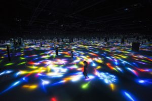
This exhibit, created by TeamLab, is on display at a Japanese festival in Tokyo. These colored artificial fish are projected onto the shallow water and each navigates and changes speed, bursting into flowers when coming in contact with a person. This completely enclosed space has its vastness emphasized by mirrored walls and ceilings, creating a truly immersive experience.

This mystical magical quality of these fish, coupled with the experience of walking through the water in a vast space is quite captivating. I love exploring designed experiences and I think that this one is certainly well executed and intriguing. My one critique on the execution is logistical, but my guess is that it took enormous amounts of resources to put this exhibit together. The pond seems almost ridiculous but I wonder if could’ve been done simpler.

In the digital age that we live in, it seems that ‘experience’ is strongly diverging. On one hand, we seem more attached to our phones and screens, removing us from whole hosts of experiences around us. On the other hand, real experiences cannot be simply replaced by shallow technology. In the future, immersive experiences will only become more rich and valuable. While many things will be replaced by robots or machines in the future, experiences will not and will continue being a place of innovation, expression, and creativity.


Rebecca Enright-Looking Outwards-05

Blur Studio located in Culver City, California creates beautiful 3D animation clips. Their images, which typically portray the unnatural, seem to somehow actually be real. They also have a video reel in the article about them, which can be seen here.

I never realized that some of the images in movies such as Thor (which was frequently displayed in the video reel), were made completely by utilizing computer graphics. The image below particularly caught my interest, though, because I found it to be very interesting to look at. I was not aware that this image and other images like it are made entirely from computer graphics. I had thought that they took videos and pictures of people and just added the effects in rather than being entirely computer-generated. I also thought that for the Thor action sequences as well, so it was a very cool thing to learn about.

This company was founded in 1995 by Tim Miller, a director, and David Stinnett, a visual effects supervisor. They presumably drew from their backgrounds in film to create this company and its productions, and they have certainly melded their prior experience with the rapid growth of technology for the duration of their company’s existence.

These 3D graphics have been storming screens everywhere, and, if made any more realistic, they have the potential to completely replace actors in films while still making a realistic-looking movie. Companies like Blur Studios are taking this cinematic revolution in stride as more and more animated clips are inserted into films to make for fantastic productions that marry the extraordinary with the mundane.

Liu Xiangqi-Looking Outwards-05

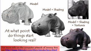
Ed Catmull, from Pixar, invented the texture mapping technique in 1974. It is regarded as a breakthrough in 3D Computer Graphic. I admire this because it evokes sense of touching by sight and gives more vivid feeling to a flat object. The technique is widely used in animation. It brings life to millions of cartoon characters. Texture coordinates(generated by some functions) are added to the original vertex. Besides that, colors are changed accordingly. Several techniques are evolved including forward texture mapping, inverse texture mapping, affine texture mapping, etc. It is still in progress for it is not capable of accomplishing some complicated surfaces vividly.

An example of texture mapping

More texture mapping knowledge from CMU

Jun seo Hahm is an animator, designer, and media artist based in Seoul, South Korea. This piece is a short film, entitled “Walking Follows Form”. I like the film because of the way it uses the modelling process to inform the animation. The way each model moves is based on it’s structure or shape, and this means that each character moves in really strange and humorous ways. I like the idea of using loose sets of rules to make art, and this is a good example of that.

Hahm’s fascination with cartoony forms and visuals really comes across in the film, along with a strong interest in the forms of the 3d objects. His models are also incredibly smooth, avoiding the sharp geometric style that some other new media artists are drawn to.

I don’t know what exact tools Hahm uses to create his work, but I’d imagine a 3d modelling program like Blender.

His work can be found here

mreyes-looking outwards 05-Sublime Moments

Eyal GeverSublime Moments2014

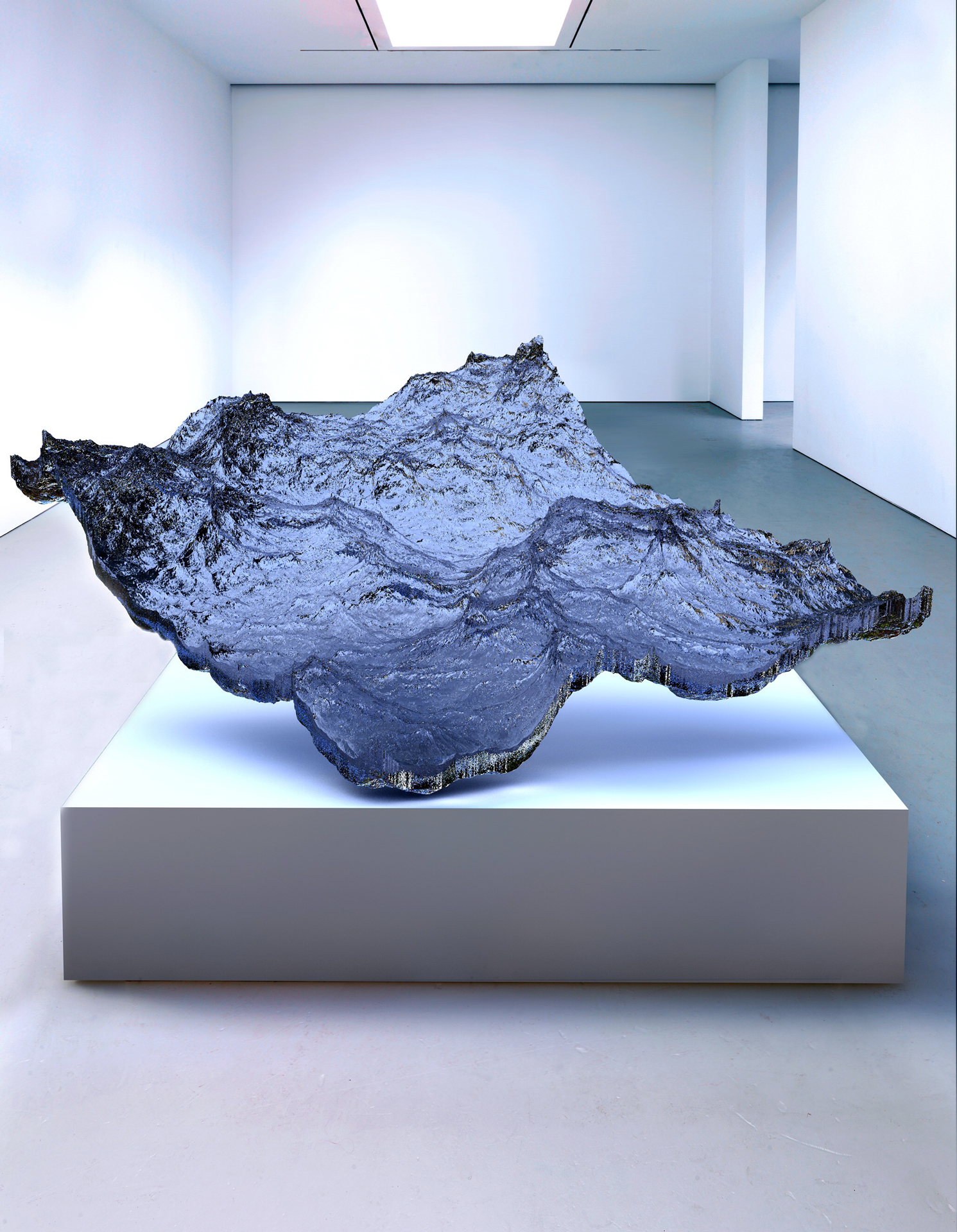
In his show, Sublime Moments all of Eyal Gever’s pieces have two parts to them.  An complex computer simulated animation, and then a 3 foot sculpture of that animation. Gever volunteered to be in the Israel Defense Forces’ computer R&D unit, where he programed computer graphics to simulated possible outcomes. This was the foundation for him eventually developing his own software for his art. In an interview with Beautiful Decay he said “Using my own proprietary 3D physical simulation technologies, I have developed computational models for physical simulation, computer animation, and geometric modeling. Combining applied mathematics, computer science, and engineering…”

Piece of the Ocean 2014 

I admire this body of pieces because, I usually find hyperrealism (in both painting and sculpture) to be impressive but, ugly. However with Gever’s work I found his subject matter interesting as well as his execution and the forms he chooses to depict. The collection of pieces is enticing to look at as the forms suggest a movement but also give hint to a bigger motion yet to come. Gever Manages to capture the ominous potential along with a beauty and serenity of natural forms in a poetic juxtaposition.

803ec6874cc8b23ffa4a2d73d4347388


Sphere Pop 2014

zhuoyinl-Looking Outwards

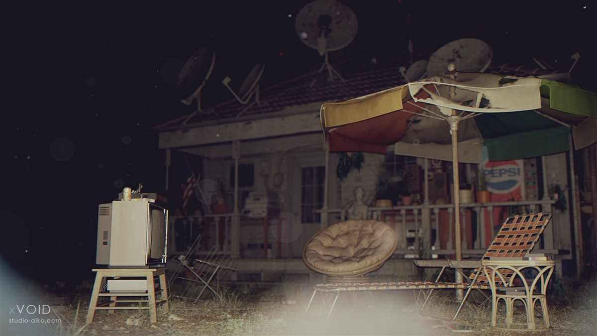
day time

night

These Hyper-Realistic 3D computer graphic rendering is inspired by sci-fi and horror films and from locations of abandoned places which could be a great environment for making film story lines to occur. It is made by xVOID studio. They made around 14140 objects in the scene and used art CG 3D software such as 3D Studio Max, VRay, MODO, ZBrush, and Marvelous Designer. I found this project amazing because it simulate the environment so detailed, and they made 3D models to create this scene so that it could render scenes in different condition and viewer could get a 360 view of the objects. I found this extremely smart because in the architecture field, the simulation and graphic indication for clients is significantly important and such way of indication is rather comprehensive and impressive. For architecture student like me, 3D Max and VRay is no strangers but the way the author using different images and materials to render objects is amazing.

Jinhee Lee; Looking Outwards 05

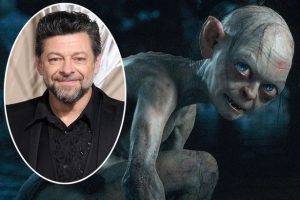
gollum-and-andy-serkis

Gollum (pictured right), played by Andy Serkis (pictured left) in Lord of the Rings (2001-2003), and The Hobbit: An Unexpected Journey (2012), both directed by Peter Jackson.

Being that this blog post is about images rather than animation, I will talk about how Gollum’s appearance was rendered, though I will reference the latter in regards to The Hobbit.

Gollum’s appearance I believe is a rare achievement amongst CGI characters (even in modern films), as it incorporates several elements to create the character other than CGI, combining, to name a few, the 3D model with sculpted models as reference, motion capture with Serkis’ facial expressions, and Serkis’ physical presence on the set to help his fellow actors react believably.

According to this article, Bay Raitt and his team at Weta Digital created a system “which implemented 964 control points on Gollum’s face,” allowing detailed control of his facial expressions. To summarize, this system was used to animate Gollum’s face and a 3D model was drawn over the rest of Serkis’ body during recording.

The additional technique used in The Hobbit is particularly interesting in that it essentially gives Gollum a “living” skeleton, muscles, fascia, etc. to further enhance his lifelike appearance. As for the algorithms, I believe that the individual body elements are calculated to react to Serkis’ nuances in facial expression, in order to save the trouble of having to animate every single frame by hand.

Here is a link to a video describing the added techniques for animating the 3D image of Gollum for The Hobbit: An Unexpected Journey.

Looking Outwards-05

The stunning images in James Cameron’s Titanic captivated audiences when it came out. While Cameron and his production team built half of the Titanic, for the iconic scoping shots, a 3d rendering of the full RMS Titanic was needed. Digital Domain, Cameron’s own CG company, did the majority of the effects and even went so far as to create new ones. Titanic was the first time that motion capture was used so algorithms had to be created to translate the movement of actors to the 3d animation. In addition, the full length iconic shots of the ship itself were mostly produced through animation. While a lot of the ship had been physically built, animators had to add extra sections to the ship and sometimes even render the whole ship.

I suppose that the algorithms created to produce the work dealt with looking at the movement of real ships, flags, people, etc and then animating the scenes appropriately. I don’t know how the animators would control the camera angles with the ship, but I assume that keeping the animation consistent while changing the camera angles was a big obstacle.

Titanic VFX

Behind the Scenes of Titanic

Creating Titanic

Looking Outwards 05

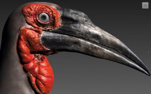
This 3D graphic named Southern Ground Hornbill depicts a southern ground hornbill bird’s head. It was crafted entirely in 3D by artist Leandre Hounnake. I really like how it looks like a photo as it is ultrarealistic. The author used a combination of Sculptris, 3ds Max, Mudbox, V-Ray, MultiScatter and Hair and Fur. These names listed above are 3D design software packages. The creator shows a love for details as the art is precise to a high level. The colors are also dim and simple. The entire design is dark with uniform colors. There is also strong contrast between the red and black colors. Which gives a highlight to the work.

sep30
Ground Hornbill by Leandre Hounnake

Link :http://www.creativebloq.com/3d/inspiring-examples-3d-art-12121523