![[OLD – FALL 2016] 15-104 • COMPUTING for CREATIVE PRACTICE](../../wp-content/uploads/2020/08/stop-banner.png)
This week, I looked at Amanda Cox‘s work. She works for the New York Times as a graphics editor, and as I am a big fan of the NYT, I decided to pick her as the individual whose work I would look at. She received a Master’s degree in statistics and ended up at the NYT when she decided to take an internship there while she was still in school.
I am drawn to her work because I think data visualization presents an interesting challenge but is relevant because there is so much information available to us in this day and age. I think the NYT consistently creates fun and interactive infographics, which I find fascinating. They are both informational and engaging, which I think can be a difficult balance to strike at times.
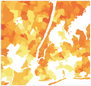
One of the things she worked on that I found particularly interesting was this infographic on Netflix rental patterns depending on location and neighborhood.
(Please click on the image below to access the infographic.)