The presentation was by Ben Fry. He’s an expert in data visualization and part of Fathom which is a design and software consultancy in Boston. He also codeveloped Processing which is an open source programming language and IDE. He received his Ph.D. from the MIT Media Lab and was also the chair of design for Carnegie Mellon’s School of Design.
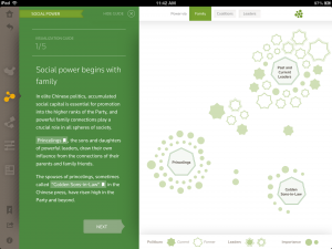
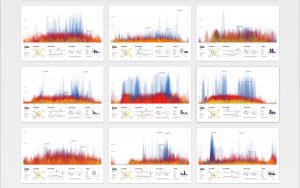
Some things I noticed about his presentation was that he used a lot of useful infographs that attract the attention of the audience. He starts off very basic and also uses a little bit of information shock value to grasp the audience’s attention. Afterwards he goes into a little more detail about his actual project. I think I can take a lot away from this presentation, however, there were some things I wasn’t a fan of either. Some slides were a little too packed with information and it wasn’t possible to internalize all the information.
The main project that Ben is working on is to take their clients data, and create patterns and narratives that the audiences can relate to. Allowing better understanding of topics like global gender gaps to gas turbine rhythms. Essentially trying to make more sense of the world.
![[OLD – FALL 2016] 15-104 • COMPUTING for CREATIVE PRACTICE](../../../../wp-content/uploads/2020/08/stop-banner.png)


