Hannah K-Looking Outwards-05

This week for my Looking Outwards, I looked at some 3D images of a Human Immunodeficiency Virus created by Alexey Kashpersky. The images were created in 2013 for an international 3D contest run by the CGSociety. These images initially caught my eye because of the rich, vibrant colors and strong composition of the images’ contents. I was further intrigued when I realized that the image was of an HIV virus. The images are both beautiful and terrifying because visually, they are mesmerizing, but in reality, they represent something deadly. Ultimately, this work is a perfect intersection of the arts and sciences and shows how powerful the combination of the two could be.

I was unable to gather the details of the exact process of how these images were made, but they were created using Cg, which is based on the C programming language. Upon doing some further research, I found that Cg allows users to program vertex and pixel shaders.

A 3D Image of the HIV Virus created by Alexey Kashpersky

LookingOutwards-05

While I (along with the rest of the world) am very familiar with Frozen, I’d never really looked into how they animated the movie. I knew it was CGI, and I knew the basics of how they created the people in the movie, but I had ignored one major aspect: the snow.

Since their creation of Snow White and the Seven Dwarves in 1937, Disney has studied movement in order to create realistic-looking animation. With Snow White, it was studying the movements of a young woman, like walking and dancing; with The Lion King it was studying how lions move; and with Frozen, it was the movement of snow.

There was no software ready-made that would create the visual effects with snow that they wanted, so they had to start from scratch. They assembled a team of people (led by art director Michael Giaimo) to go study snow and figure out how to recreate it. Not only was it a new concept to tackle, it was a complicated one – snow comes in a huge number of varieties: powdery snow, wet snow, icy snow, etc. They had to figure out things like how snowballs looked when thrown against a wall and what it looks like to walk through the snow in a long skirt. While they didn’t have much time to make the deadline, Giaimo and his team put in considerable effort in making the snow look like it belonged in “a believable world.”

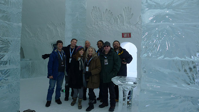
The art team also went to Quebec, Canada to visit the Ice Hotel as part of their research.

The above video includes an explanation of the algorithms used (which I fully admit I do not understand at all) as well as shots of the animation in action. It even includes formulas above some of the animations, often side-by-side, to show how changing certain variables effects how the snow looks.

Frozen was released in 2013 and was produced by Peter Del Vecho.

Looking outward – 05 – 3D graphic design art

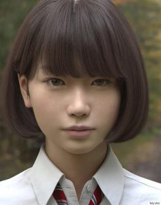
o-cgi-saya-570There are tons of 3d graphic design artists all around the world. Some of the artists creates surrealistic environment, and some of the artist creates hyper realistic art pieces. I think one of the graphic arts that fascinates me is ‘Saya’, the lifelike Japanese girl character. When I first saw this art piece, I thought it was just a picture of a girl, however once I’ve noticed that it was made by graphic I was shocked.
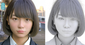
Saya is created by Japanese graphic artists, Teruyuki and Yuki Ishikawa, who live in Tokyo. They tried to create each hair and even eyelashes. They mentioned that the most challenging part was the skin. It was hard to express the texture and color of natural skin. _________2016-09-0918-03-51-jpgcy9kq1ou0aage8tSaya has her own twitter account, and she updates her status regularly and when she was released, her picture was retwitted over 8000times.
Denise Jiang- Looking Outwards 05


Emmet Truxes, Nathan Shobe, Julian Bushman-Copp, Mijung Kim, Jeffrey Laboskey, Misato Odanaka
2014,GSD

Looking through all kinds of 3D computer graphic projects, I naturally paid more attention to architectural visualization since it relates to my major. I discovered a rendering animation of Kenzo Tange’s Yoyogi Olympic Arena in celebrating the 50th anniversary of Tokyo hosting the Summer Olympics. The rendering is created by professors and students from Harvard GSD as part of their course projects. I admire it because architectural rendering takes a huge amount of time and could be repetitive or boring during the process. Their animation pictures the Arena even better than photos. Not only architectural details are shown, but also the relationship between the surrounding and the building was nicely integrated. In order to make such rendering, the students have to make a digital model of both the exterior and interior of the arena. Then they would render the building in softwares such as Vray and Maya. They also have to match all the materials to every single part of the arena. Their product is very impressive aesthetically. Natural lighting and shadows are time-lapsed and even the reflections on the windows are nicely mimicked. Different angles of camera takes the viewer to multiple key details that might lost in photos. The materials and colors all fit together to make it a really successful visualization.

Archdaily-Video: Yoyogi Olympic Arena / Kenzo Tange

mdambruc_LookingOutwards_05

Andy Lomas Cellular Forms 2014

http://www.andylomas.com/cellularFormImages.html

Video of Cellular Forms

I’ve always been fascinated by the small processes in biology that are not able to be seen by the human eye. I was drawn to Andy Lomas’s Cellular Forms because he created an animation of forms that was modeled after cellular growth. I admire that Lomas chose to create a graphic that took inspiration from biology but did not model the animation after any particular organism, leaving the interpretation up to the viewer. Lomas created the graphic by starting with an initial cluster of cells and then adding complexity to the structure. Lomas used parameters to measure and control the accumulated nutrient levels in the cells to monitor when a cell would divide. Once a certain nutrient level was reached, the cell would divide and reconnect with neighboring cells. I suppose that due to all of the repetitions in the work, Lomas must have used loops or a variation of them. Lomas was also interested in the reactions of his viewers. He believed that there was something deeply psychological in humans where if we see these biological processes we feel connected to the biological forms. Being the CG supervisor for the movie Avatar, I believe Lomas is very invested and successful in creating an appreciation for biological processes in his viewers. 

LookingOutwards-05-sehenry

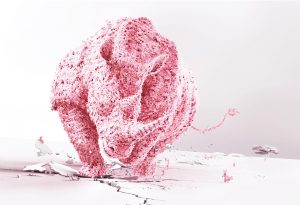
pink-rhino

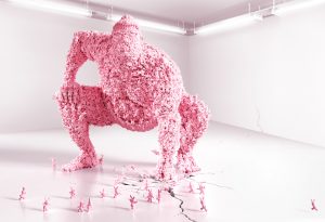
pink-sumo

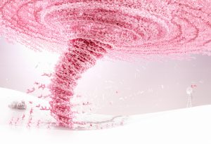
pink-tornado

Duracell Print Campaign Europe/Asia
Ogilvy & Mather Paris
Digital illustration : Full Computer Generated Image.
2010 Cannes Shortlisted
2009 Eurobest Bronze Award

Behance Nikopicto Site

Nikopicto is a Hong Kong based 3d production company that has an enormous portfolio of 3d projects. As I was browsing through their projects, one particular one that caught my eye was one they had made a few years ago called DURACELL. They took the cartoon animation from DURACELL and turned it into a masterpiece. By using a large amount of small pink bunnies, they were able to create a pink stampeding rhino, a pink tornado, and a large pink sumo-wrestler. And if you look closely you can see various bunnies all in different poses. I like when something so small can make up something even bigger and that is exactly what Nikopicto did. The agency that sponsored the full computer generated images was Ogivly and Mather for the client Proctor and Gamble as a part of the Duracell Print Campaign 2009 Europe and Asia.

vtavarez-Looking-Outwards-05

The song “Drugs” by Eden is complemented by this great piece of computational Virtual Reality art. The piece was filmed using a Canon 5D on top of a Kinect, which captured the real-time 3D data using a beta software. Creator, Stuart Cripps, worked hard to incorporate the experience of music into his piece and demoed it 2D system running Rift. The piece uses a series of lines to depict depth and perception. I really enjoy it for its narration of the story and use of virtual reality to immerse the user in the experience. I wish I knew how they incorporated the 2D view into the virtual reality experience, but I could not find anything on that process. I would assume it was putting together several 2d models

presentation1

sihand – LookingOutwards 05 – Glinting Algorithm

Glinting Algorithm

Researchers used their method to model the glittery shell of this snail.
Credit: Jacobs School of Engineering/UC San Diego

If you like the glittery metal texture as much as I do, you would understand the struggle of recreating the shimmering surface in drawings. A couple of current commercial software are able to recreate the details, but only in stills. However, the game has changed recently. A team of researchers led by UC San Diego professor Ravi Ramamoorthi developed an algorithm that significantly improves how computer software reproduces the glints, which is how light interacts with the smallest details on a metal surface.

The current method, which models details at the pixel level, is sufficient for most production but cannot represent the real world scenario. Professor Ramamoorthi’s team, on the other hand, broke down each pixel into “thousands of light-reflecting points smaller than a pixel, called microfacets”, so the results will be more grainy and noisy, and more realistic (Science Daily). Their solution also features a “position-normal distribution” that approximates the distribution of light at each location. This method is tremendously more efficient than the traditional method, where the light on each microfacet is calculated.

With their new algorithm, rendering will become almost instant. Their work is a manifest of how improvement in technology pushes artistic potential.

Iron Man’s armor

Read the original article at Science Daily

Diana Connolly – Looking Outwards 5

screen-shot-2016-09-30-at-1-36-39-pm

Zika Virion Scientific Illustration, John Liebler

Link to the article about this illustration:
http://www.artofthecell.com/animation/2587

Scientific illustrator John Liebler was intrigued by the Zika Virus as its name quickly spread due to its severe health implications. Liebler knew that there was a need for somebody to illustrate the Zika virion in its entirety, depicting all of the proteins in it. So, he set out to illustrate it and came up with the above image. His artistic sensibilities are manifested in the final form in that the image is a very clear but detailed depiction of the Zika virus, illustrating for any viewer what the physical make-up of the virus is. His use of varying colors also helps the viewer to parse each of the proteins in the virus. I’m not sure of the algorithms used to create the image, but I am sure that he must have used a program such as Maya to create his 3D representation of the virus, modeled after several scientific images of the physical virus, and then had the final 2D image rendered from this model. I had thought for a while that I might want to become a scientific illustrator, so scientific illustrations have always intrigued me. After searching online for 3D Zika illustrations, I came across Liebler’s and found it truly inspiring. I admire this piece because it not only filled the need for a detailed and clear illustration of the Zika virus, but it also inspired researchers to further study each of the individual proteins in the Zika virus. Now, researchers have published the homology models (3D renderings of each protein for the sake of other scientists to observe when the specific protein make-ups aren’t yet known). Thus, this illustration not only helps to depict the Zika virus in its visual properties, but it also spurred further research of the virus itself!

Looking Outwards 05 – Alison Hoffman

1327573131_chamelion-01-1000

This piece is a 3D model of a Chameleon by Aram Vardazaryan done in completely in photoshop. Even though it is incredible that this piece only took him a week to complete, what I find more fascinating is how it not only is a 3D render in 2D, but that it is also completely sculpture-like. I would expect to find a piece like this in a sculpture garden, crafted from mixed metals and wire, yet it is completely done on the computer with software. It amazes me how realistic the metallic elements are. Recreating such effects must have required a lot of consideration when it came to lighting sources, especially given the fact that there is so much curvature in the shapes.