Looking Outwards 5- Digital Emily


“Digital Emily” Introducing Image Metrics
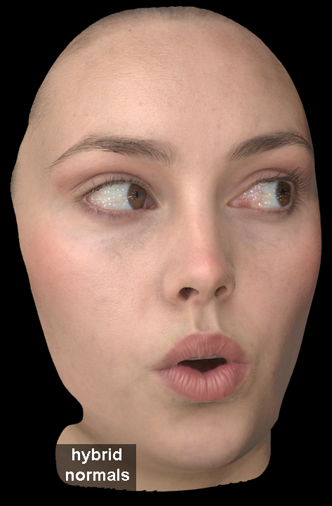
A 3D computer graphic image of Emily by Image Metrics
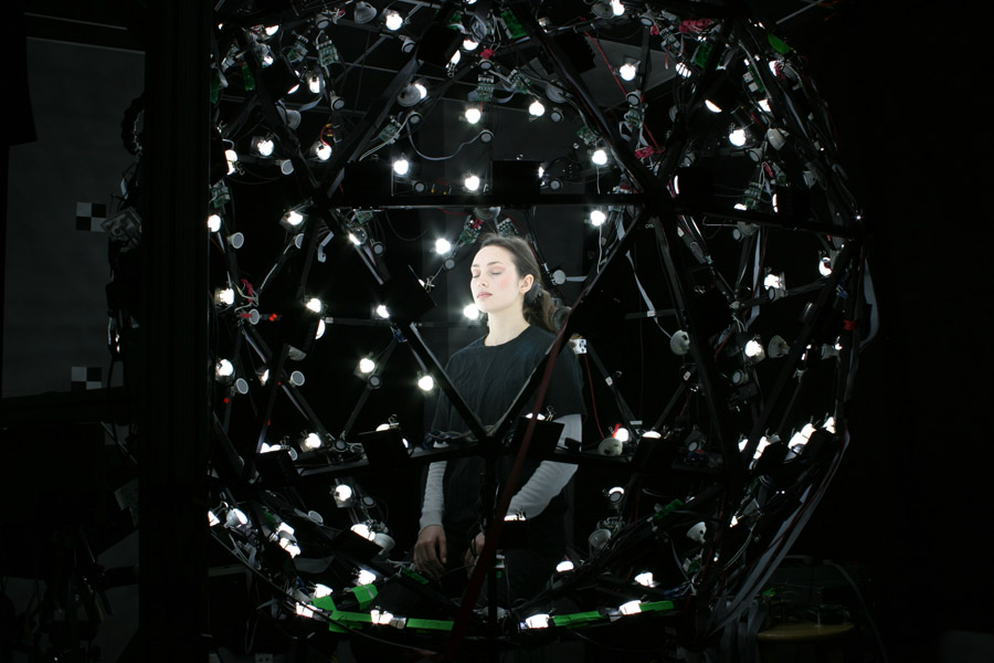
Emily under 156 LED lights at USC Institute for Creative Technologies Graphics Lab
slide03
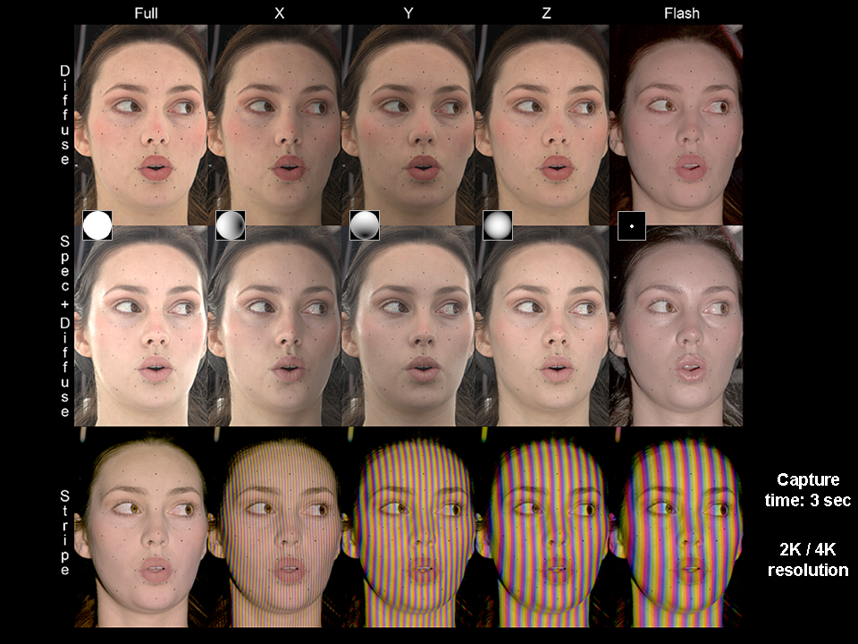
The fifteen photographs of the face under different lighting conditions by Image Metrics

The Digital Emily Project was done by Paul Debevec and his team from Image Metrics in 2008. They built a 3d digital puppet of the actress Emily O’Brien that they could manipulate. Viewers could not tell whether they were watching the real person or the computer graphic animation. Countless rays of light produced by 156 bulbs bounced off the surface of Emily’s skin and into the camera, which allowed people to “scan” her face. Different from putting trackers on her face, this process can capture more details like pores and fine wrinkles. The team used hybrid normal map rendering in Maya 8.0.
sm_slide36
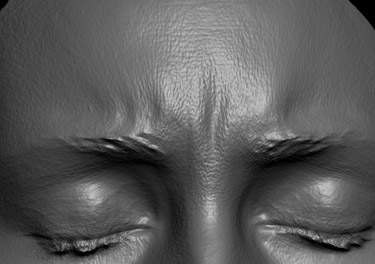
Specular (high-res) geometry image of Emily O’Brien by Image Metrics

The use of hybrid normal maps created better effects than diffuse map rendering because it made the surface more like skin. Emily’s eyelashes were often covering her eyelids and pupils so they had to build the model of her eyes from scratch. A program that could move each part of Emily’s face like her brows and teeth allowed the team to create whatever expression the real Emily could make. Using this program, they made a Computer Graphic animation by replicating each frame from a video of the real Emily in less than two weeks. It is surprising how the actual animation process only took so little time. It gives us a sense of how powerful this tool is once the process of generating the system is finished. I admire this project because it can be applied easily in the film industry. One of the intentional decisions that Debevec made was determining the extent to which Emily’s facial expressions could be exaggerated and what kind of expression would be considered realistic. This whole project gave me an appreciation of the complexity of the human face.

Links:

The Digital Emily Project: Achieving a Photoreal Digital Actor

Acquiring the Reflectance Field of a Human Face

Check out the TED talk given by Paul Debevec on The Digital Emily Project:


James Katungyi – Looking outwards 05

transport_iv

Artist: Eric J. Heller

Title: Transport IV

Year: undated

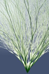
A branching shrub-like image results from mapping the 2 dimensional path of each of 100,000 electrons released at a single source, using algorithms. While each electron’s launch angle is different, the paths overlap which increases pixel concentration resulting 3 dimensional texture and depth to the image. The electron paths are mapped in a colour of choice – green in this case.

Of interest to me is how mapping these random trajectories results in an uncanny resemblance to plant ‘geometry’.

In addition to being an artistic piece of work, the idea of recreating the flow of discrete particles to resemble natural organisms, promises to inspire design. Rather than copying by observing, artists – from painters to building designers – can recreate natural patterns using this technique.

The artist, Eric Heller, has produced similar works in the Transport series, all inspired by a team of Harvard scientists that measured electron trajectories.

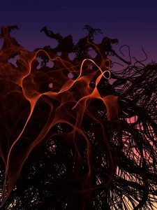
Similar work – Banyan (below)

banyan

Christine Kim – Looking Outwards – 05

office_render
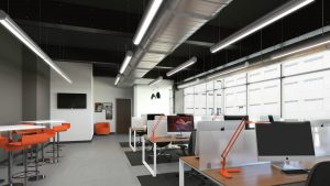
Render of the office space
office_photo
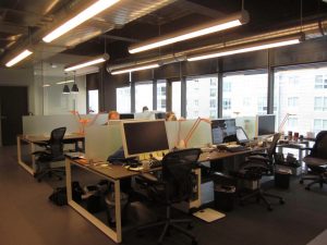
Photograph of the office space

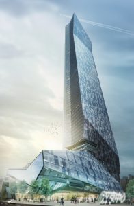
As an architecture student, making digital renderings is common. From this article, I found out that clients feel that they cannot trust the digital renderings because it “lacks realism”. In this article, one digital rendering and a photo of the actual space was being compared. This comparison showed that the digital renderings can be an inaccurate representation of the actual space created. Most of the time, the 3D computer graphic photos focus on artistic values of the render rather than the creating realistic experiential render. Even when architects are making renders of their work, they use programs like Revit, ElumTools and Sefaira which allow them to calculate light and other factors that they have to take into account. However, because there are some factors that cause renders to look different or make something different, clients should understand and try to understand the essence of the renders instead of focusing on exact replica. Rendering programs like Revit helps see both the architect and client the gist of what the space is going to be. I think it’s very helpful and useful for both sides to understand the space. Through the renders created by the architects, clients can see what the architects focused on and deem important.

hct_re_full-tower_final
Render of Hanking Center Tower in Shenzhen by Morphosis Architects
atlantic_ave_boston_sm
Render

Article Link

Michal Luria – Looking Outwards – 05

Inside Me / Nils Frahms

The work I will discuss this week in “Inside Me” by Nils Frahms. The project is a 3D computer generated work of art that aims to express the inner self of an individual in today’s information and technological world. The video presents what looks like the inside of a person, combined with expressive light and color, into a magnificent video work of art.

The project was created using a special 3D scanning technique – the artist 3D scanned his own body. This technique allows not only scanning from the outside, but also “inner scanning” where the objects are inverted and create abstract shapes.

With this initial scanned material of his own body, and with the help of 3D computer generating software, the artist, in my opinion, succeeded in presenting his inner world. What I like about this project is that the artist’s own body was the starting point and the core material to work with, and therefore there is a strong connection between his body and the resulted 3D art that is made to represent his inner self.

Inside Me by Nils Frahms, presents the inner world of the artist using scanning and 3D computer generated art techniques. Source

Jessica Medenbach – Looking Outwards -05

“The Box” by Bot and Dolly is a really interesting use of 3D graphics to me because it’s taking 3d graphics from Maya and then projection mapping them onto a box that moves, creating depth of space and then creating the illusion of 3d objects within that space. The extra added element is that the choreography of that box is done by robots which hold it.

What I think is interesting and exciting about this, is that it requires the use of algorithms to make everything work and flow together. The movement of the robots holding the box and how the 3d graphics move within that box, along with a lot of systematic planning and choreography create a really interesting otherworldly feeling installation.

I admire how these artists used different technologies to create this magical feeling. They are able to put the viewer into this unreal mesmerizing space while simultaneously making it feel uncanny and tangible, which I find really effective.


Sofia Syjuco – Looking Outwards -05

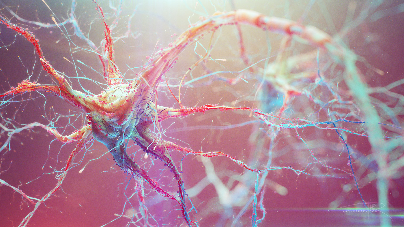
Neural Pathways (Stills from movie)
Alexey Kashpersky
2015

Kashpersky’s project, to create 3d visualizations of neural pathways for a movie, is something that I very much admire. It’s really interesting that the movie strove to depict something that, it’s likely they couldn’t just use a physical example of. Instead, an artist had to be brought in, and with him, his own aesthetic and ideas about how things should look. Resulting in a depiction of something that is real, but is uniquely represented because it’s not naturally occurring in nature – it is the product of an artist trying to *make* something in nature. I really admire that about this project, because it shows how important the role of the artist is in helping people to understand the world around them, in ways that are singularly beautiful and pleasing. I know that these works were generated using 3D programs like Zbrush and 3DS Max.

Brandon Darreff – Looking Outwards – 05

screen-shot-2016-09-24-at-3-58-29-pm
Print of 3-d computer model

screen-shot-2016-09-26-at-7-21-26-pm
One of many explorations of lighting effects through projection

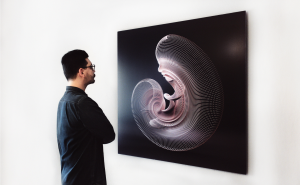
With his work “Unfold 01,” visual artist Can Buyukberber utilizes a combination of lighting effects and 3-D computer graphics to abstract the process of morphogenesis. I admire the way Buyukberber is able to present a scientific process related to the development of an organism in a beautiful way using powerful imagery that starts to read like a time-lapse. With this project in particular, he began with a 3-d model of a child’s face in Maxon Cinema 4D Studio and utilized cloning tools within animation modules of the software to array the base curves along a circular path. He then lofted surfaces between the curves and used the tool Atom Array to create spheres around vertices of the curves. Lastly he played with the illumination levels and shadows while rendering images to experiment with the effects of light on the 3-D model resulting in a variety of images of the same object. In this project, Buyukberber successfully communicates his interest in patterns and intelligence within nature by abstracting his perception of biological processes.

-Project Link-

Unfold 01 from Can Buyukberber on Vimeo.

Isabella Hong – Looking Outwards – 05

Andy Lomas is an artist and mathematician well versed in the art of computer graphics. His graphic projects are based on the bridge between the general characteristics of biological principles and nature. Lomas uses basic mathematical rules to render his images of cells and their various stages of mutation. The cells are not drawn based on biology but on Lomas’ vision and what he sees as fitting, letting his creative influence come through in a concept heavily rooted in biology.

What I find fascinating about Lomas’ work is the intricacy and detail of his renderings. “Hybrid Forms – Cell Differentiation” consists of 100,000,000 cells, a number so large that Lomas commented he had to select a few 1,000,000 cell seedlings to grow to full maturation to save his computer. Lomas also adds an abstract aspect to the seemingly concrete purpose of science, a twist that I haven’t seen before.

The following video is one of Lomas’ most recent projects. Illustrated is the competitive nature of cell growth based on form.

Sources:

http://www.andylomas.com/

https://vimeo.com/andylomas

Janet Lee – Looking Outwards – 05

The 3d Computer Graphics that I found interesting was the Microsoft Hololens. Using a hololens one could interact between the physical and the digital space allowing one to visualize their digital work into the real world. I was fascinated by this project because it allows people produce their imagination easily through a digital space. The hololens scales the work into real life scale and so that is what caught my attention. Their algorithm is to blur the physical and digital space. Being able to visualize artwork and projects through a hololens is how their artistic sensibilities manifest in the final form.
https://www.microsoft.com/microsoft-hololens/en-us

Microsoft HoloLens – Transform your world with holograms (3D AR Goggles) from CGriver.com on Vimeo.

Sarita Chen – Looking Outwards – 05

This week I chose the Doodle3D Transform project for my Looking Outwards report. Doodle3D Transform is a 3D design app that converts 2D images to 3D images for 3d printing. The application works for most tablets and browsers.

(Pictured above are gifs showing in a few quick steps how the application functions. )

What I admire about this project is how user friendly the entire application is, making it easy for people who have a mostly basic understanding of 3d printing and 3d graphics to create something useful (like a vase for example, as pictured above). This is also the reason for why the creators made this project in the first place. They wanted to make 3d design easily accessible for people who may not necessarily be experts in that field.

Here is a photo of the team that created the project:

Doodle3D is a tech company located in the Netherlands. The team working on this project consists of Rick Companje, the founder, and four collaborators: Nick van Dijk, Casper, Peter Uithoven and Jeroen Somers.

Here is a link to the project website.

How the program works is that you can draw anything, whether it’s tracing, freehand etc in 2D. The app then renders your design into a 3D version using CAD (computer aided design) software, which you can freely play around with as the two images are side by side, as shown below.

Here is a video for the application.