![[OLD FALL 2019] 15-104 • Introduction to Computing for Creative Practice](https://courses.ideate.cmu.edu/15-104/f2019/wp-content/uploads/2020/08/stop-banner.png)
Stamen Design — Mapping the World’s Friendships
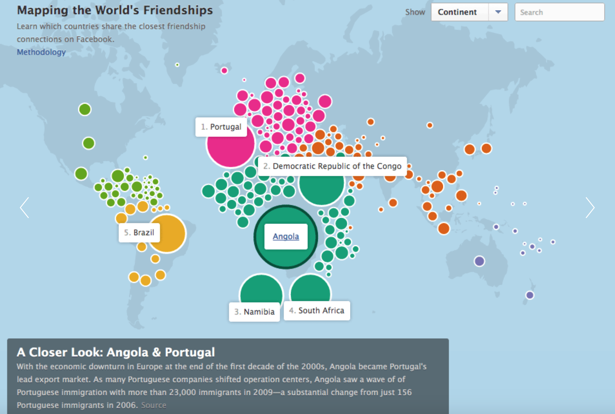
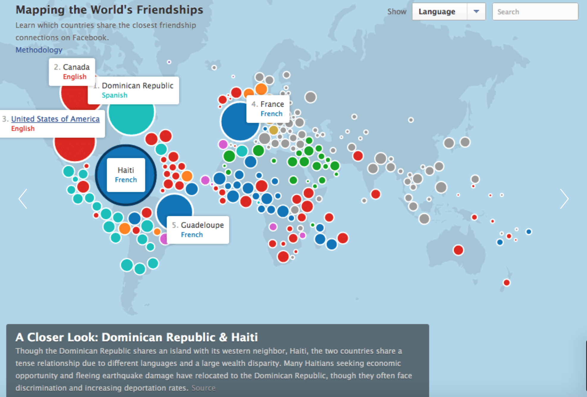
Data visualization is really interesting and cool to me. I found Stamen Design that mapped the world’s friendships through data visualization. It uses Facebook friendships the new stories feature to map interconnectedness between countries. The countries are divised by how many Facebook friendship there are between the countries, and the total number of Facebook friendships in that country. I found it interesting because you can see a bit of history through this project. You can tell where a country has been (ie. US occupied some far island in the 1980s). I think it is also really great to see us connecting outside of our country. It is important to have diverse friendships to learn about different cultures and nuances. The algorithm must map number of friendships to size and also group countries that have friendships together in the same color. The creator’s artistic sensibilities come through by how he/she chose to represent the data, specifically, the colors chosen and the use of circles to represent areas.