![[OLD FALL 2019] 15-104 • Introduction to Computing for Creative Practice](https://courses.ideate.cmu.edu/15-104/f2019/wp-content/uploads/2020/08/stop-banner.png)
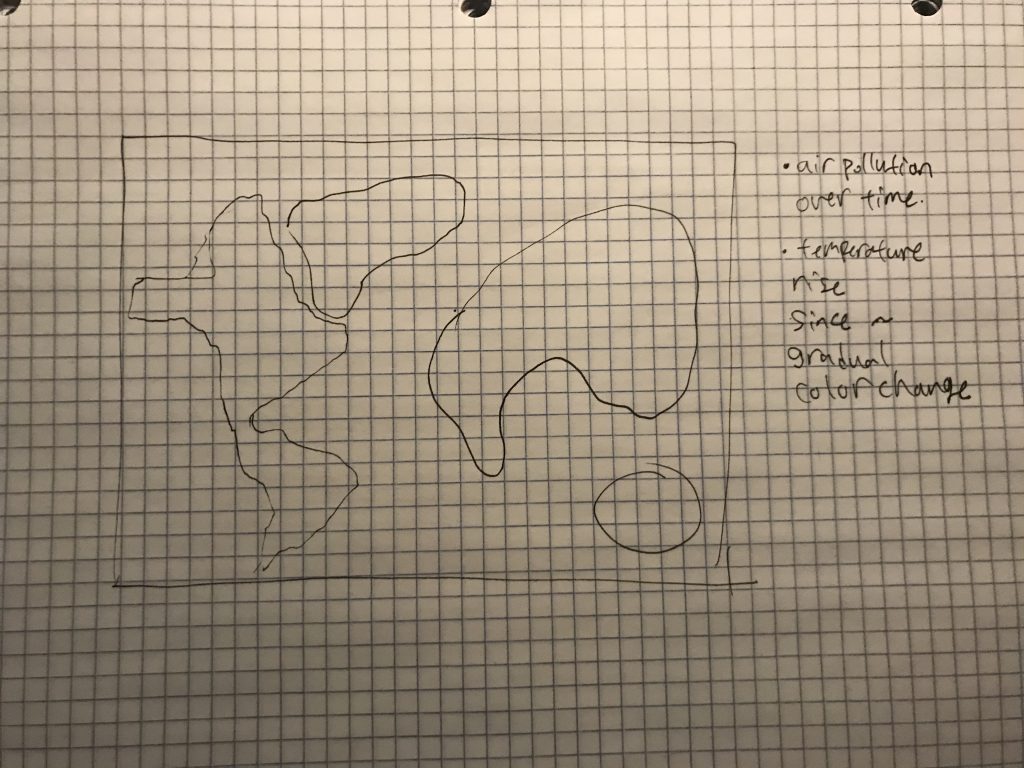
For the final project, we want to create an information visualization map of the world that represents climate crisis by emphasizing either the rise of temperature around the world due to global warming, or the amount of electricity used around the world. To further elaborate on one of the idea we have proposed, the map could possibly show the amount of light (or even how big the city is) of each places. For instance, places like United States will be much brighter with more use of lights compared to third world countries. In the United States, depending on how many parts we divide it into, bigger cities like New York city or Los Angeles will light up much brighter than Wyoming. Moreover, the world map that displays the gradual increase of temperature on Earth may also be very attractive potential topic. We believe the matter of issue on global warming may be effective in order to visualize information because it is our reality that the Earth’s temperature is constantly increasing.
I will be collaborating with Jenny Lee on the final project, ylee1@andrew.cmu.edu Section C
Jenny will be responsible for coding to design the illustrative aspects of the map and Minjae will be responsible for coding the interactive aspect (of lighting up certain areas, for instance). We will both help each other to create this map art and fairly divide the work together.