Blog 07: “BikeCycle”

By Ilia Urgen
Section B

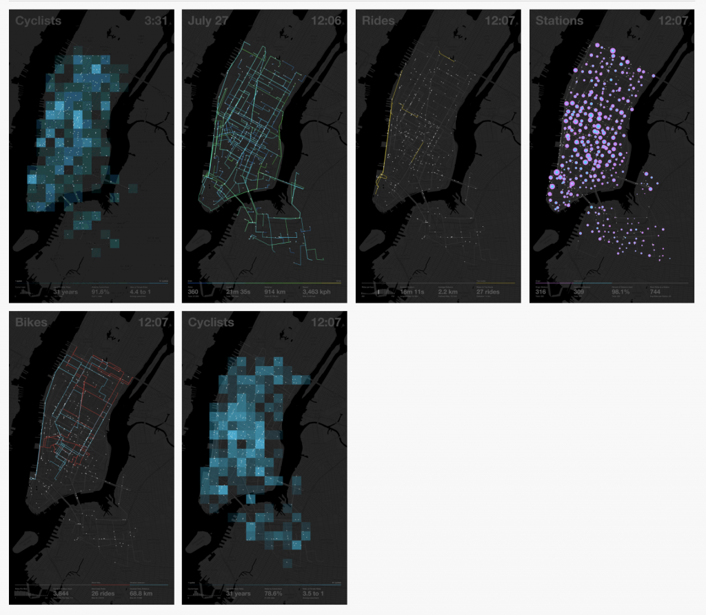
This week, I came across a cool app called BikeCycle. It was developed by Nicholas Felton back in 2014, which is a visual display of everything an avid biker needs. However, this app will only work in New York City, as the coordinates were pinpointed on a map of Manhattan and Queens.

When you launch the app, you can see various interactive REAL-TIME visual maps, which are not limited to bike-sharing locations, different bike routes, cyclist demographics, and density of bikers in a certain area.

I find Felton’s app BikeCycle intriguing because I, myself, am an avid biker! Although I’m from Long Island, NY, and not the city, it’s very interesting to see real-time stats for different biking variables. If I were to go to the city for a ride, the app would help me optimize my bike route, see which areas to avoid, and find popular scenic routes in Manhattan!

6 different maps showing 6 different real-time biking variables!

Looking Outwards-07

Graham Murtha

Section A

One of the most fascinating visually represented datasets is perhaps one of the largest single-website collections of information on the internet- OneZoom’s tree of life Explorer. This website graphically represents all of science’s current understanding of biology in the universe, starting from eubacteria, eukaryotes and biota. As you can imagine, there is a ridiculously expansive number of species included in this data set, and the tree emphasizes that by it’s scale- human beings and most familiar mammals happen to take up .001% of the tree’s entire figure, according to the resources’ “about” info. The more you zoom out from where we are in the tree of life, the more you come to realize how insignificant we are in the grand scheme of biology- our species is in no way special, despite the leaps and bounds we’ve come. Only a vectorized graphic such as this could convey such a shockingly accurate scale of life as we know it, and how puny humanity is to nature. The graphic conventions of the tree itself is also fascinating- each species is represented as a circular leaf on a tree, and the closer two species are in evolution, the closer their leaves are on their respective branch. The branches are represented as bending curves that spiral off of their larger parent, which emphasizes the connection between all living things, rather than just linear branches shooting off in their own direction.

It really is an incredible and informative dataset- I recommend everyone to explore it a little!

https://www.onezoom.org/

Project-07-Curves

A modified hypotrochoid on top of a modified epitrochoid! I reversed x and y in the second vertex function to create the double layered effect.

sketch
// Zoe Lin (ID: youlin)
// Section B

var nPoints = 80;
var angle;
var x, y, theta;
var r, g, b;

function setup() {
  createCanvas(480, 480);
}

function draw() {
  r = map(mouseX, 0, width, 0, 20); //draws bg color based on mouse pos
  g = map(mouseY, 0, height, 0, 20);
  b = map(mouseX, 0, height, 0, 20);
  background(r, g, b);
  noFill();
  stroke(130);
  translate(width/2, height/2);
  moddedeEpitrochoid(); //draws first geometry at center
  rotate(HALF_PI); //draws second at an angle
  moddedeEpitrochoid();
  hypotrochoid(); 
  rotate(PI / 3); //repeat at third angle
  moddedeEpitrochoid();
  hypotrochoid();

function moddedeEpitrochoid() {
    var a = 85; //angle
    var h = constrain(mouseY / 10, 0, 100); //limits geometry size
    var mouse = mouseX / 70;
    
    beginShape();
    for (var i = 0; i < nPoints; i++) {
        theta = map(i, 0, nPoints, 0, TWO_PI);
        //modified formula for epitrochoid
        x = (a+a/2) * sin(theta) - cos(mouse + theta * (a + a/2) / a/2) * h;
        y = (a+a/2) * cos(theta) - sin(mouse + theta * (a + a/2) / a/2) * h;
        vertex(x, y);
        vertex(y, x); //layers vertexes, draws 2d geometry
    }
    endShape();
 }
  strokeWeight(0.25);
}

function hypotrochoid() { 
    var h = constrain(mouseX / 100, 205, height); //contrains geometry size
    var a = map(mouseX, 0, width, 25, 15); //maps mouse pos to desired angle
    var b = map(mouseY, 0, height, 0, 15);
    beginShape();
      for (var i = 0; i < nPoints-15; i ++) {
        var theta2 = map(i, 0, width/2, 0, 50);
        //hypotrochoid formula
        x = (a - b) * cos(theta2) + h * sin((a - b) * theta2);
        y = (a - b) * sin(theta2) - h * cos((a - b) * theta2);
        vertex(x, y);
      }
    endShape();
}

Blog 07 – Data Visualization – srauch

I enjoy these data visualizations of the 2021 summer olympics, conceived by designer Eden Weingart and created by the New York Times graphic department. This one is specifically for swimming, the 400-meter freestyle.

To make these animations, the graphic team created a program that can apply the raw data of the race onto animations, allowing twitter users to see a sped-up version of the race’s events (not just the results!). This raw data included each swimmer’s time for every meter of the race, the time they hit the end of the pool and turned around, and the time they finished. The program then mapped this data onto an animated avatar for each athlete.

I find this approach to sports reporting really cool, since it provides a different way for us to interact with the data of the sport. It can be quite tempting to throw all of the data out the window once we know who won, but an approach such as this allows casual readers to see those intricacies – who led at first, any surprising turnovers, etc. – in a consumable and exciting way.

week 6 blog

The article I ended up finding the most interesting wasn’t about a particular artist, it instead talked a bit about the history of randomness and then the application of randomness in art among other things now. One example that was given was in the field of architecture, randomness is used for things that are unimportant like blades of grass. But in other cases the randomness can be used to reveal patterns that were previously unnoticed or not given enough attention. Another example uses randomness to generate randomness which creates intrigue and surprise in designs. An example that I can think of is a website called coloors which uses random generation to create color palettes and when you save a color you like it bases the next colors off of that one. Although it isn’t completely random, it still is to some extent even if it does have limitations. I guess it’s more like a gaussian random function because it has some limitations that can be incorporated.

Week 5 blog

Roger Magrini is an artist that uses programs as well as manual correction to generate human faces that look insanely realistic. I was first introduced to his work by one of my friends in high school when they asked me to guess which of the people out of a set of pictures was a real person. The people are so fully rendered that it’s impossible to tell the difference between them and an actual person’s picture. I assume that the programs he runs have something to do with facial proportions and to get the final result he runs randomizers to combine traits, coloring, and proportions. I’m not sure how he is able to make the people look like people and take into account traits that usually come together like pale skin and freckles with lighter eyes etc because there are obviously exceptions to these groupings but I guess that’s all stuff that is much more complicated and stuff that is learned later on if I choose to continue to pursuing computing stuff related to rendering.

https://www.artstation.com/rogermagrini

Information Visualization – Gun Deaths

A particular computation information visualization project that I found and admire is Periscopic’s “U.S. Gun Deaths” visualization. This project was overseen by Kim Rees, who is a co-founder of Periscopic. This project was created in 2013, and has been continually updated through 2018 data about gun deaths. This project uses data from U.S. Law Enforcement that voluntarily reported gun homicide deaths. The data does not include suicide deaths by guns.
What I admire most about this project is the simplicity of it. It isn’t a hard graph of data to look at visually, nor is it hard to grasp what it is showing. The data is shown prominently with the total people killed on one side counting up, and the years that were stolen on the other side. I liked showing the years stolen as it is a very large number and really highlights the impact guns have on people in the US, specifically male black Americans. The graph also shows what age each person was killed at, and the predicted age they could have lived to. The last figure is interesting as it highlights how many years they could have had to live. They calculated that data based on the morality rate data from the WHO. I am not sure what algorithms they used to generate the work, but I think it was mostly just loops for each set of data they had, and then a counter for each value they wanted to keep track of.
The creator’s artistic sensibilities of illustrating what potential was lost due to gun deaths, is very prominent and apparent in the final form. The colors highlight the flames of life that were extinguished by guns, and how far they could have gone with the arcs of life. It is a very easy graph to view as well and to understand, making it easily digestible to the regular audience.

U.S. Gun Deaths in 2018 by Periscopic, created in 2013

LO-07: All Streets (2006)

All Streets (2006) is a data visualization map of all streets in the lower 48 United States created by Ben Fry, a new media program developer and computational designer. The project is an image that drew 26 million individual road segments, mapping out all major points of population and transportation. As the co-developer of Processing – an open source programming platform for computational design and interactive media software, Ben Fry’s work often revolved around using creative data visualization as a tool to understand information in both practical and aesthetic ways. In analyzing the image, I believe Fry used an algorithm that drew information from a database record containing the geographical location of all streets in the lower 48, which then mapped said data to the canvas and, in turn, drew curved lines corresponding to each street. All Streets is not only straightforward and effective in its visualization of transportation in the U.S., but it succeeds from a design perspective in its aesthetic layout and composition as well. Computational works like Fry’s All Streets that are practical and pleasing to the eye are a huge part of why I’m taking 15104; afterall, data can be beautiful.

All Streets (2006), Ben Fry

https://benfry.com/allstreets/

Looking Outwards 07: Information Visualization

Hannah Wyatt

In Stefanie Posavec’s piece “art.park.data” she combines the unpredictability of childhood experience and nature with statistical/graphical representation. Each child was given a “Raspberry Pi” device, which aided in recording various data sets in the park: temperature, humidity, types of plants spotted, sounds heard, emotions, and others. The children were then tasked to supply this data per each latitude/longitude coordinate in order to create the mural.

The artwork, a 32.5m long data visualization displayed for the East London Canvas, is impressive to me because it effectively incorporates an aspect of the human experience with statistics. It also presents the data in an aesthetically pleasing way, with complimenting colors and shapes. While data is often confined to graphs or charts, this artwork offers a new perspective into data presentations, encouraging the observer to connect with outside ideas more effectively.

Art.Park.Data in the East London Canvas

Looking Outwards-06

A project that I find interesting is the Dall-E mini software that became vary popular this year. The way that it works is using AI software to generate images from any prompt. Many people used this for comedy, because the software is able to make any image typed, even if it’s impossible to actually occur. Randomness is involved in the way that the photos compile themselves with the AI software. The programming works in order to generate prompts with information that developers have given to the website. I really admire this project because it’s quite fun to compile images into something that isn’t actually possible to create something impossible, which is creative and unique design. Many of my friends have made amusing things with it, and I find it so interesting that computing was used in order to randomly generate any prompt that someone may think of into a picture.

Link to Dalle-Mini.