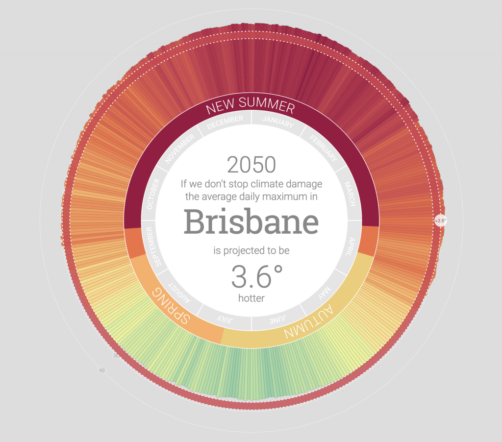
Climate change is a topic that is seriously important, yet often overlooked despite its devastating impact on every single aspect of living, especially for lower income communities who often contribute the least to the destruction of the planet. My Climate 2050, created by Mitchell Whitelaw in 2018 demonstrates the drastic impact of climate change in a way that is both personal and easy to understand. Dr. Whitelaw utilized a unique program that took in all the data about predicted temperature trends in the near future and used color coordination to match a temperature to a color, creating a glance at a year in Brisbane impacted by climate change. Dr. Whitelaw’s understanding of simplicity and color theory allowed him to create a diagram that was very easy to understand, as he used reds to signify hotter temperatures and greens to signify cooler temperatures. He also utilized the impact of the red circle to represent the cycle by which it will only get worse. This allows the viewer to truly understand just how horrendous the impacts of climate change will be.

^^My Climate 2050, Mitchell Whitelaw (2018)
![[OLD SEMESTER] 15-104 • Introduction to Computing for Creative Practice](../../../../wp-content/uploads/2023/09/stop-banner.png)