junebug-clock

Charted Territory Timekeeper

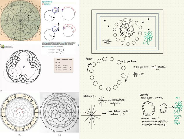
I was inspired by Dr. Donna Carroll’s lecture about the history of timekeeping, and I was so enamored with the ways of timekeeping before knowing time was a necessity. I’ve always love astrology, so I decided to base my inspiration off of charting maps and celestial time in astrology and the overlaps that are drawn between planets, moons, and stars. Included in my picture of inspirations, there were orbit maps that mimicked geometry curves. At first, I used an epitrochoid curve instead of my ellipses to demonstrate seconds, but I found it a little too busy on the canvas and I found it difficult to track with seconds. So instead, the seconds are measured with the rotating elongated ellipses (resembling orbits) as well as measured with the stars in the background (each star is added every second). Minutes are measured with the lines that resemble chart lines, but it also looks resembles our traditional clock design. The hours are measured with the circles rotating around (resembling lunar cycles), and one circle is added per hour. One detail I included was that the minute lines are spaced evenly for each “moon” to fit so it looks like the chart lines could be a measurement for the moon.
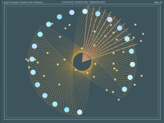
@ 9:12pm
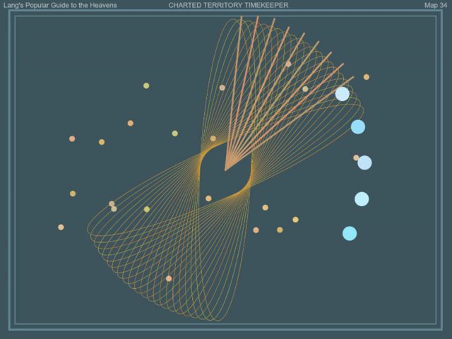
@ 5:09am
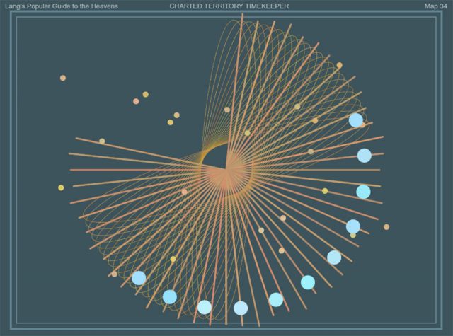
@ 11:47am

Inspiration images (left) and my sketch (right) – Click image to expand
junebug-timekeeping

Reading and watching these resources really got me thinking. We know time to be a known fact, one that is – quoting Drucker – “uni-directional” and always continuous with no breaks. But to humans, the concept of time doesn’t follow that of science but is purely subjective and relative. And yet, we humans always strive to find the accuracy or the truth behind everything, such as the creation of the atomic clock – which I found really interesting about the science behind it all just to justify the accuracy of time. I wonder how it’d be if we were to relive ancient times when timekeeping wasn’t a known fact or a part of science, and just appreciate mother nature a little bit more with its natural timekeeping resources.

junebug-meander

I loved reading about Hodgin’s process of creating this work. Similar to my Looking Outwards on Manolo Gamboa Naon, I love it when artists attempt to recreate nature and mother earth with computation and technology. Breaking down how mother nature works by formulas, points, and vectors and the contrast of philosophy and process really fires me up in a good way. I learned a lot of things from his process because I feel like I lost a lot of my coding skills after taking a year break from coding, but watching his beautiful work come to life motivates me – such as his process of thinking through how to create oxbow lakes by isolating two collision points and turning it into its own curve segment or using Voronoi fracture to turn the background plane into smaller polygons. His background map was similar to what I wanted to create in my grid-plan city map but I couldn’t think through how I could code that out.

junebug-LivingWallpaper

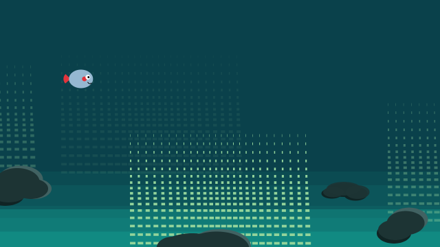
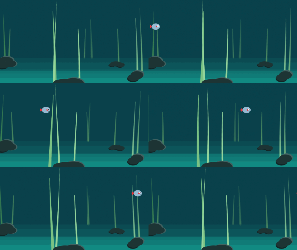
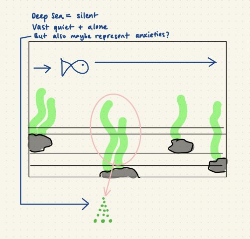
The concept behind my design is replicating my current environment and feelings. I’m living by myself and working remotely, so I always feel alone, especially now since school started and the campus reopening. In my original design, I had the speed of the seaweed contrast the speed of my fish because it felt like the seaweed represented my anxiety and the multitude of anxieties I have been feeling recently. The fish’s easing speed represented the change of mood I usually have during the day, with an up and down. I used the “Double-Exponential Sigmoid” easing function for that reason. With my final design, I decided to decrease the number of seaweed and slow down the animation to instead represent how I feel when I’m stuck in my current location/environment. Everything is very still, quiet, and lifeless.

I am very frustrated and disappointed about my work because my original design and code didn’t work as an endless loop of animation no matter how much I tried to tweak it. The animation of the seaweed just didn’t match the animation of the fish so I had to simplify the seaweed animation. Critiquing myself, I find my final design a little too simple.

My original code and design

Final code and design

Sketch

junebug-Reading02

I found this article really interesting, and something I have wondered multiple times and discussed with a few of my professors before. This conflict between creating art that is new and innovative and never done before versus art that is focused on perfecting a medium/craft. We discussed this before in our open sculpture class talking about the exploration of mediums and processes, but finding it difficult to explore without being inspired to use unconventional methods that were already discovered (i.e. expanding foam is an unconventional tool for art but is a pretty common medium for sculptures nowadays) I found that this dilemma exists in almost every field of art, from painting to new media art.

When the article talks about finding examples that are both first word and last word art, I thought that that’s the biggest problem with the conflict. It is almost impossible to create something completely new in art, either traditionally or technologically, and nowadays artists just want to create something that is innovative but also evolving the medium and memorable. Artists would like to aspire to create work that is of lasting importance, but when technology becomes involved as a tool or a medium, there are times when it doesn’t age well because of how fast technology is evolving and how fast trends come and go. How old the interfaces and graphics used in works are easily identifiable based on trends during the time and how sophisticated technology was at the time. The works become less impactful and more about nostalgia. This dilemma between first word and last word art is very grey-scale and is not clean cut. I think it ends up depending on what the artist wants for their art at the end of the day.

junebug-LookingOutwards02

Manolo Gamboa Naon’s “a02”

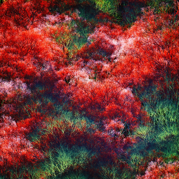
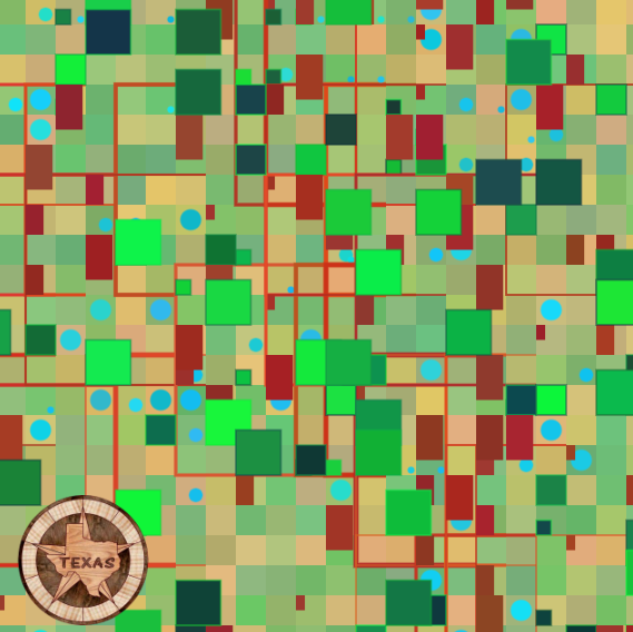
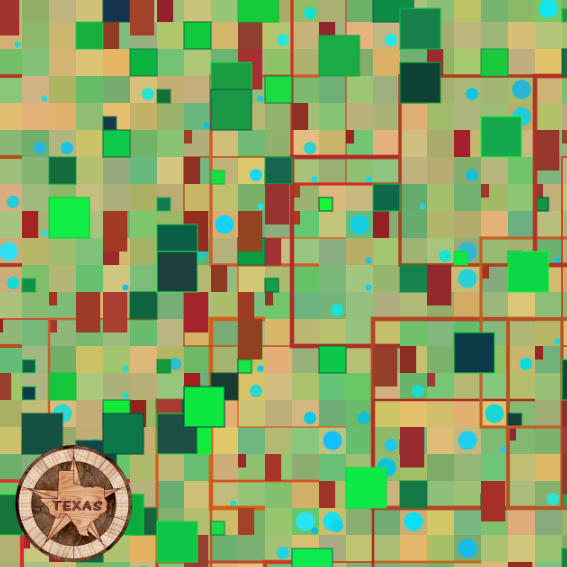
I chose this project by Manolo Gamboa Naon because I just love the idea of trying to replicate Earth’s complicated and beautiful nature through technology. I appreciate this piece’s intricate details and the amounts of layering that occurred. I love the complementary colors of red and green that contrast each other beautifully, and the layering of artifacts creates almost a visible texture.

junebug-Map

Link to project

Description:
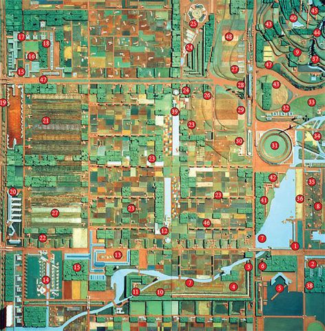
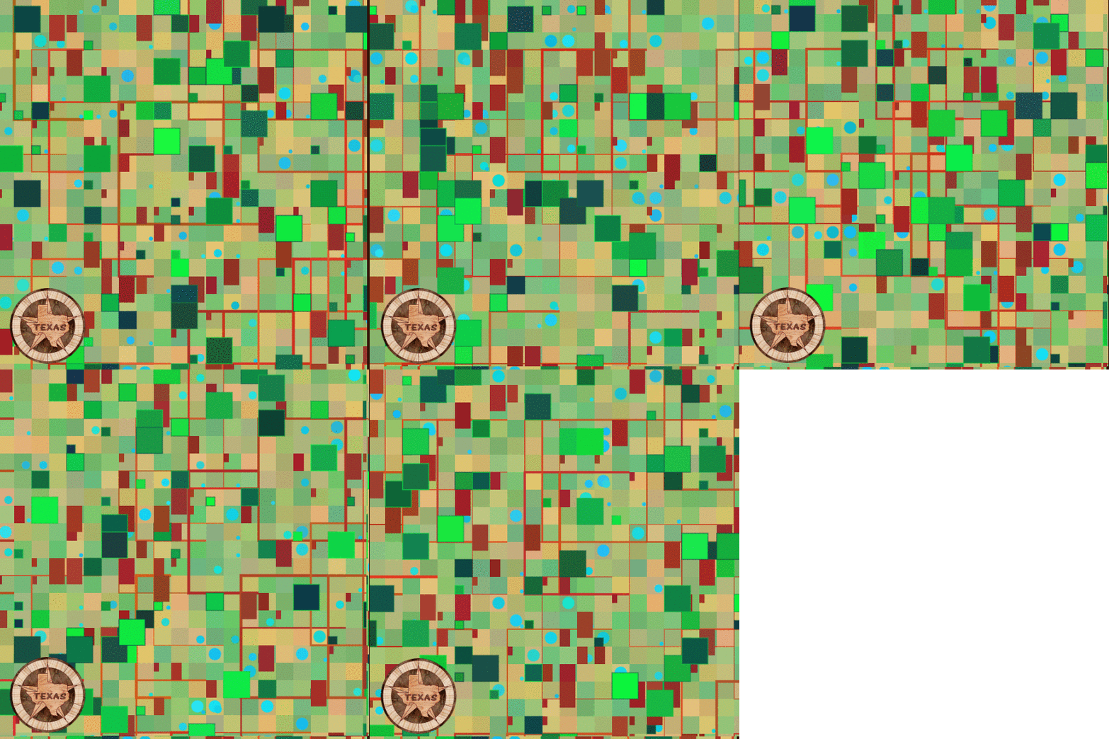
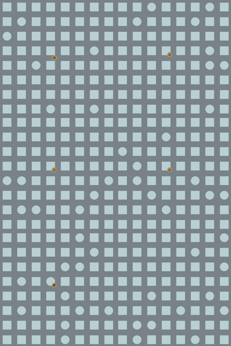
I’m very interested in the structure and chaos of city planning and the geometry that results from it. View from an aerial perspective, there exists symmetry and asymmetry, as well as a lack of identity.

Technical Process:
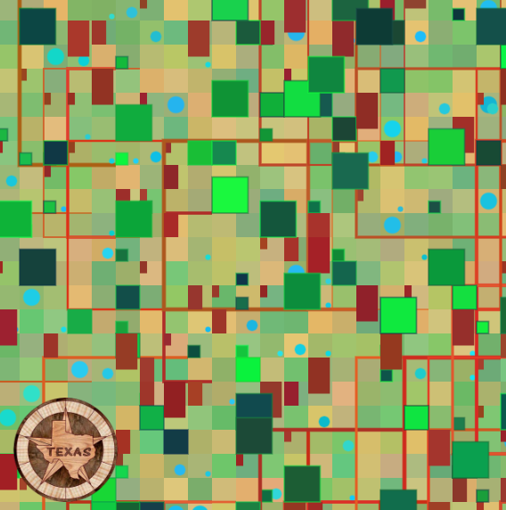
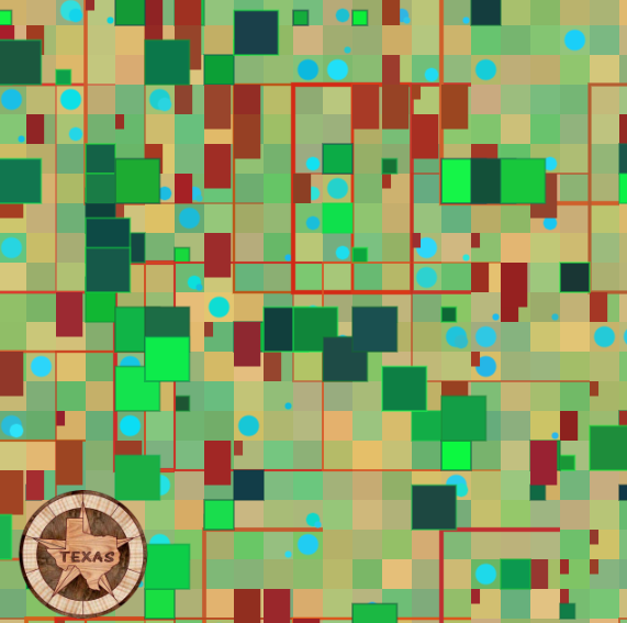
I chose to use basic shapes that are typically seen when you view grid-plan cities from an aerial view. Artifacts include trees, house roofs, and bodies of water all from three for loops. Each time the mouse is clicked, the city grid layout is always different, but overall, they end up looking almost the same – akin to perceptual differentiation. The colors are generated randomly but limited to certain RGB codes that represent the formal colors of each artifact. I was inspired by my hometown, where our city grid is very visible aerially because of our flat terrain.

Inspiration picture of a city grid plan

junebug-Reading01

In Kate Compton’s reading, the “10,000 Bowls of Oatmeal Problem” describes an issue in generative work when an algorithm can produce a ginormous amount of artifacts that are each unique but are not perceived as uniquely different from the audience perspective. Compton provides an example that if she created 10,000 bowls of oatmeal and each grain of oat was different, according to the algorithm, it is unique, but perceived from an outside view, it all ends up looking the same.

When you need to generate thousands of artifacts that will have to vary slightly, you can choose between perceptual uniqueness or perceptual differentiation. Perceptual differentiation is an easier level to succeed at if the environment doesn’t need the artifacts to be highly memorable (i.e. trees in a landscape or a very large crowd.) Perceptual differentiation is when the user can tell from a glance that there is a difference between the artifacts, but it isn’t that significant. On the other hand, perceptual uniqueness is the contrasting view between remembering a main character versus remembering a face in the crowd. The artifact must have a distinct character personality, making it more memorable than the other artifacts.

To overcome this problem, it is important to understand your audience and know the key characteristics of the artifact you are generating. Humans like readable meanings and identifiable personalities, and is a great strategy to start with overcoming this problem.

junebug-lookingoutwards01

Casey Reas’ “KNBC” // Dec. 2015

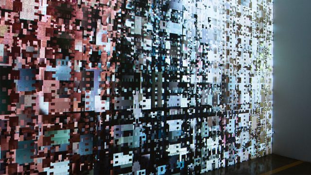
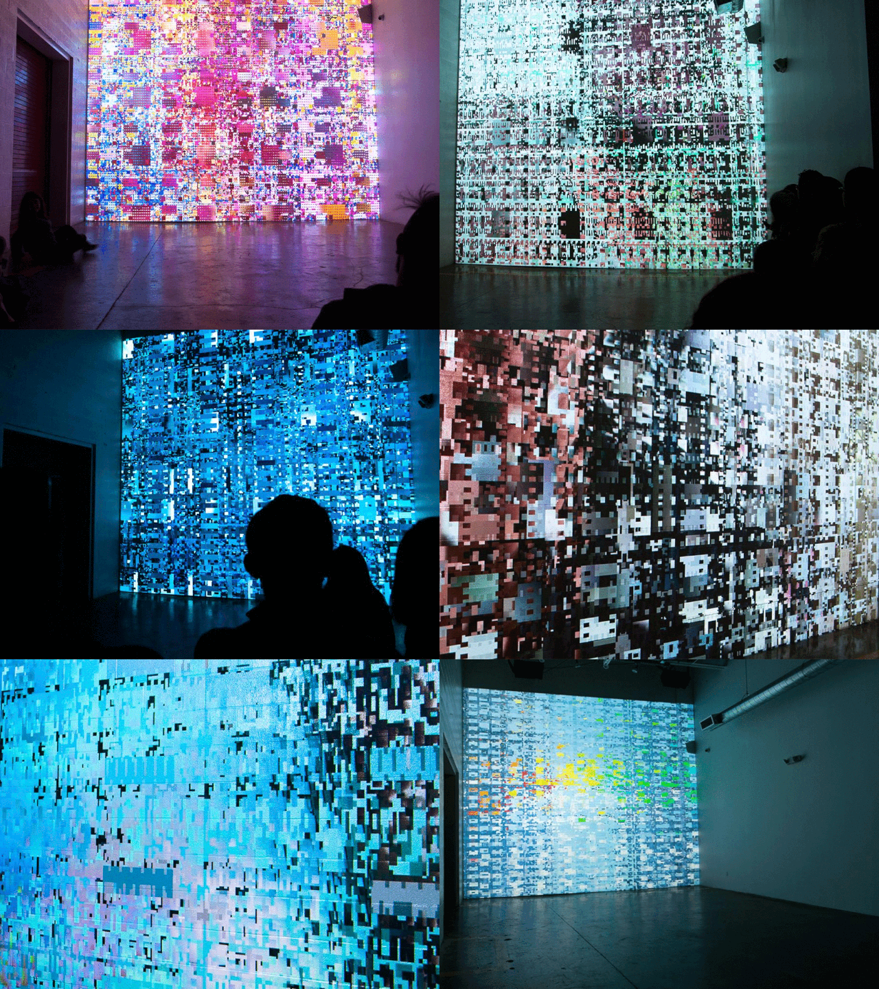
This project is a continuous, generative collage created through an audio and visual distortion of television signals that are looped continuously as the data is extracted, amplified, and composed into a new stream. This installation combined coding, art, and sound into a unified piece of work. What I find interesting about this work is his unique artistic expression with a visual experience that builds upon conceptual art, experimental animation, and generative software technology. It’s full of chaos yet is somehow still kind of uniform by the symmetry of the visual distortion of the television broadcast signals. The audio played with the visual fits beautifully with the portrayed imagery by immersing the viewers with a haunting and eerie feel.

Reas wants to depict through his work that writing code is a versatile way of thinking of design, and not just another tool. Reas created his own called Processing, in hopes to inspire others, including his students at UCLA, to use code not only for STEM but also for visual arts. This project was inspired by his previous work that also focused on distorted, television-static imagery, such as “Tox Screen”, “Ultraconcentrated”, “100% Gray Coverage”, and others.

Video recording of the audio and visuals for Casey Reas’ “KNBC”.

Close-up picture of a generative visual for Casey Reas’ “KNBC”.

Animated gif of various images of Casey Reas’ “KNBC”.