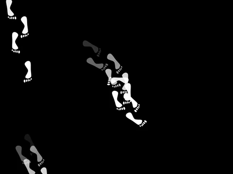
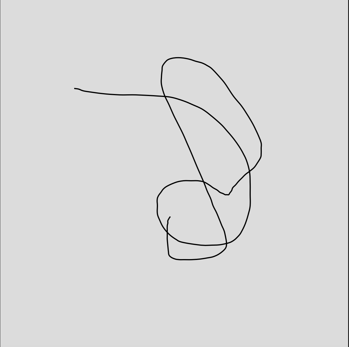
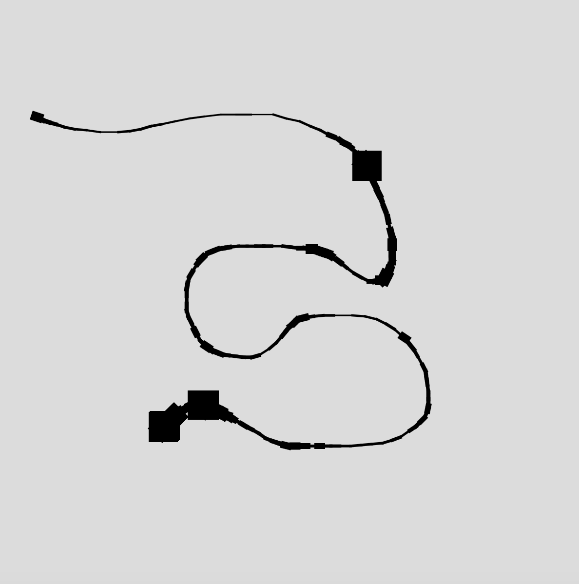
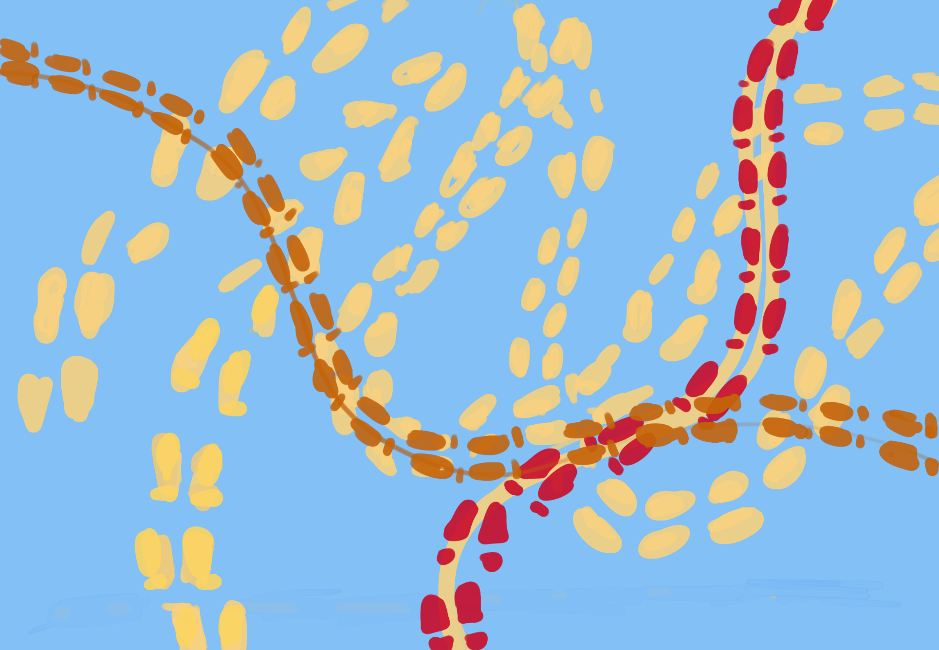
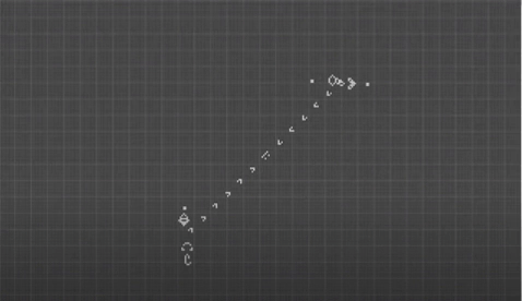
Footprint Clock

6:35
 12:43
12:43

3:35
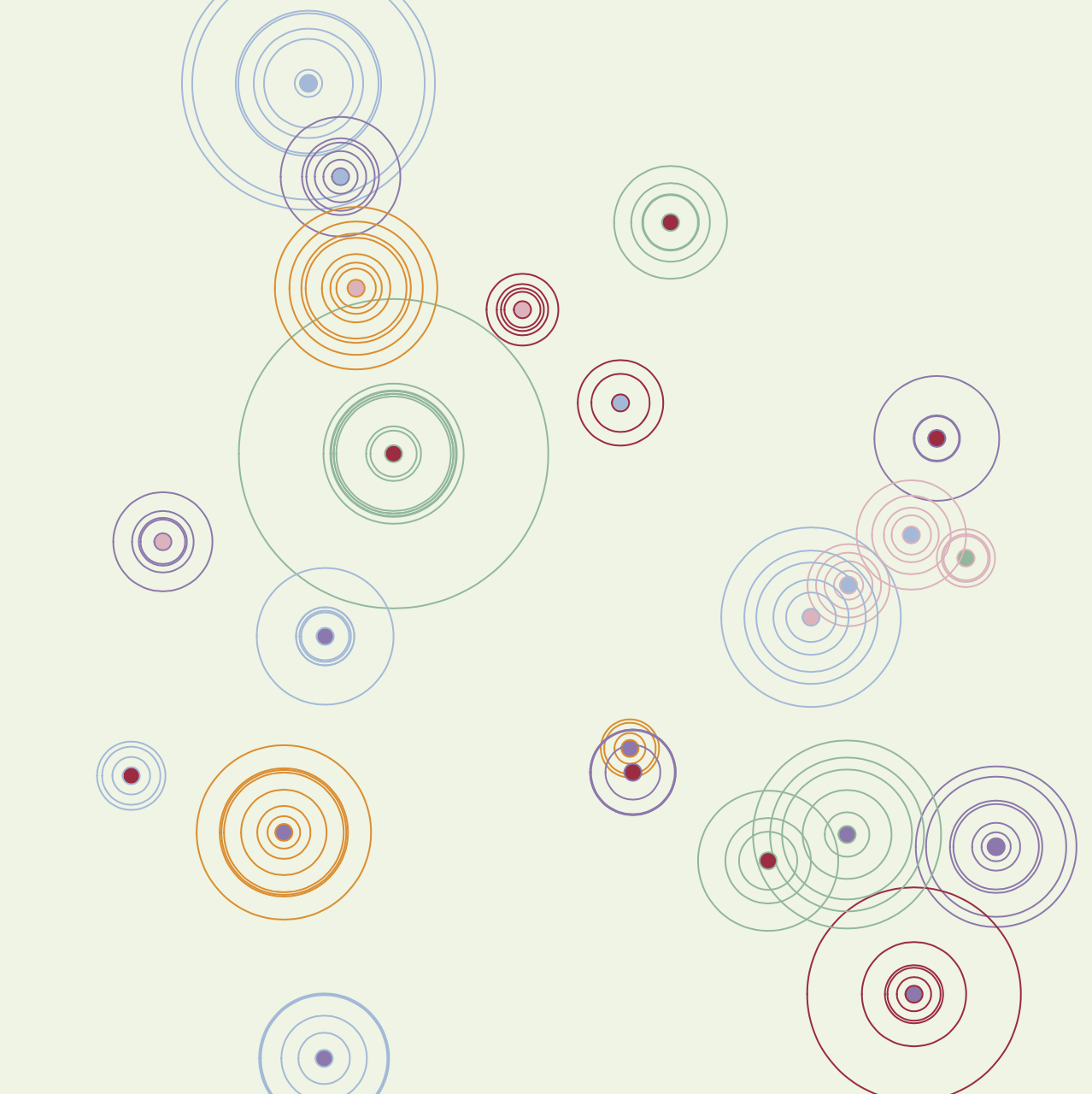
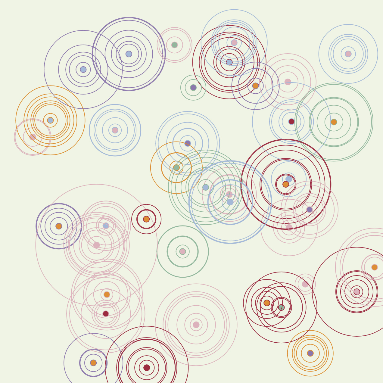
Sketches

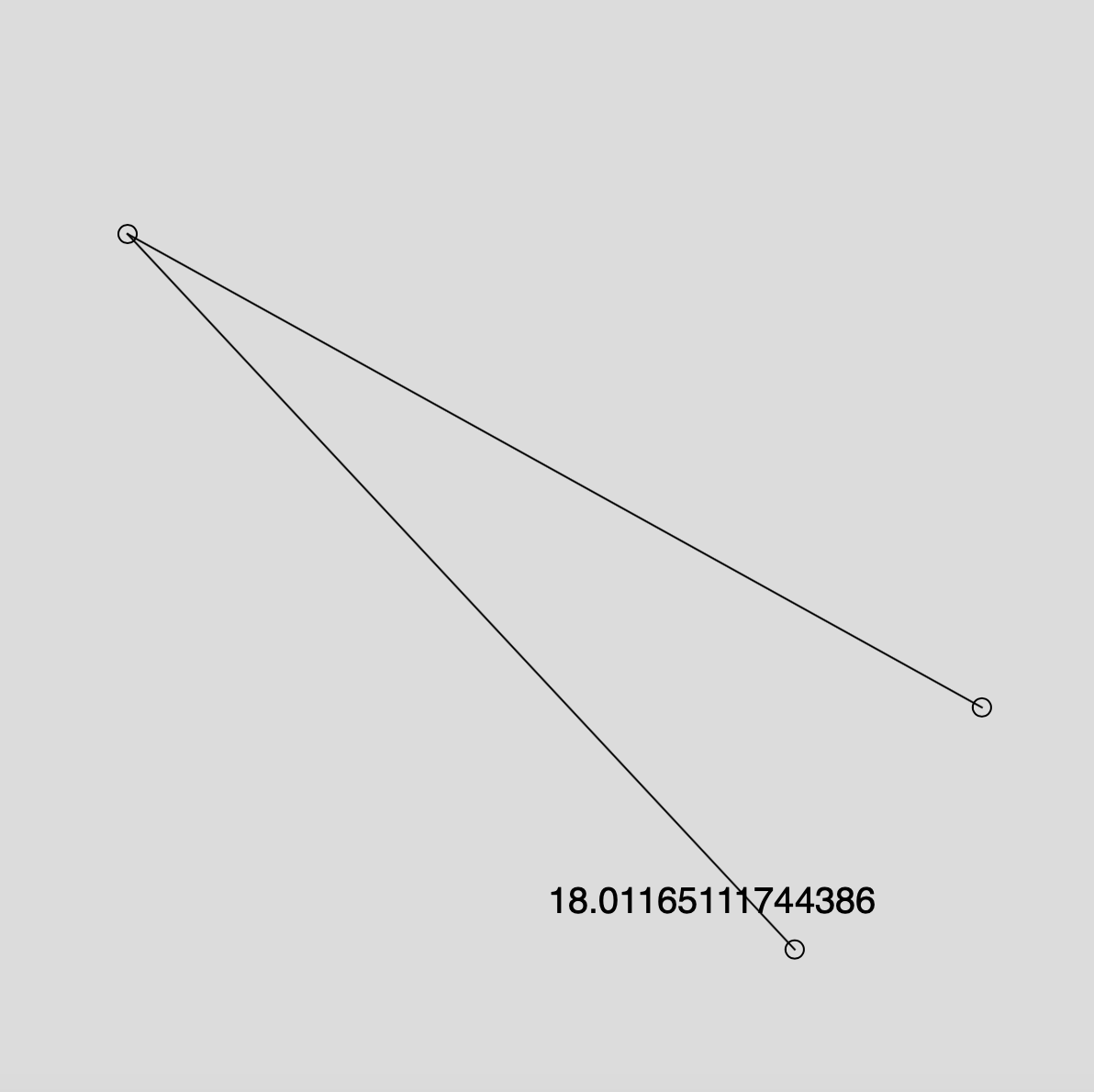
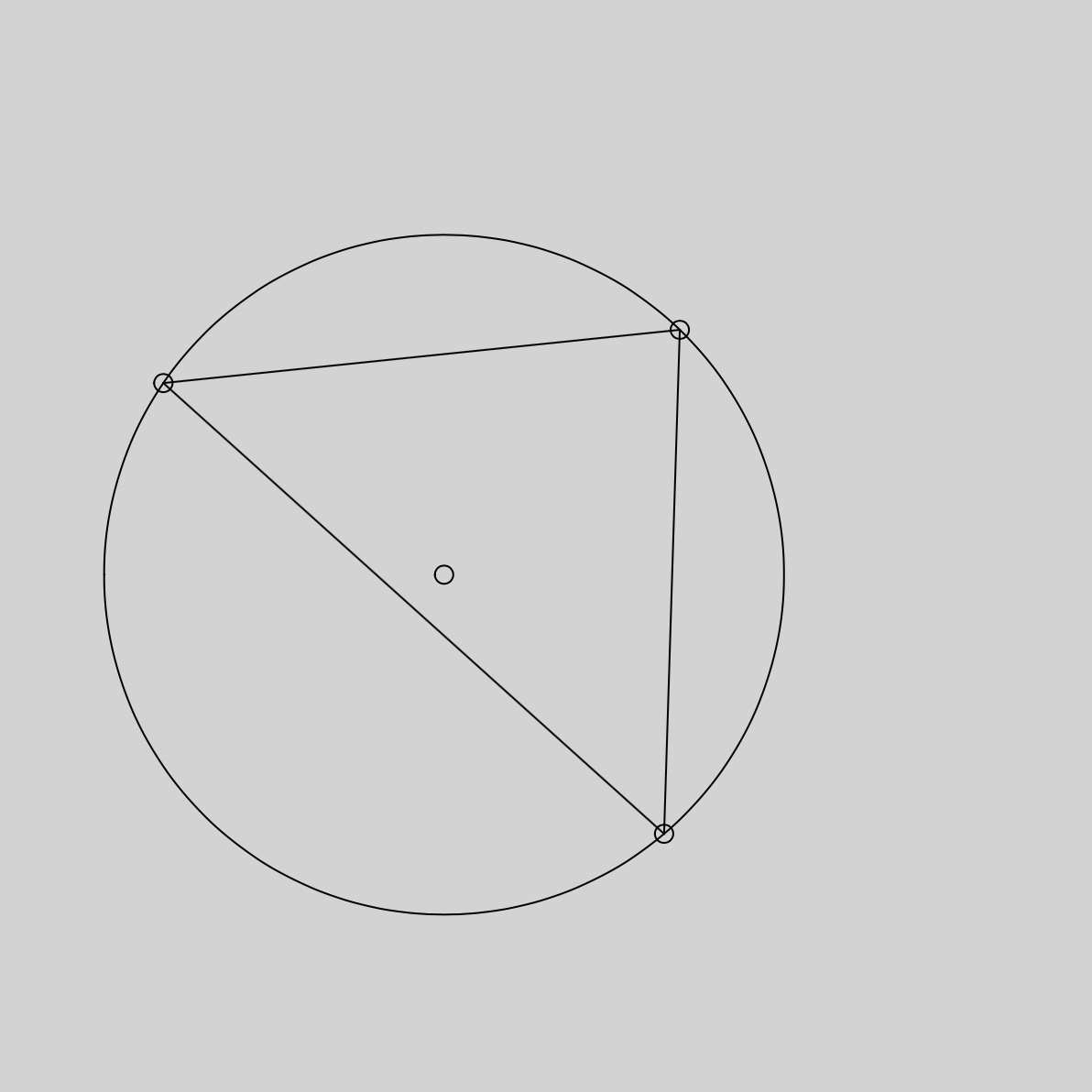
It took me a while to arrive at these two sketches. I played with star charts, circles, children’s imagery, and other ideas, but I found that I would get so literal with representing time.

So instead of brainstorming ideas about representing time, I brainstormed images that reminded me of time. I was particularly inspired by the study that asked people to predict a minute. From there I thought about how individuals move throughout time according to their internal clock.
Process
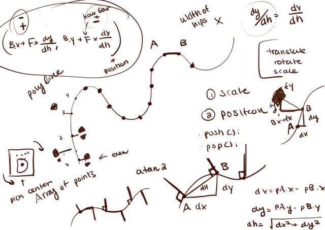
Once I decided I wanted to make foots paths I had three major challenges. The first was finding a way to save the paths. The second was positioning and rotating the foot prints along the curve. The third was designing a way to present time with paths.
Challenge #1:
With some help from Coding Train, I learned how to use saveJSON to save the vertexes of my paths into a json file. In my final sketch I used loadJSON to call upon the paths I made manually.
Challenge #2:
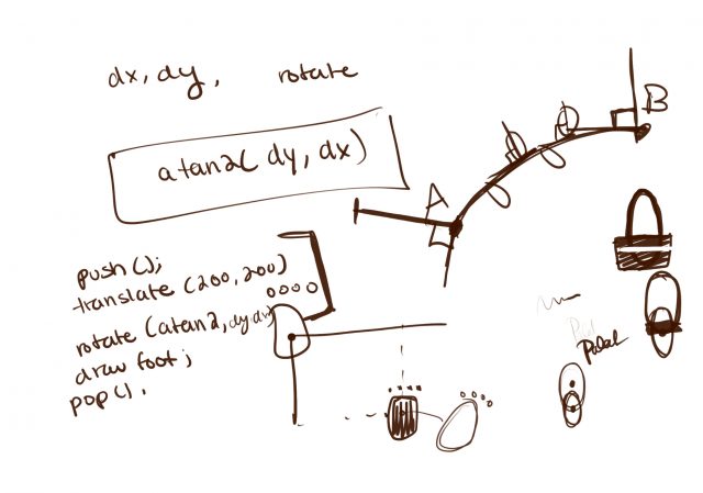
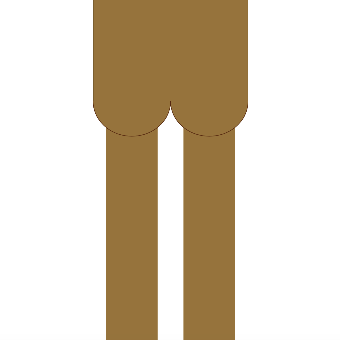
Positioning and rotating the feet was my hardest problem. I learned that given a curve, if I placed foot steps perpendicular to points and alternated which side they appeared on, it looked like walking footsteps. Rotating the footsteps was just a matter and picking the next point in the curve, calculating the displacement and using atan2.
 Challenge #3:
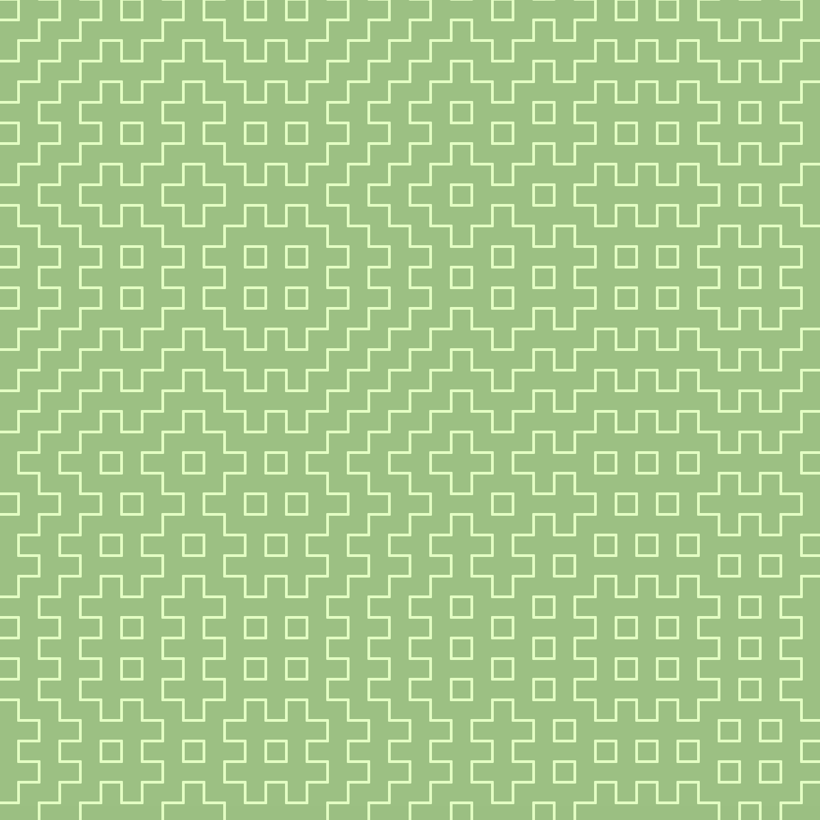
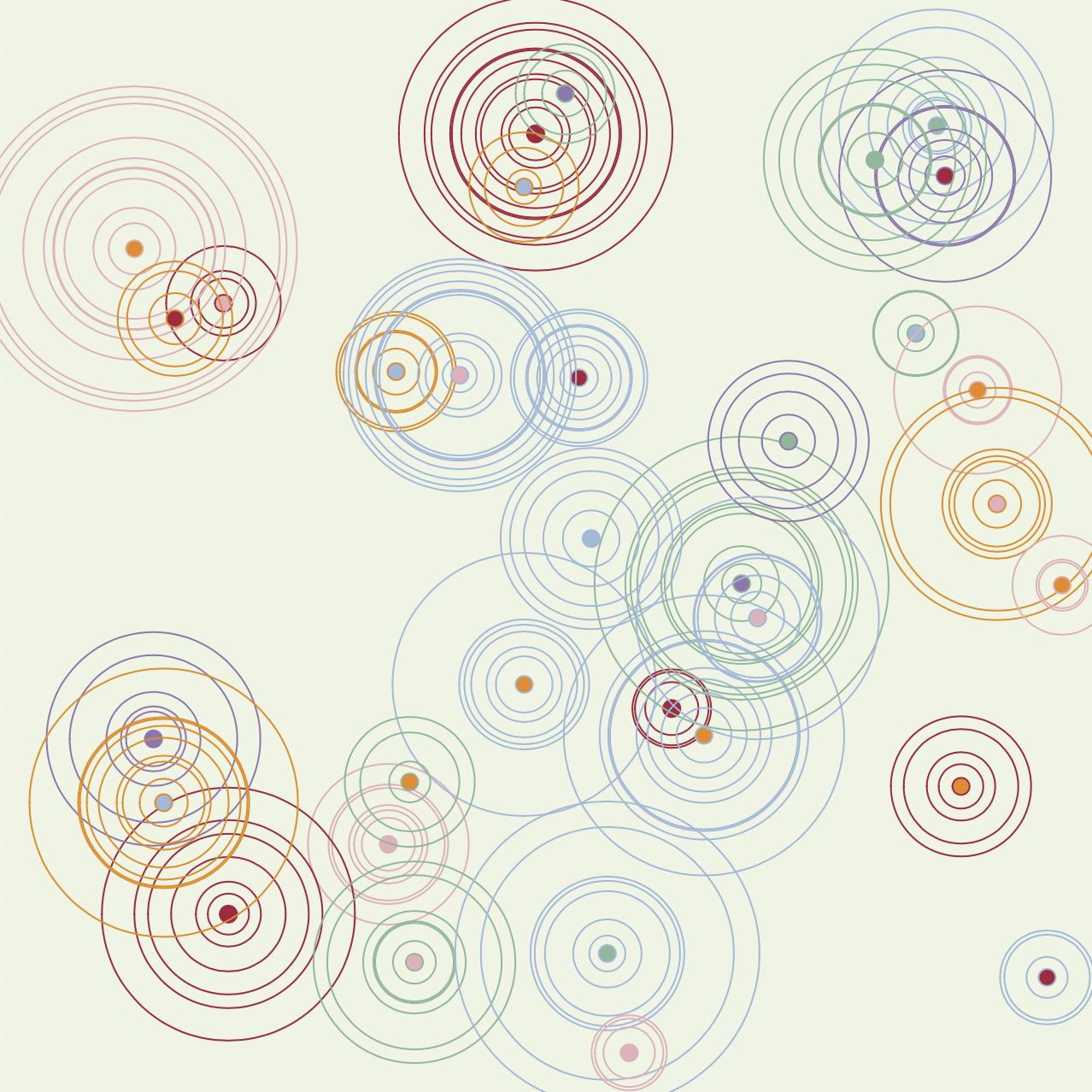
Finding a way to represent time with paths was a fun challenge. I tried various designs and researched time patterns. I ended up creating my own design that simultaneously looks like crossing paths, but the time is technically there.
Final Thoughts
Making this was a lot of trial and error and staring at a wall trying to figure out calculus. I’m excited by the final product and if I were to continue I’d try to make the foot steps more realistic and smooth out the walking. For future projects I want to break out into color. The color combinations I tried for this project turned out quite ugly, but I want to challenge myself with different color pallets.
P.S. (How to actually tell the time) The slowest and the most consistent path represents the hour. It only cycles through 12 hours and you can tell what hour it is by the angle and direction. I picked the four corners to represent the center of a clock so if you trace the path of the hour, image what number you’d get to if you started at the center of the clock and walked in that direction. I split the minutes into its tens and singles digit. The tens digit will always start from the bottom of the screen and has curves that you can count (0-5). The singles digit will travel across the screen (right to left) and the farther it gets to the left, the higher the singles digit is. The circular path in the center is my seconds and it takes a minute for the path to complete.
//=================================================
Update
After reading the feedback I changed the ellipses into actual feet and I clarified how to tell the time. I experimented with colors, but ended up liking the black and white the best.
Updated Code


