shoez-LookingOutwards03

Priscilla Bracks’ and Gain Sade’s e. Meura Superba (2009) is a robotic bird sculpture. Besides its slightly terrifying exterior, the bird is equipped with facial recognition and tracking software. As a result, when people approach the bird, the bird can sometimes look directly into their eyes. Additionally, the bird can become nervous in large groups of people, or become distant and moody when ignored. According to the creators, e. Menura Supurba is an interactive artwork and it explores the paradox between people’s fascination with the exotic and a dystopian future devoid of many animal species. The bird was modeled off of the Australian lyre bird, known for its ability to mimic natural and human sounds in their habitats. I chose this project because it reminded me of rumors about pigeons being robots placed by the government to spy on the public. The camera eye and shutter noise are off-putting because it feels like the bird is collecting information on you. However, I love the sporadic movement of its head and the continuously changing glow of its body. When I look at the piece, there’s a mix of fascination and terror, which only makes me want to see what it’ll do next.

Priscilla Bracks and Gavin Sade – eMeuraSuperba, Robotic Sculpture 2009

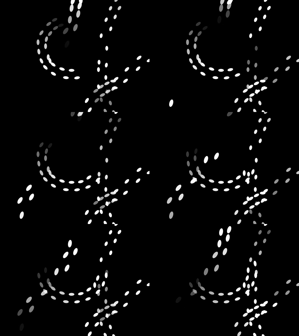
shoez-clock

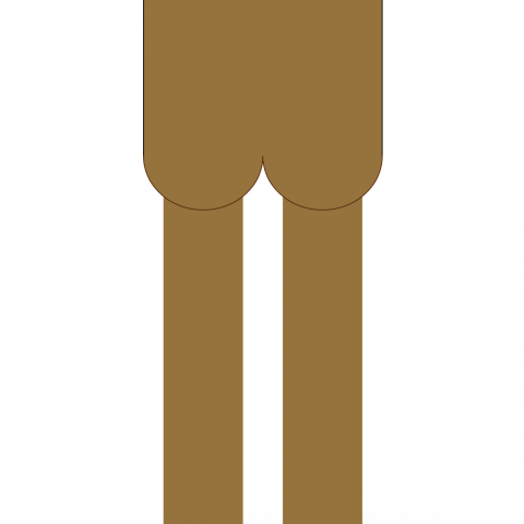
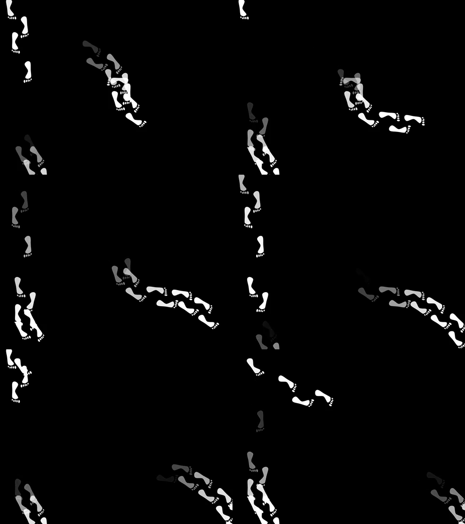
Footprint Clock

6:35
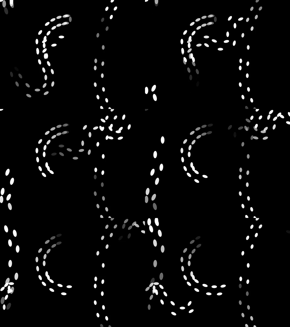
12:43

3:35

Sketches


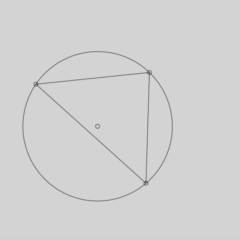
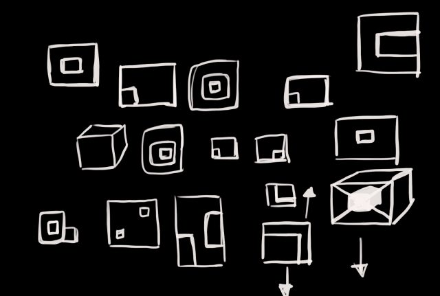
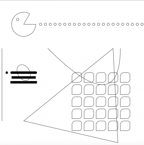
It took me a while to arrive at these two sketches. I played with star charts, circles, children’s imagery, and other ideas, but I found that I would get so literal with representing time.
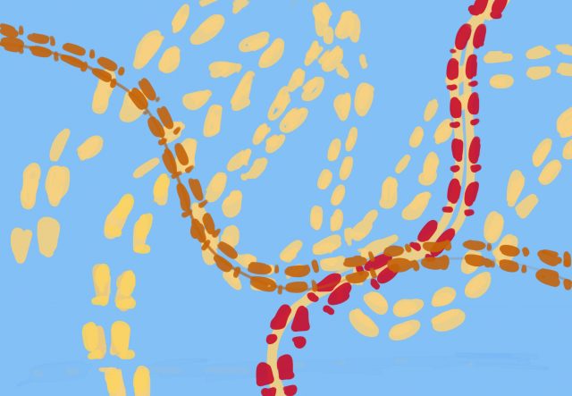
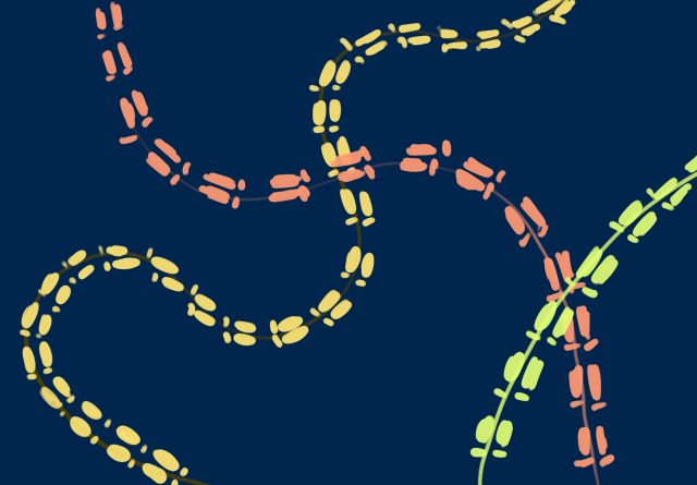
So instead of brainstorming ideas about representing time, I brainstormed images that reminded me of time. I was particularly inspired by the study that asked people to predict a minute. From there I thought about how individuals move throughout time according to their internal clock.

Process

Once I decided I wanted to make foots paths I had three major challenges. The first was finding a way to save the paths. The second was positioning and rotating the foot prints along the curve. The third was designing a way to present time with paths.

Challenge #1:

With some help from Coding Train, I learned how to use saveJSON to save the vertexes of my paths into a json file. In my final sketch I used loadJSON to call upon the paths I made manually.

Challenge #2:

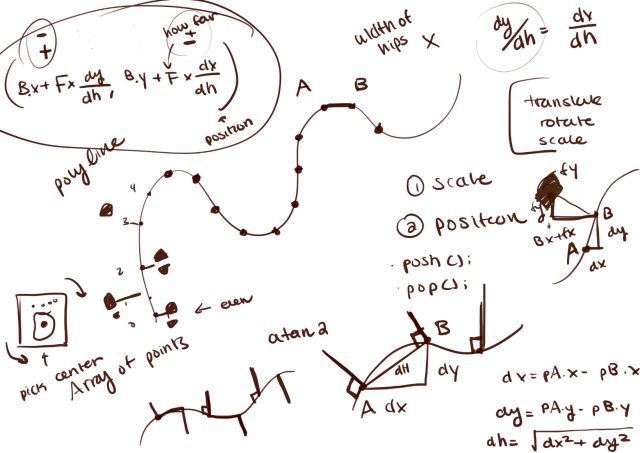
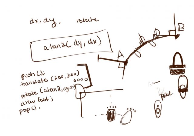
Positioning and rotating the feet was my hardest problem. I learned that given a curve, if I placed foot steps perpendicular to points and alternated which side they appeared on, it looked like walking footsteps. Rotating the footsteps was just a matter and picking the next point in the curve, calculating the displacement and using atan2.
Challenge #3:

Finding a way to represent time with paths was a fun challenge. I tried various designs and researched time patterns. I ended up creating my own design that simultaneously looks like crossing paths, but the time is technically there.

Final Thoughts

Making this was a lot of trial and error and staring at a wall trying to figure out calculus. I’m excited by the final product and if I were to continue I’d try to make the foot steps more realistic and smooth out the walking. For future projects I want to break out into color. The color combinations I tried for this project turned out quite ugly, but I want to challenge myself with different color pallets.

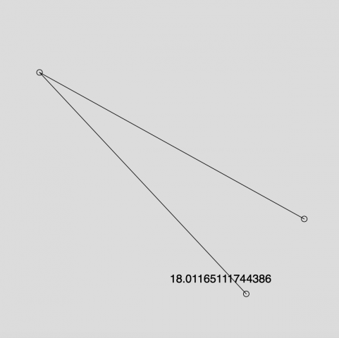
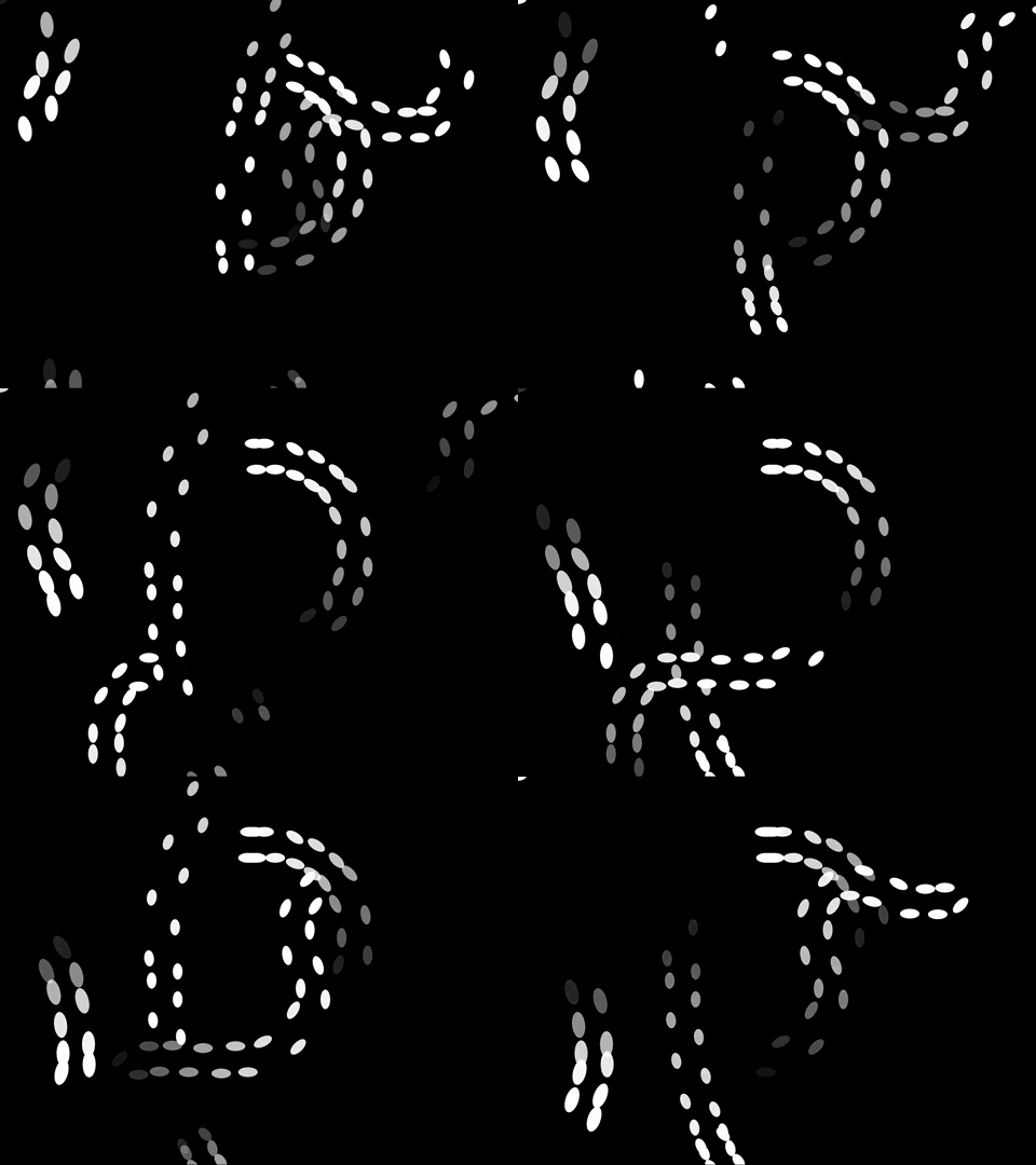
P.S. (How to actually tell the time) The slowest and the most consistent path represents the hour. It only cycles through 12 hours and you can tell what hour it is by the angle and direction. I picked the four corners to represent the center of a clock so if you trace the path of the hour, image what number you’d get to if you started at the center of the clock and walked in that direction. I split the minutes into its tens and singles digit. The tens digit will always start from the bottom of the screen and has curves that you can count (0-5). The singles digit will travel across the screen (right to left) and the farther it gets to the left, the higher the singles digit is. The circular path in the center is my seconds and it takes a minute for the path to complete.

//=================================================

Update

After reading the feedback I changed the ellipses into actual feet and I clarified how to tell the time. I experimented with colors, but ended up liking the black and white the best.
Updated Code
shoez-timekeeping

I learned that our current calendar draws a lot of inspiration from the roman calendars. Romulus, the first king of Rome, had an affinity to the number 10 (probably because people have 10 fingers), so he split the year into 10 months and left 61 days nameless. This attempt at combining the lunar system with the solar system was by no means perfect, but it shows just how much people wanted to standardize time. Amongst the timekeeping devices, I learned that candle clocks took advantage of candles that burned at a constant rate. While this method would not have worked to keep constant time, it’s a clever way to know how much time as passed.

shoez-meander

I’m surprised Meander was more than just river generation. Hodgin had to code realistic roads, land plots, and random landmark names. I found the algorithm for roads to be simple, but the result looked amazing. I learned that generating organic rivers requires a set of vectors and a couple restraints and the intensity can be changed by scaling the blend of vectors.
shoez-LivingWallpaper

Organized Chaos

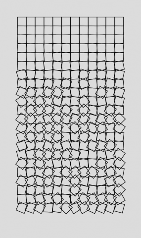
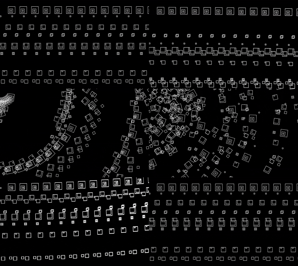
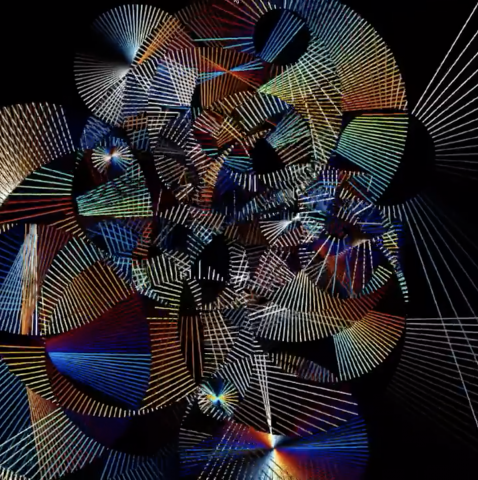
It was tough to execute my initial vision due to my limited capabilities. I was really inspired by Zach Lieberman’s black and white art pieces, so I wanted to create a similar environment. I’m still amazed Lieberman can achieve such organic shapes, but I eventually had to compromise and tried creating a dynamic environment with 3D shapes. I used a ton of different easing functions, but my favorite has to be the bounceOut function. I like the use of movement, but visually, I wish I had added more. I tried for a while to delay the rotation of some of the other cubes, but I couldn’t figure it out. I wanted it to look like a moving creature made of geometric shapes, but it was too difficult to individually program the movement of every square. I think I learned so much about what not to do during this project and I think that’s just as helpful as discovering something new.

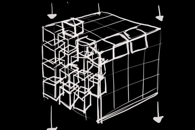
Sketches

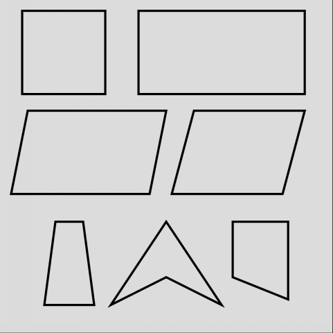
A lot of my initial concept relied on having cubes instead of squares, so when I changed my design to 2D, I experimented with the squares and tried to make things visually interesting.


shoez-Reading02

Naimark’s distinction between “First Word Art” and “Last Word Art” reminds me of how fickle definitions of art are. Since coming to art school, I’ve become more passionate about making art accessible. I don’t think anybody should need a degree or an art education in order to understand someone else’s work. But at the same time, I think it’s our job as artists to defy expectations and push the possibilities of art in different directions. Since the beginning of COVID-19, there has been this exodus to a completely digital format.

I think it’s interesting to consider how we can make lasting digital art when technology evolves so fast. It’s possible that after ten or fifteen years, you might not be able to access the art due to changes in browsers, social media, etc. Additionally, the internet is so vast that a single art piece is just a drop in an ocean of other artists, ideas, and innovations. I believe one way to combat this fast paced evolution is to evolve with the technology and continuously create new pieces. However, this approach makes it difficult to make lasting art. We could also bring digital pieces into the physical world (e.g. digital prints, installations, etc.), but those could be less accessible. I think it’s exciting that the future of art is so mysterious and I hope with the tools I develop in this class, I can contribute to the new union of art and technology. 

shoez-Map


Cirlrea 

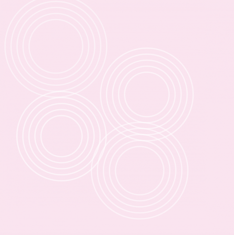
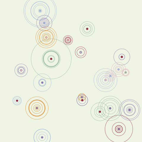
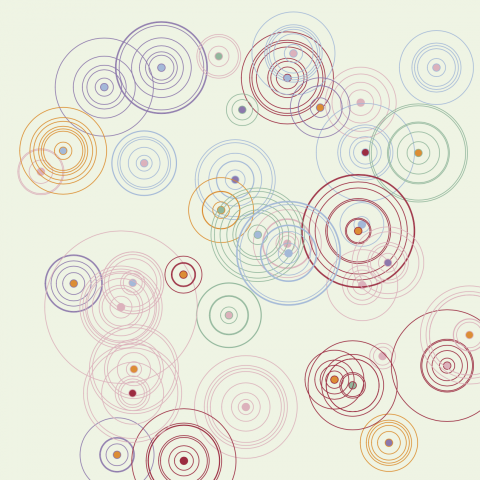
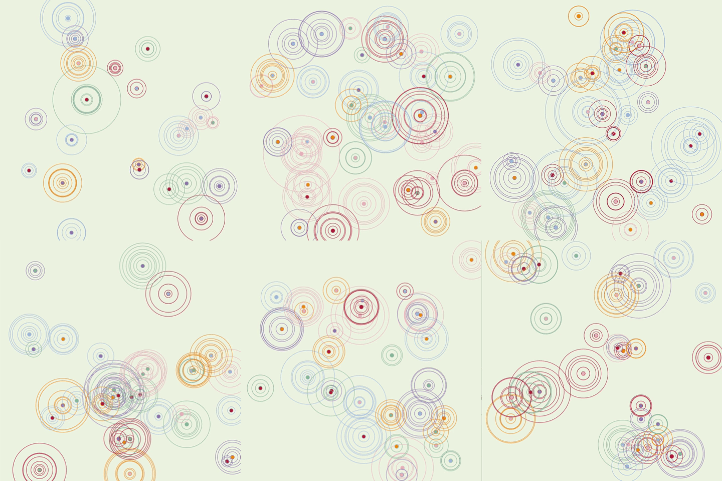
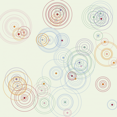
Cirlrea is a uniquely shaped world where important landmarks are marked by filled in circles and the surrounding circles represent the elevation. Unlike Earth, Cirlrea was once a planet covered in moss-green water. The landmarks are all manmade and they house what is thought to be the last pockets of humanity. 

Initially, I wanted to create a map that could mimic the look of train maps typically seen in brochures and underground train stations. However, I quickly realized I had to add a lot of constraints so the look of the train lines would be aesthetically pleasing. The final product was inspired by contour maps. I liked the look of rings around a filled center and while I tried with other shapes, I ended up liking the look of circles the best. I didn’t want the map to represent earth, but I did want the overlapping contours to create the feeling of land masses. I used a nested for loop to determine how many circles I wanted and another to determine how many rings would be around the respective circle. The rest was just choosing colors and numbers to increase the diversity of circles. 

Link


shoez-lookingoutwards01

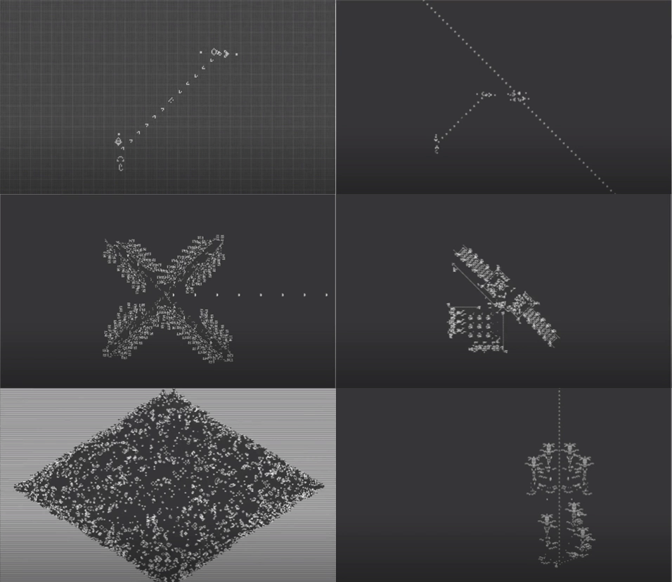
Conway’s game of life was one of the first times I was exposed to generative art. The rules of the game are simple: Cells are either alive or dead, any live cell with two or three live neighbors survives, any dead cell with three live neighbors becomes a live cell, and live cells die in the next generation. The program is relatively simple to implement, but I didn’t realize potential it had until I watched “epic conway’s game of life” on Oingo Boingo’s youtube channel. 

Accompanied by arguably the most epic music created, Requiem for a Dream, Oingo Boingo showcases increasingly mind-blowing applications of the game of life. I admire it because it’s a testament to how seemingly simple programs can be turned into captivating art. My favorite design is when the program spells out “Golly” continuously. Art created from the game of life is painstaking and requires crazy amounts of precision. 

The program Oingo Boingo uses can be found on http://golly.sourceforge.net. While John Horton Conway created the game of life, the authors of the code include Andrew Trevorrow, Tom Rokicki, and a couple other contributors. It’s not clear if Oingo Boingo created the showcased programs, but I believe most of the programs have their own creators and the video was a compilation of them. Gosper’s Glider is a staple of game of life projects and it appears often. 

Since John Horton Conway’s death from COVID-19, Kate Vass Gallery has created an exhibition filled with works from four generative artists. Just by scanning through the online gallery, it’s clear that Conway’s impact can be felt through media arts and its evolution. 

epic Conway’s game of life