Student Area

axol-clock

EDIT:

https://editor.p5js.org/axol/full/p7wExHJzu

UPDATE NOTES:

Base on the reflection, it seems that most people doesn’t like it when the lines gets really thick and the recursively drawn parts just become blobs. Thus in the update, instead of changing the thickness of the line throughout the day, the density of the lines is being adjusted, such that the density of the entire grid gets higher as its closer to noon. To avoid the clotting of patterns, when the density gets higher, the “blobs” are drawn in a less dense manner.

————OG POST————————-

https://editor.p5js.org/axol/full/oTaXEcR08
For my project, I initially had three ideas:

1.) make like a cracked screen clock (because the project will be displayed on a screen and I thought that was funny)

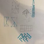
2.) make a binary clock, and focus on creating interesting repeating patterns seen on ancient China bronze casting (ref).

3.) make a clock that focuses on the movement of other planets as representation of the day, instead of the Sun and the Moon.

The last was interesting to me, but had to be abandoned because planetary movement was a lot more complicated than I expected. And as much as I loved the first idea, I think the final product would be rather uninteresting to look at (except me thinking it is funny).

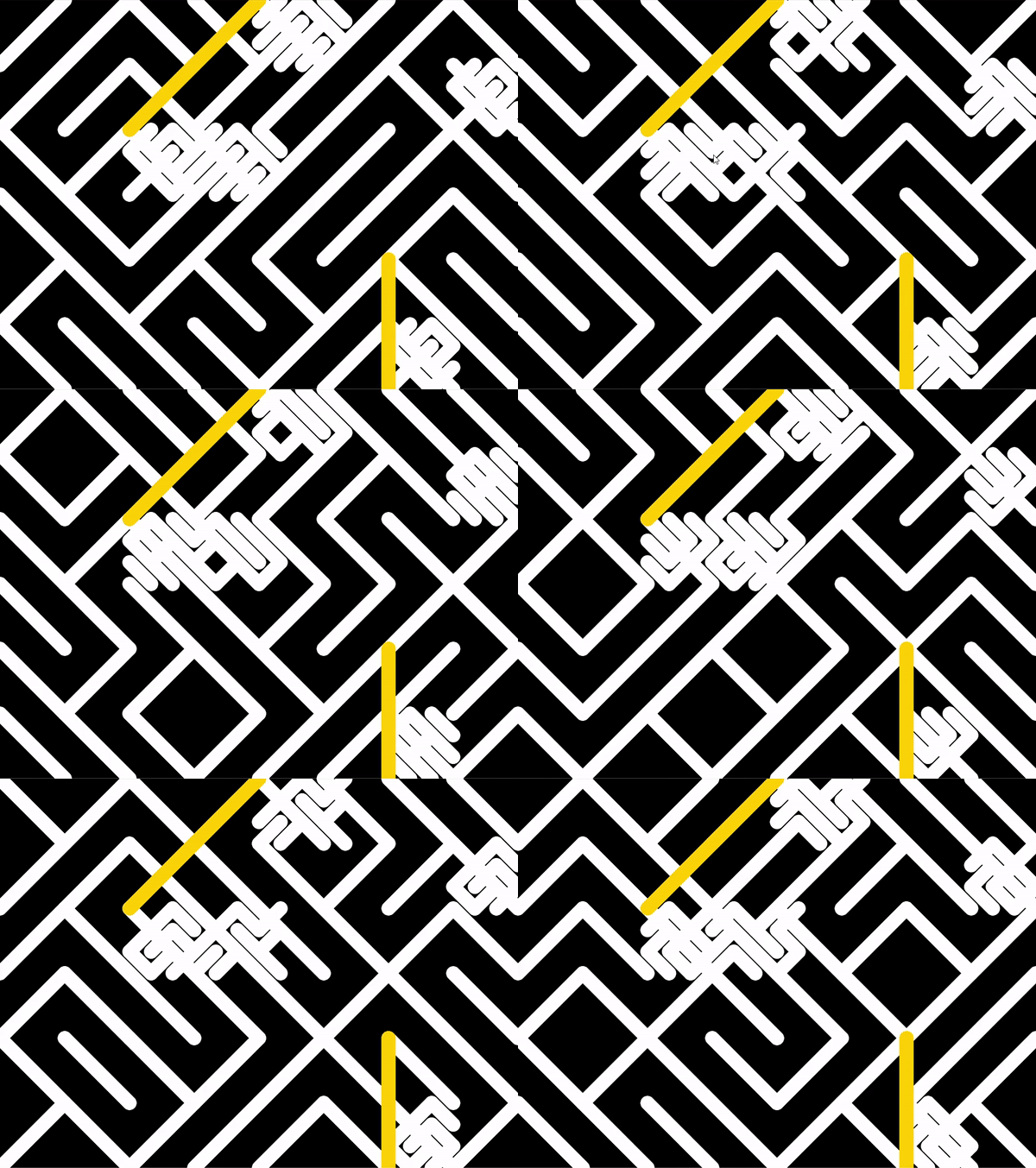
I wanted to create a pattern generation function that would produce patterns that are repeating but also tiling, and I wanted to build off the 10 print algorithm. Unfortunately I didn’t have enough time to innovate on that so it’s just the 10 print algorithm for now.

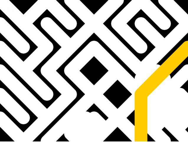
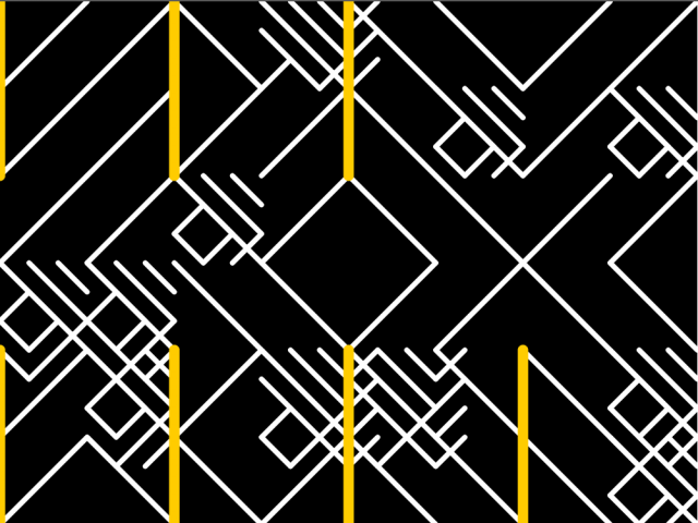
As you approach mid day, the strokes get thicker and the overall image gets brighter (cuz it’s day), and at night it gets thinner. The pattern generation is based off the percent of day passed. Every 5-min a new, slightly more dense chunk is drawn recursively. And the yellow parts represent the hours (in 12) with slightly different algorithm.

If I had more time, I wish to come up with an algorithm that better resembles the Chinese pattern I want, or layer it with more elements to make it more dynamic. Am I satisfied with it? No. But if myself from a year see this I think she’ll be impressed, so that’s something.


sketch:
gregariosa-Clock

Matroyshka clock

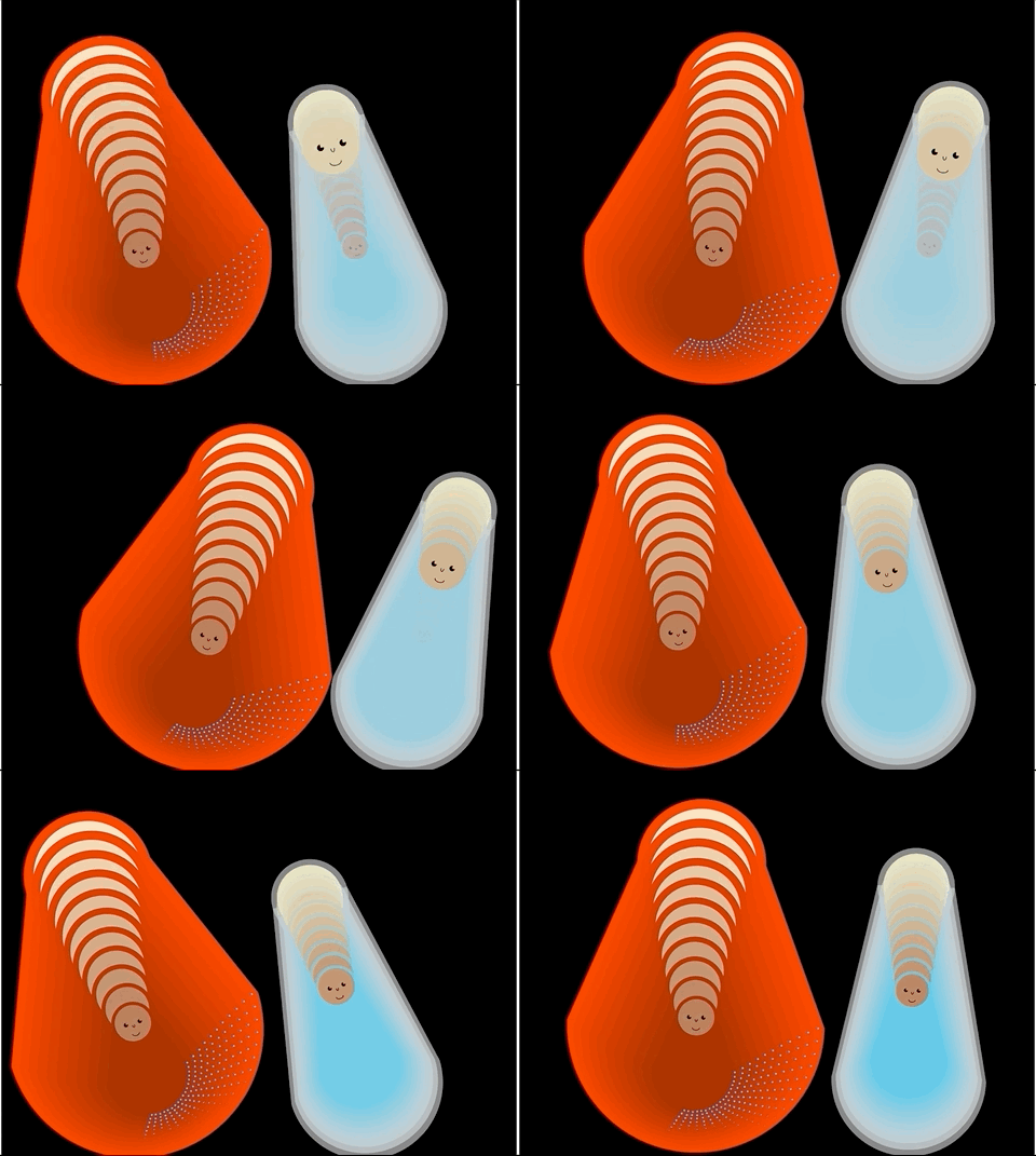
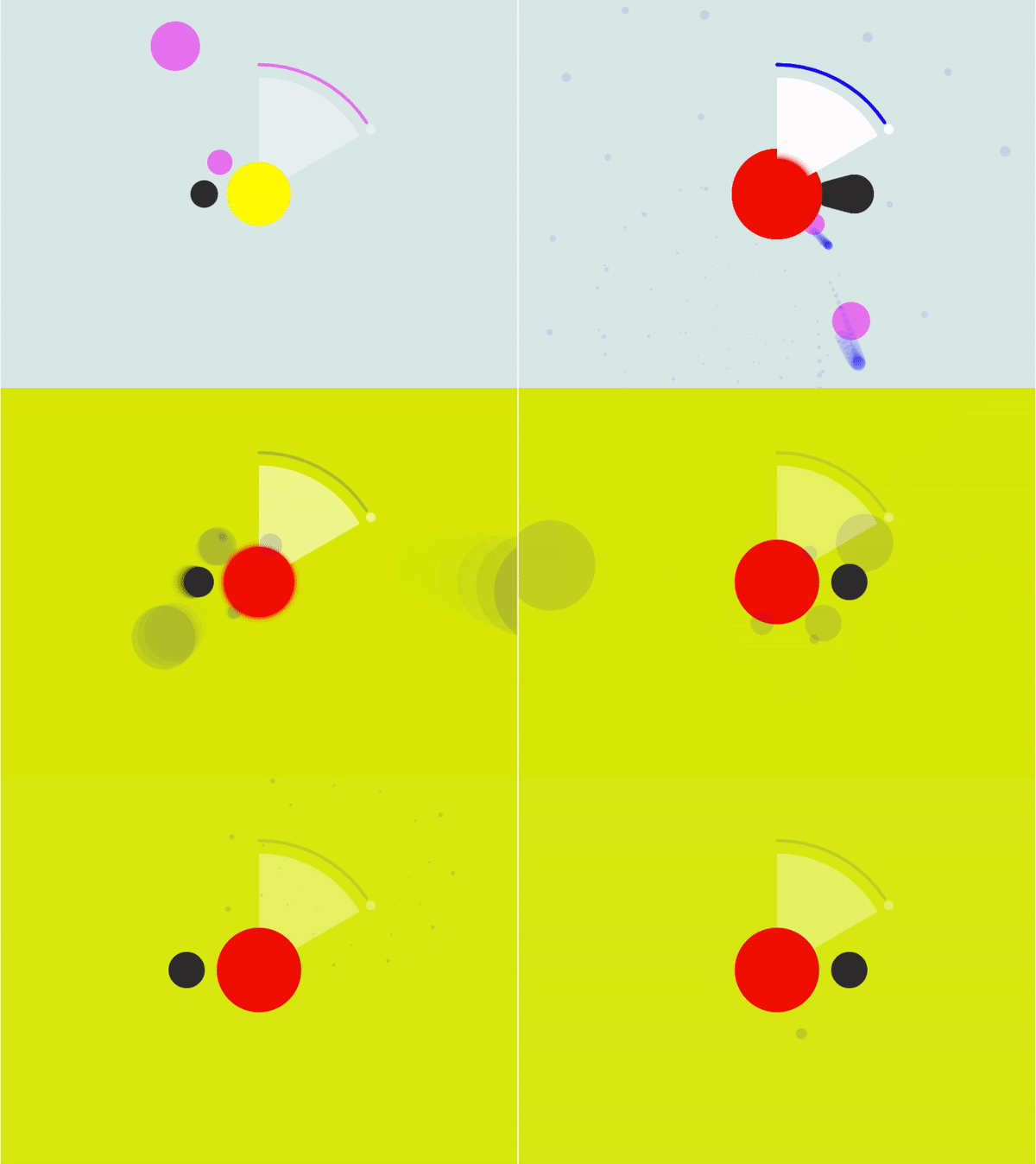
For this project, I wanted to explore how the idea of rebirth and growth can be expressed through time. I chose the matroyshka dolls for inspiration, as the nesting of these dolls resemble how the concept of time is relative, yet it still feels like a “continuous” cycle.

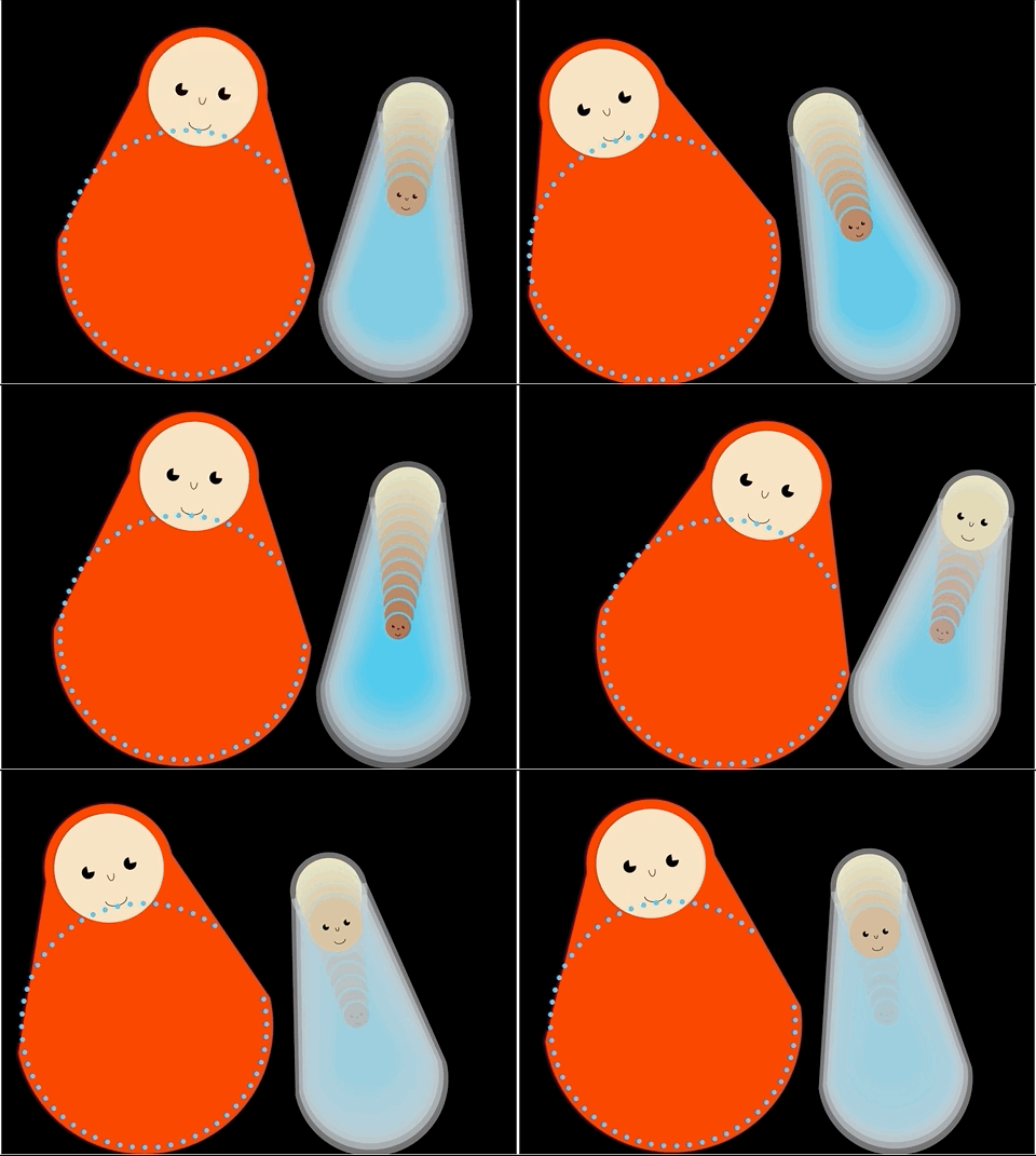
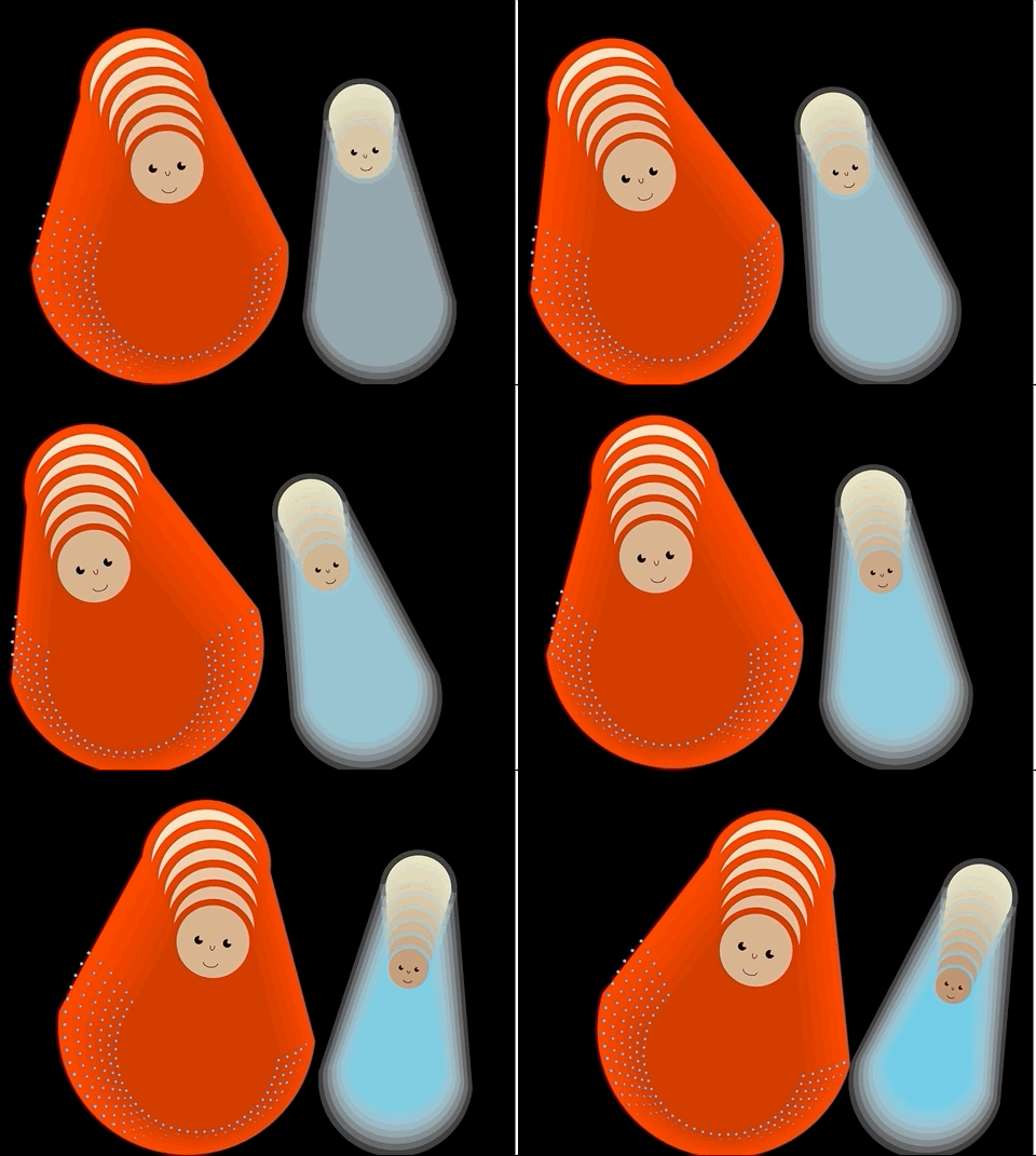
To read the time: the number of red matroyshkas on the left represent the hours. The number of blue dots represent the minutes (it makes a full circle when it reaches an hour.) And the overlapping blue dolls represent the seconds. (The seconds refresh themselves after a minute passes.)
Overall, I’m not too satisfied with the outcome. I had initially wanted the top and bottom to be separated at an interval, to show how the dolls are nested within each other. However, I spent too much of my time trying to craft a good “rocking motion” that I couldn’t figure out a stable solution for my initial goal. My lack of experience with object oriented programming contributed too. I spent a lot of time conceptually understanding how my code operates, rather than deftly making progress to the project. As a result, I compromised the outcome by overlapping the dolls on top of each other.

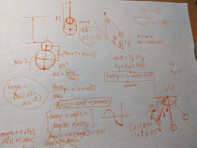
While I don’t love the outcome, I learned a lot about how motion is conveyed through code in this project. I learned about the pendulum motion, sinusoidal movements, physics behind roly poly toys, etc. to inform my decisions. I hope to apply these findings to better convey my thoughts in future projects.

Process:

I had two initial project directions:

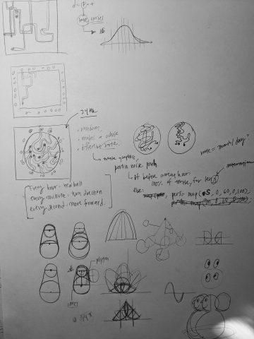
  1. Create a circle of “sand” with 24 points on the circumference. For every hour, a point travels into the circle to make shifts and turns, changing its direction every minute and chugging through the sand every second. By the 24th hour, an intricate blob of lines is formed, where each “hour line” interacts with each other in space, but never collides. (I wanted to convey how the hours in the day overlap and form an entirely new picture everyday.)
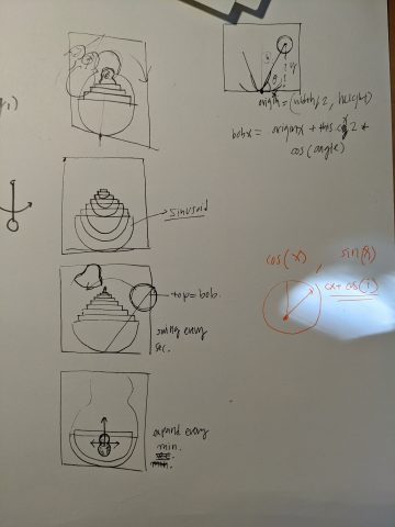
  2. The matryoshka doll idea. Create an animation where a new doll is born at every interval, to indicate the “rebirth” of time, and our existence.

(Below are sketches of those ideas.)

While I was intrigued by the first idea’s concept, I had to consider the context in which the first project would be in. A messy blob of lines can be hard to appreciate in a public display, while big solid objects are easier to comprehend. As such, I decided to go with the second idea, in consideration of the context that this project will be in. (I was also not confident that drawing smooth curvy lines that don’t collide into each other was doable under the time constraints.)

Below are some notes to consider the animation of the piece. It was interesting that many of my considerations were far from what would be executed. I thought a staggered mountain of bowls would be created, and I only realized after programming that such mountain isn’t physically possible.


I don’t have too many iterations for this project on code, as I spent a lot more time calculating things on paper than coding stuff out.

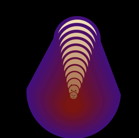
(Last note: I enjoyed using Lerpcolor and svg strings to make nice color combinations, like this one below:)


sweetcorn-clock

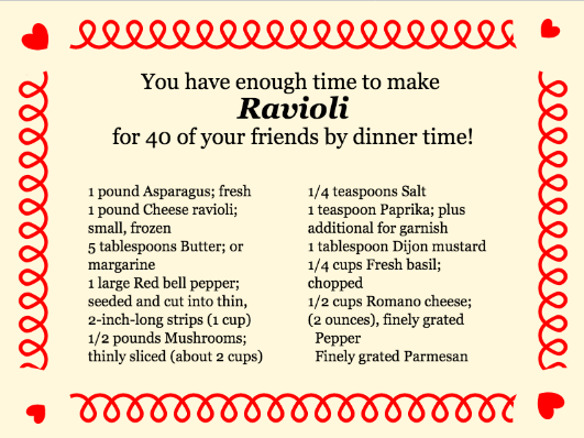
Lovely Clock for Food with Friends

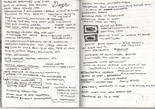
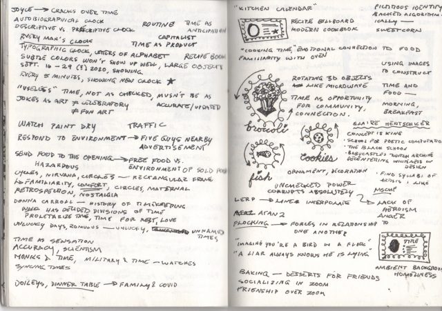
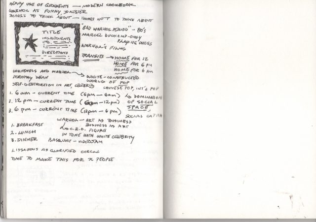
I want to use all of my time to build lovely friendships with so many lovely people around me. I want to bring everyone together for lovely meals where we all share food and stories and joy and company and time with each other. I want to spend my time realizing that lovely vision instead of dwelling on the past. Below are some of my notes and sketches while I was thinking about this project :~) (please excuse the unrelated notes).

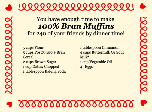
I hope to have captured a sort of Betty Crocker look (I looked back at the recipe books my mom had left behind in the dust of the pantry here, dog-eared and underlined), just as I hope to posture myself to be sweetcorn, in the fullest sense of the name. I hope this project’s affect sticks to those who happen upon it, like a lovely scent from a kitchen on your favorite sweater that reminds you of home <3

The majority of the difficulty I had was getting recipes in an easy-to-parse-through format. I ended up having to settle for this archive of XML recipe files that did not have any times as values. I then had to comb through the cooking directions looking for instances of “minute” and “hour,” then creating a substring from the numbers in front of those instances. I then summed up those values and compared it to the time until the next common meal time to determine how many friends you could feed. In the future I hope to comb through the ingredients as well and deal with the horrible mixed number formats in order to generate a shopping list proportional to the number of friends.

Feel free to view my code here!

xoxoxo

~sweetcorn

sticks-Clock


abstract clock

For my abstract clock project, I focused on creating a clock that revolved around seconds, where viewers will understand the representation of a second and see the seconds roll past their eyes. I found that creating a pulsing animation can represent a beating sensation. I was also particularly interested in representing time in cyclical motion, where cycles are repeated every second, colors are slowly altered by the second, and the rotational direction also changes with the second.

Overall, I tried to focus on a clock design that will capture people’s attentions for a couple of seconds when they walk past the public display. I figured that creating an animation with playful circles that pulsate every second would work as an aesthetic “clock” interface.

The number of purple circles is proportional to the number of seconds in the current minute, where scale and alpha level also correspond to the current time in seconds (seconds are displayed here for clarity). 

Sketches

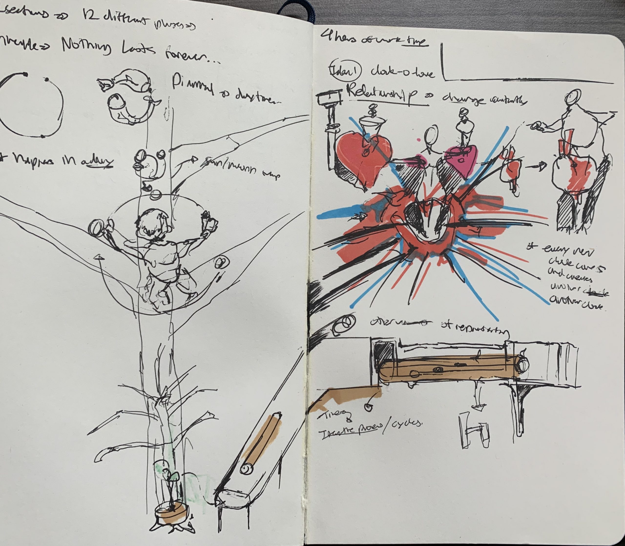
My initial ideas for this project went towards an abstract portrayal of a clock as cycles and iterative processes. I had a couple of ideas of measuring time from a biological perspective, such as representing time through the growth of a tree (i.e. a cycle of a tree growth from sapling to tree could represent 40 years in time). I was also interested in many other ways of representing a clock that would have required much more technical skill, and would not follow guidelines on the clock display; I had an idea of a “relationship clock”, where a heart’s size would change proportional to the stature and the body of a figure. The heart would shrink and expand based off the attractiveness of the figure, and when the figure reaches its lowest point in attractiveness, the heart would burst and will pop out another figure, where the cycle repeats itself. I felt that this idea could be further explored and developed, as I find it humorous and quite controversial, and will save the idea for a future project.

shoez-clock

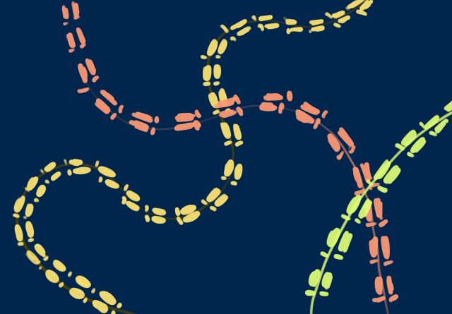
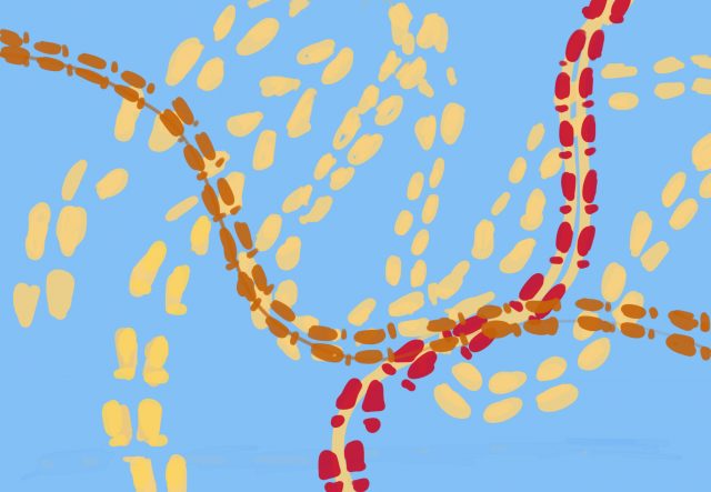
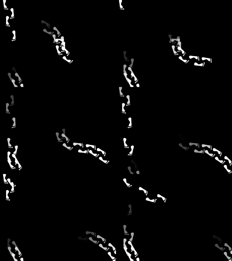
Footprint Clock

6:35

12:43

3:35

Sketches


It took me a while to arrive at these two sketches. I played with star charts, circles, children’s imagery, and other ideas, but I found that I would get so literal with representing time.

So instead of brainstorming ideas about representing time, I brainstormed images that reminded me of time. I was particularly inspired by the study that asked people to predict a minute. From there I thought about how individuals move throughout time according to their internal clock.

Process

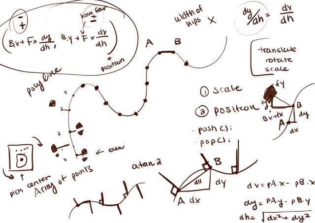
Once I decided I wanted to make foots paths I had three major challenges. The first was finding a way to save the paths. The second was positioning and rotating the foot prints along the curve. The third was designing a way to present time with paths.

Challenge #1:

With some help from Coding Train, I learned how to use saveJSON to save the vertexes of my paths into a json file. In my final sketch I used loadJSON to call upon the paths I made manually.

Challenge #2:

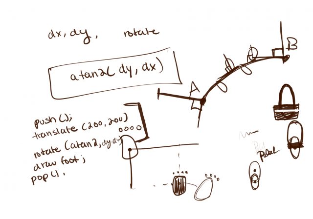
Positioning and rotating the feet was my hardest problem. I learned that given a curve, if I placed foot steps perpendicular to points and alternated which side they appeared on, it looked like walking footsteps. Rotating the footsteps was just a matter and picking the next point in the curve, calculating the displacement and using atan2.

Challenge #3:

Finding a way to represent time with paths was a fun challenge. I tried various designs and researched time patterns. I ended up creating my own design that simultaneously looks like crossing paths, but the time is technically there.

Final Thoughts

Making this was a lot of trial and error and staring at a wall trying to figure out calculus. I’m excited by the final product and if I were to continue I’d try to make the foot steps more realistic and smooth out the walking. For future projects I want to break out into color. The color combinations I tried for this project turned out quite ugly, but I want to challenge myself with different color pallets.

P.S. (How to actually tell the time) The slowest and the most consistent path represents the hour. It only cycles through 12 hours and you can tell what hour it is by the angle and direction. I picked the four corners to represent the center of a clock so if you trace the path of the hour, image what number you’d get to if you started at the center of the clock and walked in that direction. I split the minutes into its tens and singles digit. The tens digit will always start from the bottom of the screen and has curves that you can count (0-5). The singles digit will travel across the screen (right to left) and the farther it gets to the left, the higher the singles digit is. The circular path in the center is my seconds and it takes a minute for the path to complete.

//=================================================

Update

After reading the feedback I changed the ellipses into actual feet and I clarified how to tell the time. I experimented with colors, but ended up liking the black and white the best.

Updated Code

axol_timekeeping

I really liked this sentence from the reading “the experience of time is highly subjective, as if that of space, and thus the sense of a long moment, a swift day, a fast movie, a slow book requires elasticity in the way we measure, record, and express temporality”. I think it’s just a really beautiful the way time has been integrated into speech have almost descriptive qualities because of the emotions we associate with time(for example, a swift book = good read, a long day = bad day). I think it’s an interesting concept worth exploring.

axol-meadner

I am really surprised by how simple-ish algorithms can be used to simulate very organic, changing patterns. Also I am inspired how documenting change over time on a graph can generate really interesting results.

Also I thought it was super interesting that Voronoi Fracture was used to generate the irregular patterns in the land plot, and I want to know more about how he did it.

sweetcorn-Timekeeping

I was particularly drawn to the idea of time as sensation—as something we emotionally connect to rather than the typical conception of time which is very much focused on efficiency, labor, and productivity. I see an avenue of recuperating time and moving towards a time which reinforces community and rest and love <3

lampsauce-Clock

Creature Clock

11:36 PM
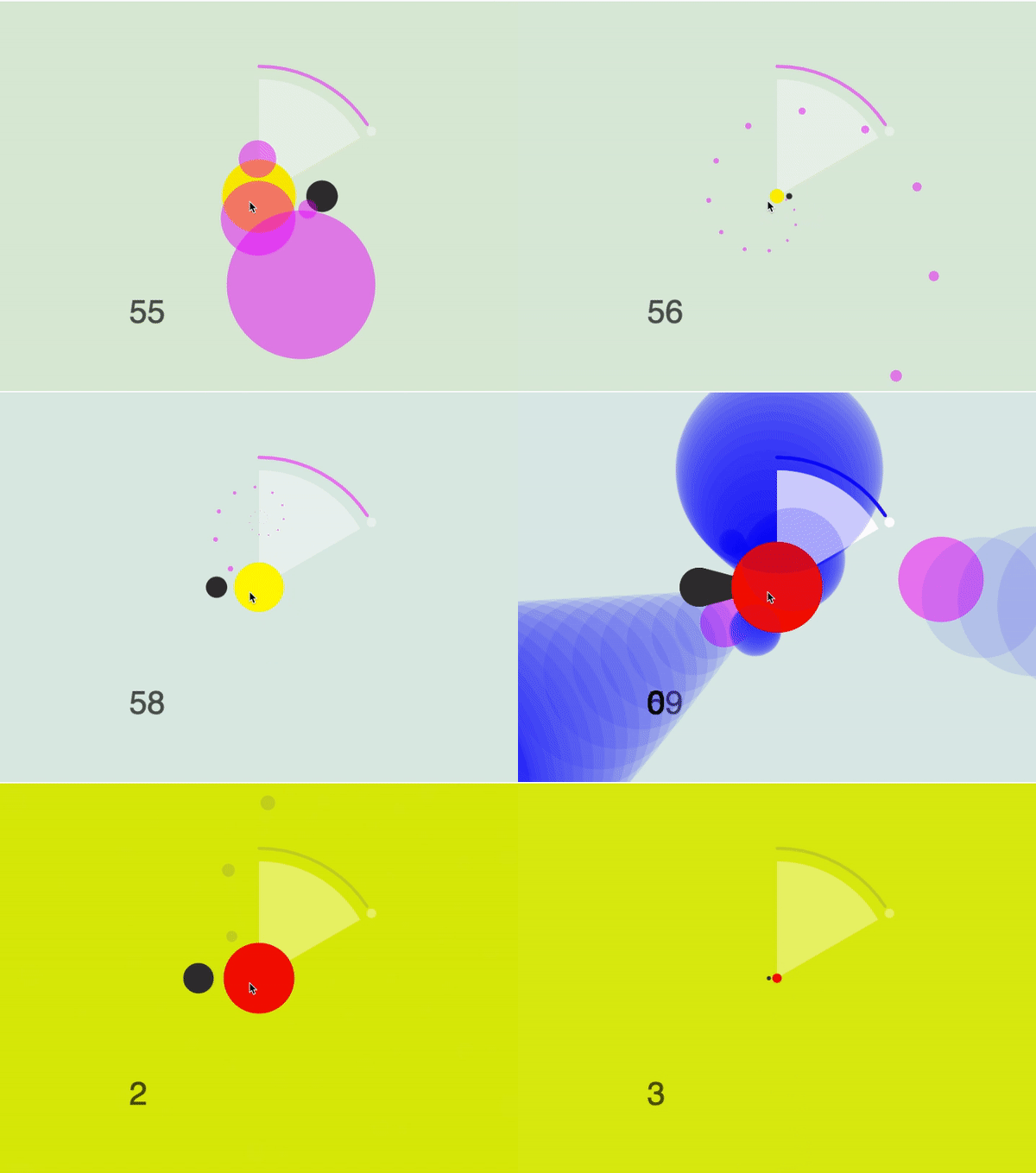
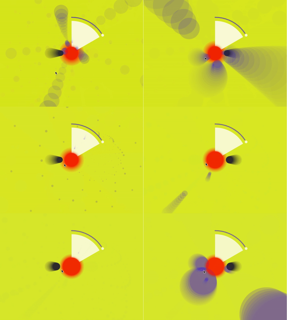
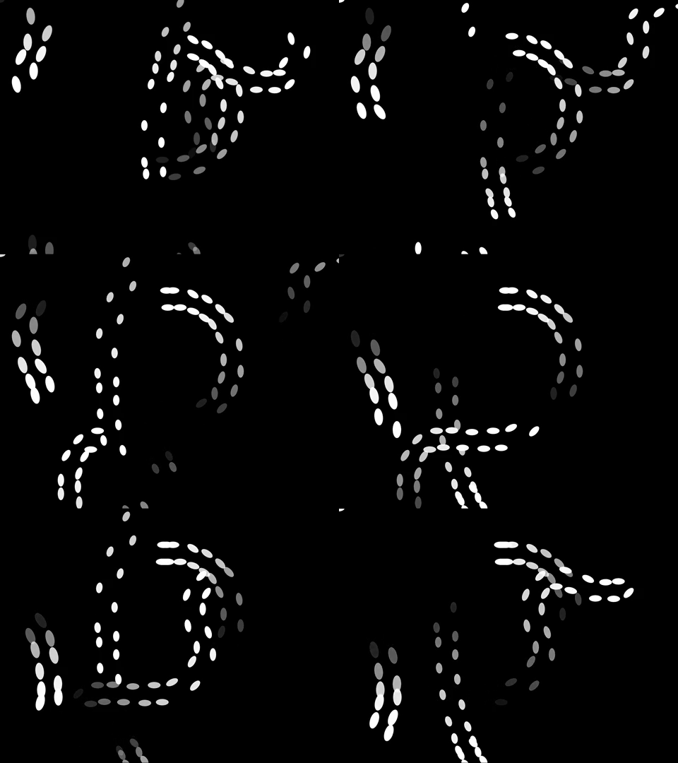
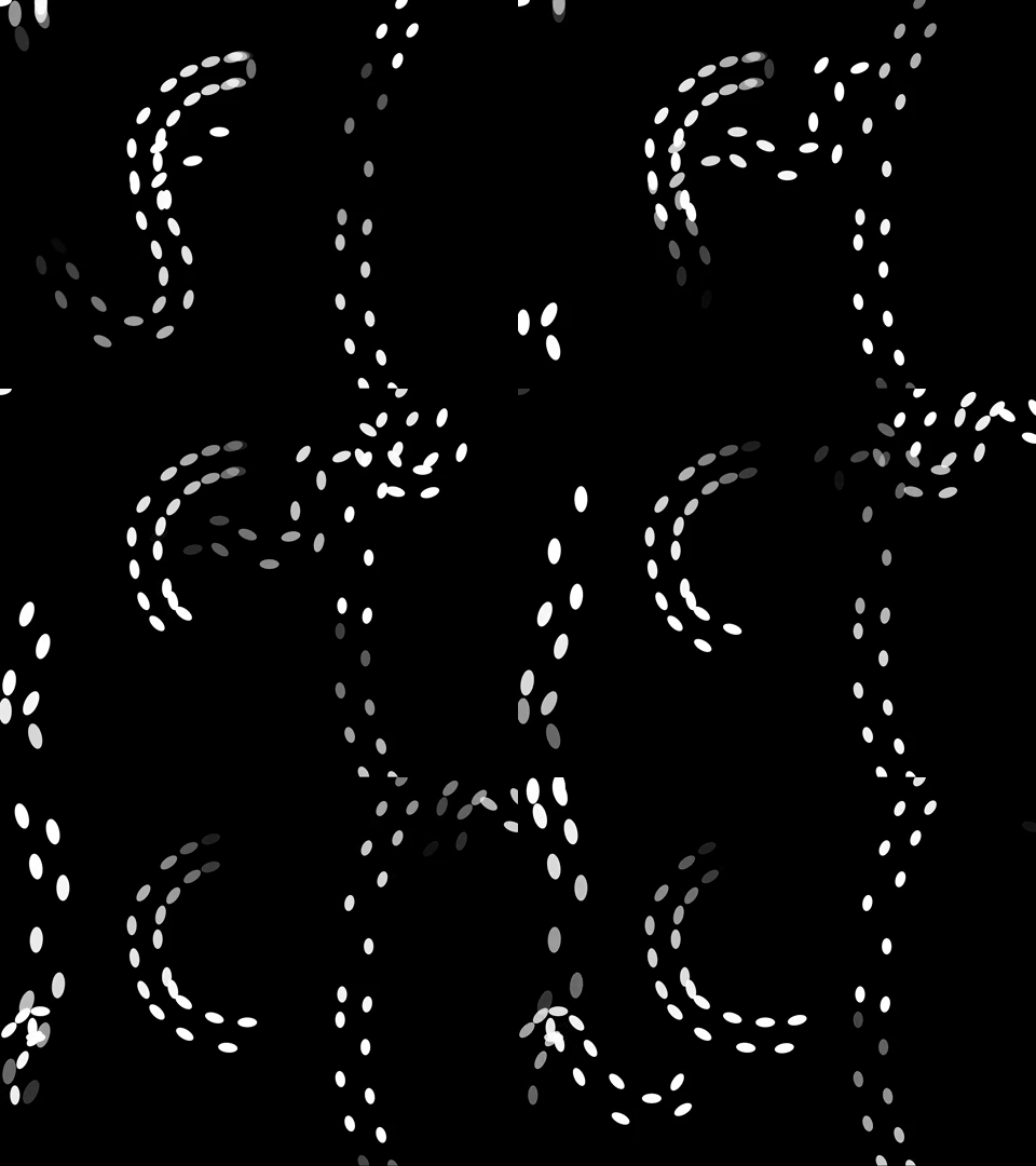
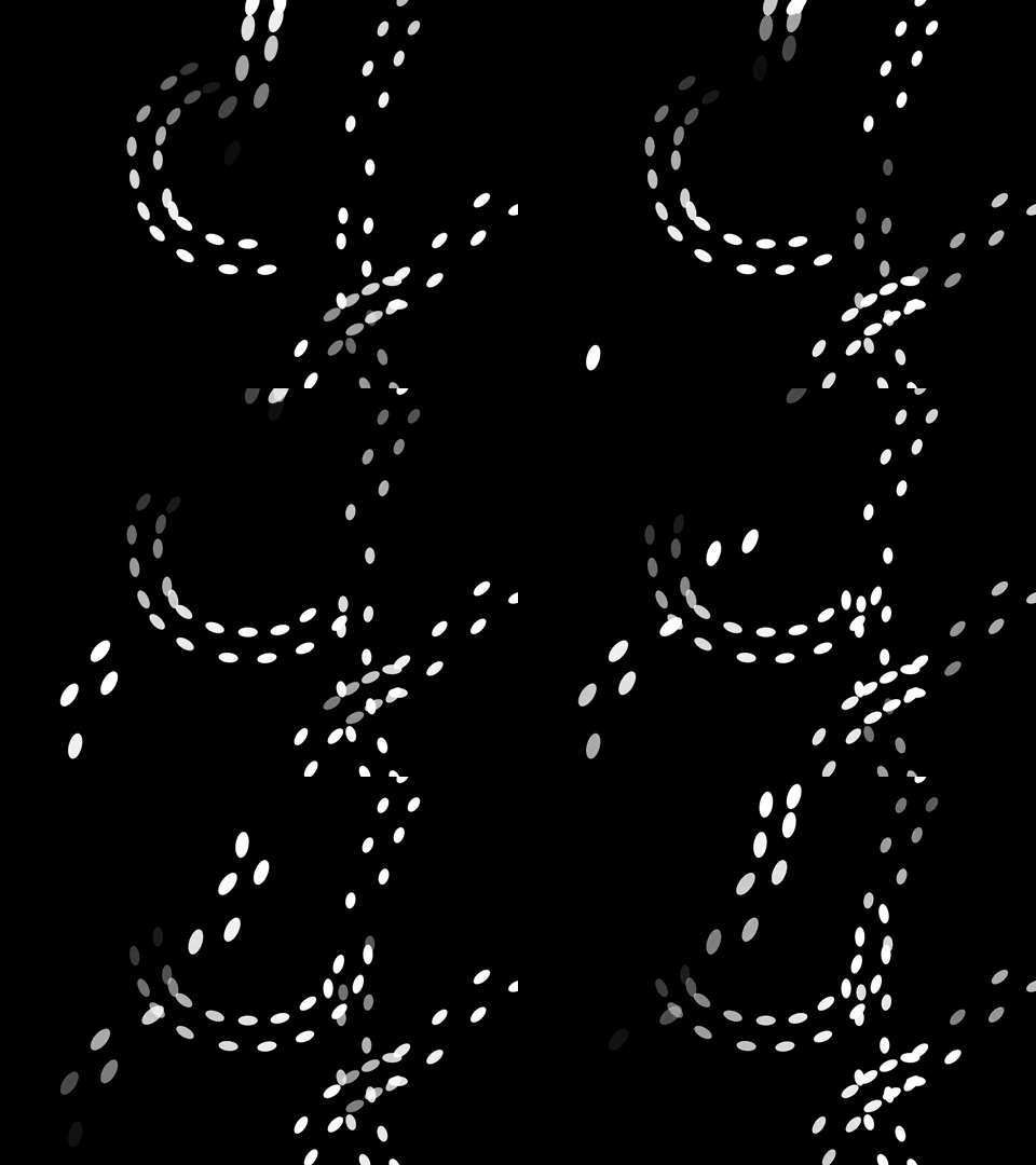
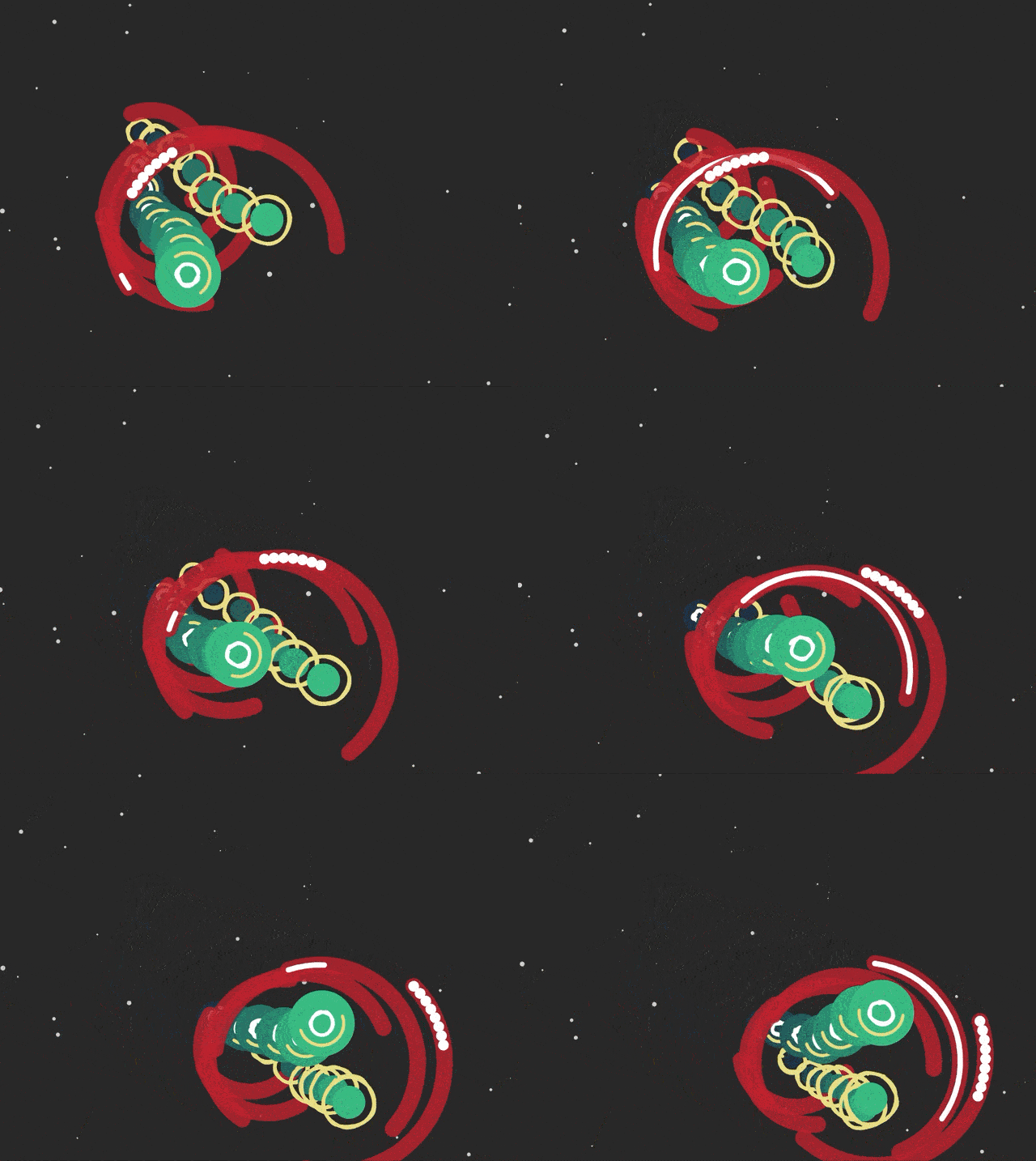
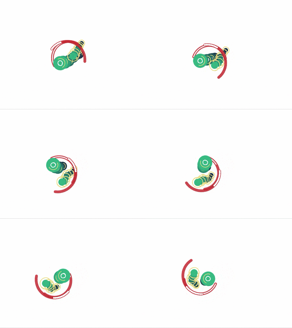
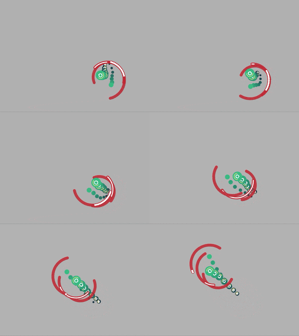
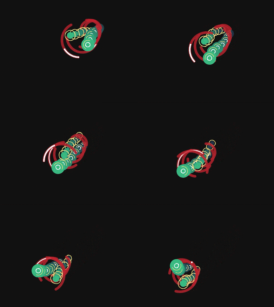
Through my clock, I wanted to combine the mechanical mechanisms we use to measure time with organic and biological measures of time. I decided that my clock should be a creature that resembles ocean microorganisms. I intended for the clock to not be readable, rather I wanted to make a clock that would be mesmerizing to look at. However, it does count 15 seconds and has a sort of biological rhythm. CODE
EDIT NOTES: The newest version of this clock creature has debris in the background to situate the creature in an environment. Additionally, the framing of the "camera" zooms in and out throughout the hour. I also fixed several bugs I found with jarring discontinuities between certain time intervals.
Clock at Several Times*
*These GIFs are from version 2
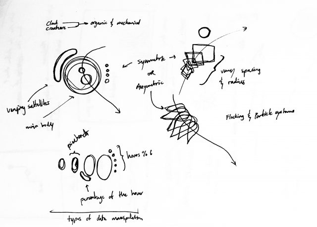
Ideation

My major struggle with this work was creating an organic feel. My initial design (see v1) felt too mechanical and were not what I had envisioned. I eventually settled for the creature I currently have. I think that my goal for it to "evolve" over days, months, years may have been a bit too ambitious. Perhaps I could have played around with the creature's behavior more than I did.

Version 3 | Version 2 | Version 1


Oodbird – clock

https://editor.p5js.org/arenouf/sketches/xqsfDmfB7

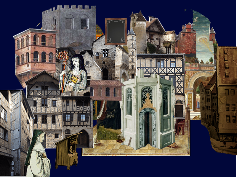
For this project I wanted to focus on the relationship between time and work, especially as it pertains to art and craftsmanship . A lot of how I measure time is based on how much work I have done or the speed at which I do work, especially given the unstructured nature of online classes.

One of the things I wanted to focus on was the human aspect of time, and i wanted to try to work against the mechanical and impersonal feeling of both clocks and computers. For this reason I became very interested in medieval text illustrations called illuminations. These illustrations feel extremely personal and when looking at a text featuring one of these, the amount of time put into them is very apparent.

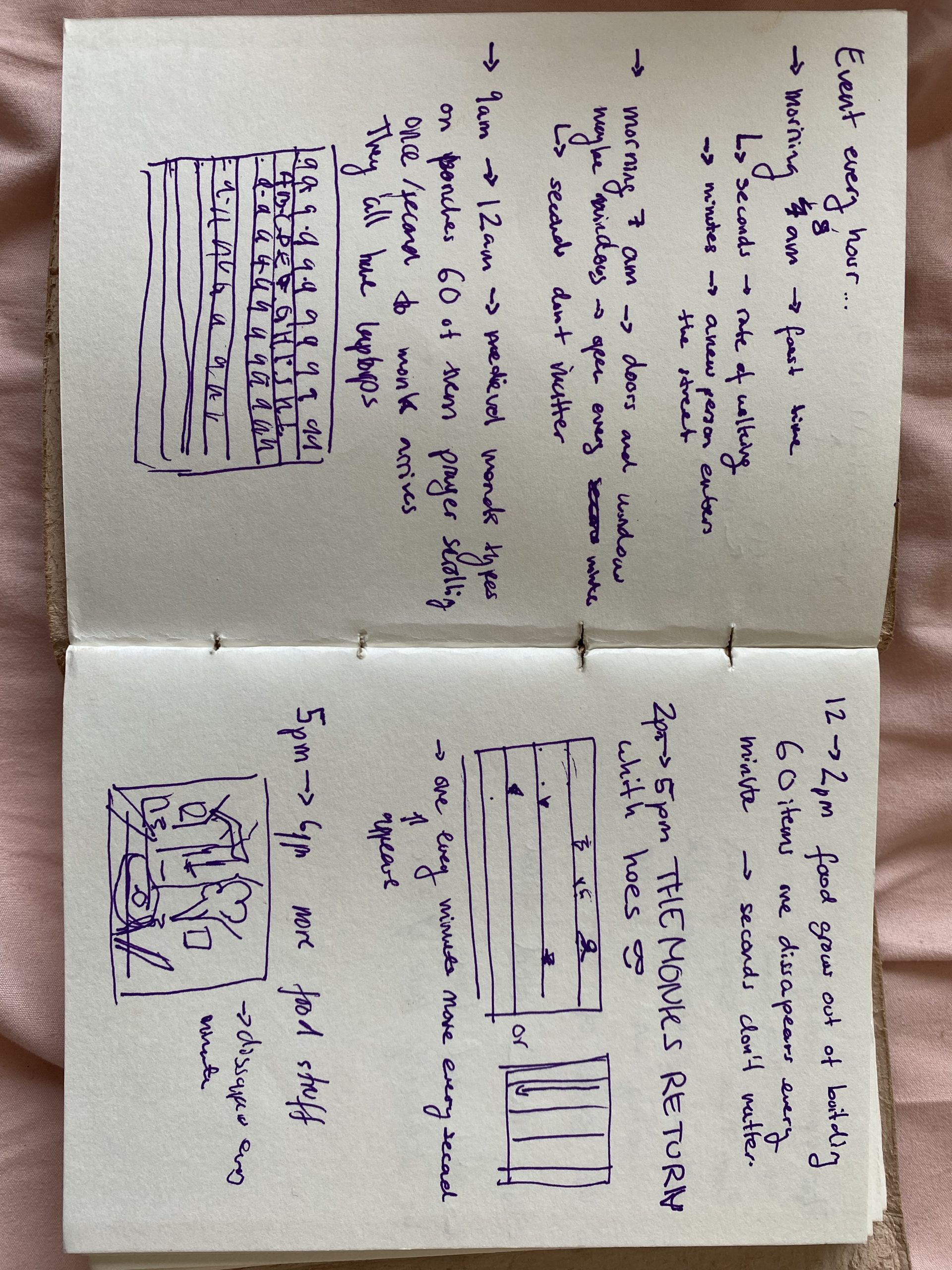
sketches and planning:


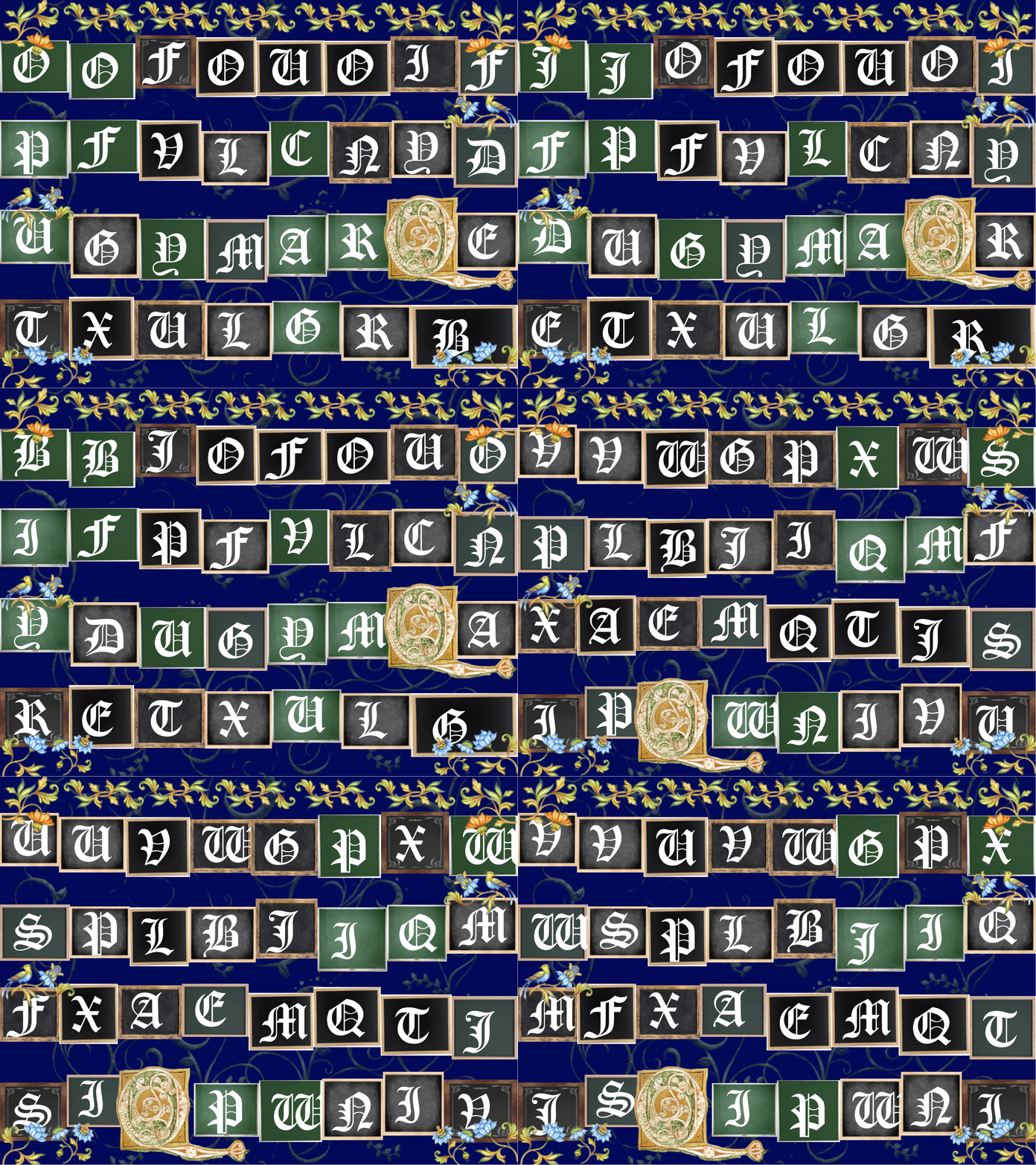
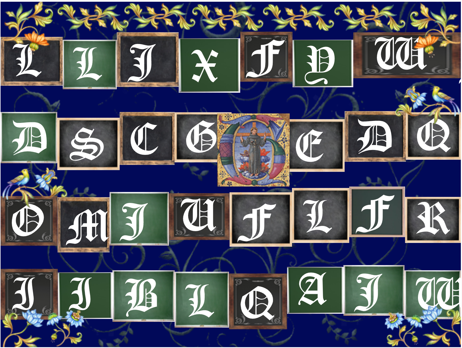
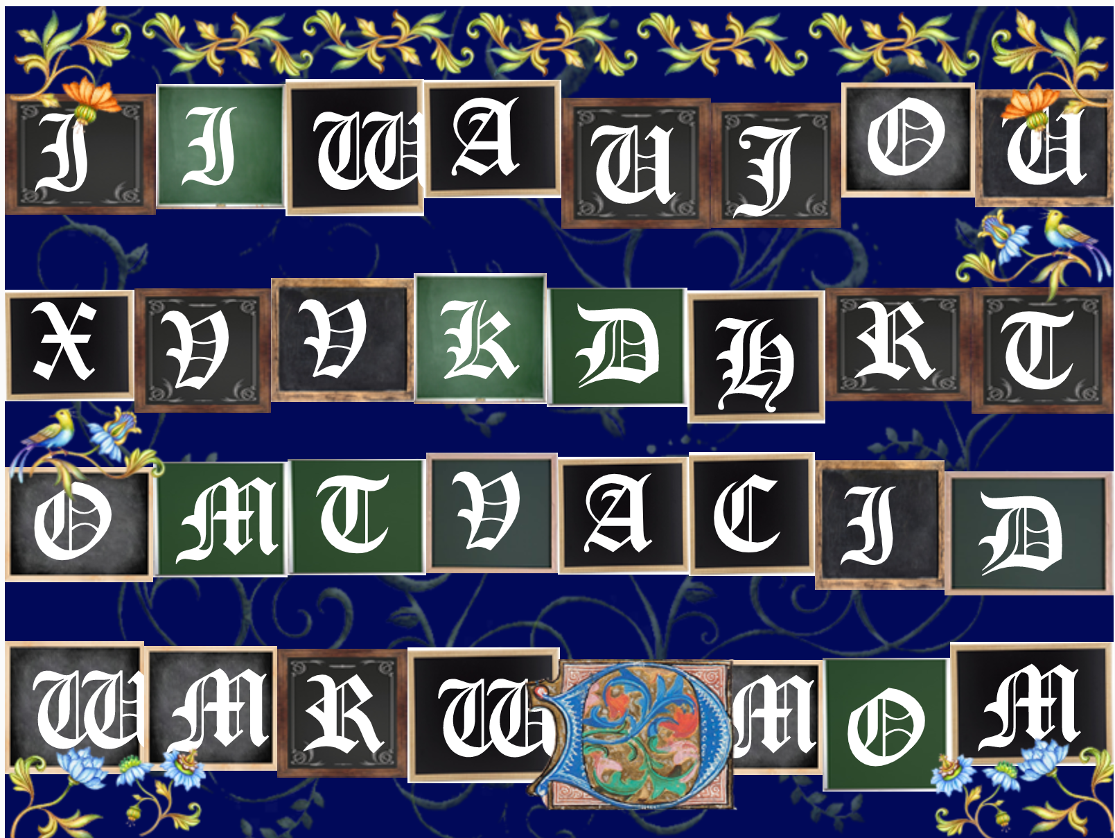
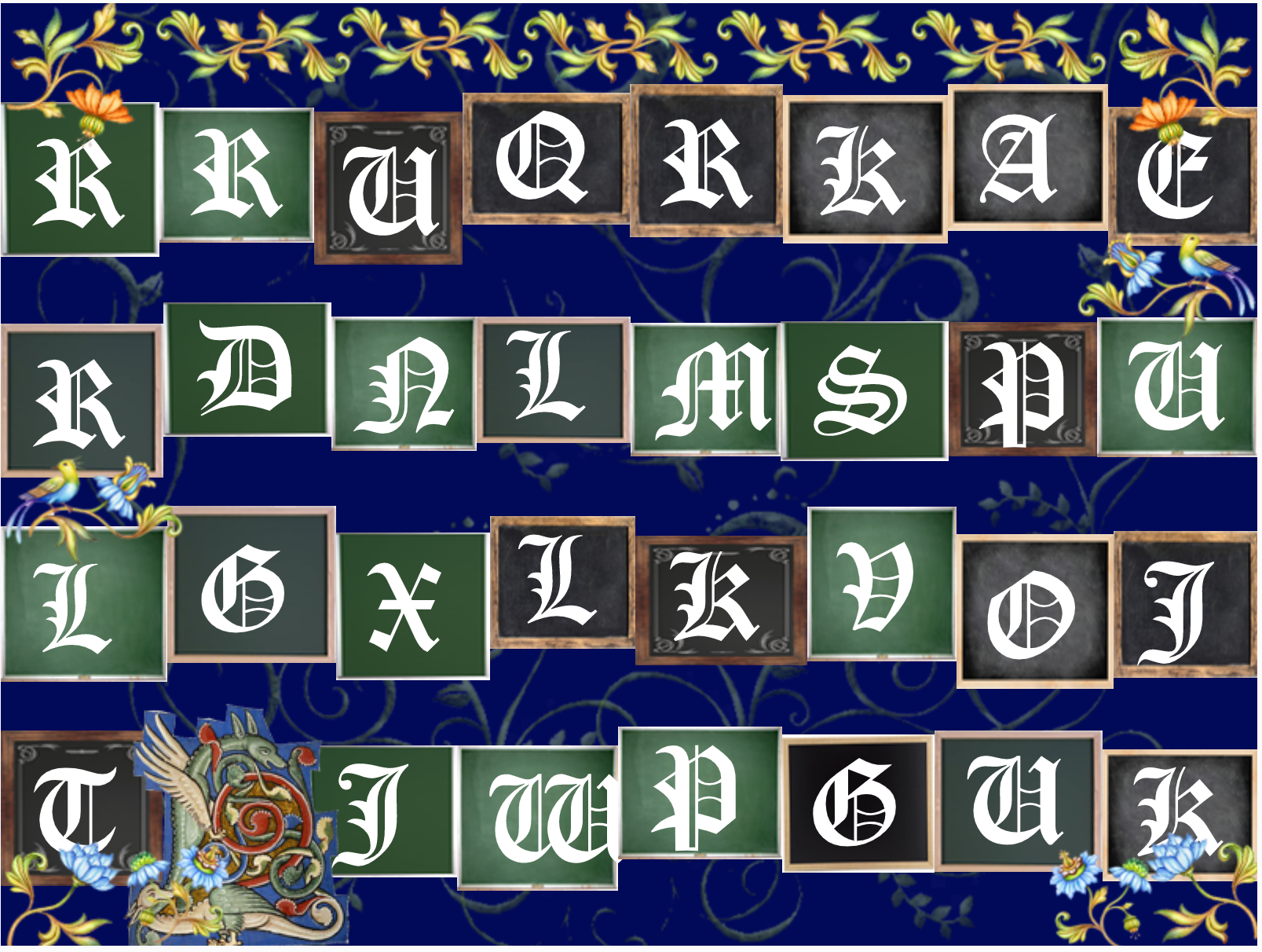
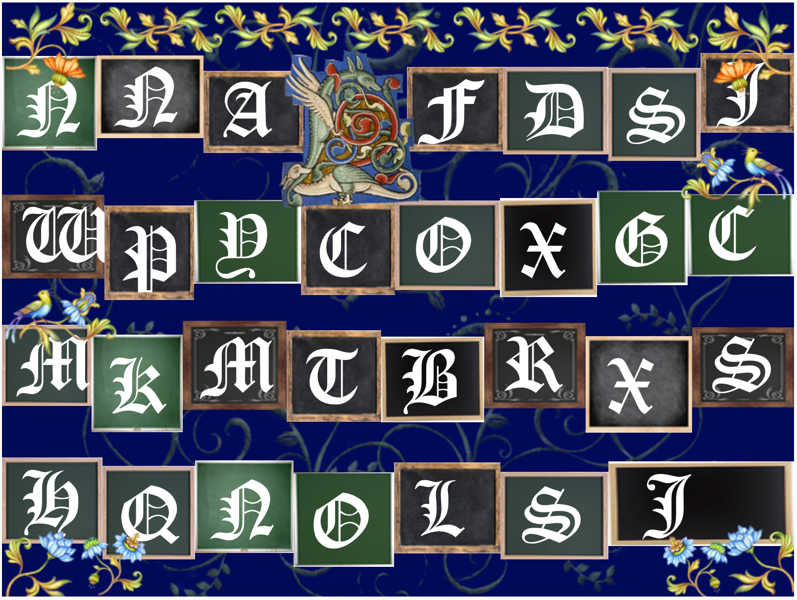
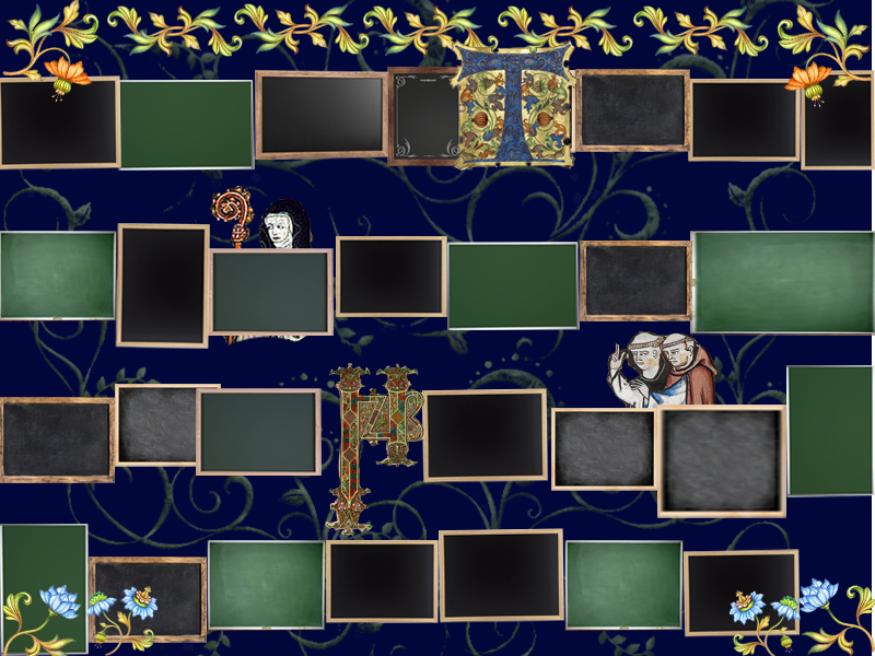
After spending  a lot of time planning out images and compositions that could work with the setup we were given for display. The final clock was created. There 23 different illumination illustration that cycle(one for each hour of the day). The writing on the chalkboards is reset ever minute and the letters cycle from left to and top to bottom every second.