Student Area
OodBird – Exercise: Embedded Iteration + Randomness
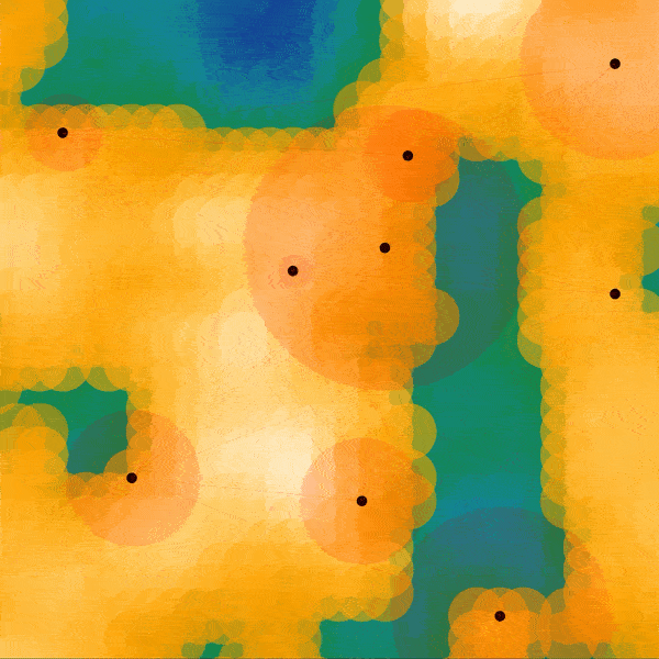
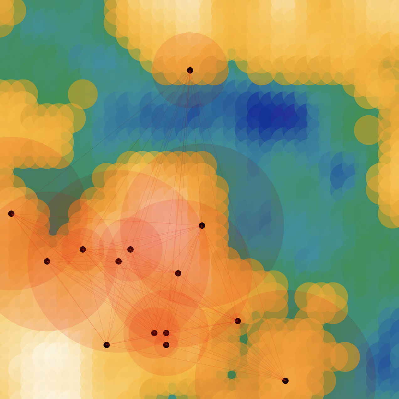
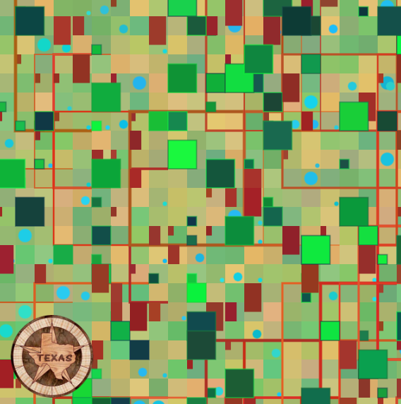
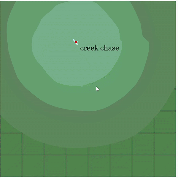
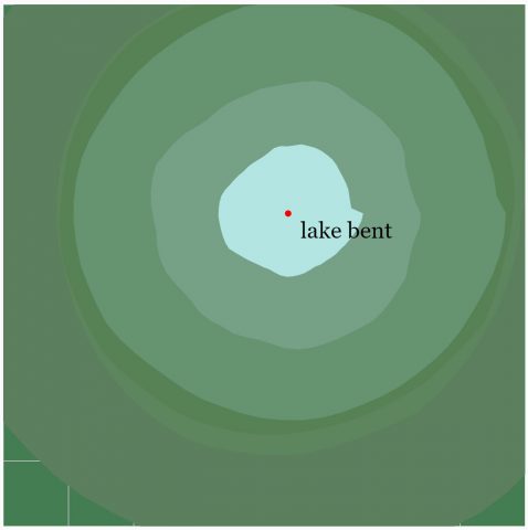
OodBird – Map
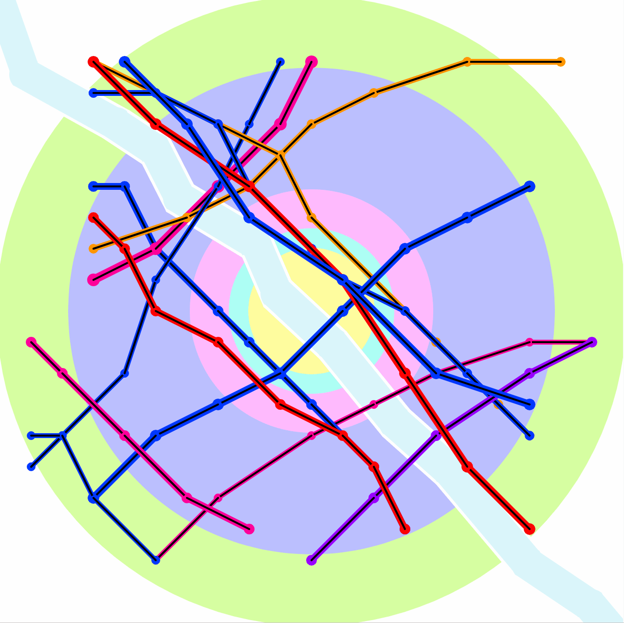
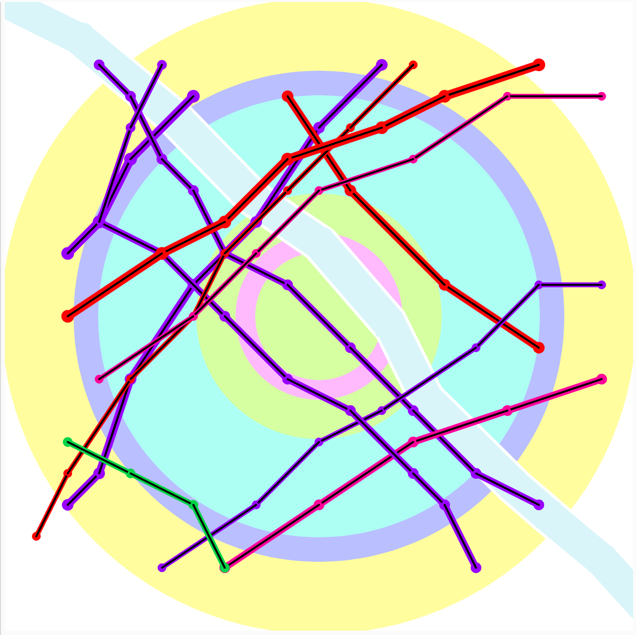
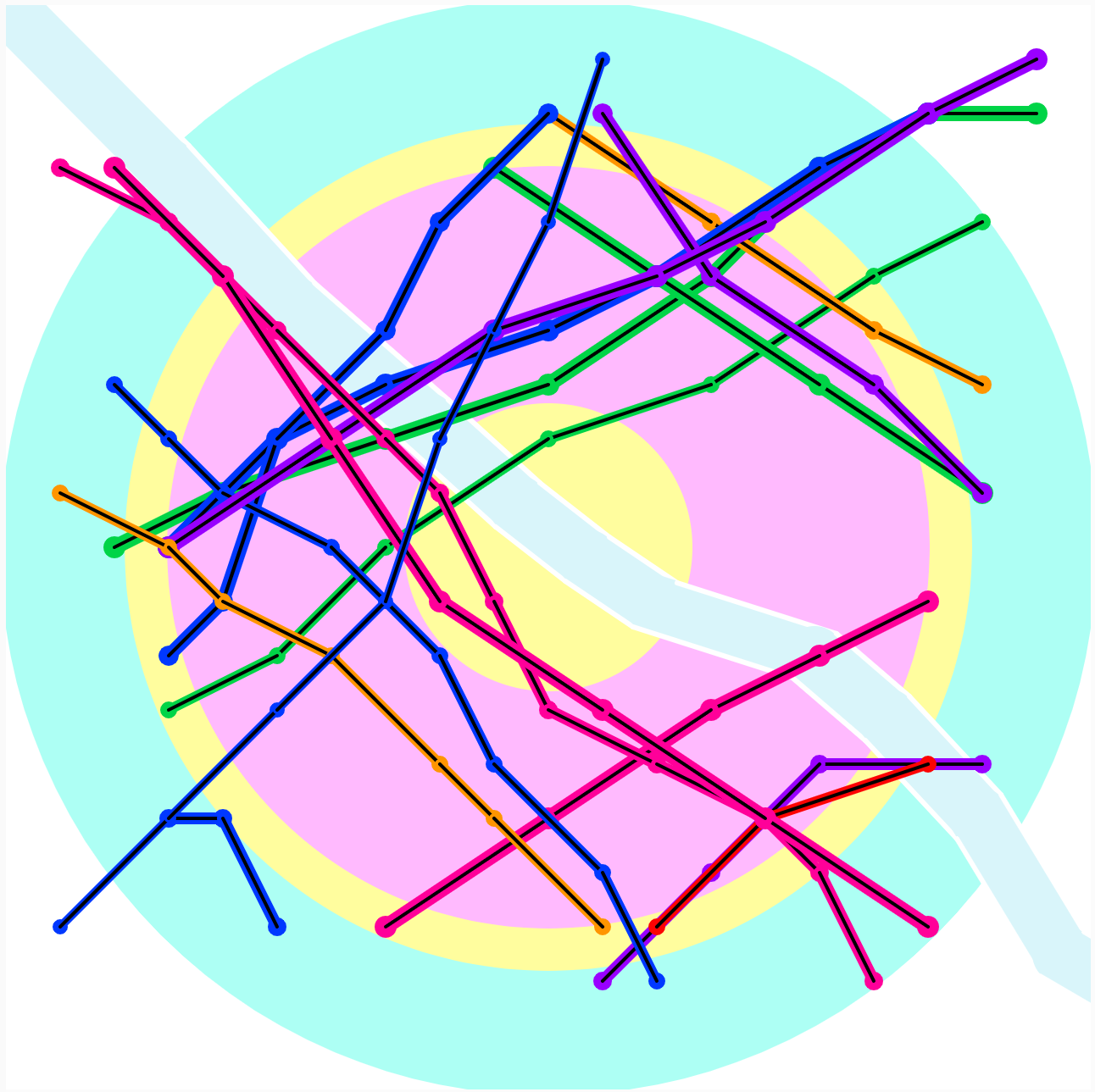
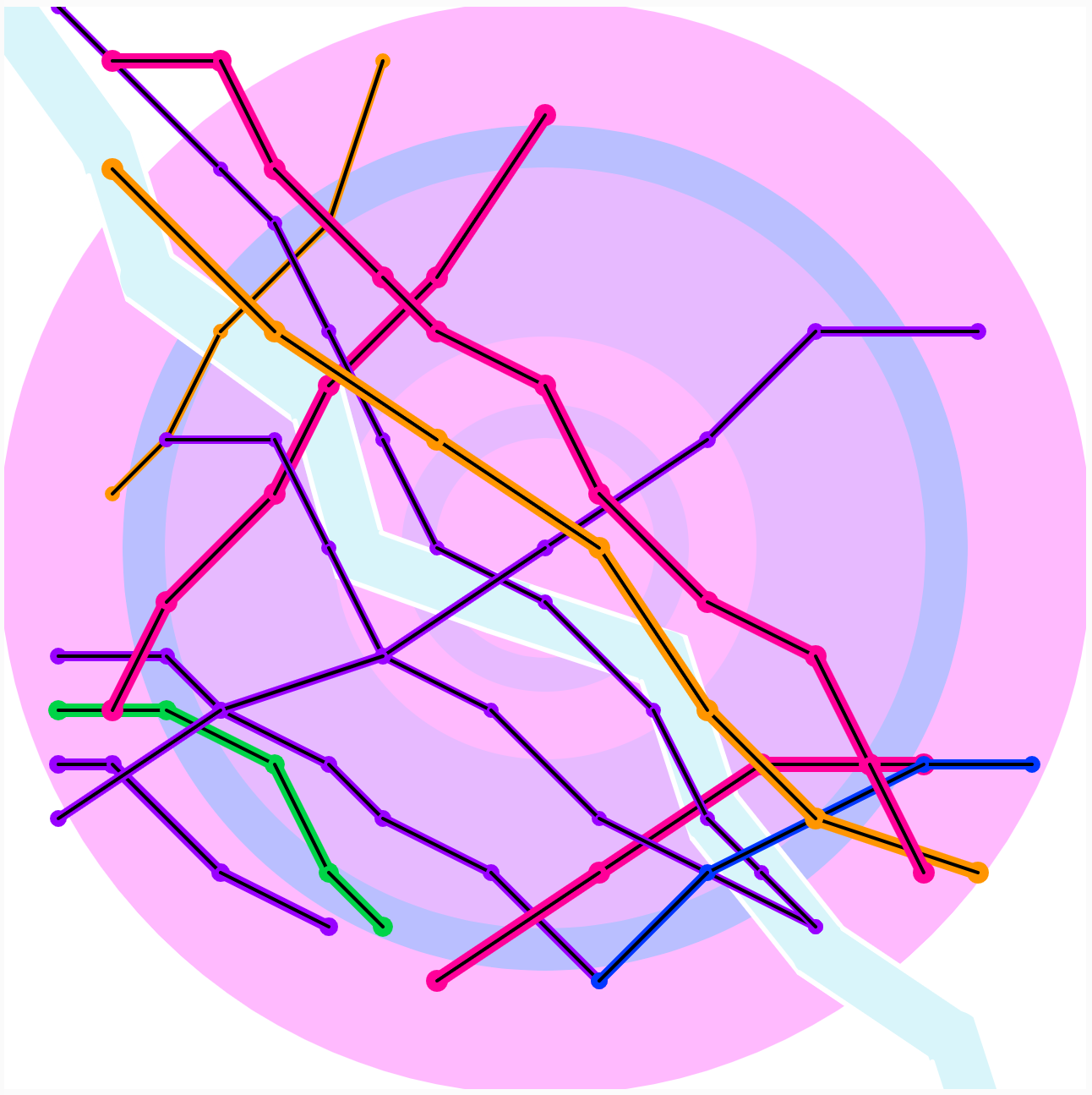
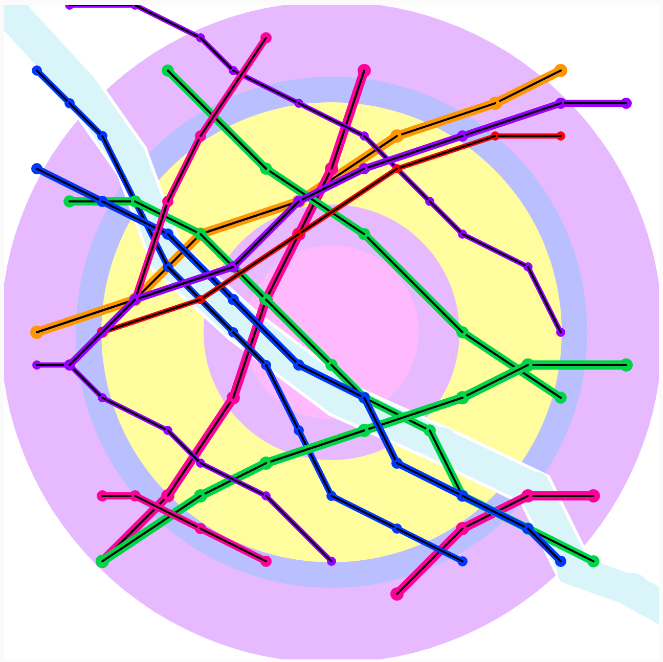
I’ve always the appearance of Metro and subway maps, and feel that they are an amazing way to try and represent a environment. They somehow manage to balance the extremely chaotic and disorganized feeling of city travel with a clinical minimalism that I’ve always found fascinating. Not the mention the fantastic colors they all tend to have. You can learn so much about the inner workings of city from looking at their public transport.
To create this map, I made a series of randomly generated lines which I then added restriction to (in the form of conditionals) to make them appear more like subway lines. These restrictions include certain directions which only certain lines could go in, and a set length that each line had to have. Other restrictions allowed me to make sure no lines that went off the map or were too jagged would appear on the map. The River was generated the same way, but only had one direction option, and the words and randomly selected from an array.
lampsauce-Reading01
Kate Compton’s 10,000 Bowls of Oatmeal Problem describes the potential for a generative algorithm to produce content or artifacts that are too similar for humans. The resulting mundaneness makes any output of a generator look too bland (ie. like oatmeal). This may be a good thing if you need to generate something like trees; each should be slightly unique, but 10,000 trees together becomes a forrest. If a given tree stands out too much, the forrest will not look right.
However, the problem of perceptual uniqueness arises when an algorithm’s output lack’s diversity. More precisely, consider a car generator. Cars are deeply personal items, with drivers often decorating them with bumper stickers, dashboard dolls, etc. It is difficult to explain why, but a human can tell if they’ve seen the same car drive by twice.
Like Kate Compton writes, considering dealbreakers of artifacts at scale is one way to try to combat a lack of perceptual uniqueness. Another strategy is to categorize artifacts into types/tiles (ie. SUVs, German, electric, diesel, sports, etc.) From a more artistic point of view, adding certain defects (ie. dust, rust, scratches, peeling paint, etc) to an artifact may make it more perceptually unique.
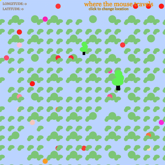
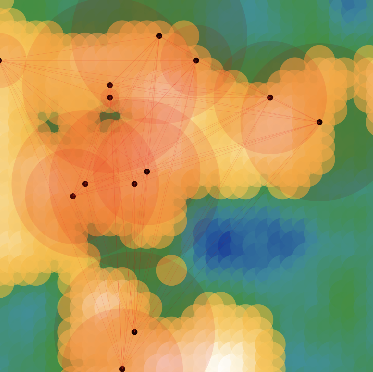
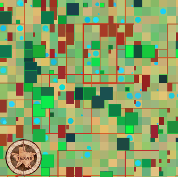
mokka – where the mouse travels
mokka – where the mouse travels
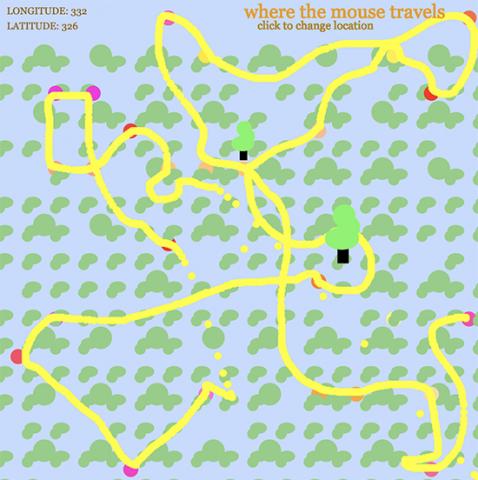
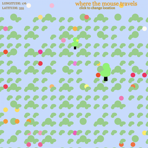
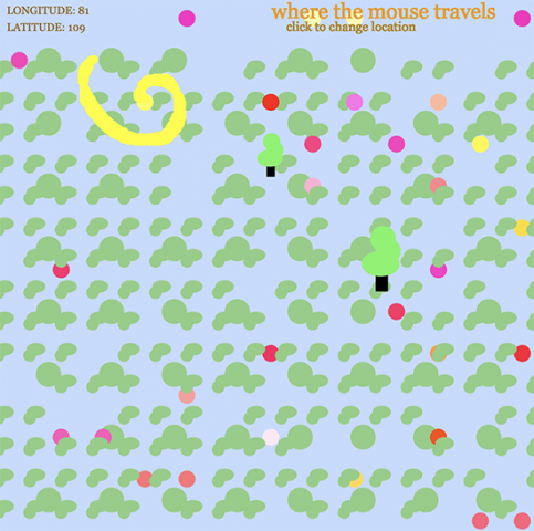
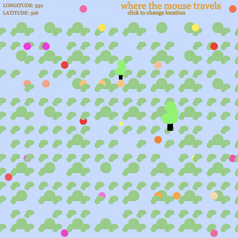
About my territory: As a kid, I remembered how my parents would always print out a google map sheet for GPS. I utilized that map to manifest my own imaginary world. There were plenty of red, orange, and green dots scattered across each map and I imagined treasures or places worth exploring.
Process: Thus, I made treasure maps for this assignment! I wanted to keep an almost child-like quality to it as I wanted to reminisce about my imagination when I was much younger. I utilized nested loops and played around with the placement of shapes to illustrate a simple landscape and kind of natural-looking dynamic utilizing randomness. I also tried providing information for the user indicating where they start once the canvas is open so that when they “get lost” they will at least know their starting point. This starting point is indicated in the top left corner where both the longitude and latitude are recorded once they start moving their mouse. I did this by abling the code to indicate where the mouse is on the canvas at all times. Also, the user’s mouse would leave a trace of its movements utilizing an ellipse that is constantly being drawn. I incorporated this because it resembles how I would immerse myself by using a pen and tracing how I would explore the world that I had in my hand. Once the user clicks the mouse a new starting point is recorded and the treasure items/areas are reset in a random, new area of the map giving the user a whole other map to explore. Due to the number of shapes I had to make, I also created my own functions to make my code a little cleaner for my own sanity.
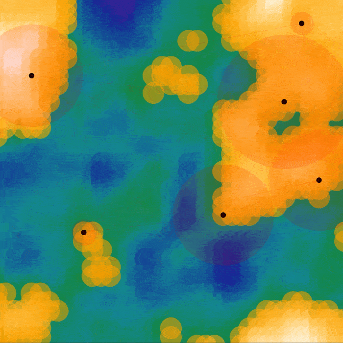
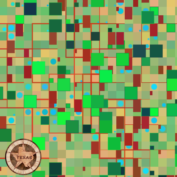
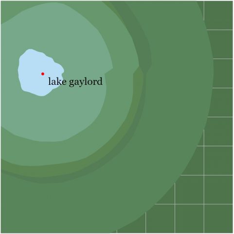
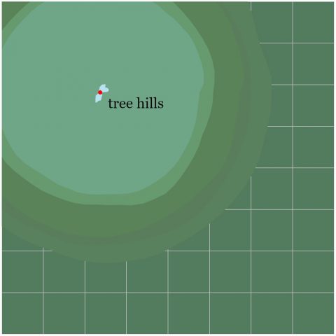
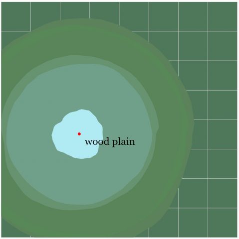
lampsauce-Map
My imaginary world, much like our own planet, has several land masses over a vast ocean. It also depicts several cities with varying populations. The ocean level varies with each generation, allowing for both huge continents and small island clusters to occur.
Variations of Generator
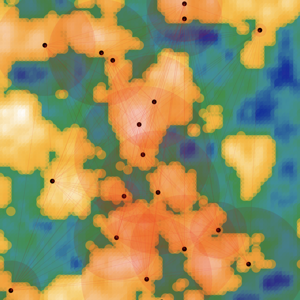
Process
This map generator creates a 3D terrain using Perlin noise. The map’s scale and ocean level is chosen at random. The points are stratified by whether or not they are below the ocean level. The points below the ocean are colored by mapping each depth to a corresponding HSL color range. I wanted the land masses to look like a treasure map, so I mapped the land points to a specified color range.
The number of cities is directly proportional to the amount of land. I was curious what it would look like if I could raise or lower the ocean level of a given map. If you use the left/right arrow keys the ocean level will raise and lower. The cities & populations will adjust accordingly.
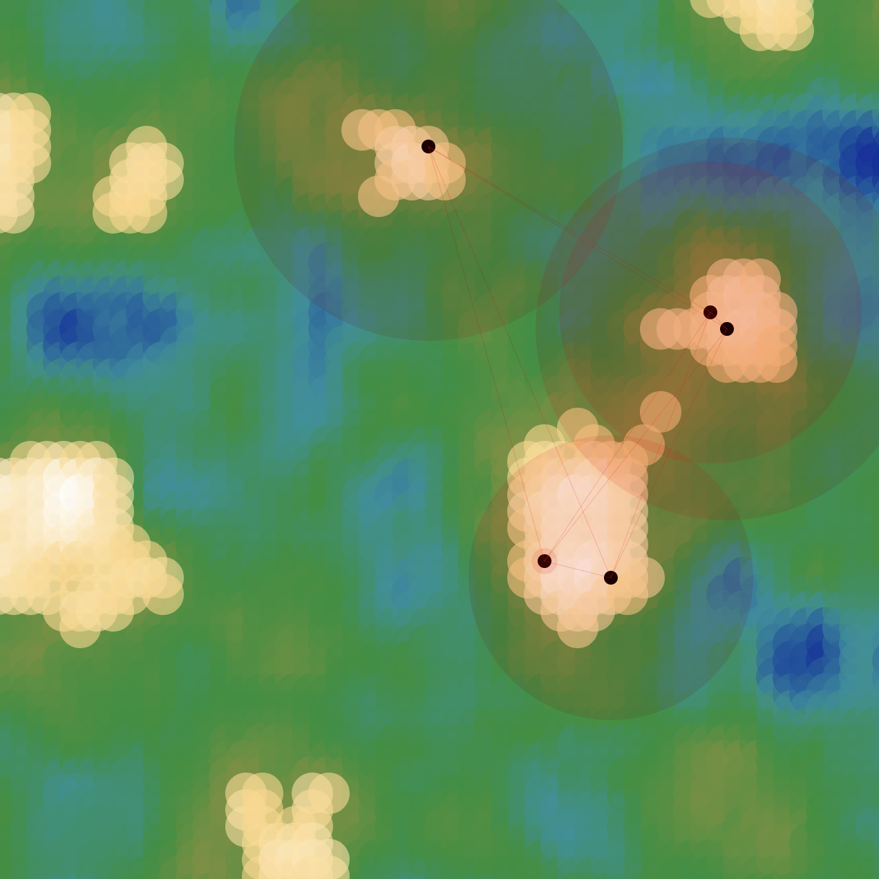
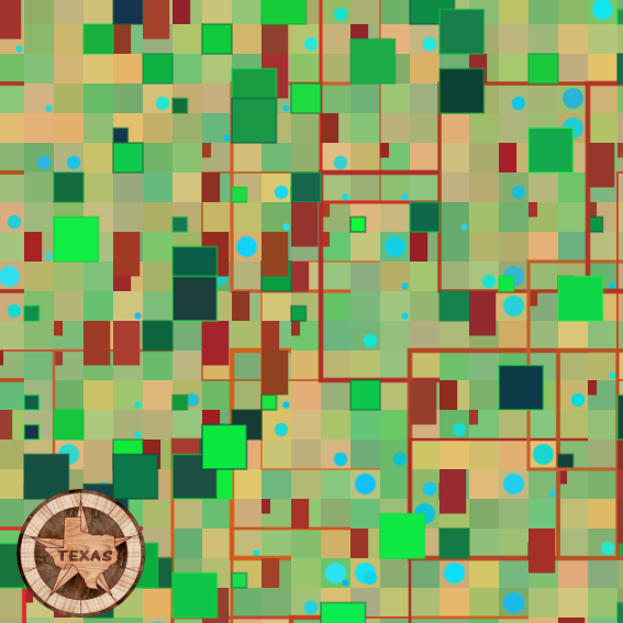
junebug-Map
Description:
I’m very interested in the structure and chaos of city planning and the geometry that results from it. View from an aerial perspective, there exists symmetry and asymmetry, as well as a lack of identity.
Technical Process:
I chose to use basic shapes that are typically seen when you view grid-plan cities from an aerial view. Artifacts include trees, house roofs, and bodies of water all from three for loops. Each time the mouse is clicked, the city grid layout is always different, but overall, they end up looking almost the same – akin to perceptual differentiation. The colors are generated randomly but limited to certain RGB codes that represent the formal colors of each artifact. I was inspired by my hometown, where our city grid is very visible aerially because of our flat terrain.
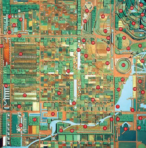
Inspiration picture of a city grid plan
thumbpin-Map
https://editor.p5js.org/thumbpin/sketches/QaTaxmeerj
The first time I left Pittsburgh and went back to my hometown, the flat terrain of my hometown was one of the things that stood out to me the most. The territory in my map is inspired by the landscape I grew up in and generic parks in my neighborhood.
To create the organic shapes in the maps, I followed an instructional video that used perlin noise to create blobs. I randomized the location that the blobs would center at and I wanted the sizes and colors of these blobs to vary but still follow some rules. To make the blobs gradually decreasing in size, I set the size of the blobs to a random number within a certain range of numbers. To create a gradient of color changes, I also set the color of the blobs to random colors within a certain range of red, green, and blue. I created an array of words used for parks, streets, etc. in my city and randomly selected two words out of the array to create the name of this fictional place.
yanwen-Reading01
Compton’s “10,000 Bowls of Oatmeal Problem” talks about an aesthetic challenge that is often seen in creating generative content. While an algorithm might be able to generate different results, they may not always be perceived as different. Based on the purpose of the generative content, uniqueness has different levels of importance in determining the effectiveness of the generator.
“Perceptual differentiation” and “perceptual uniqueness” are the two criteria that Compton used to evaluate the generative results. “Perceptual differentiation” only requires the results to be not identical. In cases that need a large group of generative results without the need of highlighting specific characteristics, like a crowd of people or a school of fish to fill as background, differentiation is enough. While for cases that require distinct differences, like generating game characters, uniqueness should be taken into consideration while setting up the generative process.
To overcome the “10,000 Bowls of Oatmeal Problem”, we need to consider the purpose of the generator, whether the results should be seen as unique or simply identical, and adjust the constraints of the generative process based on the requirements.
lampsauce-lookingoutwards01
Refik Anadol’s Melting Memories is an installation in Istanbul.
I admire the complexity and synchronicity of the work. The way that certain components melt into one another and reform or reappear later has a very aesthetic quality. I also admire the algorithms and dataset it took to generate this work. Anadol’s work often takes massive datasets and expresses them visually. One thing I admire about his works is how he uses data as a pigment, to express what is normally unseen.
Anadol partnered with the Neuroscape Laboratory at UCSF and collected EEG data from participants’ hippocampus region to create Melting Memories. Anadol’s creative team (comprised of AI and CS experts) developed a neural network to convert the EEG data into procedural noise which could be visually interpolated. Given the uniqueness of this dataset, it is likely that Melting Memories was created using custom software.
The work was inspired by Anadol’s uncle’s getting Alzheimers which making him consider the computational foundation of memory. Future works that may take inspiration from Anadol’s work may make clever use of data from different kinds of signals of the body.