Student Area

tale-reading01

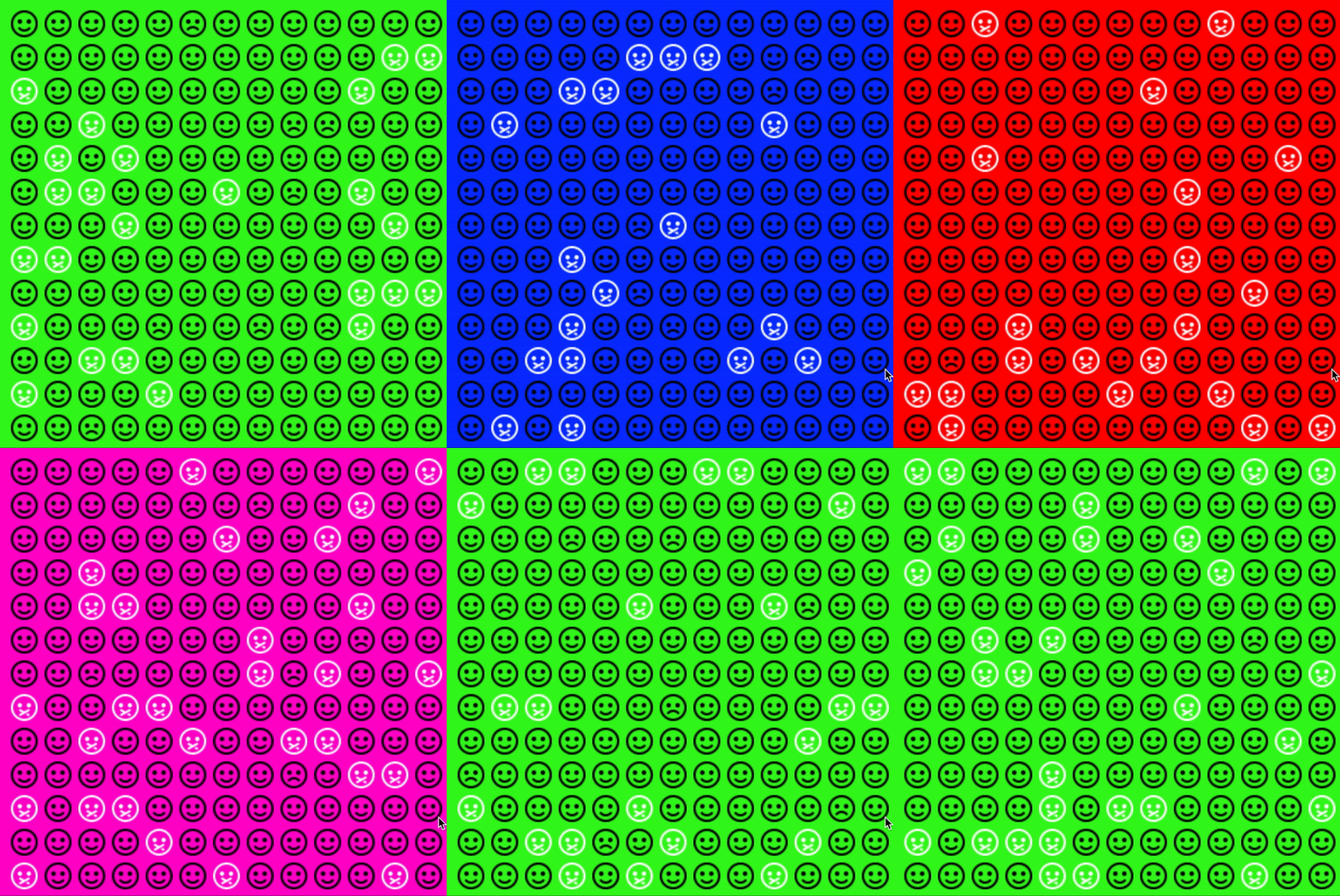
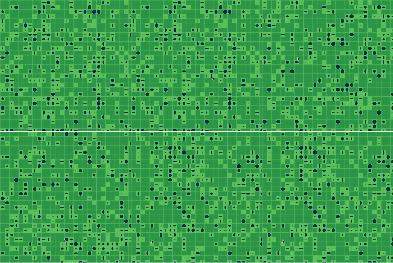
Compton’s “10,000 Bowls of Oatmeal Problem” becomes important when it comes to the situation where multiples of individual items are rendered and used. As Compton explained in the article, every oatmeal piece in a bowl is unique and different from each other in terms of size, weight, location, orientation, etc. In other words, there cannot be two or more oatmeal pieces that are exactly identical when the oatmeal was poured into a bowl straight out of the package (randomness). Because there doesn’t exist two or more oatmeal pieces molded to be exactly the same intentionally(not random), every piece is independant and different, mathematically speaking.

This would be a problem, for example, when your intention of randomly generating mountains is to create a background of a game you’re developing and wanted to create a user experience of playing in a green mountain map. If the randomly generated mountains turn out to have different color, hue, saturation, shape that are too far away from the general image of mountains, then such intention wouldn’t be fulfilled by the random generation.  This could potentially be solved by indicating certain features of the random generation before generating. To go back to the mountain example, we could limit the color spectrum to green and shape to more triangular looking. With such indication of certain features, we could then achieve what we intended to get out of the generator.

On the other hand, randomness and the uniqueness of the random generation would be beneficial when you intend to create a crowd of people, for instance. Often times a crowd of people in a film, animation, or game isn’t the main spotlight the developers want the users to focus on. The crowd of people are meant to create an impression that a lot of people/characters are there at the scene. Just like how it’s not common in real life to observe two or more people who look identical including the outfits, hairstyles, and body shapes at a crowded cafe, for example, it’d be funny if the scene you intend to create has a crowd made out of multiplication of a few the same exact looking characters.
tale-lookingoutwards01

The project that compelled me to take this class is MLDRAW: ML DRAWING TOOL by Connie Ye and Aman Tiwari. This project is still in progress and in fact, Connie is currently working on it as her senior BXA project. MLDRAW: ML DRAWING TOOL was the first inspirational project I encountered within the first month of freshman year. I was amazed that not only did the project reminded me of my childhood time scribbling on an empty paper with my friends, but also made me wish I had access to such program when I was little. What astounded me more was that this project wasn’t made by someone existing somewhere out in the world who I don’t know a single thing about, but rather two upperclassmen at CMU. I later learned that this project was made in the Interactive Art class also taught by Golan, which made me want to take this course even more, as this course would greatly help me take a first step towards building technical and creative skills for projects like MLDRAW.

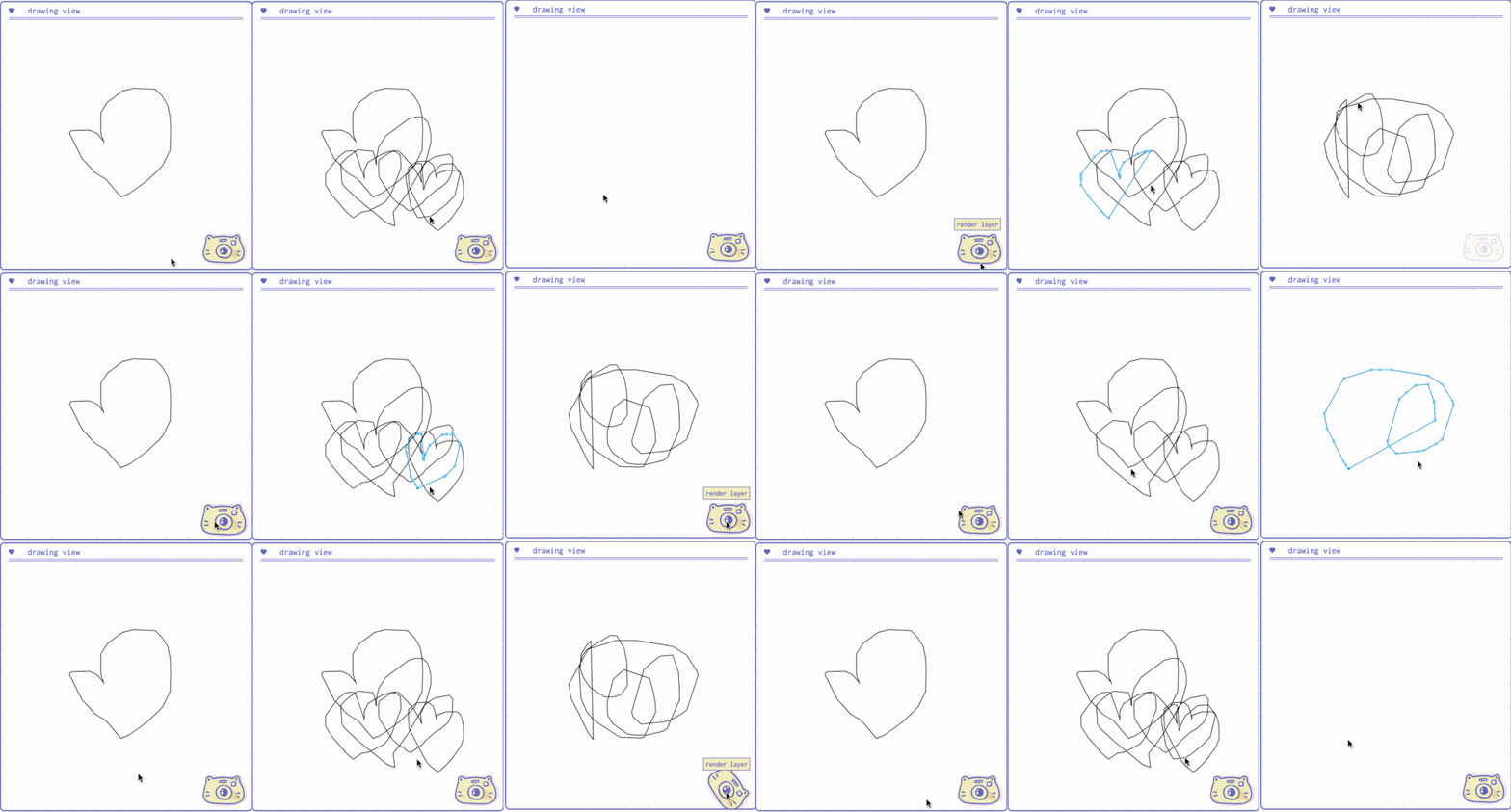
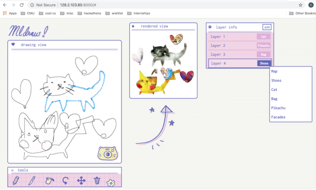
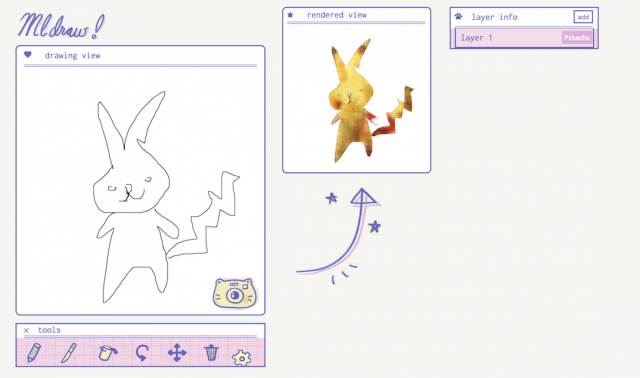
To introduce more about the project, MLDRAW is a vector art drawing program that renders the line drawing made on the left with ML on the right.

The project is developing with Typescript, choo.js, paper.js, pix2pix models, python, socket.io. When the user makes a sketch, each layer of the vector drawing would then be processed separately in the machine learning model, producing the rendered view on the right.

The project was inspired by the research done on pix2pix and the potential of it altering drawings into another images. As mentioned before, the project is still in progress. They are planning to add more ML models and features, modify UI for the user’s clear understanding of what each tool does, and potentially release to the public for everyone to play with.

These are some screenshots and gif of the project from Connie’s website. I tried to create a gif version of the vimeo video above on my own, but giphy site says the vimeo video owner has disabled them in making the gif..;


axol-Map

Distant Planet

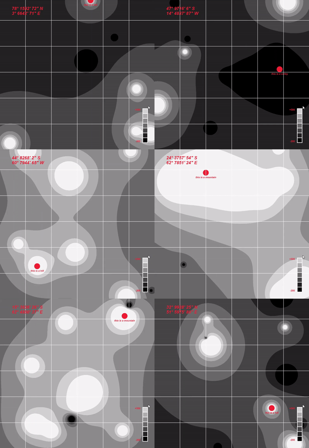
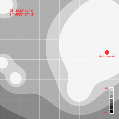
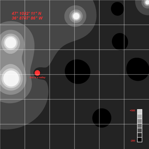
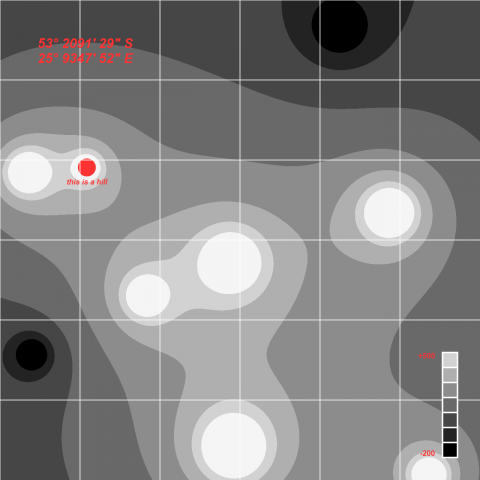
Looking through your amateur telescope, you can’t see much. The hills and valleys seem to stretch on endlessly. Nevertheless, you diligently mapped everything down, and looked harder for signs of life. 

Map more wasteland!

Process:

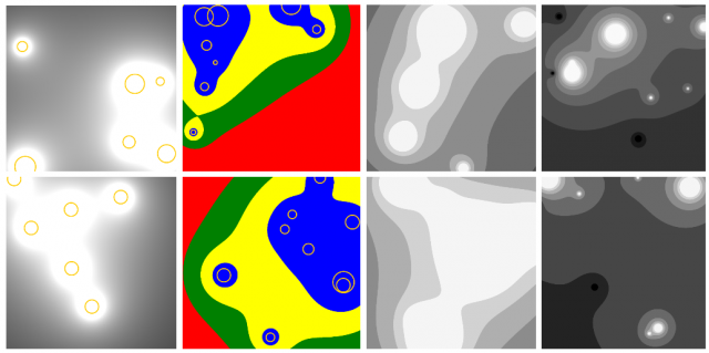
1.) basic isosurfaces from “islands” 2.) set thresholds so it looks more like topography maps 3.) dynamic coloring base on height 4.) further tweaking of variables

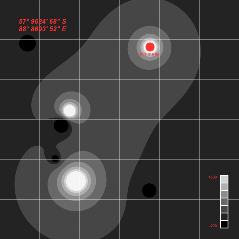
I wanted to create a topographic map, and I happened to stumble on this tutorial which I thought could be used achieve the effect I want. The “islands” are generated at random locations on the map, with a random size and height(shown in yellow circles in  1-2). The color of each pixel is then evaluated base on their distance to all islands and the height of that island, and I specified thresholds so it appears more like “levels” of land . At last, there’s some randomly generated coordinates and map legend drawn.

Although my original intention is to create like an “island on ocean” kind of map, I really liked the black and white color scheme and stuck with it. It reminded me of pictures of the moon’s surface.

More Pictures:


Toad2 – Map

 Road Maps to Nowhere

Link to Code

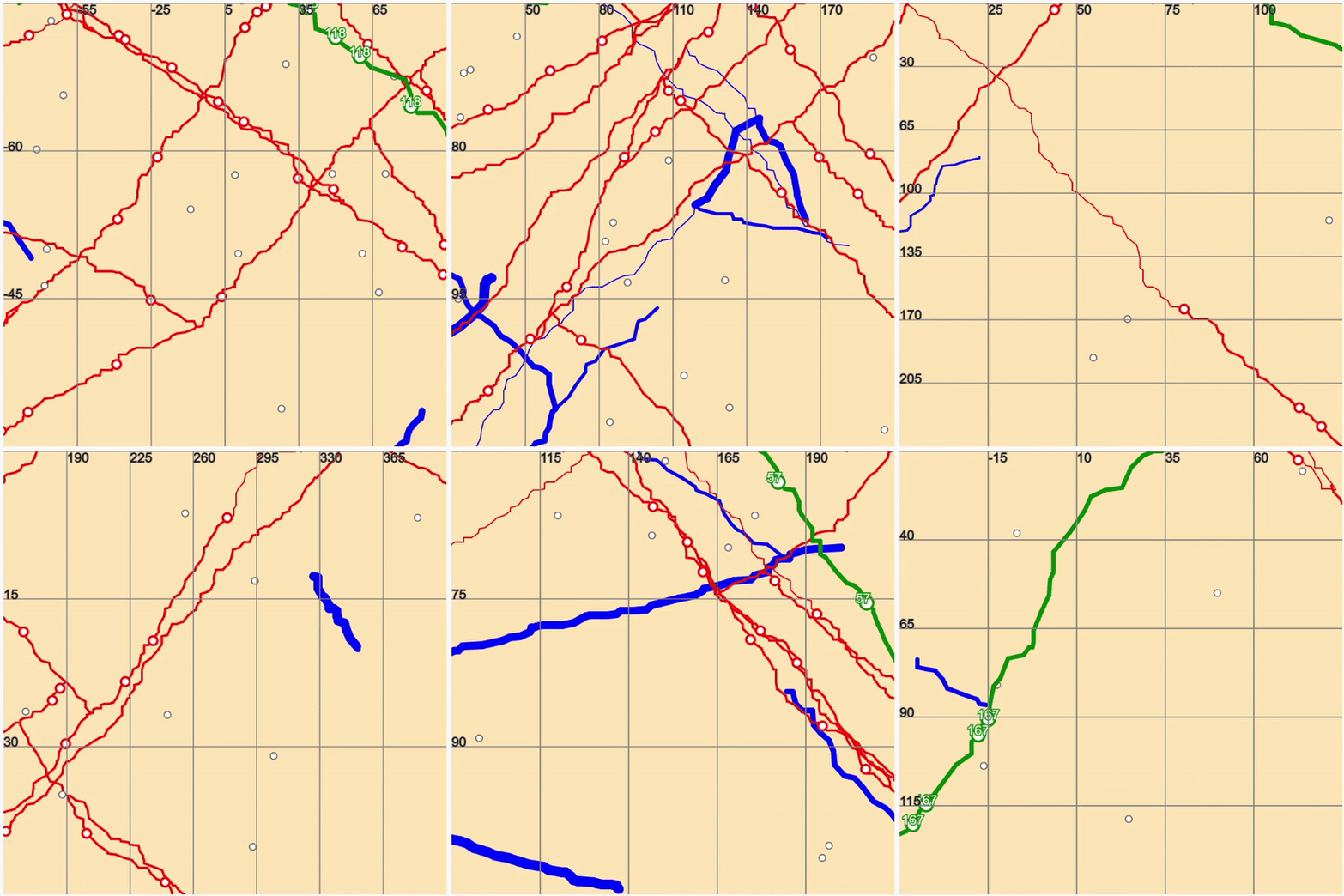
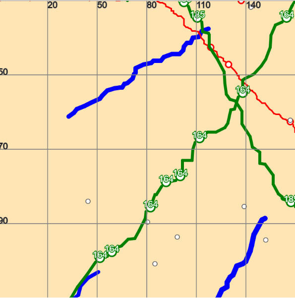
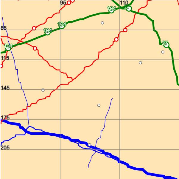
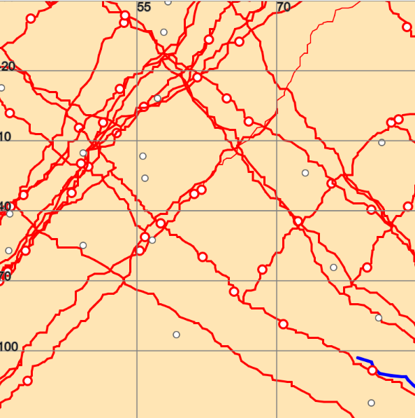
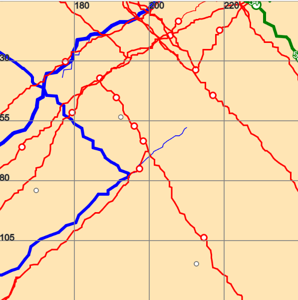
For this project, I created a road map that leads to nowhere and that the user could never reach. I wanted these maps to feel as if it the user was had opened up Google Maps while on a road trip.

These maps were created by creating jagged lines that mimic roads and rivers by drawing short line segments that varied in size and direction that began where the previous line segment began. As each segment is drawn there is chance that a white marker is placed as well a chance a completely new branch would be drawn from the current point creating a split in the current jagged line being drawn. I increased the probability that rivers would branch in order to better mimic how rivers move. Additionally, I also randomly varied the thickness of each river tributary to to make the rivers more river like.

Pinkkk-Map

Generating in Action

Selected ScreenShots

Brief Paragraph About the Territory

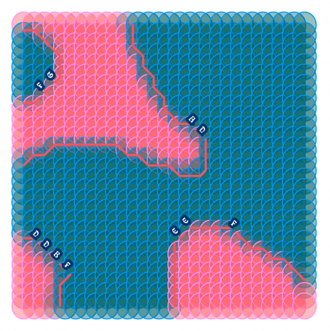
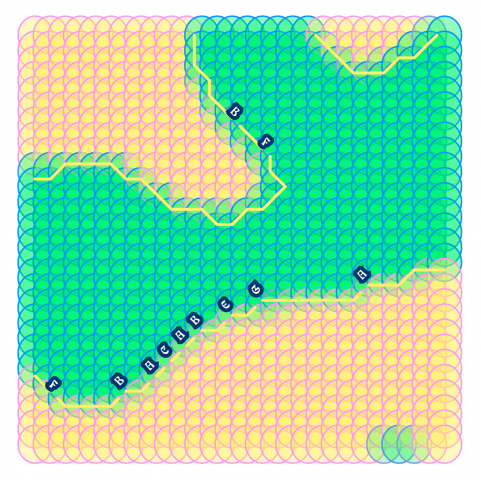
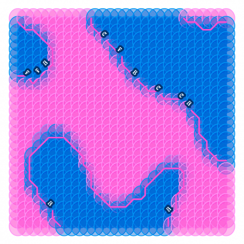
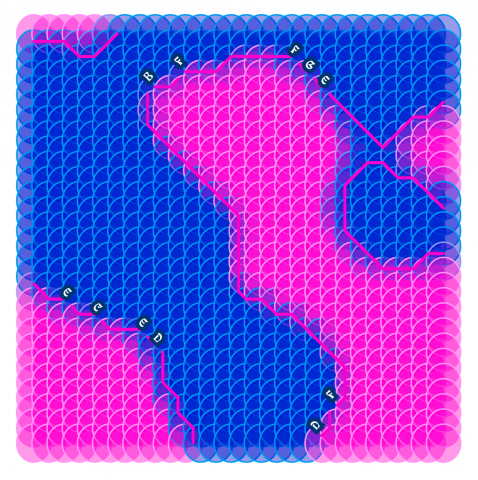
My imaginary place is how I currently perceive myself. It is dominated by contrasting colors, ambiguous shapes, and undefined labels. Around the blended vibrant colors, there exist rigid lines holding back the circles that are on the edge of merging with the unknown.

Technical Process

From the beginning, I wanted to experiment with cartography, especially with the placement of labels. Therefore I focused the majority of my time on generating arbitrary terrains and orienting letters around it.

For my terrain generation, I utilized the Marching Squares algorithm to generate arbitrary sections with weighted vectors.

Problem 1: Orienting Text on a line 

To orient the text, I took the dot product of the vectors and centered the text on the first vertex.

Problem 2: Collisions

The labels like the collide, and even when they are single-letters (used longer letters to demonstrate the problem). I approached the problem from two perspectives: controlling the number of labels on the map and detecting dark pixels on the screen. Both of the methods have their challenges such as hardcoding values and layering of visual elements. To be fair, I am not confident that they completely do not collide at all, and it would be an interesting problem to solve if I continue the project in the future.

CODE


miniverse-LookingOutwards1

“Expressions” – is a video created by the artist Kynd where the sound is from  “Collaged Improvisation In Digital VII” by the musician Yu Miyashita

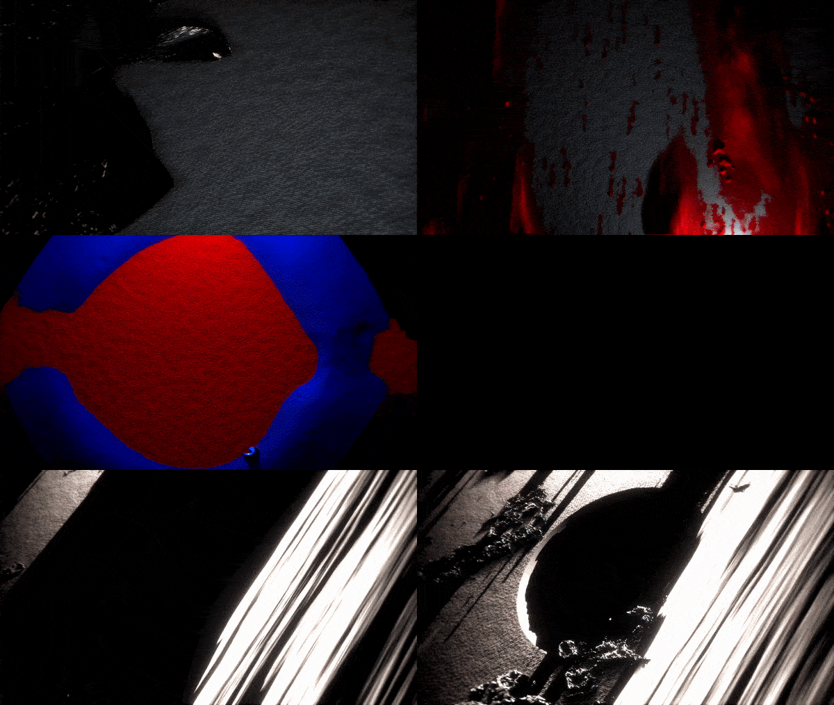
This video is a procedurally generated animation rendered in real time in response to the music piece by Yu Miyashita. The animation is 3d and was inspired in part from the thickness and texture of oil paints.

The creation process, for me, was more inspiring than the end result. To create convincing 3d graphics in real time with limited GPU, the artist made their own method of rendering. This method was specific to the piece and limited in scope. Perspective and lighting was fixed. The intuitive artistic understanding of how to create a convincing 3d shape (color, shading, details) combined with the computational background knowledge of efficient rendering birthed the generative algorithm behind the piece. It’s shocking they made a rendering method, which is very difficult and purely mathematical in the graphics field, using artistic knowledge.

(basic idea of the rendering used in the video)

This project would benefit from increased length. The animations produced are varied and exploring  a wider scope of what the algo could produce would be fulfilling for the viewer. I also think a few parts of the animation were sound wavey. This felt predictable and detracted from the abstractions in the rest of the video.

The artist, Kynd demonstrates the foundational expertise needed to create this work through their pages dedicated to teaching  physics in p5.js and the machine learning to artists.

OodBird – LookingOutwards01

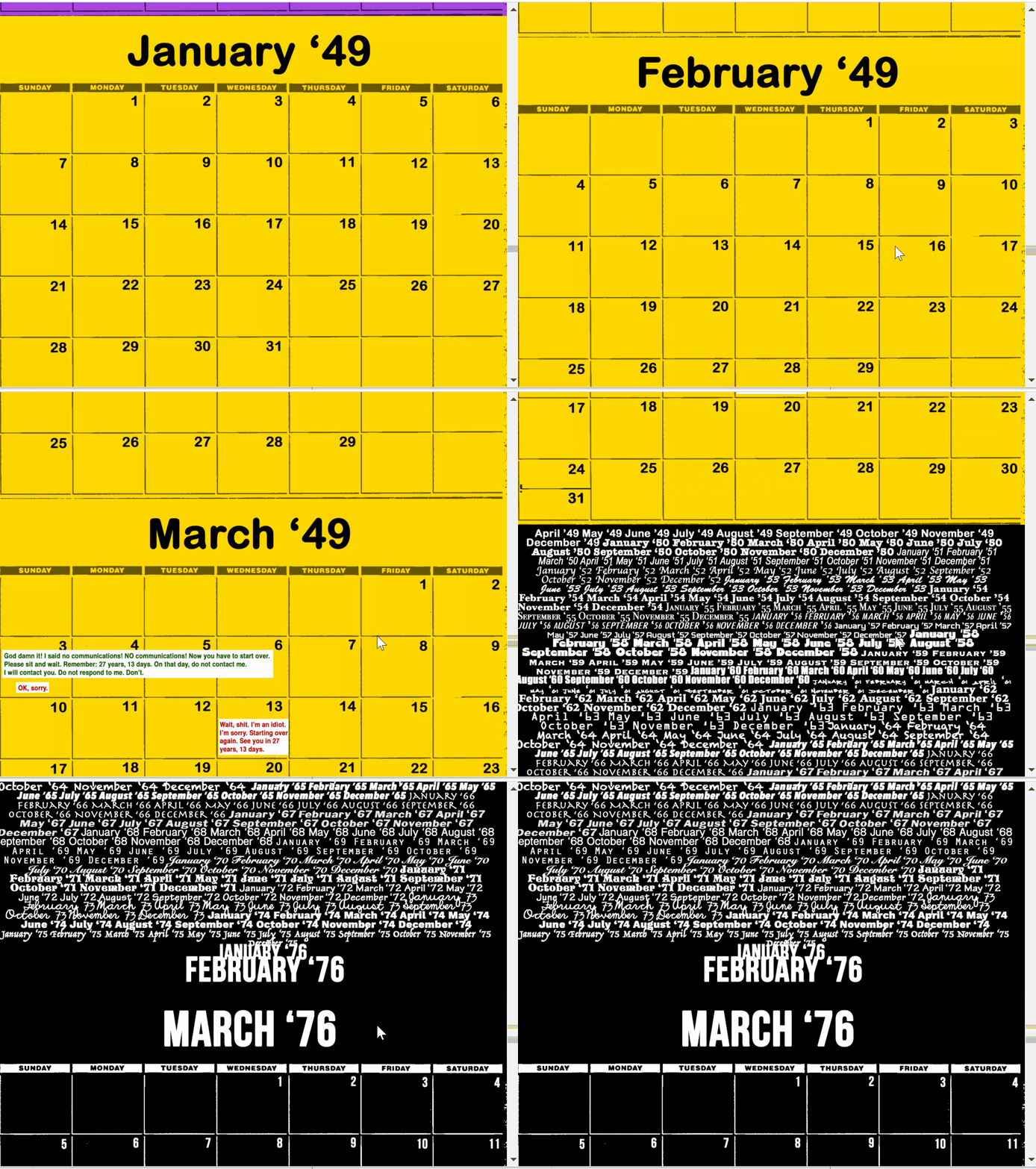
I absolutely love the interactive piece “What Will Football Look Like in The Future” by Jon Bois. It completely changed the way I think about interactive story telling and you can communicate ideas with your audience. The story itself is too long and complicated for me to explain entirely, but its basically a discussion of future earth by a bunch of sentient space probes. One of my favorite parts of this piece in right at the beginning, where the viewers frame of reference for time is completely changed by the Bois, who presents the passage of decades through seemingly never ending completely blank calendar that the viewer has to scroll through in order for the story to progress. 

To the best of my knowledge I think this piece was made by the author on their own, though the work is hosted on sbnnation.com. Jon Bois is a sports writer and video producer, but has made seemingly no other work that is comparable to this one in term of medium.

OodBird-Reading01

Cate Kompton describes a problem surrounding the uniqueness of generative works and how uniqueness can be seen  by an audience. A computer does not understand what we think makes something unique as from an algorithmic point of view, everything it makes is unique (she uses the example of 10,00 bowls of oatmeal that are all the same to a viewer but algorithmically different and unique to the computer). She explains that there are two main to resolve this issue, or at least help alleviate the problems it might cause. The first way is by use of perceptual differentiation, where we notice the uniqueness of something simply because it is imposed us as viewers and is large enough that it can not be ignored (like a forest). The other method is known as perceptual uniqueness, where someone will notice something not because it is imposing but because it looks slightly different than everything but not in a remarkable or alarming way. By giving your work strong personality and original features you can help prevent this problem.