Something that struck me in the Lostritto reading was that there were several factors that differentiated and constrained the definition of a drawing and that there were many that I didn’t completely agree with. For one, I considered the undo button as the digital perfection of the eraser on traditional pieces, but here he refers to them as completely different functions. The “A computer cannot draw” section also states that a drawing must be intended by the creator’s mind to be a drawing in order for it to be a drawing. More generally, this list leads me to believe that there can be art pieces that exist on separate incremental levels; for example, if a piece cannot be edited, was drawn with the intent of it being a drawing, and final, would that be closer to the sphere of drawing than one that also could not be edited, but was drawn without the intent of being a drawing, and final? Or, is everything that does not satisfy all the requirements on the same plane?
Author: spingbing
spingbing-LineExercises
Part A:

Part B:[videopack id=”686″]https://courses.ideate.cmu.edu/60-428/f2021/wp-content/uploads/2021/09/livingLineVid.mov[/videopack]
Part F: To create lines with varying thicknesses with the same size nib, I ended up drawing various amounts of lines various distances apart from each other depending on the intended thickness. The thin line on the left has no space between each line, while the thick line on the right has percievable space between the lines.
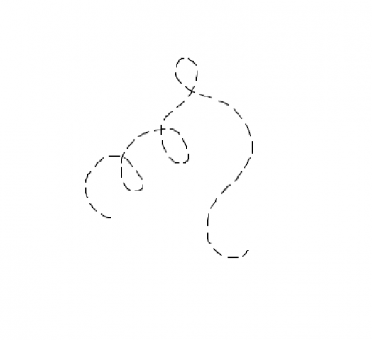
Part G: With a major amount of help from Golan, this offset curve was accomplished by calculating parallel points from the original line and connecting them to form a parallel line. The resulting offset line is spiky because of the sharp turn problem.
Part H: I used the same logic as I did in part F to create the illusion of a thicker line. It is definitely not flawless and is very noticeably adding extra lines for attempted thickness, but in a bare minimum way, I believe it satisfies the prompt.
spingbing-PlotterSkimming
Having little exposure to plotters, I find myself constantly surprised with every new thing I learn; so while this may seem trivial, I was surprised by the diversity in the art outputted by Licia He during her multiple 100-day drawing challenges. It was interesting to see the differences in style when she leaned more into using clean, precise lines vs more organic and natural-looking lines. This is inspiring for me because the more geometrical plotter drawings to me sometimes seem devoid of personality, so seeing the more chaotic drawings was intriguing.
spingbing-PlotterTwitter
With having very limited exposure to plotters, I was not sure what to expect to see while browsing #PlotterTwitter. However, I was still very surprised at the variety of kinds of pieces people were making, with as many abstract pieces as there were realistic as well as the different shapes, lengths, and weights of the strokes used. I also liked to see that people were taking what their plotters made and adding their own traditional work on top (or plotting on top of their work) because it reminded me of the topic of authorship of the works. One piece that I liked in particular was the piece below by Sean Puckett (@PhotoPuck on Twitter) because of how smooth the lines were. It was very easy to let my eyes naturally follow each curve, and each curve led to an eye-like shape that along with the curves made the piece feel very organic and alive. The organicness of the piece contrasted with the fact that it was created by a machine was also very intriguing.
More eyes? Rollerball on A4. #plottertwitter #PatreonArtist pic.twitter.com/Vw5ETGiUB9
— art for sale (@PhotoPuck) August 28, 2021
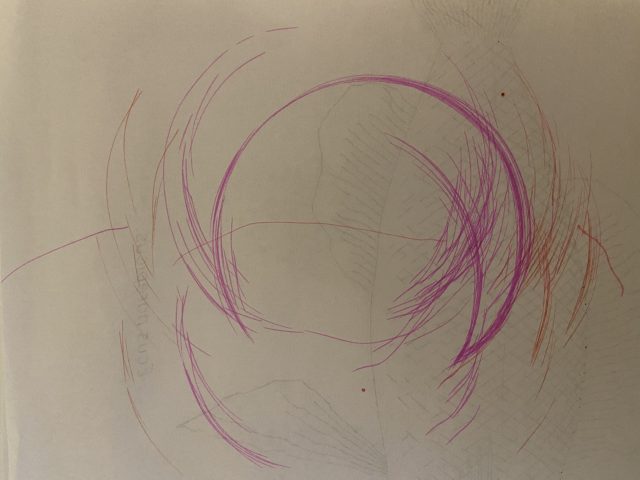
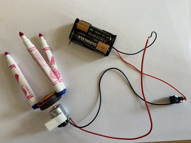
spingbing – Drawing Machine

 [videopack id=”148″]https://courses.ideate.cmu.edu/60-428/f2021/wp-content/uploads/2021/09/IMG_4550.mov[/videopack]