lemonbear—FieldComposition

SVGs:

Photographs:

Reflection:

My offering for this prompt wasn’t especially adventurous, but from Golan’s suggestions in class the other day, I learned a bit more about Perlin Noise and the various parameters I could tune to get the piece to come across as a field when plotted. I also experimented a little bit with color and hacking my way into multicolor by taping multiple pens together; I think this method could be more impactful if I devised a less shoddy way to do it (more consistent pressure, more control over distance between pens) and had an actual svg that produced some kind of optical illusion when plotted with multiple pens at once.

marimonda – FieldComposition

Hi.

So, I have been asking myself a lot of questions regarding the type of art I want to make with plotters. For one, I think that it’s been interesting how plotter interactions with manual drawing so far in this class have been limited to very little interaction with the actual plot itself. Things like coloring or small details have often been physical additions to the plot rather than full-on compositional drawn shapes.

I’ll be honest, I’ve been missing drawing a lot. So far, I feel like I haven’t had a genuine material connection with the work I am making and I often feel like I have to choose between drawing and computation, that is a feeling that I hate. So I wanted to explore the abstraction that exists in between the computationally generated pattern and how I, as an artist, interpret the hidden image within it and draw upon its attributes.

To get on to the technical background of the piece: I used reaction-diffusion and noise and randomness to make this piece. I think the most interesting things that came from this were the incremental elements of the reaction-diffusion and the use of randomness to make the shape fuzzy.

Continue reading “marimonda – FieldComposition”

sweetcorn – FieldComposition

Party Planning Floor-mat

I’m a fan of parties in an abstract sense of the word party: any sort of community event. For this project, I was inspired by Nick’s kissing tiles in the sense of treating the objects of these algorithms personally and personifying the interactions between them. Distributions of people across a space shouts nothing other than a lovely party.

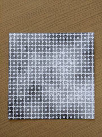
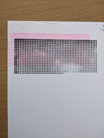
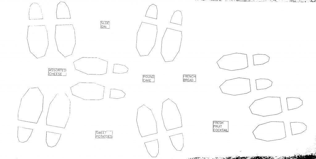
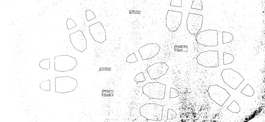
At each point whose location was determined by poisson disc sampling (an implementation stolen from here), I placed a pair of shoes. Their curves are a vertically-stretched version of a parametric cranioid curve that Golan sent me to use for my generative people’s heads. A rectangular slice is taken out near the convexity to look more like a shoe-print. Given this set of points, I obtained a voronoi diagram with SciPy and placed a special party object at each node that fell within the party space, but not too close to any other party object. I oriented each pair of shoes to face their nearest party object. These party objects could be any sort of thing: televisions, tables, chairs, but many if not most parties are centered around food, so I placed a marker for unique food at each party object location. The names of these foods were taken from dariusk’s corpora project, which has a list of “the top 1000 most appearing menu items from the 1850s to today from the New York Public Library’s ‘What’s on the menu?’ project.” I rendered a random choice from this list in the Hershey font library I’ve been using.

Here are a few generated .svg’s:

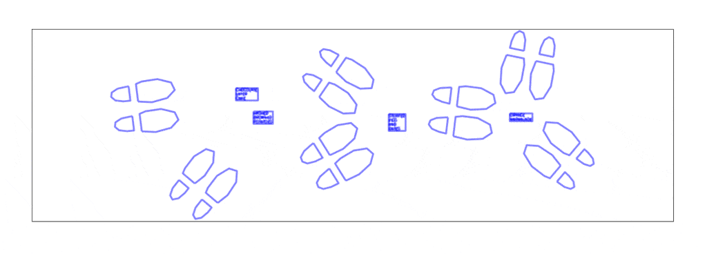
and a couple plotted on the USCutter MH871-MK2 (the feet are full-size, the paper is ~30 in. x 75 in.):