![[OLD – FALL 2016] 15-104 • COMPUTING for CREATIVE PRACTICE](https://courses.ideate.cmu.edu/15-104/f2016/wp-content/uploads/2020/08/stop-banner.png)
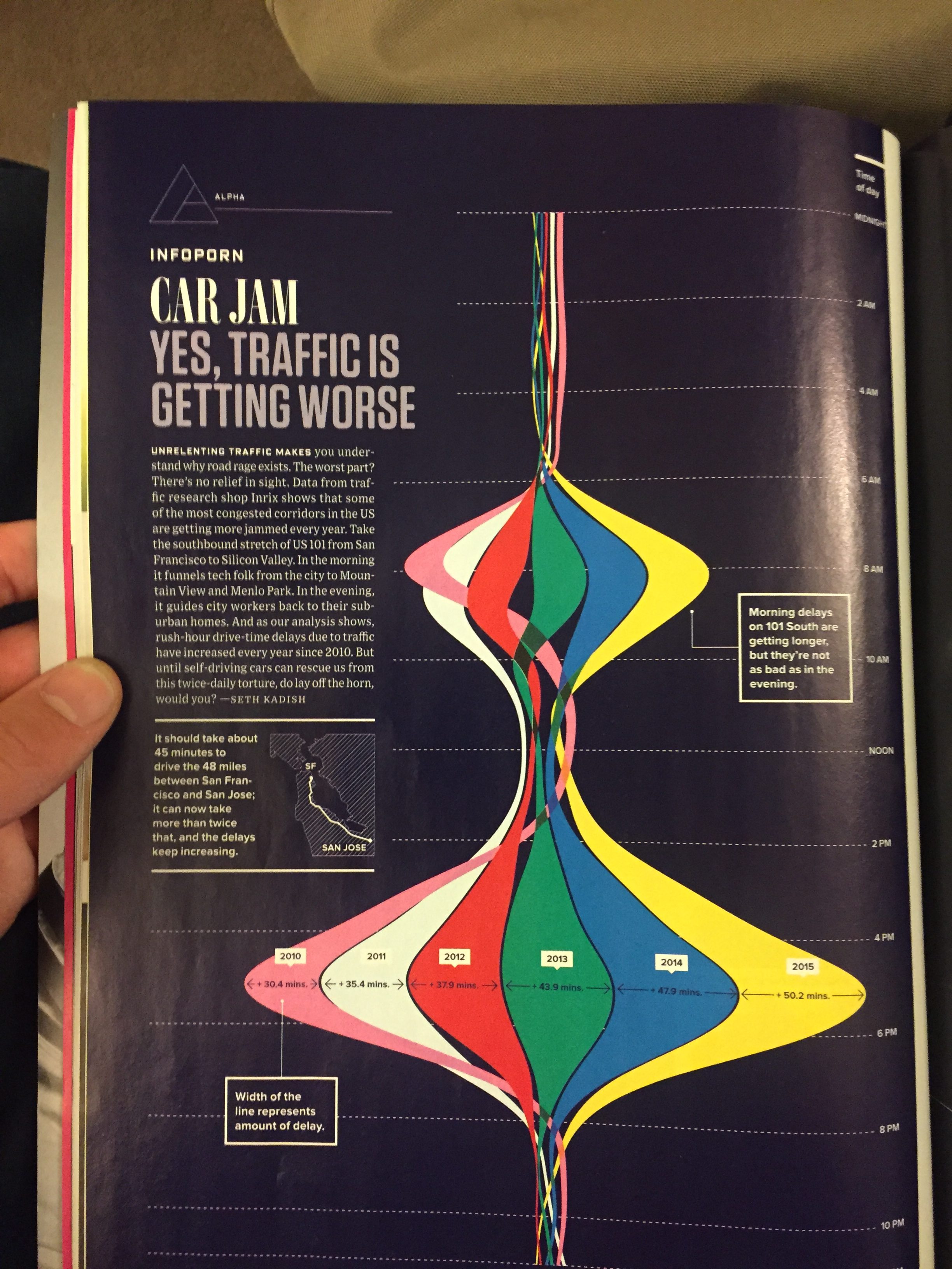
I found this infographic in Wired Magazine while I was in a waiting room at health services. Unfortunately this picture was the only documentation I was able to capture as I was unable to access the article later online. But this article by Seth Kadish, a data scientist at Chegg, discusses increasing traffic in the Bay Area, particularly along 101, the highway connecting San Francisco to San Jose.
I was originally drawn to this infographic since I’ve been a resident of the Bay Area my whole life, and live in Menlo Park, just about in the middle of 101. Needless to say that I have much first hand experience with the ridiculousness that is rush hour traffic in Silicon Valley.
I really like how dynamic this infographic is using the amount of color to show increasing idle traffic time over the years. It is certainly an unexpected representation of time. Although I admire how different this piece is, I did find it difficult at first to understand its representation. Its unusual depiction presents both things I like and don’t like.
I was unable to find how this information was collected. Furthermore, I wish there was more information on the impact of this increased traffic. So commutes are getting longer; so what? I think a few more statistics on how this traffic has impacted people or businesses would have made the article stronger. Maybe how much accumulated time per year does a person waste? or how much money do employees or companies waste from people losing time in traffic?