![[OLD – FALL 2016] 15-104 • COMPUTING for CREATIVE PRACTICE](https://courses.ideate.cmu.edu/15-104/f2016/wp-content/uploads/2020/08/stop-banner.png)
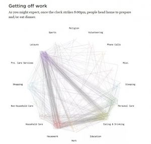
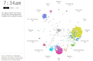
I chose two projects that make data accessible to the non-technical minded. One, the most interesting, is Nathan Yau’s ‘A day in the life of Americans‘. In it, he uses dots to simulate how each of 1000 Americans occupy themselves within a 24 hour period. The source data is based on 2014 American Time Use Survey, made accessible by ATUS Extract Builder. The project represents each person as a dot whose color is determined by the activity of the moment. Dots of the same color congregate to the same spot on a circular clock-like canvas with activities located around it. Each activity records the percentage of dots at the location. The dots are in constant motion; they become frantic in rush hour then settle into work or sleep depending on the time of day.
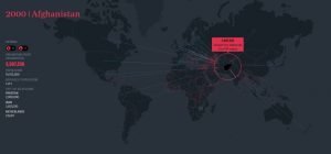
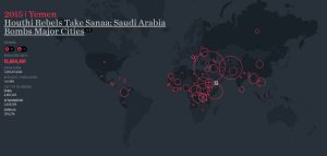
The second one is Ekene Ijeoma’s ‘The Refuge Project‘. It is an animated world map that shows the country of origin of refuges for each year from 1975 – 2015. At the earliest, the project was done in 2015. The circular illustrations are scaled to represent the number of refugees. At a glance, one is able to tell where the largest number of refugees came from for a given year. When the mouse is positioned at the circle of origin, the destinations of the refugees are shown by arrows and numbers. A side screen narrates key events contributing to the largest refugee numbers for each year.
I admire the two projects because they turn numbers into intriguing representations that are easily apprehended. One of the challenges of our times is how to make meaningful use of the enormous quantities of data that is available. Making the data easily apprehended is an important step in analyzing and using the data.
As to the algorithms, Nathan’s work suggests that each circle is an object that stores properties and functions which change its color and drive its movement across the screen. Even though Ekene’s work is static for each year, it also probably relies on an array of objects with properties and functions. The map at the back is also interactive because it is linked to the circles.
For my project, I wish to make a platform that graphically presents a location’s climate data – one unlike the common weather apps. The two projects inspired this idea which I also hope to use in later work.