Rebecca Enright-Looking Outwards-1

The Buddhabrot Technique was developed by Melinda Green and Lori Gardi, who named it such because of the image’s resemblance to Buddha.

Rendering from Metablake

This technique derives from the Mandelbrot, and, as creator Melinda Green stated, it is basically “a different way of representing the Mandelbrot set.” What she did was take the points used in the Mandelbrot set and randomize them to get this complex image. It took quite a long time to complete, as the “third eye,” (the particularly bright circle centered at the top of the “head”), alone took an entire “long weekend,” which is presumably three days, to complete. That being said, the significance is that certain parts of this, such as the “third eye,” could not even be seen in the Mandelbrot set, so ultimately this creation has opened up a new way to look at the old information.

This creation is truly magnificent and beautiful, and this Youtube video also highlights the “mini-Mandelbrot” components that surround the bigger and more in-depth Buddhabrot.

Works Cited

Bourke, Paul. The Buddhabrot. paulbourke.net. November 2000. 1 September 2016. <paulbourke.net/fractals/buddhabrot/>.

Computational Art. Metablake. 2014. 1 September 2016. <metablake.com/b/Computational_Art.html>.

Green, Melinda. The Buddhabrot Technique. Superluminal.com 1 September 2016. <superliminal.com/fractals/bbrot/bbrot.html>. 

Diana Connolly – Looking Outwards – 1

maxresdefault

Temperamental Stairs @ The Children's Museum of Pittsburgh from Agnes Bolt on Vimeo.

Temperamental Stairs is an interactive art piece at the Children’s Museum here in Pittsburgh, PA. The staircase that takes patrons from the first floor to the second floor of the museum emits recordings of people’s voices (mostly children’s) when patrons step on each of the steps on the staircase. Different recordings play per step, and the recordings have been taken from different interactions in the museum itself. The artists created this art piece using “Sensor pad system, VCT, speakers, Midi controller, computer, and 330 audio clips”

This project inspires me because I love interactive art that anyone can approach. When I’ve visited the museum, very young children up through their older grandparents all enjoy this piece. It grants the staircase a fun element that it would not have had before. I think that the creators accomplished a playful aspect in the stairs, but I would have liked to have had a bit more of a story involved in the progression of the stairs. In addition, although this piece is fun and playful, some people find the tone of the voices a bit creepy sometimes. Perhaps a bit more selectivity in choosing the audio clips would benefit this project. I wasn’t able to find the artist’s exact thought process or inspiration for this project, but this piece does relate to the idea of interactive staircases in general. For example, an interactive staircase mimicking a piano was installed in a train station in Stockholm, Sweden in 2009 to encourage people to take the stairs over the escalator (below).

piano-stairs-stockholm-sweden

Looking Outwards-01: Legend of Zelda: Skyward Sword

Nintendo’s Legend of Zelda: Skyward Sword, for the Wii U, is a video game that I find especially inspiring. It includes majestic landscapes, floating castles, monstrous bosses, creepy monsters, adorable creatures, giant flying birds, sword fights, gorgeous temples and castles, and an incredible story.  Nine people led the design of the game, organizing themselves into teams of writers, composers, designers, producers, and a director (Hidemaro Fujibayashi). The entirety of the game’s development process took five years. The main drive behind creating Skyward Sword was the creators’ feeling that they had not fully fleshed out the world of Legend of Zelda: Twilight Princess, and the need to create a Zelda game that was as well received and cherished as Ocarina of Time. Skyward Sword makes up for the flaws of Twilight Princess, and recreates the intrigue and beauty of Ocarina of Time. The creators of Legend of Zelda could work with virtual reality in the future and have the players fully immerse themselves into the beautiful worlds and landscapes and characters. They are currently in the process of developing a Zelda game for the PlayStation 4. Skyward Sword inspired me to pursue a minor in Game Design, because it showed me the incredible results (an entirely new universe full of crazy fantasy places and characters!) of incredible imagination.

SadieJohnson- Looking Outwards 01

Mass_Effect_3_Game_Cover

I most admire the action RPG game Mass Effect, a video game developed by Bioware and published by EA games. I admire it because it was the first game I played that showcased the artistic side of video games, such as character design, writing, and musical composition. Mass Effect inspired me to follow my love of game design, and enter a field I  had once deemed “too technical”. Because it is a triple-A game, there were about 300 developers working on it and it took two years to complete. Like many big-budget video games, it was made on an engine- in this case, Unreal Engine 3. Dungeons and Dragons influenced the interactive storytelling, while Star Wars helped inspire the writing and sci-fi artists like Syd Mead.  This project points to a future of more refined storytelling in video games, better graphics and heavier investment in story and art.

Janet Lee- Looking Outwards-01

As I was living in Korea, I came across this artist called Nam June Paik. His artwork and his philosophy “touch my art like it’s your toy” caught my attention. He is well known for his video/media art. Out of his whole projects, I liked “Tv Garden” which was produced by about thirty televisions lying by tropical leaves. It was interesting to me that he combined television and nature without a definite meaning to it. I do feel like this project would have been more effective if the tv screens included a lot more scenes of nature. Though, I also feel like he intentionally excluded a lot of nature scenes to make people question about his work. Paik once wrote that he wanted “to shape the tv screen as precisely as Leonardo and as freely as Picasso”. His purpose of his work was to not conform his work in a traditional way but to freely express himself.

11-TVGarden

https://www.arts.gov/photos/nam-june-paik-artist-who-invented-video-art

http://www.medienkunstnetz.de/works/tv-garden/images/2/

http://www.variablemedia.net/f/introduction/case_paik_tvgar.html

JihoonPark-LookingOutwards-01

http://

I encountered one of these grotesque videos by Albert Omoss upon scrolling through an Instagram art page, with eyes half open from the sleep only waiting for the right moment to kick in after midnight. The series of gif’s with melting down human figures came to me as an unexpected disturbance.

Famous for renders of disfiguring people, Omoss seeks to challenge the modern day achievements by often showing how indefensible we are in nature, and thus connecting concepts of technology and humanity to find mutual relationship between the two.

Though many of his videos are abhorrent at first sight, the messages and the interpretation found underneath the skin is what makes people as well as myself keep looking for more.

The cynical mood Omoss conveys in unraveling in his works stimulates viewers to doubt the use of all the secular problems and come back to the existentialist reality. Like shown in his work “Entangle,” the two lovers embracing each other and finally reaching for the heart reminds us all that in the bottom line, love is is the desire to be close to each other, and nothing else.

Omoss continues to reveal the very basic values of human existence. Wealth, Fame, Status, etc. None of them means anything when we are stripped down to our bare skins. Nothing, but only humans, letting us care about what really matters-love, friends, thought.

SiminLi-LookingOutwards-01

snout_1  
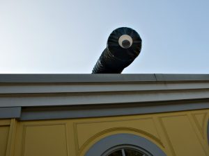
The Snout is a robotic arm with a googly eye on top that reacts to human movement by doing what seems like a double take. This project was done by Golan Levin, Lawrence Hayhurst, Steven Benders and Fannie White in 2008. It took 5 months and dealt with difficult problems like getting the 600-kilo robot on the roof for display. The software for this robot was developed in 3 weeks using toolkits such as openFrameworks. Professor Levin explains that thisproject was inspired by a performance by Mummenschanz when he was 6 years old. The performers were dressed in worm like tubes that look similar to The Snout. What is interesting about this interactive project is that it causes the illusion that it is confused. It is difficult making an animated character seem confused in a normal setting, not to mention doing what professor Levin calls “real-time animation” with a huge robot. This project addresses only one emotion. In future projects, robots should be able to display other emotions like joy, anger, sadness and fear etc. This may be a difficult task, requiring artists, computer scientists and Psychologist to work together, but something like The Snout project had been done almost 50 years ago. In 1970, Edward Ihnatowicz made a robot called “Senster” that turned to you when you clapped. It was a simple reaction but it shed light on what we are able to do with the technology we have today.

See 38:15 — 42:51 for details.

http://www.flong.com/projects/snout/

Many thanks to Professor Golan Levin.

GraceCha-LookingOutwards-1

Random Chance – #commonflag2016


This summer, I stumbled upon a twitter hashtag called the #commonflag2016 that was an open commission by The Design Office to create a cool moving animation of a universal animated flag that could symbolically unify and represent America for flag day.  It’s a fun little doodle with a pretty interesting story behind it.


‘Random Chance’ was one of my favorites among the submissions because of its crazy American Flag animation, which flashes different color stars, background colors, and disappearing/appearing stripes. The sound-less nature makes it  Other submissions included using a mixture of placing the stars and stripes in different locations. After using the ‘random’ function in class today, this reminded me of the random changing positions of the colors, but using colors and different thickness of lines.

On this particular submission, for another iteration, I think it would be nice if the colors weren’t flashing too fast (although I think one of its charms is the quick flashing quality).  Also, the stars and stripes were in a predestined area of the screen, but it would be interesting to see how different it would look if the stars spilled out over the stripes or vice versa.


Some Other Examples of #commonflag2016 

Screen Shot 2016-09-01 at 1.42.10 PMScreen Shot 2016-09-01 at 1.42.39 PM

Some other examples utilize the creative more abstract ways of displaying their examples showing “Blurred lines, blurred identities, different shapes, overlap & unification”.


https://twitter.com/hashtag/commonflag2016?src=hash

http://thedesignoffice.org/project/the-common-flag


KyleLee-LookingOutwards-1

http://www.commarts.com/column/reformulating-ux-norms

This article, written by Brian Burke, discusses the role of UX agencies to transform norms of business, education, social interaction, and large societal transitions. The CEO of Smashing Ideas, a UX agency, Burke discusses changing trends to onboard digital, the affect of big data, as well as the balance of art and science. One of their projects includes aiding Penguin Random House Publishing’s digital transformation to deeply broaden and diversify audiences.

For me, my greatest fear as a designer is that people see my role as shallow; all I do is make things simple and look “pretty.” The most admirable points in this article was the discussion of using design to lead some of these big trends towards a more cohesive future. In particular, the aiding of design to effect education and development of children significantly resonated with me.

One critique I have is on the results of some of Smashing Ideas projects. Given their success and reputation I am not too critical, but I would have liked to see some hard evidence on the fruits of their design work, namely how their aiding of Penguin Random House Publishing has actually changed peoples lives.

UX is huge now. Nearly every tech company and start up is in need of a UX/UI role. A lot of the time, UX can be coupled with Engineer. At Google, these UX Engineers are obviously prominent and have less of a presence in the vastness of Google. I like how even in the design of the company’s small 70 person employee roster seems to focus on the experience of their workers. In a more intimate workspace, there is greater opportunity to acknowledge and appreciate the work itself.

karen-LookingOutwards-1

A New American Picture by Doug Rickard is a project in which he aimed to bridge the gap between art and technology. More specifically, he utilized Google street view images as inspiration, taking images from Google Maps and then digitally manipulating them to create his final project. Ultimately, Rickard was seeking to make social commentary on the state of social classes in America. In his series of photographs, he chose specific locations across America that were “abandoned,” areas with high unemployment rates or low amounts of any type of opportunities. In order to create these manipulated photographs, Rickard first carefully examined the images from Google Maps, composed images on his personal screen, then photographed again.

The algorithms and “code” that already exists within Google Street View already composed most of the photograph, but he manipulated the images further in order to match his vision, purposefully making images low resolution or containing blur. He employed many artistic concepts when manipulating the images existing on the internet, from the resolution of the image, darkness, shadows, etc. Rickard aimed to give his photographs a sense of anonymity at the end, as the subjects in the photos that he selects are often isolated or in desolate locations, trying to develop this idea that the social structure in America is becoming increasingly separated and stratified.

Although this project did not require extensive creation of a custom software or script, or a high level of “technique,” this project sticks out to me because the way Rickard effectively utilized Google Maps, a source that is not usually considered artistic, in order to create his final product.

http://www.dougrickard.com/a-new-american-picture/