![[OLD FALL 2019] 15-104 • Introduction to Computing for Creative Practice](../../../../wp-content/uploads/2020/08/stop-banner.png)
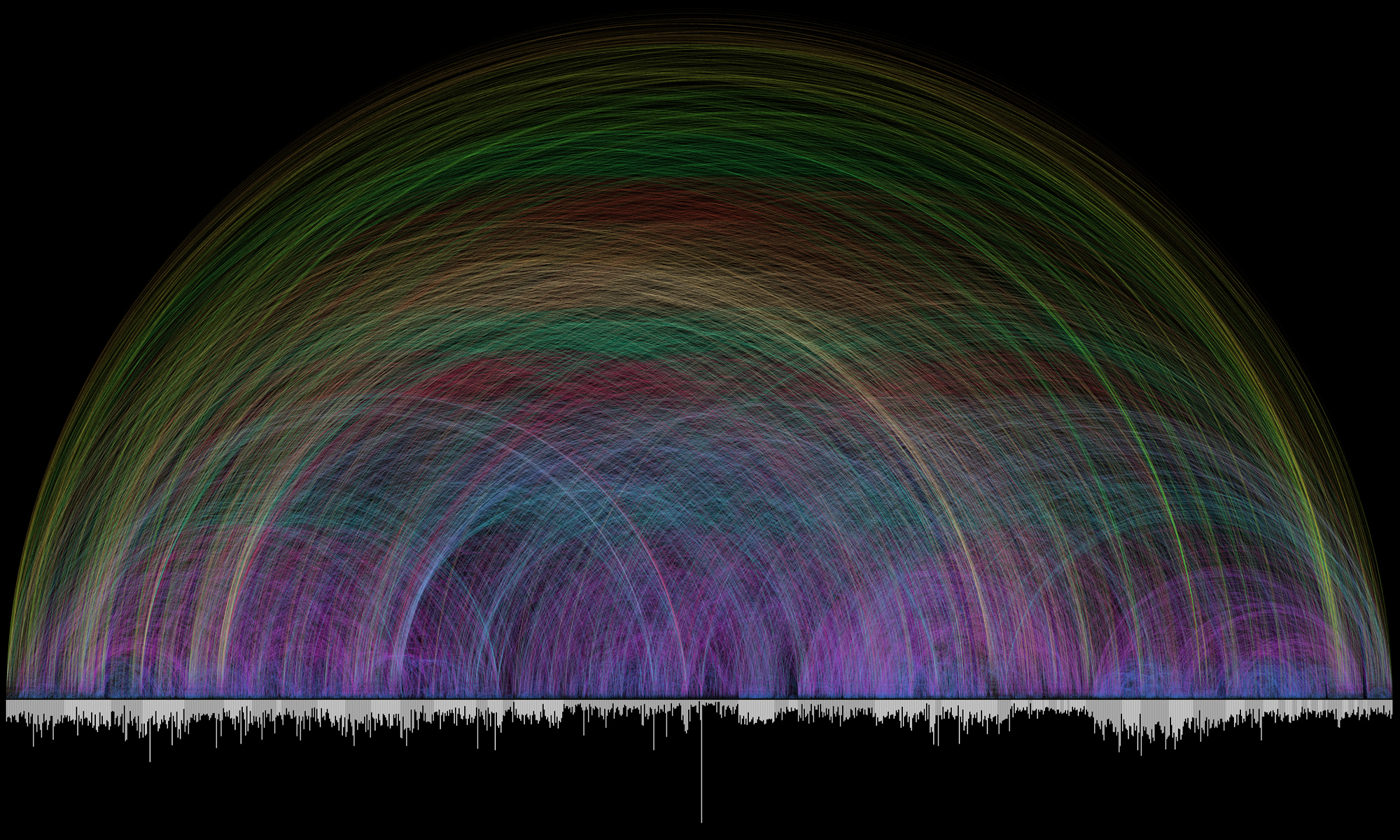
Studio NAND’s Emoto (2012)
I was deeply inspired by Studio NAND’s Emoto, a data visualization for the 2012 London Olympics. This KANTAR-Information is Beautiful Awards winner collected responses to the Olympics through Twitter. The collected data was then used to determine the collective sentiment on individual topics, such as events, players, and teams. Unfortunately, the studio’s website does not specify which algorithm the team used to organize the data. I think it is really interesting that the studio decided to generate visuals using Twitter, and I am curious if they ever looked into other social media, such as Facebook or Instagram, for responses.
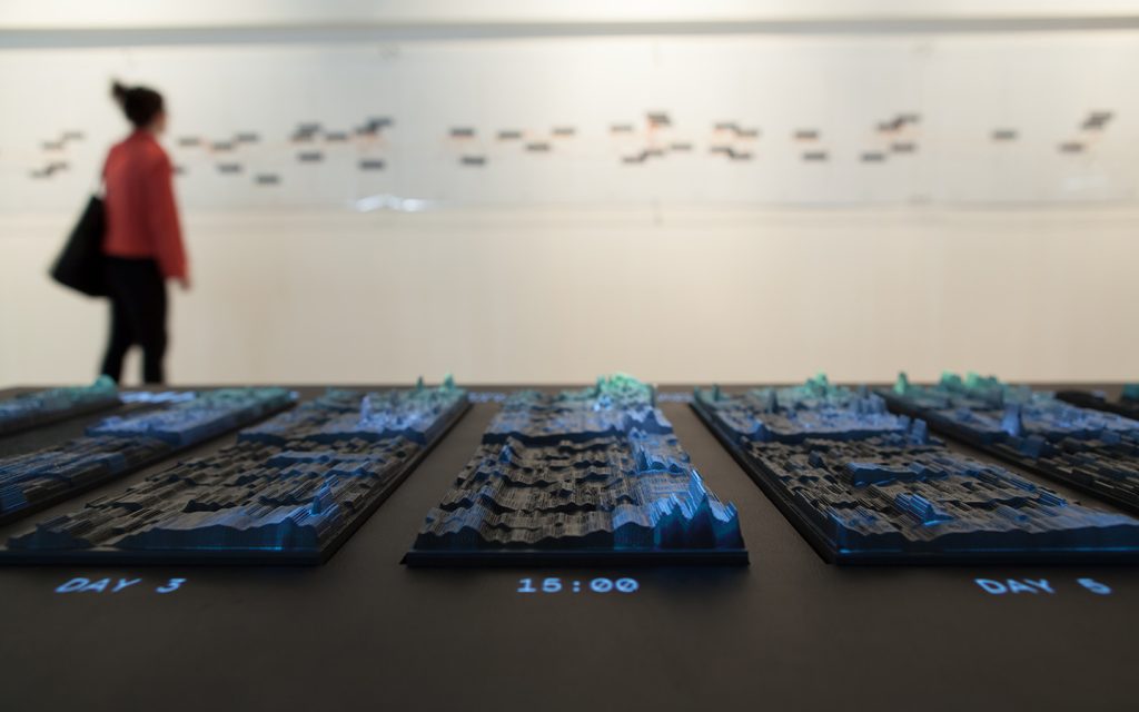
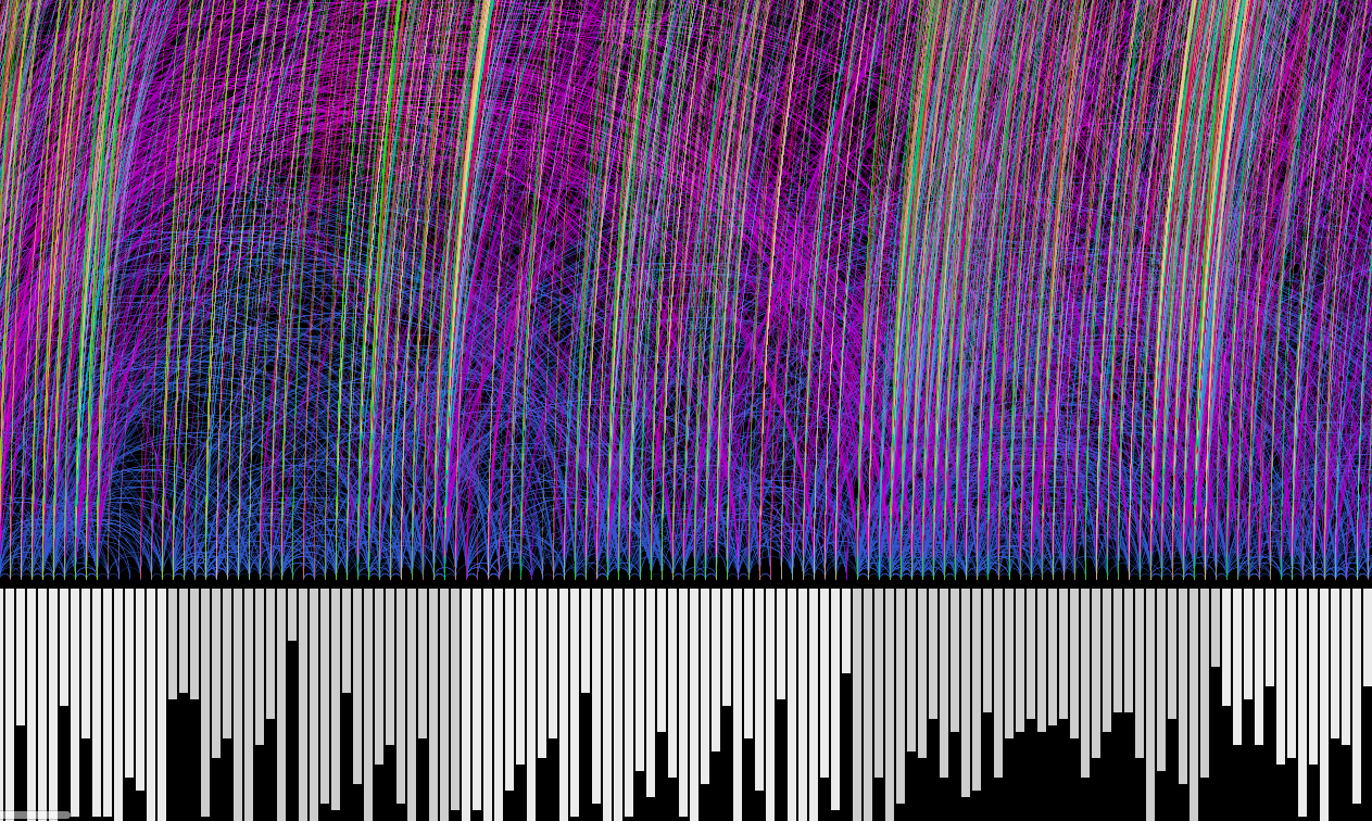
Emoto: Physical Installation 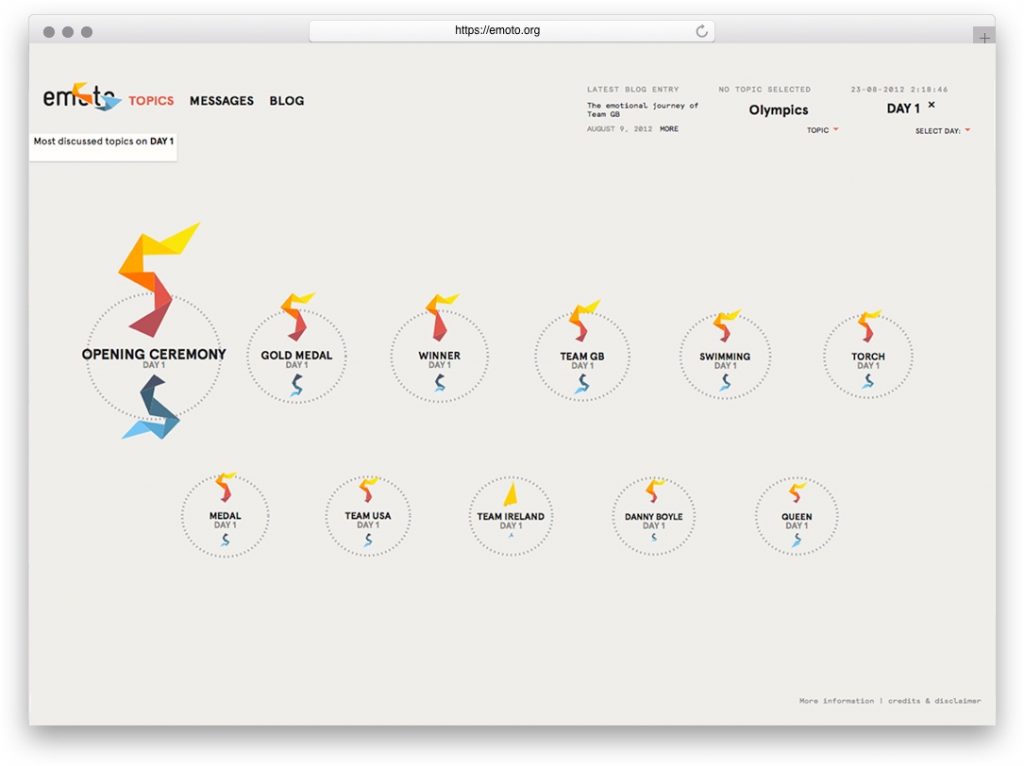
Emoto: Website
The studio also created a physical installation of the data that represents all responses over time with overplayed information from posted Tweets. I am, again, curious to know if the team had drafts of their installation before creating the data. The way they have represented the data is very particular, and I would like to know their thought process before designing it.