Caroline Song-Looking Outwards-07

Created by Nicholas Felton and Ryan Case in 2008, Daytum is a web application, as well as a phone app, developed to allow users to quickly capture any personal data and share that information with others. It communicates such information through custom chosen data visualizations, charts, as well as different colors to represent the user’s desired information.

Image result for daytum
A look into the Daytum app’s functions by Nicholas Felton and Ryan Case

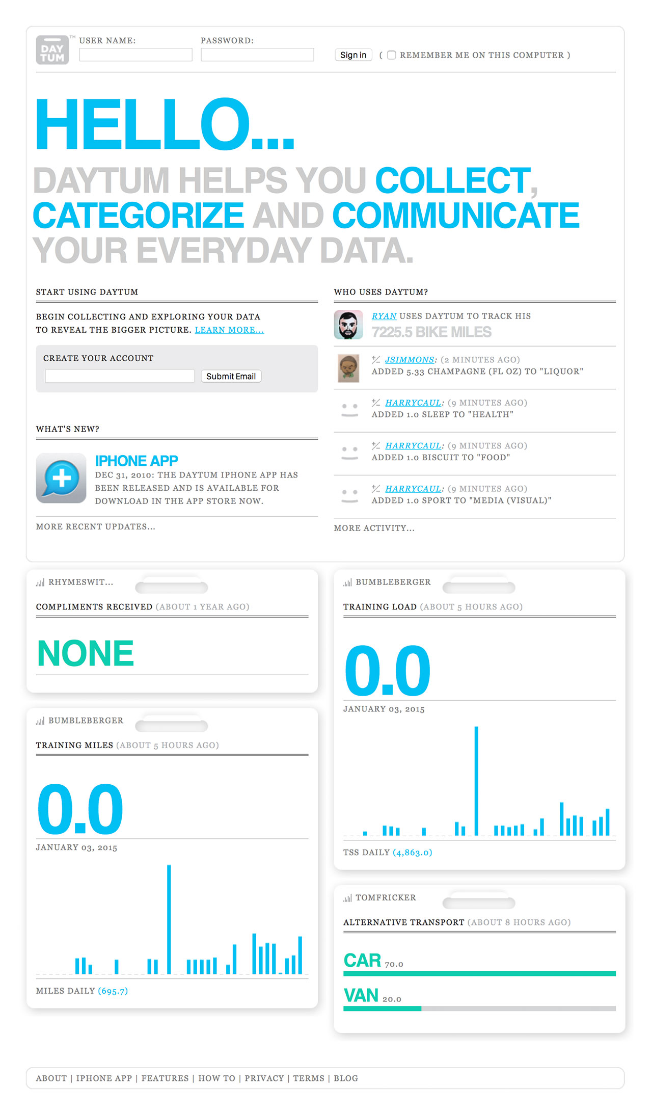
I’m intrigued by this app because of the functions. The purpose of it being to display absolutely any information the user wants is interesting. Furthermore, the way the information is displayed is also up to the user. I think I am intrigued by the app because it all depends on the user and therefore, the way people use it will vary from user to user. I find it interesting that even though the app will still look coherent overall, because the fonts and the style of the layout will probably stay the same, it is still personal/customizable for each person. It is interesting because Felton and Case seems to be playing with the idea of having his design be both coherent but distinguishable for each person.

Though I am not entirely sure of the algorithms that went into this work, I assume there were algorithms that changed the written information that the users put into the systems to a base format of visual information, and from there, the users decide what the visuals look like, which would change which algorithm the app was working with.

I see both Felton and Case’s artistic sensibilities come out through this app because both of them are passionate about the different ways written data can be visualized, and because this is the purpose of Daytum itself, the app existing even shows Felton and Case’s interest in this subject of design.

Ammar Hassonjee – Looking Outwards – 07

Video showing Aaron Koblin’s Flight Pattern visualization as a graphic animation.

The project above is called “Flight Patterns” by Aaron Koblin. It is a graphical visualization which uses a software to represent flight patterns and routes running across America through representational means of form variation and color. Koblin developed the project as part of a larger study called “Celestial Mechanics” in partnership with two other scientists at UCLA. According to Koblin’s website, the project leaders took FAA data of flight patterns and parsed it using an algorithm. The parsed data was then processed using another program and visually edited with software such as Maya and Adobe AfterEffects.

I like this projects interest in utilizing a data set like flight patterns and turning it into a very interesting and compelling visual graphic. I think the author’s original intent in creating the graphic was recognized as they wanted to study celestial data and represent it.

Static image of visualization.

Ellan Suder Looking Outwards 07

Chris Harrison’s “Word Associations Visualizing Google’s Bi-Gram Data” displays information from a dataset in a really cool and artistic way. The project gathers information from the web to make the graphics.

Here is what Harrison said about how the project processes data: Each of [the rays] represent a different tendency of use (ranging from 0 to 100% in 4% intervals). Words are sorted by decreasing frequency within each ray. I render as many words as can fit onto the canvas. There is a nice visual analogy at play – the “lean” of each ray represents the strength of the tendency towards one of the two terms. As in the word spectrum visualization, font size is based on a inverse power function (uniquely set for each visualization, so you can’t compare across pieces).

One of the visualizations — this one shows the word associations for ‘cold’ and ‘hot’

Words closest to one side are used more for that term (so we can see from the graphic that ‘turkey’ is closely associated with cold, and the ‘water’ is used almost evenly for both cold and hot). I enjoy looking at the graphic and seeing what words usually ‘belong’ together — I imagine something like this is used for predictive text search.

I would also like to see something like this for a different dataset, where instead of gathering word frequencies from the web, you present the terms to many people and ask them to say the first word that comes to their mind.

This was a continuation from his previous Word Spectrum project, which looks more like a typical word cloud. They use the same dataset, but I prefer this one to ‘Spectrum’ since it looks more readable. He has more infographic projects on his site –– I also thought his Wikipedia Top 50 Visualization was interesting to look at.

Julia Nishizaki – Looking Outwards – 07

This week, I chose to look at Stefanie Posavec’s art.park.data, a 32.5m long data visualization drawing in Queen Elizabeth Olympic Park, created from data collected by students participating in Space Studios’ “School’s (Not Quite) Out for Summer.” The students, who were from the nearby neighborhoods, and transitioning from elementary to middle school, explored the park with Raspberry Pis fitted with special sensor Hardware Attached on Top (HATs), in order to collect data like the latitude and longitude of their locations, the humidity and temperature, the sounds they heard, the types of plants around them, and even the emotions they felt in that place.

Stefanie Posavec’s art.park.data, at the East London Canvas in Queen Elizabeth Olympic Park
A section of Posavec’s art.park.data, a visualization of data collected by students in the park

I particularly admire this project, as the students were able to explore the park, make observations, write down notes, and afterwords, use arts and crafts materials to create their own personal visualizations of the data, making this experience more meaningful for the students, and centered solely around them and their perspectives. Although data visualization can sometimes seem impersonal or distant, through Posavec’s use of bright colors, graphic forms, and simple composition, she was able to create a friendly, interesting, and playful snapshot of the park through the eyes of the children who visit it.

Monica Chang – Looking Outwards – 07

LAUNCH IT by Shane Mielke

The beginning screen and visual options
Movement of the globe: Book locations

http://launchit.shanemielke.com/ (the website)

https://shop.shanemielke.com/ (the shop)

Shane Mielke is an award-winning creative director and designer who wrote this book called, LAUNCH IT- 300+ things I learned as a Designer, Developer and Creative Director. Along with publication, he created this website which illustrates all of the book locations that Mielke is aware of from sales data that was gathered from Amazon as well as his online shop(link provided above). Currently the website visualization shows book locations in 54 countries and 38 states in the USA.

Within this website, he provided different visual options for the viewers to interact with by incorporating different designs. For colors, he incorporated three different color options: base( dark blue and red), invert(red as the main color while a fluorescent blue indicates the location), and random(which utilizes different colors every time the user clicks the ‘random’ button). For visuals, he provided three options: bloom(constant lines), rocket(moving lines), and snake(moving lines with receding lines).

This website makes me feel like I traveled time into the future. There are very intricate details like the tiny, dust-like specs floating around the screen hidden within this beginning screen that just has me captivated with the whole concept although it is so simple: book locations. The idea could have easily ended up as a globe with marks on it, but Mielke was very clever with the idea of allowing the viewers to interact with the globe and even have a little fun with it by altering the visuals.

Taisei Manheim – Looking Outward – 07

The project I chose was PENNY, an artificial intelligence tool developed by Stamen and researchers at Carnegie Mellon University.  Penny is an AI that is built on machine learning using neural networks to understand what kind of infrastructure is found in low income versus high income housing and then guess the neighborhood income based on these patterns.  It was built on top of DigitalGlobe’s analytics platform called GBDX, which uses the world’s most advanced commercial imaging satellites to create high resolution imagery that developers could then use.  The AI was first given income data from the U.S. Census Bureau, which was then divided into smaller areas to match satellite images from GBDX. Then the Census based color map was overlaid on the satellite map.  Then the AI looked for patterns in the satellite imagery and how they correlate to the income map. Through this is started to notice patterns in NEw York City, such as lower income areas tending to have baseball diamonds, parking lots, and large similarly shaped buildings (such as housing projects), middle income areas having more single family homes and apartment buildings, and high income areas having more greener spaces, tall shiny buildings, and single family homes with lush backyards.  You could then change the neighborhoods by adding different types of infrastructure to see how the AI would predict the income of the area would change. I found this project interesting because I live in New York City and you could notice differences in low income areas and high income areas, but never seen the visuals of the neighborhood’s infrastructure converted into data to understand their income.

link to project

Satellite imagery using DigitalGlobe’s analysis program GBDX.
Income date from the US Census Bureau that was overlaid on the satellite image.

Ankitha Vasudev – Looking Outwards – 07

Flight Patterns is a time-lapse animation made by Aaron Koblin, a digital media artist and entrepreneur, in 2011. This project displays American air-traffic patterns and densities over a 24-hour time period, by following the routes of around 140,000 American planes crossing the United States. I found this project interesting because of the way it visualizes this information. The artist uses a variety of color and patterns to illustrate a wide range of data including aircraft type, no-fly zones, weather patterns and alteration to routes.

Flight Patterns, 2007

As the animation reveals iterations of flight patterns during the cycle, the viewer experiences a changing, phantom geography of the country with airline hubs appearing as bright points of diffusion within a complex web.This project employs data visualization and processing, an open-source computer programming environment. FAA (Federal Aviation Administration) data was all parsed and plotted using Processing. Koblin’s use of aggregate data to reflect on life and our systems is a reflection on the relationship between humans and technology.

The paths of air traffic over North America visualized in color and form
Another version of Flight Patterns visualizing planes in monochrome

Siwei Xie – Looking Outwards 07

Ben Fry, Sept. 2009, Watching the evolution of the “Origin of Species”

Ben Fry created a dynamic presentation of Darwin’s multiple editions of “On the Origin of Species.” In the changes are refinements and shifts in ideas, including increasing the weight of a statement, adding details, or even a change in the idea itself. The artist uses different colors to depicts 6 different editions, and show the changes in animations. 

I admire how accessible and clear the presentation is. Darwin scholars are of course familiar with the evolution of “On the Origin of Species.” Yet the animations allow more audiences to view the changes directly, both on a macro-level as it animates, or word-by-word as they examine pieces of the text more closely. The artist might use drawing and coding software such as p5.js to draw the dots, then animate the map.

Creator’s artistic sensibility manifests by harmonize the shapes and colors of the animation. The coordinates on the layouts are simple and clear, creating soothing changes in color when the animation progresses.

Original source here.

Emma NM-LO-07

Stamen Design — Mapping the World’s Friendships

Data visualization is really interesting and cool to me. I found Stamen Design that mapped the world’s friendships through data visualization. It uses Facebook friendships the new stories feature to map interconnectedness between countries. The countries are divised by how many Facebook friendship there are between the countries, and the total number of Facebook friendships in that country. I found it interesting because you can see a bit of history through this project. You can tell where a country has been (ie. US occupied some far island in the 1980s). I think it is also really great to see us connecting outside of our country. It is important to have diverse friendships to learn about different cultures and nuances. The algorithm must map number of friendships to size and also group countries that have friendships together in the same color. The creator’s artistic sensibilities come through by how he/she chose to represent the data, specifically, the colors chosen and the use of circles to represent areas.