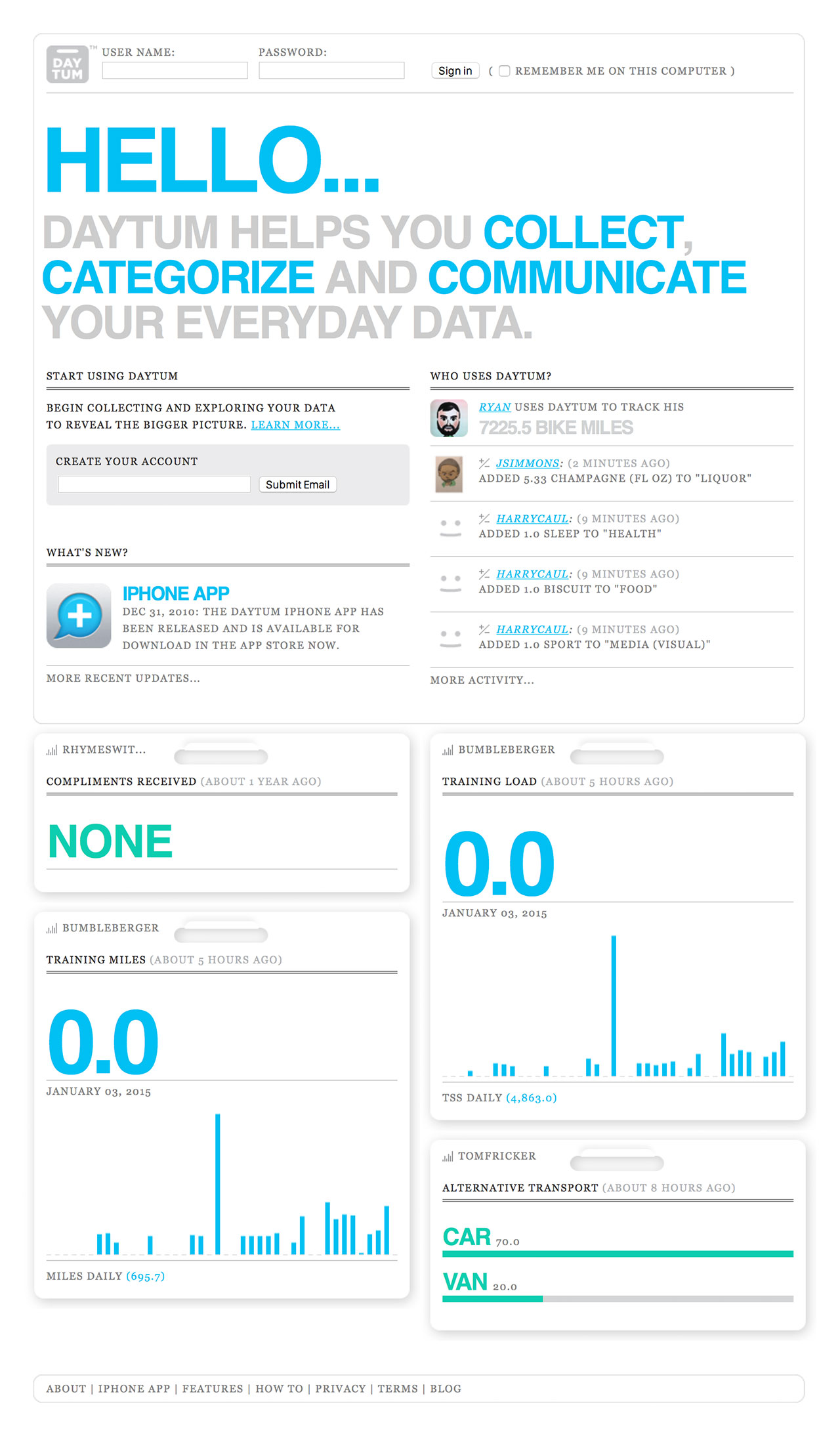
Created by Nicholas Felton and Ryan Case in 2008, Daytum is a web application, as well as a phone app, developed to allow users to quickly capture any personal data and share that information with others. It communicates such information through custom chosen data visualizations, charts, as well as different colors to represent the user’s desired information.

I’m intrigued by this app because of the functions. The purpose of it being to display absolutely any information the user wants is interesting. Furthermore, the way the information is displayed is also up to the user. I think I am intrigued by the app because it all depends on the user and therefore, the way people use it will vary from user to user. I find it interesting that even though the app will still look coherent overall, because the fonts and the style of the layout will probably stay the same, it is still personal/customizable for each person. It is interesting because Felton and Case seems to be playing with the idea of having his design be both coherent but distinguishable for each person.
Though I am not entirely sure of the algorithms that went into this work, I assume there were algorithms that changed the written information that the users put into the systems to a base format of visual information, and from there, the users decide what the visuals look like, which would change which algorithm the app was working with.
I see both Felton and Case’s artistic sensibilities come out through this app because both of them are passionate about the different ways written data can be visualized, and because this is the purpose of Daytum itself, the app existing even shows Felton and Case’s interest in this subject of design.
![[OLD FALL 2019] 15-104 • Introduction to Computing for Creative Practice](wp-content/uploads/2020/08/stop-banner.png)