![[OLD FALL 2020] 15-104 • Introduction to Computing for Creative Practice](https://courses.ideate.cmu.edu/15-104/f2020/wp-content/uploads/2021/09/stop-banner.png)
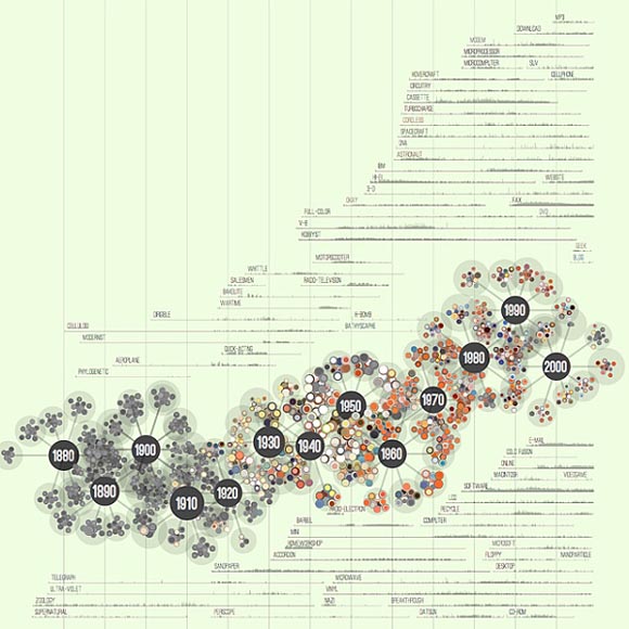
One piece of work that I admire is Jer Thorp’s “138 Years of Popular Science.” The data compiled is from Pop Science magazine’s past publications. The chart illustrates how different scientific terms have come into and out of popular usage over the years in scientific reports. As somewhat of an homage to the content, the data is visualized in a molecular chain format, with different atoms delineating distinct year clusters, further demarcated with different colors. Thorp developed a “simple, space-filling algorithm” that places the different molecules around the chain, and stacking them deliberately to create a neat flow. Further deepening the study is layered histograms in the background, showing the usage from different issues of specific terms. I like this work because it shows the artist’s personal design style with whimsical coloring and visualization, while also respecting the client for whom they are producing for with logic and thorough analysis. Every detail was clearly thought out. Furthermore, not only is it aesthetic but intellectually intriguing as it shows a progression and shift of technology and academic focus.
In a somewhat unrelated note, in the reddit app there is a subreddit that is interesting called r/dataisbeautiful which features data visualizations by anyone (ie regular people!) who chooses to submit a post. The content ranges from “Daily Polar Sea Ice Area with Monthly Ice Extent” to “The distribution of Minecraft Biomes in the overworld.”