![[OLD FALL 2020] 15-104 • Introduction to Computing for Creative Practice](../../wp-content/uploads/2021/09/stop-banner.png)
http://feltron.com/BikeCycle.html
I found Nicholas Felton’s data representation very intriguing. The BikeCycle project gathers cyclists’ data over a year and represents them on screens in MoMa to show patterns of people’s commute and journey. The data is represented through various diagrams and breakdown of information in order to visualize it for easier digestion. The visualization of the bike patterns are lively and constantly changing. I feel that this is a very interesting way to portray Manhattan, a city that never sleeps. The constant buzz of the city is well represented by the ever changing patterns and movement in the visualization of cyclists and bikes.
Category: LookingOutwards-07
LO – 07
Shaun Murray,
shaunmur – Section B
This week I read about the works of Stefanie Posavec (b. 1981). She is a designer, artist, and author writing algorithms to create art.
I am interested in her collaboration project with Greg McInerny ‘(En)tangled Word Bank.’
The project is an abstract representation of the six editions of Darwin’s ‘On the Origin of Species’ and the changes made throughout these editions.
The six editions are represented as six circles with different colors, blue and orange, used to show whether the edits made it into the final version.
The color coding is a metaphor for Darwin’s own survival of the fittest.
The project has a visually appealing style using data collected from Darwin’s many revisions to create each circle’s design.
The algorithm used incorporates this data and has lines and shapes spawn from each circle’s origin.
Posavec’s artistic style shines through this project through her use of algorithms to create colorful and repetitive deigns.
(En)tangled Word Bank (2009)
LookingOutwards-07
Designed by Frederic Vavrille, Musicovery is an interactive music service program that personalize music recommendations to various types of listeners by algorithms.
Listeners can start by choosing a mood or a radio as the initial metrics. Then the sound navigate the listeners to navigate between different artists.
Many music service engines are only based on collaborative filtering and user’s context, facing problem such as creating clones of playlist with very few artists, repetitively shuffling highly popular songs and cold start issues. To allow listeners to wander strategically out of their song/artist preferences, Musicovery optimize the system with more customized metrics to measure diversity. By concentrating less on the tops of the playlist, increasing higher variety and disparity, the service provides not only users based playlist but also context based playlist with more different navigations on genre. It also measures metrics including skips to analyze listeners’ level of engagement to each music. This increase the accuracy of the listeners’ preferences significantly.
LO-07
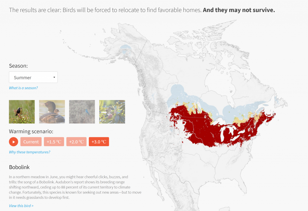
The projects I looked at were from Stamen Studios, they are a studio that creates many types of interactive informational visualizations, especially maps. They help companies/ organizations/individuals to customize their information and present them in the most insightful and legible way possible. One of their projects that I looked at was an interactive map that explores the impact of global warming on North American birds. The map allows you to control what scenario and what season you want to view and uses colors on the map and the species to inform us how much the species is in danger because of global warming. I thought the map delivers information very well and is also really easy to navigate.
http://stamenprod.wpengine.com/work/audubon-survival-by-degrees/
Link to the map:
Looking Outward – 07
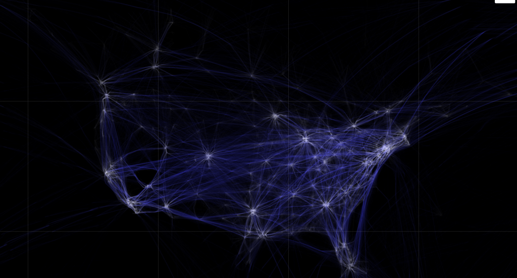
The project I chose to look at for this week’s looking outwards was Aaron Koblin’s light project called “Flight Patterns”. The project facilitates a way to look at the air traffic over North America and visualize it into color and forms. I admire this project because the basis of looking at air traffic patterns seems mundane and maybe irrelevant, but Koblin was able to completely shift that to find underlying geometry, form, and depth of design. I suppose the algorithms generated for this piece was using air traffic control data and finding and system to systemize the information and plot into beautiful patterns and connections. I think the artist’s creative sensibilities lie in the determination for what colors respond to the algorithms to produce images that separate and combine information.
Link: http://www.aaronkoblin.com/work/flightpatterns/index.html
LookingOutwards-07
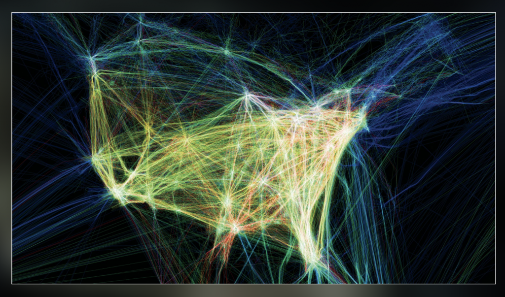
For this week’s Looking Outwards on the topic of informational visualization, I decided to look at the works by Aaron Koblin, and in particular, I was drawn to his Flight Patterns visualization (http://www.aaronkoblin.com/project/flight-patterns/). In this project, he took many data values and mapped out the paths of air traffic across North America. The visualization is abstracted to show strings of moving, glowing lines showing the progression and density of flight routes. When there is high air traffic and many routes intersect, the lines seem to glow at the intersection point. When the supposed “planes” travel away from each other, the movement fades out. To make this computational visualization, Koblin worked with his colleagues and plotted the data using the Processing programming environment. For the algorithms themselves, I think there is a component of controlling the amount of brightness of the lines. When they come in close proximity, they glow brighter, and this effect would have been created using conditionals and loop statements. I think the artist was able to take the shape of North America and make that appear obvious in the final product through creating color boundaries that show the distinction between “land” and “sea” spaces. I find this work really interesting, and it reminded me of a similar map that I was shown in my global history class, which mapped out the traffic patterns of slave ships to America over time.
Looking Outwards 07: Information Visualization
“We feel fine” project was created by Jonathan Harris in 2009 for a book co-authored with Seth Kamvar. The graphs show in-depth exploration of human emotions. They’re developed from a database of more than twelve million individual sentences collected over three years from personal blogs on the Internet and show the world’s emotional landscape of ups and downs. I personally admire how he was able to create a statistical graph of the world’s emotional struggles, such as mood swings. I thought that choosing this particular theme was interesting to begin with. I believe that gathering information on emotional state and putting it into graphs are more challenging than getting statistical and measurable information, such as rainfall rate, and turning that into graphs. His artistic ability shined through his graph by using different color schemes and styles to convey all the different emotions. His graphs clearly conveyed the complexity of emotions as well.

LO7 – Information Visualization
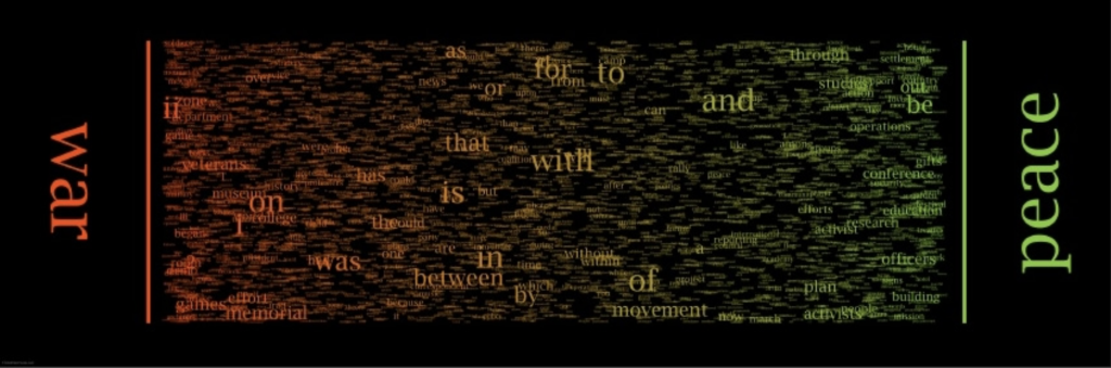
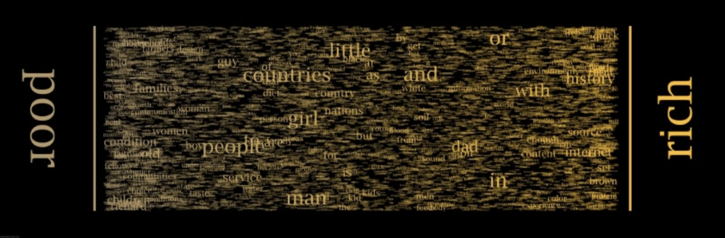
The project that caught my eye this week is Chris Harrison’s WordSpectrum. Its purpose is to visualize bigram data to represent word associations. For example, it takes the words “war” and “peace,” and then places words that appear most frequently as bigrams with these from left to right depending on which word they appear next to more. Due to this, you get “war” and “ii” on the same side of the graphic, then you have “peace” and “officers” on the other side. In the center of the graphic you have words that are used generally equally between the two, and because these words are related to each other, most of the time these words will be conjunctions. For example, the word “and” is near the center for most graphics because people have a tendency to write phrases such as “war and peace,” or “good and evil,” leading to high word associations between the two. I find this project particularly interesting because it shows to at least some degree what people associate with certain words, giving a glimpse into the minds.
Looking Outwards 07: Information Visualization
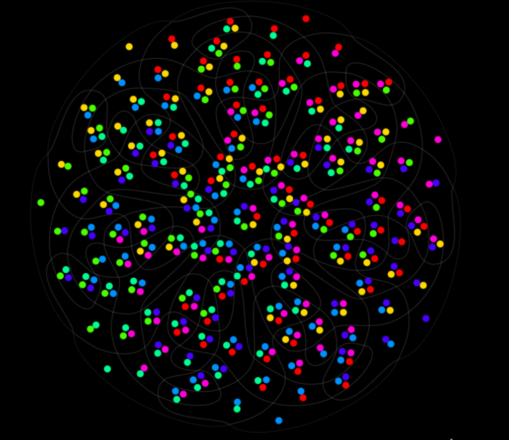
Of the examples I looked at, I really enjoyed the 7 sets Venn Diagram, made by Santiago Ortiz’s Moebio Labs. I really like that they use colors instead of numbers or letters, since it makes the intersections between the different sets much simpler to understand. The work was created by looking at a static set of the 7 way Venn Diagram, and using the shapes as a base to create an interactive version. Similar to much of the other work on the Moebio website, they use a lot of color, specifically intersections of color, in order to help with visualization and gradients between zones. I think that it is also great that they didn’t stop at the first success, and went on to add a second side of the diagram which consists of only the gradients of different colors.
LookingOutwards-07
The work is called “Word Spectrum: Visualizing Google’s Bi-Gram Data” by Chris Harrison. It is a visualization of word associations found from Google, where words closer to the ends are more associated with that one word, while words in the center are more evenly associated between both opposing words, and where the font size of the word would be based on the frequency of use of the word. Immediately I was drawn to the work for the following reasons. First, it was visually obvious that there had been many factors that contributed to the color, size, and placement of each word. It reminded me of tug-of-war in the sense that the strength a word had (which would be the frequency of use), the closer or further it came to one side. Second, I admired how the words that were pitted against each other covered many topics, such as war/peace, socioeconomic status, ethnicities, religious beliefs, and things such as love/like. These words often come across our daily dialect and it was interesting to see exactly how often we associate certain words with it. The algorithm that helped generate the work was Google’s enormous bigram dataset, where distributions of words can be analyzed. The creator’s artistic sensibilities and thoughts are manifested in this work as many of Chris Harrison’s previous works focus on research done online. His previous works include unique visualizations of Wikipedia categories, Amazon book links, and internet searches. This work was intriguing and made me wonder what a visualization of my most common used words would look like.
https://www.chrisharrison.net/index.php/Visualizations/WordSpectrum