LO-10 Computer Music

Explanation and example of Computer Orchestra

Computer Orchestra was created in 2013 by Fragment.in, an artist collective comprised of Laura Perrenoud, David Colombini and Marc Dubois. They used Processing, SimpleOpenNI, and OpenKinect to create this project. Computer Orchestra is an interactive installation that uses multiple computers to allow the user to conduct their own orchestra. Their hand movements are recognized by a Kinect motion controller that transmits data to Processing through the SimpleOpenNI library. Processing then sends a signal to the main computer which gives instructions to the rest of the screens.

I admire how this piece is made to be accessible. Computer Orchestra crowdsources sounds to use and users can upload their own sounds as well. I also admire that there is a visual component to the project, along with the sound the program creates aesthetically pleasing sound waves on the screen that enhance the experience. It’s amazing to see how just one person can create the feel of an entire orchestra.  

Fragment.in states that they use their work as a way to question the impact of the digital on everyday life. These artistic sensibilities are seen in Computer Orchestra through the way it highlights how one person can replace an entire orchestra with the use of digital. 

LO – Digital Grotesque

As a fellow studier of architecture, I also admired this piece’s structural qualities. However, it seems my peer and I are taking two different scopes when admiring the project. He remarked on the delicate ornate detailing, while I find myself inspired differently. To me this project ponders a larger idea, that at one point in our future not only products, but entire environments will be digitally fabricated. I agree with my peer that the intricate detail is astounding and impressive, but I would disagree that it is the “main idea” of the work. I think that it’s actually the opposite: I see this project as attempting to ponder a massive, and extremely scary question: can an environment be digitally manufactured with a level of detail that actually makes it impossible to distinguish from a “natural environment”. Like a simulation, the detail is there not to draw attention, but to dismiss attention that might expose the environment as “fake”. For example, someone standing in an empty room knows it’s man made, because no natural environment really looks like it. In the middle of a forest, however, we don’t even consider that the environment is fake, because of the sheer amount of detail.

https://www.bing.com/videos/search?q=digital+grotesque+vimeo&&view=detail&mid=87EF57FBFB7556D6E77787EF57FBFB7556D6E777&&FORM=VRDGAR&ru=%2Fvideos%2Fsearch%3Fq%3Ddigital%2Bgrotesque%2Bvimeo%26FORM%3DHDRSC4

LookingOutwards-09

Expressions by Kund and Yu Miyashita

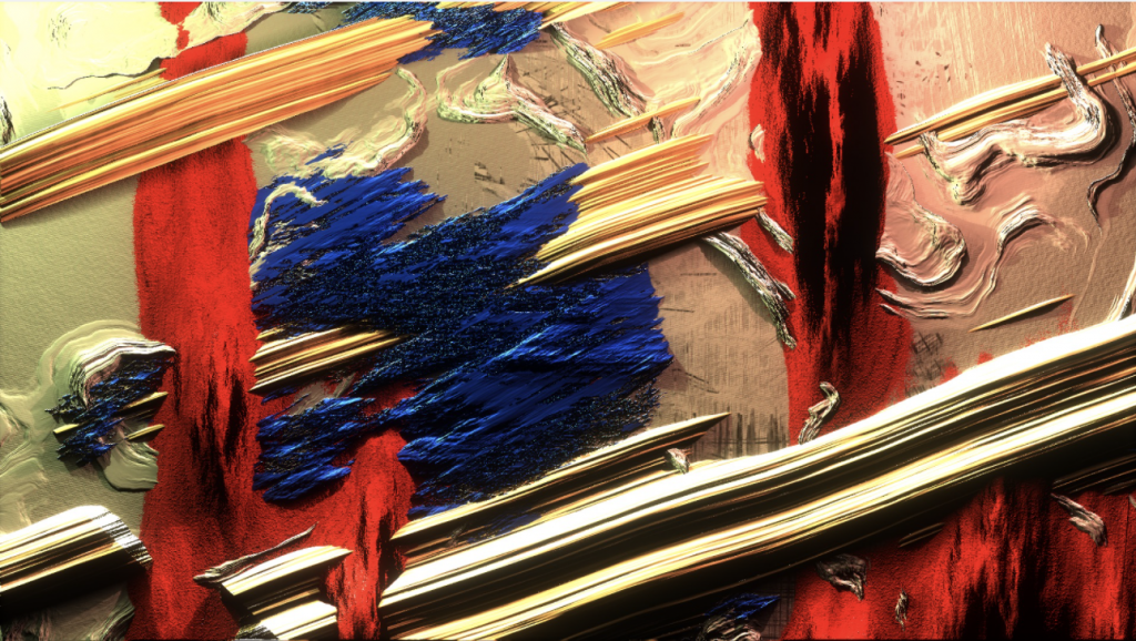
One of my classmates whose post I came across was Rachel Kim’s (rkim) Looking Outwards 04, where she analyzed Kynd and Yu Miyashita collaborative artwork called Expressions. I liked how my classmate gave thoughtful insight about how the artist used thick and bold paint as inspirations for creating 2D and 3D graphics. I agree that the artwork is interesting, especially because there is a play with light and shadows to create a digitized representation of paint strokes.

From my own observation of the work, I can add on to the conversation that the variation in texture and intersecting strokes create a visually harmonious and balanced composition which is pleasing to the eye. The use of light and shadows is what makes the artwork appear like oil paint, which is very unique.

LO-09

This week, I looked at Shaun’s post about Ariel Waldman. It is crazy that she got a job with NASA right out of art school by cold calling them! I think that this background makes her perfect for the project that Shaun talks about in his blog: she seems to be all about making space exploration (and all of her other projects) more accessible to the average person. I wonder if this is because she did not have as much of a science background coming out of school, and therefore she is able to articulate concepts in ways that average people understand.
When I looked through her website, I saw that she also wrote a book titled “What’s It Like in Space?: Stories from Astronauts Who’ve Been There.” This is another project that, like Spaceprob.es that Shaun talked about in his post, gives everyone a look into what going to space is like. Right now, few people can actually go to space; significantly more people can read her book or visit her website.

Shaun’s original LO-08 post

Ariel Waldman’s website

Ariel Waldman’s book: What’s It Like in Space?: Stories from Astronauts Who’ve Been There (2016)

LookingOutwards-09

heyingw Section B

Project: Christina Phazero Curlee, “from Video Art to Video Game”, Breathe,2016

I think it’s amazing how the artist is able to turn her difficulty with depression to power and creativity that helps her build her unique, artistic, and meaningful games. Christina explained that before she started to make games, she was stuck in her own world and detached from the rest of the world. She has been struggling with depression for years. But in the process of making games, Christina began to connect with others as she needed to understand what the players are thinking at every stage to make good games. She became more social, and more curious about the world and other people. Her games spark a dialog between her and her players. Christina began to understand how they experienced the world, and make them understand her world through games. My peer admires the artist’s ability to use video game as a platform for communication and interaction. I think that’s definitely true. The video games served as bridges between Christina and the players, and also the world. Also, her games deal with meaningful topics such as child abuse, racial and sexual violence, marginalization, beauty standards, etc. She also incorporated illustration and photography. This makes her games different from regular shooting games that we see on the market. Her games become art that left deep impression on players and made people think.

The artist talks about her works

My peer’s Looking Outwards post: https://courses.ideate.cmu.edu/15-104/f2020/2020/10/26/08_lo_creativepractice/

Looking Onwards: 09

I really like the artist Roman Bratschi in LO 5 by hollyl, The colorful rendering really caught my eye and after reading holly’s interpretation, it made me appreciate this work a lot more. I am also really intrigued by the textures and materiality shown in this composition as well as how the combination of color and patterns can make the imagery realistic and quite surreal at the same time. I think what’s really interesting about Bratschi’s work is that while the texture is rendered in such detail and portrays how we see the material in real life, the wax-like texture almost looks like it is only possible in a digital reality.

Roman Bratschi on Behance

Looking Outwards – 09

I think Xander’s cited project, thispersondoesnotexist.com, is a fascinating project involving AI. I agree with Xander’s notes about the controversy but I don’t agree that people should worry about this type of system. It’s really interesting to me how they can form a full face out of cherry picking and choosing different features to make a face. Xander talked about how this type of software could be used for facial recognition but I also think this could exist as sort of a payment type in the future. I think that the technology can be adapted to then recognize people from their faces and be able to connect them to their bank account or credit card info.

Link: https://courses.ideate.cmu.edu/15-104/f2020/2020/10/08/lookingoutwards-06-2/

LO-9

I found Isabel’s post on Ethmode’s solution to reducing material waste in the fashion industry super innovative. With rendering technology skyrocketing in recent years, it seems relatively intuitive to bring fashion design to the virtual world. This goes to show how applicable rendering technology is to our modern world. There are so many ways rendering can help how we think about design. There are now companies that render sites for construction and architectural designs for clients to experience the place in virtual reality. This is an ideal solution to help clients visit sites without being there due to travel restrictions from COVID. The ways rendering can help us is essentially limitless.

Looking Outwards – 09

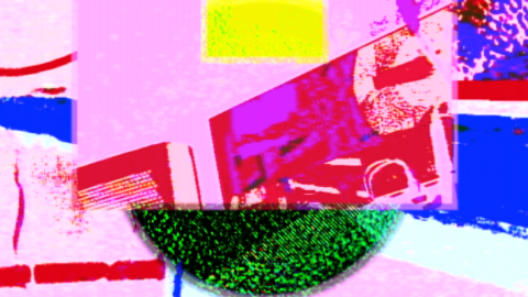
For this Looking Outwards assignment, I chose to look at Flora’s blog post from last week. Flora’s post mentioned how she really liked the “Summer ’91” piece by Sarah Groff Hennigh-Palermo because the work had a smooth visual flow, with mesmerizing warm tones. I thought this was accurately describing the work because upon first glance at the work, I immediately thought of a hot summer day, but an enjoyable type of hot weather. It’s very appealing to the eyes especially during dark seasons and cold weather right now.

I think that in order to add to this discussion, Sarah’s type of artistic style should be talked more in-depth. Upon looking at her portfolio of modern artwork, it was very apparent that her work tends to relate to the “rare aesthetic/deeply hidden memories” trend, where the art tends to remind you of something you’ve seen long ago.

According to Sarah’s own website, my assumption about her art style was correct because she claims to focus on “hybrid nostalgia” with her work. I always tend to find these aesthetics amusing because in a way, it gives me deja vu or a quick glimpse of an old, fading, memory.

This is Flora’s original blog post from last week.

Below is the link to Sarah Groff Hennigh-Palermo’s work website.

http://art.sarahghp.com/works/

This is “Summer ’91” by Sarah Groff Hennigh-Palermo.
This is “Make Manifest” by the artist. This is the one that for some reason gave me ‘deja-vu’ vibes, and reminded me a lot of familiar images that I seem to remember from a while ago.

LO 09

Iris Yip iyip
15-104 Section D
LO-09

This week for Looking Outwards, I looked at Tian’s Looking Outwards post on Stamen Studios as part of interactive informational visualizations. He specifically looked at a map looking at bird populations in National parks. I wanted to write and learn about this topic this week because I felt that he really communicated the importance of interactive maps that allows people to look at an issue from multiple perspectives simultaneously. I think it’s a good way of communicating massive amounts of information with lots of different variables. I think that this particular example definitely helps support how interactive data can achieve ways of communication through motion and interaction that regular types of data visualization might not be able to do.

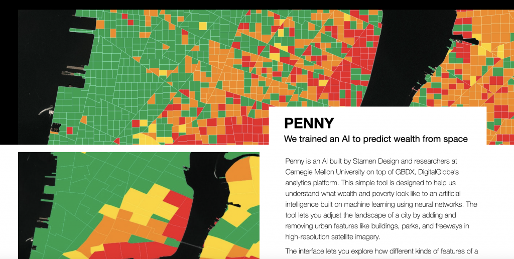
Another project I was drawn to from the same studio/artist is PENNY, which uses an AI to estimate wealth levels of an area based on images. While not entirely guaranteed to be accurate, there is a lot of consideration for signs of areas of low socio-economic welfare in a more directed way. I think that overall, there is a lot of consideration for the unique ways that digital information can be uniquely synthesized and used to make data collection and analysis easier.