![[OLD FALL 2020] 15-104 • Introduction to Computing for Creative Practice](https://courses.ideate.cmu.edu/15-104/f2020/wp-content/uploads/2021/09/stop-banner.png)
Iris Yip
15-104 Section D
Looking-Outwards
Information Visualization
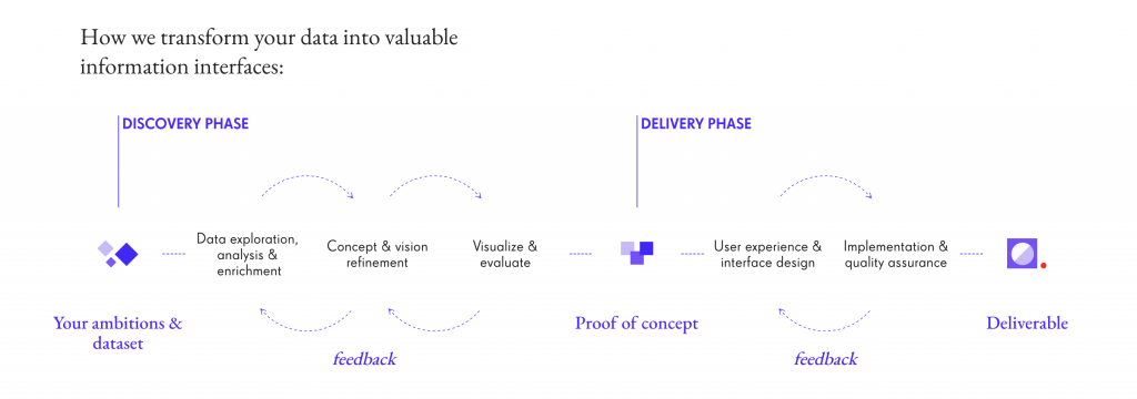
For this week I looked at nand.io and the way they synthesis information through custom data software. I took a look specifically at their project ‘Peak Spotting‘, which was a tool designed to visually manage Germany’s complex railroad network and its daily passengers.
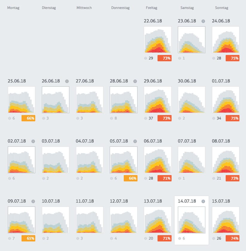
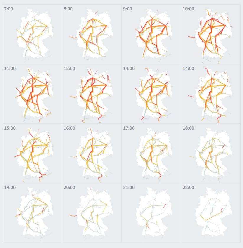
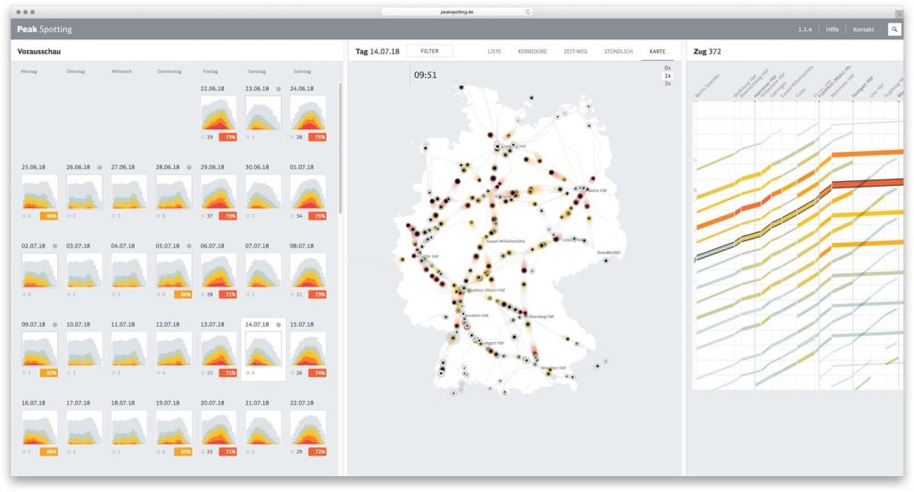
Based on machine learning algorithms, it uses load and capacity prediction data heavily to allow traffic managers to look at data up to 100 days in advance so they can optimally calculate ticket prices and supply and service.
I was personally drawn to this project because of its amazing applications. Being able to predict data points up to 100 days in advance while being able to automatically generate concise and readable visual depictions of the data is a huge step in the automation of data visualization.
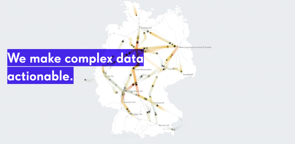
I also really enjoy the aesthetics of nand.io’s projects from a visual design perspective. The colors used are distinctive and readable yet aesthetically pleasing, making it functional and optimal for data visualization.