![[OLD FALL 2020] 15-104 • Introduction to Computing for Creative Practice](https://courses.ideate.cmu.edu/15-104/f2020/wp-content/uploads/2021/09/stop-banner.png)

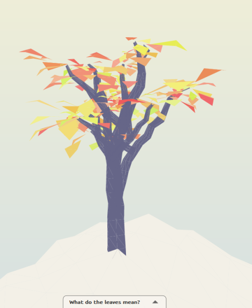
For this week’s Looking Outwards, I was drawn to Dutch creative developer Jurjen Verhagen’s online data visualization Human Development Tree, an interactive platform that lets users visualize a level of human development based on set conditions of life expectancy, expected years of education, mean years of education, a country’s GDP, the country’s ideals on gender equality, and a color of your choice. Based on your input, the platform will reveal
your “ideal tree” with leaves. Leaves that fall off the tree represent current countries that don’t meet your conditions in 1985. More leaves grow back on tree as the data visualization progresses to the year 2013.
I thought this project was a super fascinating way to combine data and gamification in a fun but educational way. This visualization taught me a lot about human development and how much the world has changed since 1985, as well as leave me curious on how the tree’s leaves would have changed since 2013. I’m really curious on what kinds of algorithms Verhagen combined with
his beautiful 3D models, and if he ever plans on updating this project to reflect data from 2020.
Interact with the data visualization here.