![[OLD FALL 2020] 15-104 • Introduction to Computing for Creative Practice](../../../../wp-content/uploads/2021/09/stop-banner.png)
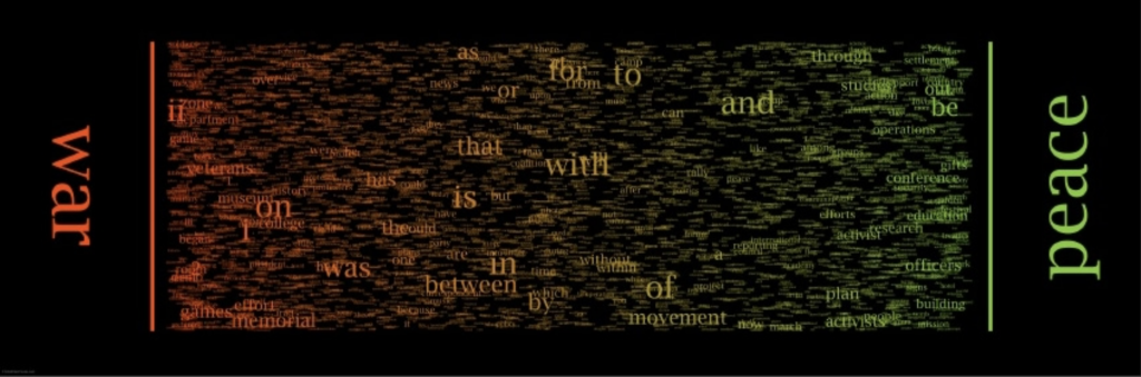
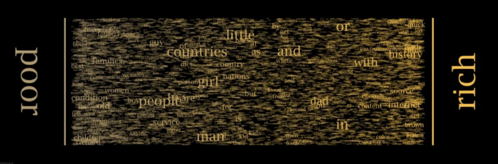
The work is called “Word Spectrum: Visualizing Google’s Bi-Gram Data” by Chris Harrison. It is a visualization of word associations found from Google, where words closer to the ends are more associated with that one word, while words in the center are more evenly associated between both opposing words, and where the font size of the word would be based on the frequency of use of the word. Immediately I was drawn to the work for the following reasons. First, it was visually obvious that there had been many factors that contributed to the color, size, and placement of each word. It reminded me of tug-of-war in the sense that the strength a word had (which would be the frequency of use), the closer or further it came to one side. Second, I admired how the words that were pitted against each other covered many topics, such as war/peace, socioeconomic status, ethnicities, religious beliefs, and things such as love/like. These words often come across our daily dialect and it was interesting to see exactly how often we associate certain words with it. The algorithm that helped generate the work was Google’s enormous bigram dataset, where distributions of words can be analyzed. The creator’s artistic sensibilities and thoughts are manifested in this work as many of Chris Harrison’s previous works focus on research done online. His previous works include unique visualizations of Wikipedia categories, Amazon book links, and internet searches. This work was intriguing and made me wonder what a visualization of my most common used words would look like.
https://www.chrisharrison.net/index.php/Visualizations/WordSpectrum