Looking Outwards-07

Wind Map is a living portrait of the wind currents over the U.S., where it conveys the movement of the air through visual motion. The creators, Fernanda Viégas and Martin Wattenberg, wanted the artwork to reflect the real-world and how its “emotional meaning” changes on a daily basis. For instance, on calmer days with little to no wind, it can can represent the “soothing mediation” of the environment, whereas days that are more rampant (e.g. hurricanes) the visuals are much more sporadic and ominous. I can see how the artists’ creative sensibilities have manifested into their work as they have used their project for artistic exploration within dramatic patterns and delicate tracery of wind, combining weather elements and art together.

Wind Map: Tracery of Wind Over the U.S.
Data Visualization of Hurricane

The two artists created this work through surface wind data collection of the National Digital Forecast Database, which are near-term forecasts revised once per hour. Further, the technique is implemented entirely in HTML and JavaScript, which is another facet of what I like about the piece because it is what we are learning right now!

Project 07 – Curves

Using a rose curve function I created two overlapping shapes. Moving the cursor to the left side of the canvas decreases the petal count and changes its rotation direction to counterclockwise; to the left, the petal count increases, and the rotation direction is clockwise. Clicking the canvas will pause its motion.

sketch
// Emily Franco
// Section C
// efranco@andrew.cmu.edu
// Project-07
 
//num of petals
var n=3;

//track move clickes
var state = 0;
//tracks when petals function runs
var petalState =0;

//store x and y cordinates of petal
var petalPointX = [];
var petalPointY = [];

function setup() {
    createCanvas(400, 400);
 }

function draw() { 
    background (0);

    //move origin to center canvas
    translate(width/2,height/2);

    //outter rose
    fill(167,1187,232,120);
    rose(n,200,5);

    //inner rose
    fill(252,219,3,120);
    rose(-n,120,3);


    petals();
} 

//only call petals mouse house is clicked    
function mousePressed(){
    if(petalState == 0){
        state = 1;
    }

    if(petalState == 1){
        state = 0;
        petalState = 0;
    }
}

//make rose shape
function rose(n,radius,rate){
    var x; 
    var y;
    var newRad;
    //make rose shape
    beginShape();
    for (var a=0; a<=360; a++){
        newRad = radius*sin(n*radians(a));
        x = newRad*cos(radians(a)); 
        y = newRad*sin(radians(a)); 
        petalPointX[a] = x;
        petalPointY[a] = y;
        vertex (x,y);
    }
    endShape();
    petalLines(rate);
}

//draw lines at determine increments from center to petal coordinate
function petalLines(rate){
    stroke("black");
    for(var i=0; i<=petalPointX.length;i = i+rate){
        line (petalPointX[i],petalPointY[i],0,0);
    }
            
}

//add or subtract petal depending on mouse location
function petals(){
    if(state==1){
        if(mouseX>=width/2){
             n=n+0.01;
        }if(mouseX<width/2){
             n=n-0.01;
        }
        
        petalState=1;
    }   
}


Project 7 – Curves

It slowly draws a butterfly if u move your mouse from left to right!

/*
 * Andrew J Wang
 * ajw2@andrew.cmu.edu
 * Section A
 *
 * This Program is ButterFly and Flower Curves
 */


function setup() {
    createCanvas(480,480);
}

function draw() {
    background(220);
//create constrain for the rest of the codes' mouse X and Y
    var conY = constrain(mouseY,0,height);
    var conX = constrain(mouseX,0,width);
//create two array sets for Flower's X and Y
    var pointX2 = [];
    var pointY2 = [];
//remapping A and B with mouse X and Y
//A => inner circle, B => outer circle 
    var a = map(conY,0,width,50,150);
    var b = map(conX,0,width,5,15);
    var h = 20;
//using for loop to get points
    for (var k=0; k<=2000; k+=1)
    {   
        //2 PI but 2000 points
        var t=k/1000*Math.PI;
        //epitrochoid formulas for X and Y
        var xP2= width/2+((a+b)*Math.cos(t)-h*cos(((a+b)/b)*t));
        var yP2= height/2+((a+b)*Math.sin(t)-h*sin(((a+b)/b)*t));
        //push values to lists
        pointX2.push(xP2);
        pointY2.push(yP2);
    }
//connect vertexes and close them
    push();
    noFill();
    //stroke
    stroke(0);
    strokeWeight(5);
    beginShape();
    for (var k=0; k<=2000; k+=1)
    {   
        vertex(pointX2[k],pointY2[k]);
    }
    endShape(CLOSE);
    pop();
//connect vertexes and close them
    push();
    //no stroke only fill
    fill(255,200,200);
    strokeWeight(0);
    beginShape();
    for (var k=0; k<=2000; k+=1)
    {   
        vertex(pointX2[k],pointY2[k]);
    }
    endShape(CLOSE);
    pop();
//same logics but this time it is the butterfly curves
    var pointX = [];
    var pointY = [];
    for (var k=0; k<=2400; k+=1)
    {   
        //Mouse Y dictate how big the butterfly will be
        var xP= width/2-map(conY,0,width,0,100)*Math.sin(k/100*Math.PI)*((Math.exp(Math.cos(k/100*Math.PI))) - (2*Math.cos(4*(k/100*Math.PI))) - (Math.pow(Math.sin((k/100*Math.PI)/12), 5)));
        var yP= height/2-map(conY,0,width,0,100)*Math.cos(k/100*Math.PI)*((Math.exp(Math.cos(k/100*Math.PI))) - (2*Math.cos(4*(k/100*Math.PI))) - (Math.pow(Math.sin((k/100*Math.PI)/12), 5)));
        pointX.push(xP);
        pointY.push(yP);
    }

//this time I use smaller circles to represent the curves
    fill (90,map(conY,0,width,0,255),100);
    stroke (90,map(conY,0,width,0,255),100);
    //mouse X dictates how many circles
    for (var k=0; k<=conX*4; k+=1)

    {
        circle (pointX[k],pointY[k],3);
    }
    }


Project 07

logarithmic spirals!

sketch
// Sowang Kundeling skundeli Section C Project 07

var theta; // angle from x-axis
var r; // dist from the origin
var nPoints = 700;

function setup() {
    createCanvas(480, 480);
    angleMode(DEGREES);
}

function draw() {
    background(28+mouseY, 74, 55+mouseX); // green

    strokeWeight(2);
    startAngle = constrain(mouseY, 100, 100);
  
    // spirals
    stroke(110, 53, 140); // dark purple
    logSpiral(mouseY, startAngle);
    stroke(199, 129, 227) // light purple
    logSpiral(mouseY, startAngle+20);
    stroke(76, 63, 152) // dark blue
    logSpiral(mouseX+25, startAngle+40);
    stroke(136, 128, 224) // light blue
    logSpiral(mouseX+50, startAngle+60);
    stroke(176, 69, 149) // pink
    logSpiral(mouseX+75, startAngle+85);
    stroke(224, 110, 196) // pink
    logSpiral(mouseX, startAngle+95);

}

function logSpiral(r, theta, color) { // logarithmic spiral
    noFill(); // use noFill or else only one line is shown
    var a; // arbitrary constant
    var b; // arbitrary constant
    
    beginShape();
    for (i=0; i < nPoints; i++) { // apply nPoints onto spirals
        a = (width/2) + (r+i) * cos(theta+3*i);
        b = (height/2) + (r+i) * sin(theta+3*i);
        vertex(a, b);
    }
    endShape();
}

Project 7 – Composition With Curves

Using multiple layers of atomic spirals, I created a composition that emulates either the acquisition & rotation of electrons around a nucleus or planets around a Sun – whichever interpretation is up to the viewer. In order to emphasize the idea of ‘cosmic creation’, I added randomly generated stars that twinkle from last weeks project and a lower opacity epispiral in the background to give an subtle explosion type effect.

Features:
– mouseX controls a (rotation of the circulating bodies)
– mouseY controls n (scale of epispiral + no. of points)

sketch
// Name: Tsz Wing Clover Chau
// Section: E 
// email: ctchau@andrew.cmu.edu
// Project-07

var a = 0;
var atomStart = 360
let stars = [];
var nStars = 60;
var noiseParam = 0;
var noiseStep = 0.08;
var count = 0;
var twinkleRate = 10;


function setup() {
    createCanvas(480, 480);
    background(0);
    for (var i = 0; i<nStars; i++){
        stars.push([random(0, width), random(0, height), noise(noiseParam)]);
        noiseParam += noiseStep;
    }
}

function draw() {
    background(0);

    for (var i = 0; i<nStars; i++){
        curStar = stars[i];
        push();
        noStroke();
        fill(100);
        circle(curStar[0], curStar[1], curStar[2]*5);
        if (count % twinkleRate == 0){
            twinkle(curStar)
        }
        
        pop();
    }


    var h = constrain(mouseY, 0, height);
    var w = constrain(mouseX, 0, width);


    //atomic spiral
    noFill();
    stroke(255);
    
    a = map(h, 0, height, 0, 16);

    
    beginShape();
    for (var i = 60*a; i <= 360*a; i++){
        var theta = radians(i);
        var r = theta/(theta-a)*65;
        var x = r * cos(theta) + width/2;
        var y = r * sin(theta) + height/2;
        vertex(x, y);

        
        if (i == 360*a){
            push();
            fill(190);
            circle(x, y, width/70);
            pop();

        } 
    }
    endShape();


    // SUN / NUCLEUS
    a2 = map(h, 0, height, 0, 10);
    beginShape();
    for (var i = -360*a2; i <= 0; i++){
        var theta = radians(i);
        var r = theta/(theta-a2)*50;
        var x = r * cos(theta) + width/2;
        var y = r * sin(theta) + height/2;
        vertex(x, y);

        if (i == -360*a2){
            push();
            fill(255);
            stroke(2);
            circle(x, y, width/20);
            pop();
        }
    }
    endShape();


    b = map(h, height/3, height, 0, 16);
    beginShape();
    for (var i = 60*b; i <= 360*b; i++){
        var theta = radians(i);
        var r = theta/(theta-b)*100;
        var x = r * cos(theta) + width/2;
        var y = r * sin(theta) + height/2;
        vertex(x, y);
        
        if (i == 360*b){
            push();
            fill(190);
            circle(x, y, width/50);
            pop();

            circle(x, y, width/20);
        } 
    }
    endShape();


    if (mouseY >=  height/2){
        c = map(h, height/2, height, 0, 16);
        beginShape();
        for (var i = 90*c; i <= 360*b; i++){
            var theta = radians(i);
            var r = theta/(theta-c)*150;
            var x = r * cos(theta) + width/2;
            var y = r * sin(theta) + height/2;
            vertex(x, y);

            
            if (i == 360*c){
                push();
                fill(190);
                circle(x, y, width/50);
                pop();
            } 
        }
        endShape();
    }


    //poinsot's spirals
    var n = map(w, 0, width, 0, 8);
    push();
    stroke(150, 150, 150, 150);

    beginShape();
    for (var i = -360; i <= 360*b; i++){
        var theta = radians(i);
        var r = pow(n, 3)*abs(1/cos(n*theta));
        var x = r * cos(theta) + width/2;
        var y = r * sin(theta) + height/2;
        vertex(x, y);
    }    
    endShape();
    pop();

    count++;

}


function twinkle(star){
    //constraining star size
    if (star[2] >= 1){
        star[2] -= random(0.8, 0.8);
    } else {
        star[2] += random(-0.4, 0.4);
    }
    star[2] = abs(star[2]);
}

Blog 07

Stefanie Posavec is a designer, artist, and author. Her mission is to push different ways in which data can be communicated to a diverse range of ages and audiences. What especially intrigued me about her is that her projects are “wearable or danceable, be found in hospitals, museums, or on television.”

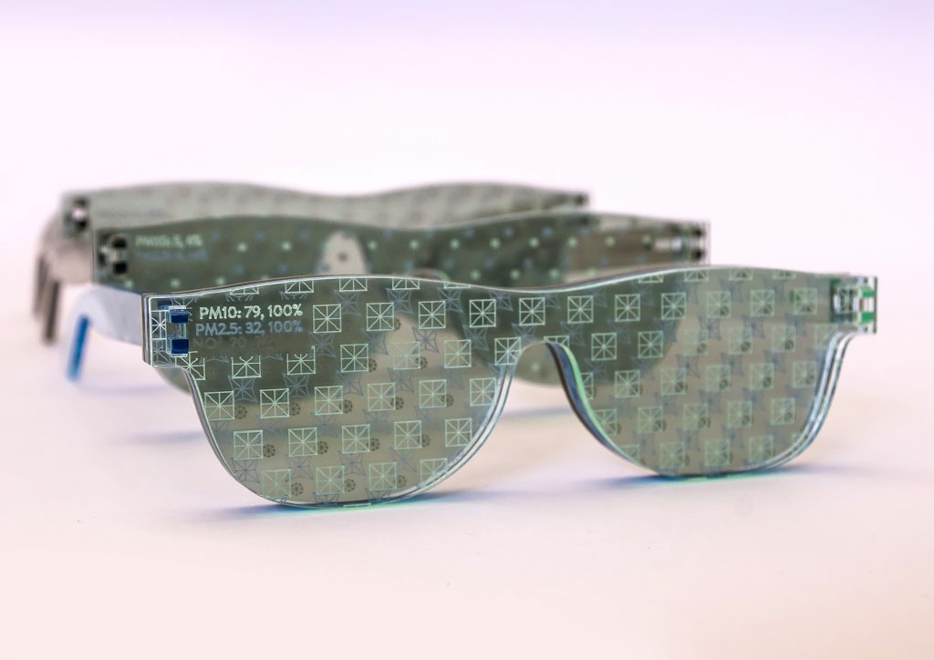
An example of the wearable aspect of her work is “Air Transformed: Better with Data Society Commission”. This series is a collection of wearable air quality data, initiating a conversation about air pollution. My favorite piece is “Seeing Air”. The projects consists of 3 pairs of glasses, each pair demonstrating the levels of air pollution on a different day in Sheffield in 2014. Each pair of sunglasses also signifies a different type of pollutant: nitrogen dioxide, small particulates, and large particulates.

The 3 pairs of “Seeing Air” glasses

Looking Outwards 07: Information Visualization

Where the Wild Bees Are
Moritz Stefaner (+ Jen Christiansen + Jillian Walters)
Nobember 28, 2013

Where the Wild Bees Are – Scientific American

Please discuss the project. What do you admire about it, and why do you admire these aspects of it?
What do you know (or what do you suppose) about the algorithms that generated the work?
It what ways are the creator’s artistic sensibilities manifest in the final form?

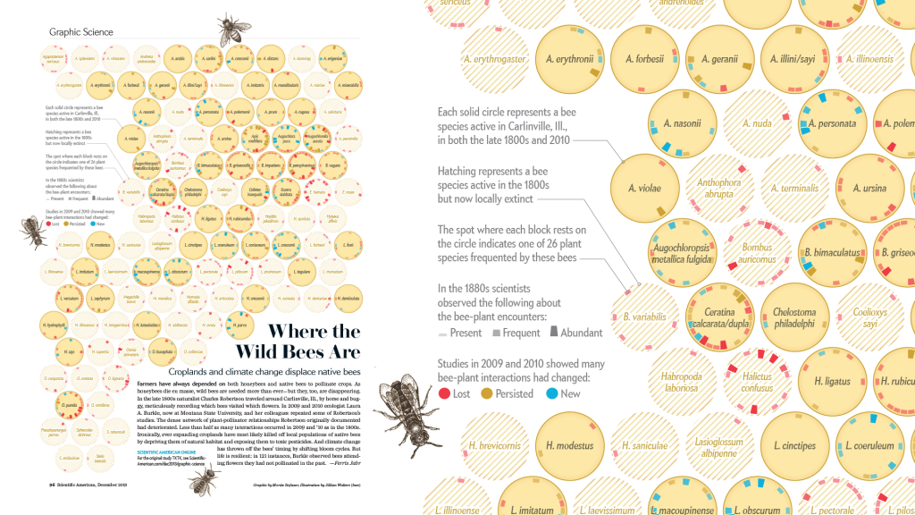
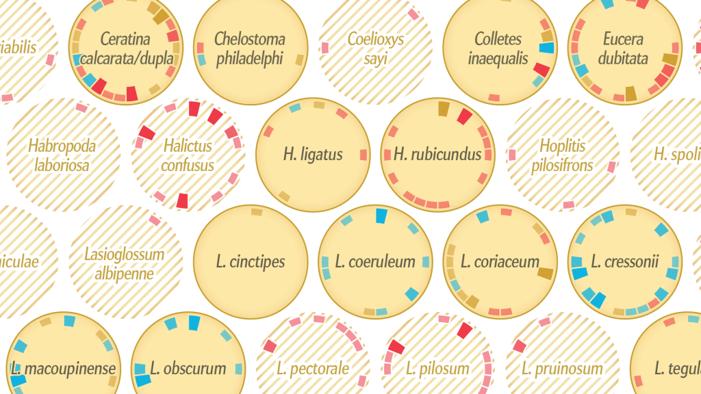
The project I have chosen to discuss is ‘Where the wild bees are” by Mortiz Stefaner (+ Jen Christiansen + Jillian Walters). It is an information graphic showing the status of various bee species and the relationship between each bee species the plant species they frequently interact with. One thing I admire is the sheer quantity and complexity of data the graphic is able to succinctly and clearly communicate on a single page. Great care has also been put into establishing a visual language of circular charts, each representing a single bee species, that is reminiscent of the hexagonal bee comb structure to emphasize the bee theme, allowing the graphic to feel clean and coherent. A short explanation of the various visual elements and their meaning can be found on the left, but it is split into short sentences that are easy to parse.

Original data visualization
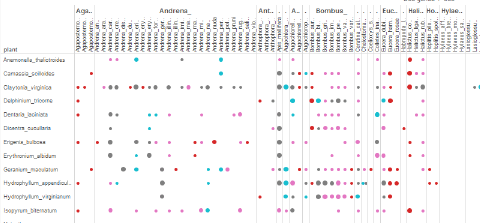
Initial matrix view in Tableau
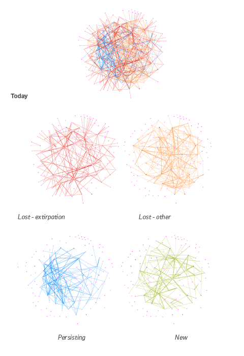
gephi explorations

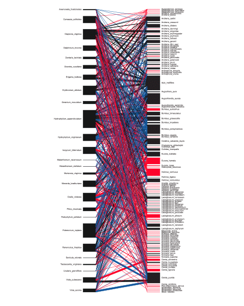
According to Stefaner’s blog post detailing their progress, the first and most crucial step was understanding the feel of the texture of the data – “understanding what can be done with it, and which views seem to generate the most interesting insights.” They first entered the data into a spreadsheet-style program called Tableau and produced a matrix view, which allowed to them to judge the denseness of connectivities between different network links and identify connection patterns. They then investigated the topology of the network (via gephi, an open graph visualisation platform), trying to see if there were any emergent commonalities between bee species that had gone extinct.

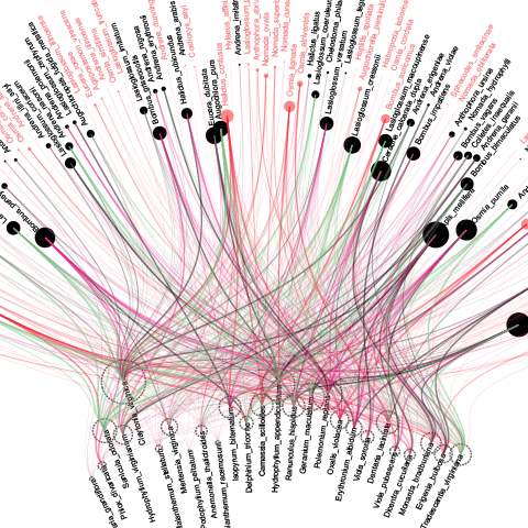
Matrix organisations

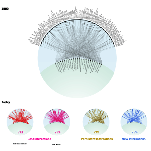
Organising the plants on the ‘ground’ and the bees in the ‘air’, they then connected the different data sets. However, it became complicated very quickly and difficult to read, prompting them to adopt a more general ‘plant visitation profile’ that highlighted each bee species individually.

“In this case, shifting the view from the macro-patterns to the micro-level… was crucial to untangle the mess and make sure the basic statistics about the bees – the main story = came across well.”

Looking Outwards – 07

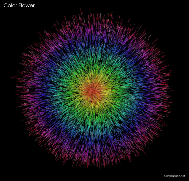
I really admire how Chris Harrison did his color flower, and the way he made his algorithm to create these sets of patterns is amazing and visually satisfying to look at. Although he didn’t specify how he made his algorithm, I can still guess a few of the steps that he took to make this work of art. First he made a set of point data within a boundary of a circle, and assigned values of those points based on the distance of them towards the center of the circle. Then, he used the points and the center of the circle to create vectors from the points and go away from the center of the circle. Eventually, based on hue value stored on each circle, they grab the name of the named color and list them on the vector using the color with the corresponding hue value, making this image a colored and worded art piece. Also, I love that he’s able to use the same algorithm to generate images not just circular but other shapes, such as spirals and others. 

Link: https://www.chrisharrison.net/index.php/Visualizations/ColorFlower

Looking Outwards-07

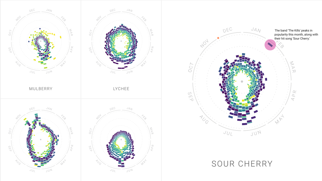
For this week’s blog post about information visualization, I picked the work by Moritz Stefaner “The Rhythm of Food”. It is a project that analyzes different food seasonality. He gathers the information we learn about food culture by looking at Google search data. The project collaborates with Google News Lab, and sheds light on the many facets of food seasonality, based on twelve years of Google search data. In order to investigate seasonal patterns in food searches, the team developed a new type of radial “year clock” chart to reveal seasonal trends for food items. The way it works is each segment of the chart indicates the search interest in one of the weeks of the past 12 years, with its distance from the center showing the relative search interest, and the color indicating the year. I admire the way Stefaner turns a huge amount of data into an easily visualizable graph. It was interesting to see how cultural and social influence has on the data result.

different types of fruits during different seasons

Creative direction, data visualization, design: Moritz Stefaner
Design and development: Yuri Vishnevsky
Illustration: Stefanie Weigele

07 Project

sketch
//Evette LaComb 
//section D 
//deliverable 7 project

var Cardioid= 0; // Astroid Inovulte oarametric 
var nPoints = 100; // points manipulted on the shape 


function setup() {
    frameRate(5);
    createCanvas(400, 400);
    background(220);
}

function draw() {
    background("lightBLue")
    // if mouse is above or below the monster backgrounf red:
    if (dist(width/2, mouseY, width/2, height/2) > 100) {
        background("red");
    } 
    //Draw the astroid monster
    fill("white"); 
    draw_cardioid(width/2, 150);
    }

    function draw_cardioid(x, y) {
        // transformations for esthetics
        push();
        translate(x, y);
        rotate(radians(90));
        // set variables
        var x;
        var y;
        //set esthetics
        stroke("red");
        fill("blue");
        //draw monster occording to the cardioid equations 
        beginShape();
    for (var i = 0; i < nPoints; i++) {
        var manipulate = mouseX/20;
        var t = map(i, 0, nPoints, 0, TWO_PI);
        var a = mouseX/8 +50;
        var p = random(mouseY/350, .5);
        var q = random(mouseY/350, .5);


        x = a *(1+ cos(t)) *(cos(t) * 1.5 * p);
        y = a *(1+ cos(t)) *(sin(t)* 1.5 *q);
        vertex(x, y);
        } 
        endShape(CLOSE);
        pop();
     
    }