![[OLD SEMESTER] 15-104 • Introduction to Computing for Creative Practice](../../../../wp-content/uploads/2023/09/stop-banner.png)
The person that I chose was Mike Tucker who presented during the 2019 Eyeo Festival. He is an artist that is involved in virtual reality and creating different ways of perceiving our surroundings. He has done work for a good amount of big and small companies, some of which include Apple, Kanye’s video game, and Radiohead. His work is interesting because it allows people to experience art by being part of it. In one of his projects he has people touch and interact with the world and it creates a string of music notes which then play. These notes continue to exist but move around like real animals in an environment. 6DofControl is another project that demonstrates the way people interact with their surroundings and as a result of certain actions a collection of sounds would be played in the user’s ears. From looking into his work it seems that his biggest interests lie within VR and music, how do we make things that change based on the way we interact with them or their surroundings. What then do these changes make us do as a result, how would a distorted song make us react to a certain action? The videos of his work are necessary in order to understand because what he makes is so sensory based.
Category: SectionD
2. Looking Outwards 08: The Creative Practice of an Individual
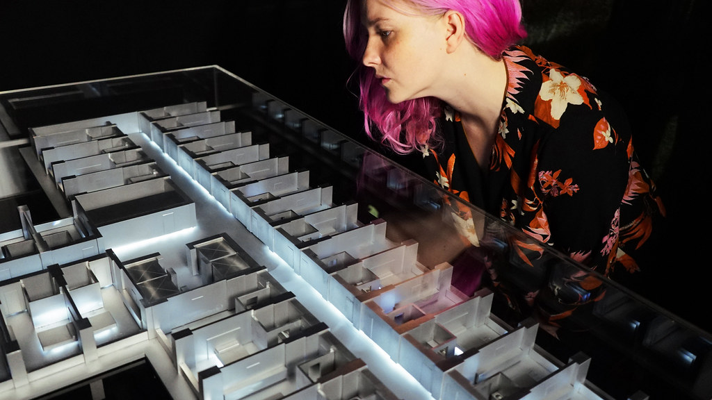
I really admired the work of Matt Adams. Matt Adams is the lead artist at Blast Theory, which is a pioneering group of artists creating interactive art related to political and social scenarios of the world. In my opinion, the fact that really makes his work unique is the fact that he is really passionate about theater
and theatrics. Matt works draw inspiration from pop culture which is another aspect which makes his work more interesting, engaging and relatable. I admire
how interactive and visually striking the artist’s work is in all formats of art, whether it be 2d, 3d or digital. I really liked ‘A Cluster of 17 Cases: Installation’ , a piece which demonstrates the outbreak of a virus in the world back in 2003.
The aspect which makes it extremely relatable is because of the pandemic onslaught which was very recently upon us. The artists showcased how a virus spreads in a 3d artwork installation which I think is really cool. Matt’s approach
to his work is simple, drawing inspiration from global affairs and issues, which as I mentioned before makes the work extremely likable and engaging.
LO 8: The creative practice of an individual
Christina “Phazero” Curlee is a video game and video artist. She designs video games that express her emotions and childhood experiences and connects the audience to themselves to help them discover who they are as a person. I think it’s really interesting how video games can be connected to someone’s inner feelings and emotions and not something superficial like tactical shooters. I have never seen anything similar before. Curlee also had a different style of learning for game making because she has a fine arts background where she uses and combines it with game development to create her own style. She focuses on using symbols, experiences, and nonverbal communication in her work. Her current project Artifacts lets users experience her life through a lucid dream-like state to help them become closer to themselves. I think it is really powerful how she is able to create a game that can help people understand themselves and possibly allow them to grow emotionally. Curlee does a good job presenting by explaining her passion and how her work is unique and her previous life experiences and then her projects and how her experiences helped her develop her style.
Looking Outwards – 08
Jennifer Daniel is a designer and is pursuing a career in illustration. Originally from Kansas, she moved to New York. Since then, her work has been published in a variety of publications. Jennifer has taught visual narratives for SVA’s masters program and recently moved to San Francisco. She was a professional communicator before working at an engineering company and now makes visual art.
In the eyeo festival Jennifer Daniel talks about an app she helped develop called allo. In the app you take a selfie and it makes automated emojis cartoons of your face. Traditional computers utilize mapping on the art to analyze pixels of an image. Algorithmically it examines attribute values to look for shape and colors. A well known problem is the uncanny valley of images. Emojis that look too close to the picture look scary. Machine learning can access and confront people about what they look like. Instead alo produces low resolution emojis which create a less realistic emoji. There is a customization feature of emojis. She talks about how she can as an art director design something for everyone when machine learning can reduce data about unique stories. She is aware of bias in computer algorithms and how it can promote racism and sexism. Art directors who work on these projects can work with artists with many perspectives to articulate their world. Not enough to make an avatar that is a literal representation of you when there are many versions of you.
What I really like about Jennifer Daniel’s app and project is that she takes an approach to illustrating similar to a UI UX designer, which is my dream career. She explains that visual vocabulary online is very vast. There are text, emoticons, emoji, and tiny illustrations. Emojis, gifs, stickers all make up an emergent complexity. Texting is closer to speaking than writing. People spoke first to communicate. Writing only came later. Writing is very different from talking. Writing is a conscious process while Speech is looser, text is like that. No one thinks about capitalization, we text the way we speak. Emoji is a Japanese word which is a combination of emoji and character and a very important form of digital communication in japan. Easy way to apologize or show nuanced communications. Emojis have a problem when trying to communicate something detailed. Automatic emojis can change meanings of texts. I’ve seen this with slack and face messenger. Emojis are not perfectly transferable across mediums. Ios emojis sent to an android emoji may look much different. Important emojis look similar across platforms and are cohesive but she wishes emojis used unicode like type fonts. More styles there are, the more variations can exist. Emojis have broadened the world of communication and it will be interesting to see how it shifts our language in the future.
Looking Outwards 08 – aarnavp
Mohit Bhoite is a senior hardware engineer at Particle, where he designs and builds their flagship Internet of Things products, focusing on freeform circuit boards for sculpture and art pieces. He focused his education in robotics, specifically the discipline of modular robotics, which has influenced his art practice of free form kinetic sculptures.
Mohit’s work cleverly approaches the complex field of robotics and circuit board building, which is seen as a very strict practice. In his lecture, Mohit describes the duality behind his practice and traditional circuit board design, where his aligns with the concept of rapid prototyping, and appreciating the artistic intentions that occur when working without the constraints of “industry standards” such as 3D printing/mass production of circuits. I especially liked how he manages to incorporate aesthetic into his design, as he says he drew inspiration from stained glass in his circuit board designs – specifically his Tye Fighter alarm clock.
It’s very interesting how he approaches circuit boards as its own medium, looking at the materiality of them in shaping his practices – this iterative process is often very much used with artists and can definitely be applied to these more formal practices.
https://www.bhoite.com/
Looking Outwards 08
The Hyphen Labs: In Emergency Break Glass
Eyeo (2018)
Hyphen labs, run by Ece Tankal and Carmen Aguilar y Wedge, is a lab whose projects have a wide range of qualities– from ‘translating between realities’, to experimentation, aesthetics, empowerment, and speculative. They describe themselves to still not have a super definite style and identity, especially since they started recently in 2014.
They introduced a kinetic light installation that they had been working on called Pragmatic in New York City. I thought their thought process and the relationship that was created between intention and form– especially in terms of how the form of the piece was influenced by the mood they wanted to create– was really cool. The concept of bringing the outside in is something I am curious about, especially when thinking about emerging spaces in AR/VR and even just the general advancements in technology. I think the project was a nice balance between mood and rhythms from the outside in without trying too hard to replace the experience of being outside.
Their project visualizing deaths from the opioid crisis was also one that really caught my eye. The detail that went to crafting every pill is mind-blowing. I think it was really engaging to see their projects all presented primarily in video format– it was really effective in quickly and holistically communicating big ideas.
https://vimeo.com/channels/eyeo2018/287093806http://hyphen-labs.com/prismatic.html
Looking Outwards 08: The Creative Practice of an Individual
Sands Fish’s website: https://www.sandsfish.com/
Sands Fish’s lecture video: https://vimeo.com/channels/eyeo2017/page:2
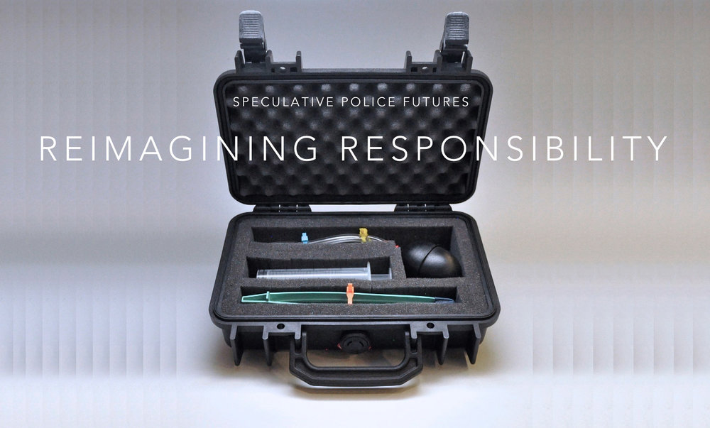
Sands fish is an Experience Designer that integrates technology to design services, interfaces, and experiences. He has previously worked with Nike to design an interactive game installation names the Joyride Experience along with MIT’s “Space Exploration Initiative”, working with NASA astronauts to design a musical instrument made to work in zero-gravity environments. Sands uses quotes, storytelling, and many visuals, other’s work that he admires, and transitions smoothly from one topic to another to present his work. Sands discusses a Futures thinking approach of thinking beyond the present and instead contemplating the possible, potential, and probable. A large emphasis of his lecture is discussing speculative design which is the idea of thinking beyond the systems, objects, etc. that already exist and asking questions. Sand’s presentation style is very effective and engaging due to the many visuals and examples he incorporated within his lecture. Since I want to be an Industrial designer, the concepts he raised and provoking design exercises, especially within the future of police are very intriguing to me and got me to think about design from a different approach.
Project 07: Curves
This is my floral composition based on mathematical curves and reacts to the mouse’s location on the canvas.
sketch
/*
    Joan Lee
    Section D

    This program draws an interactive floral composition with mathematical curves.
*/

var nPoints = 400;

function setup() {
    createCanvas(480, 480);
}


function draw() {
    background(28,92,76);    //dark green

    //drawing flower curve
    push();
    translate(width/2, height/2);
    drawCardioidCurve();
    pop();

    //drawing leaves curve
    push();
    translate(width/2, height/2);
    drawHypotrochoidCurve();
    pop();

}

//--------------------------------------------------
function drawCardioidCurve() {
    //cardioid curve
    push();
    translate(x, y);
    rotate(radians(90));
    var x = constrain(mouseX, 0, width);
    var y = constrain(mouseY, 0, height);
    var a = map(x, 0, width, 0, 40);
    var b = a/2;

    //mouse movement interaction
    if (mouseY > height/2) {    //color change
        fill(244,52,4);     //bright red
    } else {
        fill(252,156,132);  //pink
    }

    //cardioid curve parametric equations
    beginShape();
    noStroke();
    for (var i = 0; i < nPoints; i++) {
        var t = map(i, 0, nPoints, 0, TWO_PI);

        x = a * (6 * cos(t) - cos(6 * t));
        y = a * (6 * sin(t) - sin(6 *t));
        vertex(x, y);
    }
    endShape(CLOSE);
    pop();

}

//--------------------------------------------------
function drawHypotrochoidCurve() {
    //hypotrochoid curve
    noFill();
    strokeWeight(1);

    //mouse movement interaction

    if (mouseX < width/2) {      //color change
        stroke(4,220,156);  // bright green
    } else {
        stroke(204,236,228);    //pale green
    }

    var x = constrain(mouseX, 0, width);
    var y = constrain(mouseY, 0, height);
    var a = map(x, 0, width, 50, 150);
    var b = map(y, 0, height, 1, 6);
    var h = constrain(mouseY, 50, 90);

    //hypotrochoid curve parametric equations
    beginShape();
    for (var i = 0; i < nPoints; i++) {
        var t = map(i, 0, nPoints, 0, TWO_PI);

        x = (a - b) * cos(t) + h * cos(t * ((a - b) / b));
        y = (a - b) * sin(t) - h * sin(t * ((a - b) / b));
        vertex(x, y);
    }
    endShape(CLOSE);

}
Looking Outwards 07
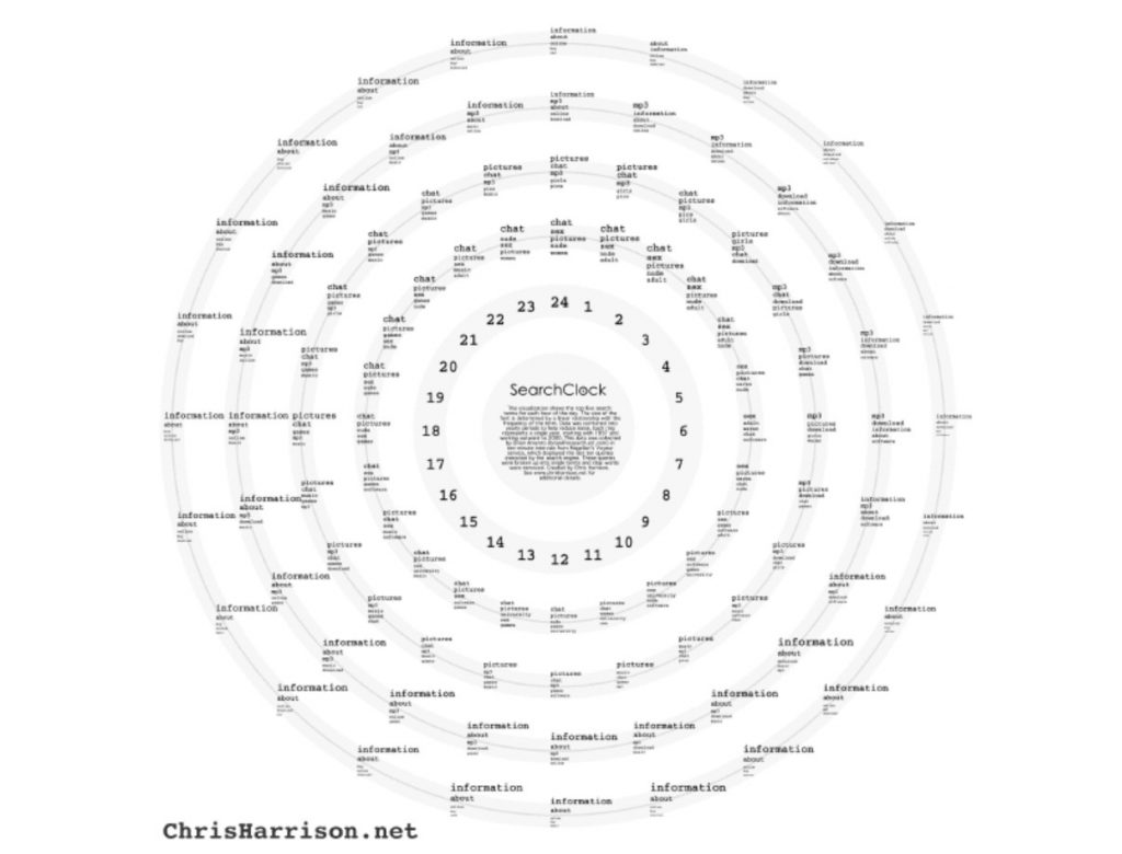
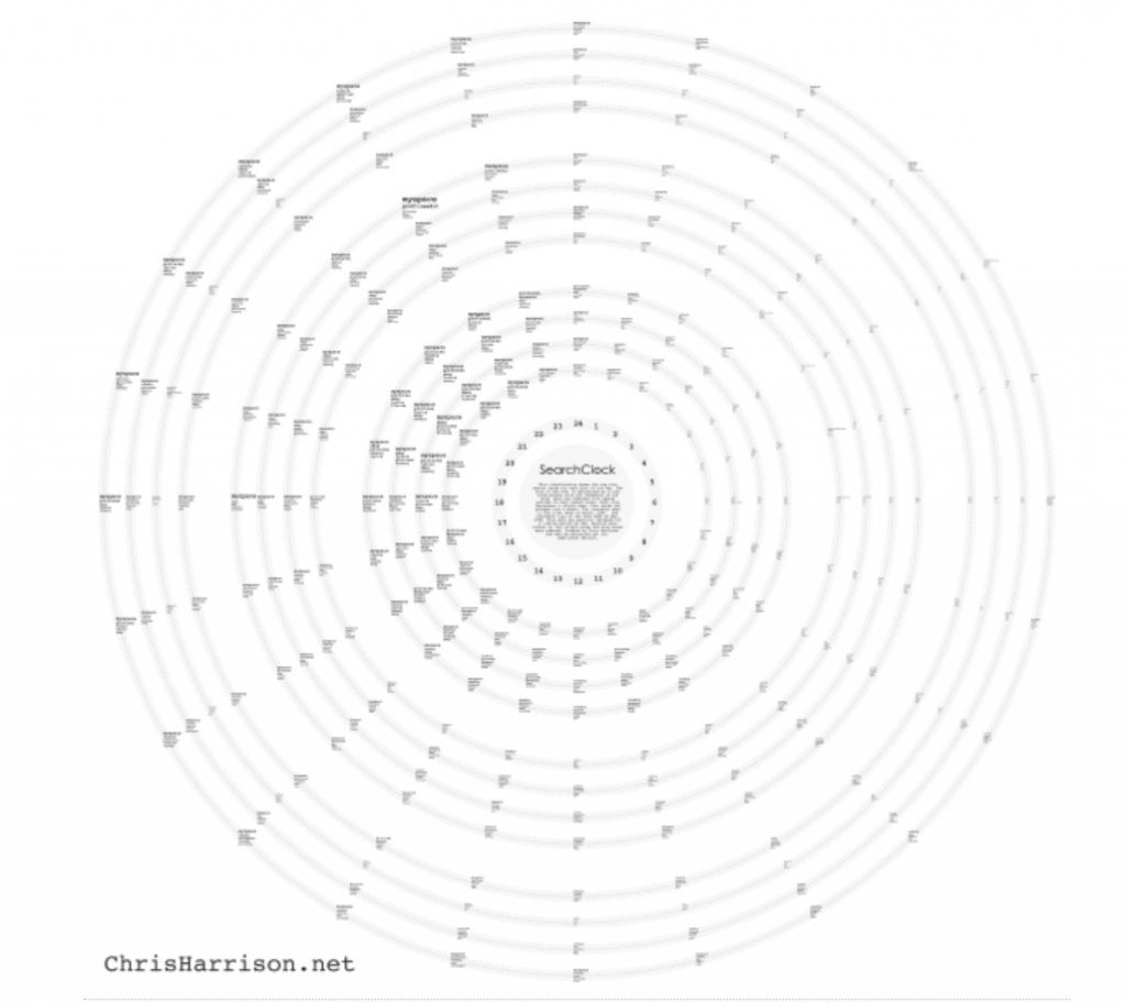
The Search Clock by Chris Harrison stood out to me because I found the concept very interesting; mapping out data from search engines, Magellan and AOL, over the course of a typical day (from studying trends for nine weeks), and then taking it a step further by mapping the differences in searches from 1997-2000. I admire firstly how visually interesting this project is because it is radially centered and balanced, but with enough variation to keep it interesting and engaging. It makes me want to read into the smaller text, and this demonstrates the artist’s eye for composition and hierarchy. Additionally, it very clearly shows information in a well-organized way. I have been learning about and practicing the visualization of data and systems in one of my design classes, and I know how tedious it is to land on something that makes sense. Furthermore, the content itself is interesting, with a lot of risqué and humorous topics trending at certain times of the day.
week 7 blog
Kim Rees visualizes data related to the black lives matters movement. Some of their work includes showing statistics about economic inequality as a city with differently sized sky scrapers and data laid out in the form of the periodic table. Other topics Reez covers include environmental, education, government, health, politics, and technological data and statistics. Most of the work is in an attempt to invoke a feeling for the need to change our current capitalistic and exploitative system. After stalking Kim’s twitter you can really see how decade they are to their work and continuing the thought provoking work they create. One of my favorite projects was about health and the increase in the lifespan of people but the disparity between how accessible health care is and as a result the difference in economic status and health. I don’t know, it’s nice seeing the data visualized, it give it more of an understandable and easier was of being digested.