Visualizing Expiration

A slow transition we miss on a day to day basis is the degradation of food. I often open up my fridge to find expired milk or some vegetables gone bad. The only way of knowing whether food has gone bad in your fridge is carefully inspecting it.

Solution:

Before placing food inside fridge attach an RFID to food product and input an associated expiration date into Ardunio ~ possibly using a potentiometer or rotary encoder.  Place a 13.56 MHz RFID outside the refrigerator. The range on these devices is approximately 1 meter which means they will be able to read all the RFID tags placed inside the fridge. A screen on the front fridge can display the food associated with every tag and and a red, yellow or green backdrop to easily indicate where in the transition from edible to expiry the food is in.
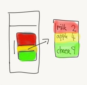
Solution

Proof of Concept:

I used a potentiometer and 3 LED’s to show my proof of concept.

The potentiometer was used to input the current state of the food. I utilized millis() to  demonstrate how the colors would change as the time approaches the expiry date. Here, for demonstration purposes, made the day change every 10 seconds.
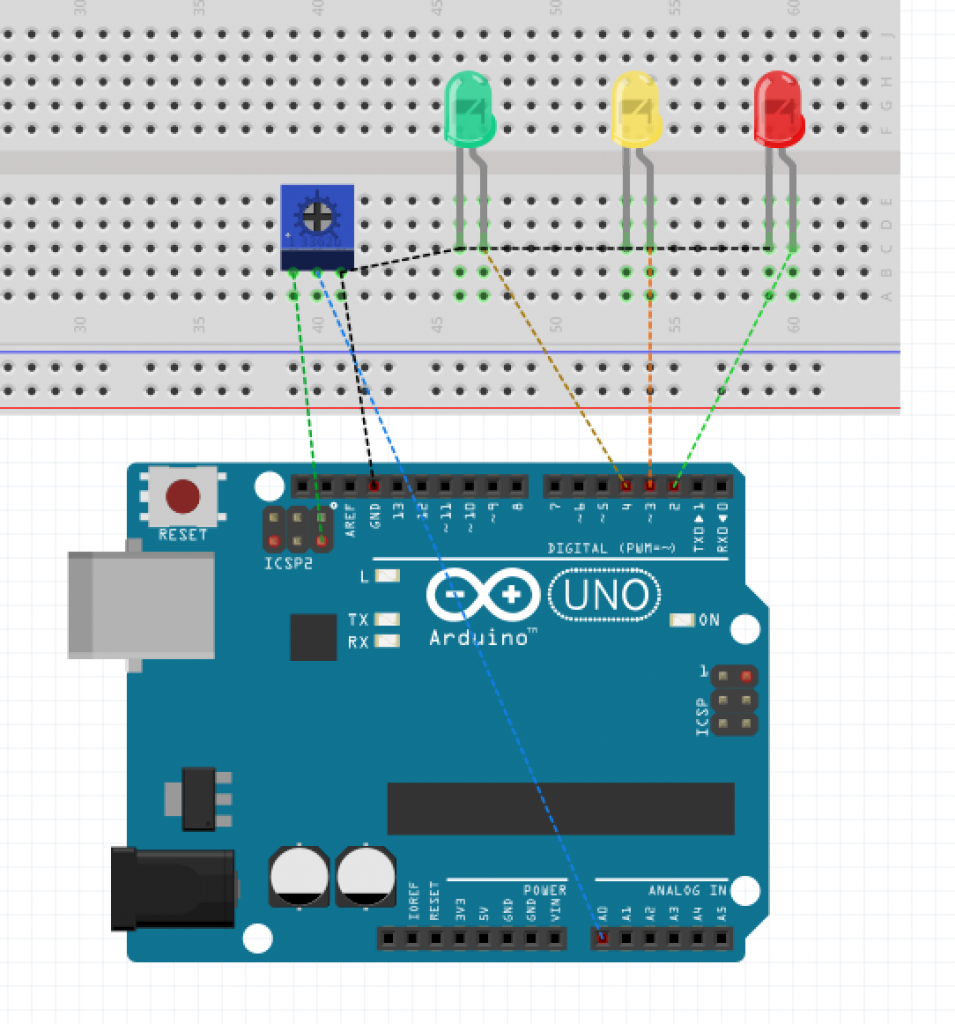
Breadboard view of circuit

Video Demonstration

Fritzing and Arduino Files


Re: Story of Your Life, etc…

Arrival is perhaps my favorite film, and while I was already familiar with the Wolfram documentary, and the original Ted Chiang story, I am always excited to revisit these ideas, and learn more about the interplay of language and cognition. I was impressed with the way the Electric Didact dissected this concept in the film and tied it back to the root of the very word “understand.”

Even more interesting to me is when we try to use language to express what we see, thereby translating visual cognition into an audible expression and back again. (As we are aiming to do with our projects in this course.)

This idea reminds me of a study that found that Russian speakers, who have separate words to distinguish between light and dark blue, are quicker to recognize these subtle differences than English speakers when shown two different shades, thus indicating language affecting visual perception right here on our own blue planet.

Article from the National Academy of Science

On the other end of the same cycle, Vox did an interesting piece looking at the evolution of words for color in language across different cultures, beginning almost always with just light and dark, then next to red before blue and green.

I’m curious if there is any way to actively adapt the interconnection between visual and linguistic cognition for use in interface design, or to create new connections by building a new vocabulary to map optical cues to concepts that do not have representations in the visual spectrum.

Cymatics: Chladni Plate

In relation to both the discussion regarding the visualization of sound/music as well as the work that Ghalya has posted about EJTECH’s work, I wanted to share this project because, well, it looks really cool. The project uses a speaker attached to a metal plate which moves sand that is placed on top of it when notes are played. It’s pretty visually interesting, and might be cool inspiration for something.

EJTECH – Soft Sound

I came across this project and thought it would be cool to share. Soft Sound combines sound with fabric in order to play with textiles as an audio-emitting surface, and to create multi-sensory interactions. For example, not only can the fabric project sound, but the vibrations caused by the sound interact with the textile, causing it to throb and move. Soft Sound creates “soft” speakers by applying laser or vinyl cut copper and silver coils onto fabric, and running alternating current through the coils.

50cm x 50 cm. Functional textiles, metallized laser cut textiles, magnet, amplifier, custom electronics.

I found this project inspiring because it was able to turn sound into a more tangible artifact, since you can feel the sound’s vibrations through the fabric. Think of all the ways this technology can be applied to a variety of different uses! It’s truly inspiring. From e-textiles for wearable technology, to more traditional applications at home and everyday, this project is really interesting.

Check out more cool work by EJTECH here.

Critique 1: Visual Interaction

“An island that cannot hear in an ocean that cannot see.”

Due 11:59pm, 25 September.

Use vision to make an interaction accessible to someone that cannot hear.   This is more than the simple state machines in the weekly assignments — for this crit we want a full interactive experience where the device interacts with a person.  “Cannot hear” is not defined only as deaf or hard of hearing, it can be a condition where listening/hearing information is impossible.  Examples:  at a Baroque symphony, wearing ear protection while using loud construction equipment like a jackhammer, at night in a dorm room when the roommate is sleeping.

The inputs that can be used for this interaction are open to whatever makes the interaction work.

Take a look at the syllabus for more information on crits and the goals of this class before starting your project.  Remember what we talked about in the first classes, the differences between reactions and interactions.  The IDeATe Lending Library is also a good resource (and some of the staff have taken Making Things Interactive!).

Email me if you have any questions or hardware problems.  I will be on the road most of Thursday but will have my laptop out at the conference taking notes on presentations.

Class Notes: 19 September, 2019, reading and listening assignments

Story of Your Life, by Ted Chiang.  A short story about alien language told only using the alphabet.   The movie based on this story, “Arrival”, was the visual version of a foreign alphabet “Armied up” so it has more tension.  Christopher Wolfram shows how he created the language for the movie with links to his code (it’s long and probably boring if you don’t think in Mathematica).  A much shorter, more philosophical question about the meaning of language uses “Arrival” as its base.

Two listening pieces, one based on “Deafspace” architecture, the other on wayfinding (which we really haven’t discussed in class yet)

Deafspace

Walk This Way


Class Notes: 17 September, 2019

Visualization of Sound and Language

Visualization of sound by audio frequencies

Visualization of simple tones

Visualizing music in real time using sound

Visualizing music using sheet music

Posters visualizing songs based on the sheet music for the song.

Bach’s Cello Suite No. 1 as a poster, as sheet music, and performed by Yo-Yo Ma.  Compare the visualization of the poster with the instructions in the sheet music.

Visualization of language

Visual ASL dictionary with full demonstrations of each word.

Written ASL (which we did not discuss in class), a notation system of translating ASL hand motions to marks on paper.

Compare ASL visualization of words to Braille‘s visualization of letters and word components.  Note that the shapes of the letters in Braille do not map to the shape of the letters used in print.

CMU’s Own Designing for Accessibility

I was watching college football the other day and caught this commercial during one of the breaks in the action. At first, I was reminded of this class because of the content (designing for accessibility), but then I realized the woman in the commercial was walking around CMU and Pittsburgh. Chieko Asakawa is an IBM fellow and a CMU professor… and blind. She’s widely regarded for her work designing everyday objects for the visually-impaired.

She also has a TED Talk that is pretty widely cited for the benefits of “accessibility” design for the entire population.

Assignment 4: Deaf Alarm

Problem

The standard alarm clock does not cater to the deaf and hearing impaired. They primarily rely on sound, and very occasionally, vibration. How do the hearing impaired wake up in the morning without having to keep uncomfortable vibrating wearables on throughout the evening?

Solution

A pulse-width modulated led alarm built into a wearable sleep mask or pillow would allow the deaf to be awakened in a flash. This alarm could also serve as an unobtrusive method for allowing an individual in a room to wake up, rather than waking up every party in a room at the same time.

Proof of Concept

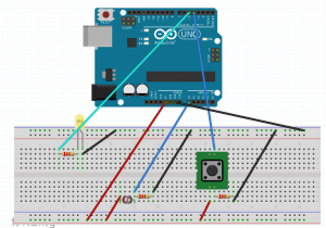
A light based wakeup alarm would give the hearing impaired the ability to program wakeup times, colors, and light patterns. This would allow users to find the most appropriate settings for there wakeup routine. For instance, a softly increasing power would allow for a more calm morning wakeup, but if a user needed to be sure that of there wakeup in the morning, they could use a bright flashing setting. It currently uses a yellow led and momentary push button to change the state from on to off.

deaf_alarm

lightAlarm

Assignment 4: Burning Down the House

I have to admit, I kinda thought this particular solution was a little cliche at first, but then just this week, I accidentally left a burner on low, and walked away for an hour. Luckily nothing got too badly damaged, but I’ve gained a new respect for practical solutions to everyday problems.

Here’s the plan:

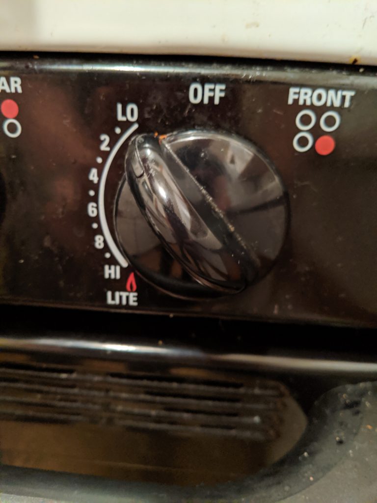
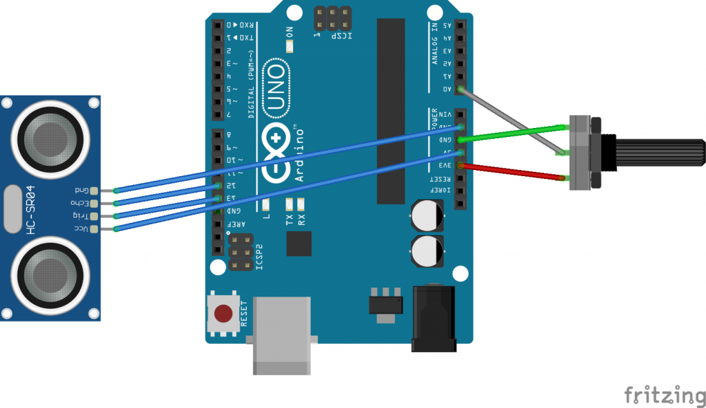
Attach a sensor to the knob to know when it’s not in the off position. This could even be a simple switch (today we’re using a potentiometer in case we someday want to know how high the burner is set).

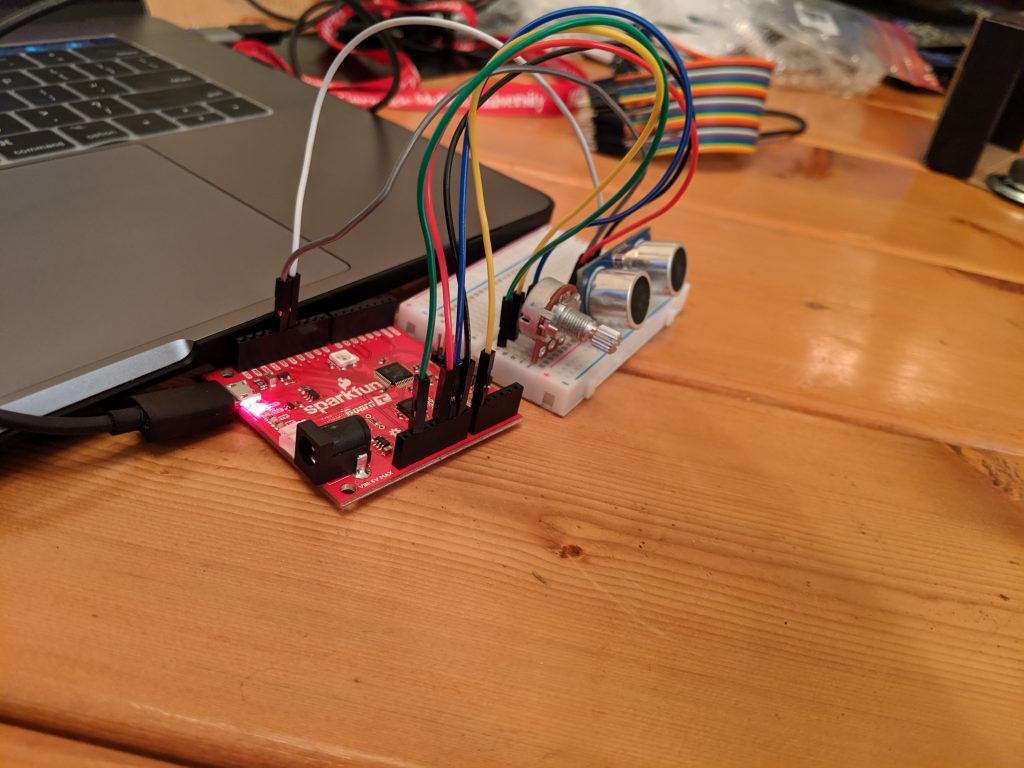
From there we add a sensor to tell when the cook has walked away. We don’t really want a visual indicator that’s always on when the burner is on, or we’ll learn to ignore it. Today I’m using the HC-SR04 provided in class.

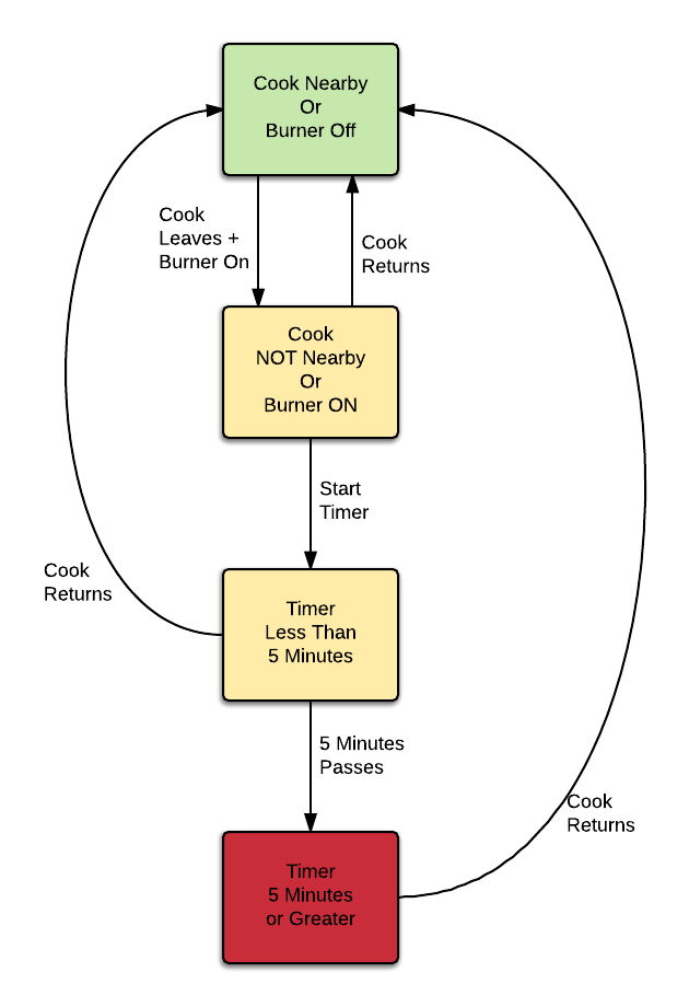
From there it’s just a matter of selecting a timeframe, and an indicator. For the purposes of the demo, we’ll use 5 seconds, but in real life something like 5 minutes is probably about right. For an indicator, I’ve gone with a red LED for the demo, but perhaps a text message or IFTTT notification on my watch would be more practical long term.

Below I’ve laid out the state diagram, wiring of the demo, and a picture of it in action. There’s a link to the zipped code at the bottom.

Let me know what you think!


burner.zip