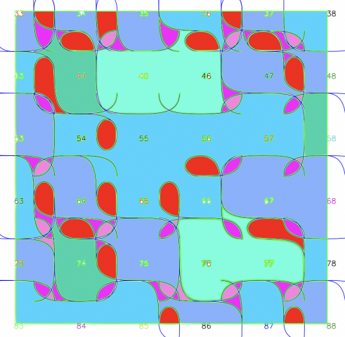
I decided to add color to revamp my tiling project from a couple weeks ago (where I coded a pattern to laser cut onto some fiberboard). Because I was dissatisfied by how strongly the grid dictated the piece, I thought of ways to make the piece more free flowing while still maintaining the original rules for the piece (edges want to match up). I devised a simple logic for the coloring, where the smaller shapes were colored warmly, and the larger swaths of color were cooler. I made sure none of the colors continued over edges, and disregarded the tile boundaries, opting to create a composition defined by only the drawn arcs.
Here’s the mockup for the coloring scheme:

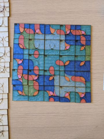
I elected to only color a chunk of it as the original piece was somewhat overwhelming in scale. It came out like this:

