I was half complete with the tiling pattern project when it was due (hence the combined title) so I figured I’d finish it for the MidSemester review.
I first created a 16×16 tile generator so I could draw my name (I made 15 tiles, 3 for each letter). Here are some examples:
![]()
![]()
![]()
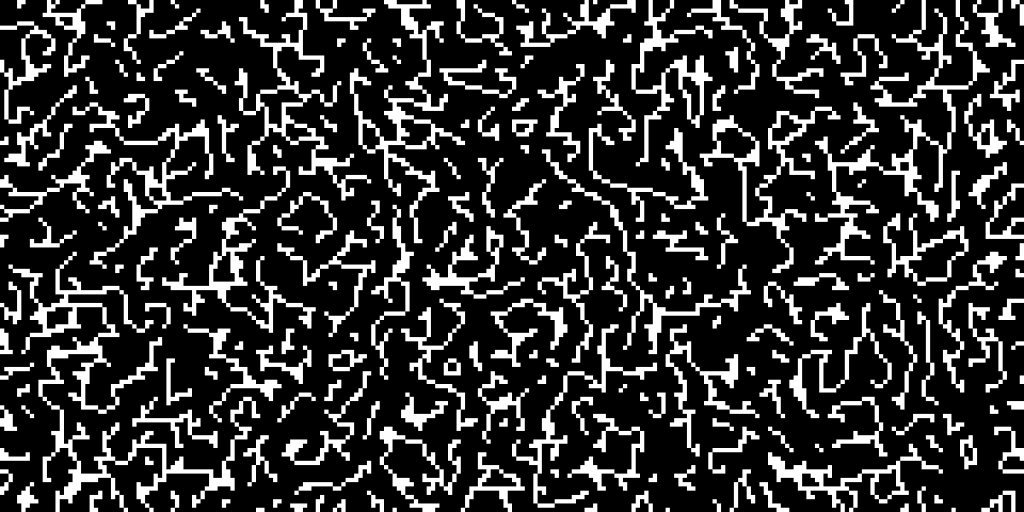
I then modified a wave function collapse implementation (after reading up about WFC’s and how they work) mentioned in this Processing thread which is based off of mxgmn’s original implementation to generate tilings of each of the letter tiles I produced as a sort of signature. And then I converted it to svg using marching squares.
Here’s one
I sort of like how it’s almost a gradient and depending on the type of font the wave function collapse algorithm generates tilings with varying amount of order/disorder.
I also presented a single tiling with used a brush pen, a willow stick, and a fine pen (just to play with the different textures.
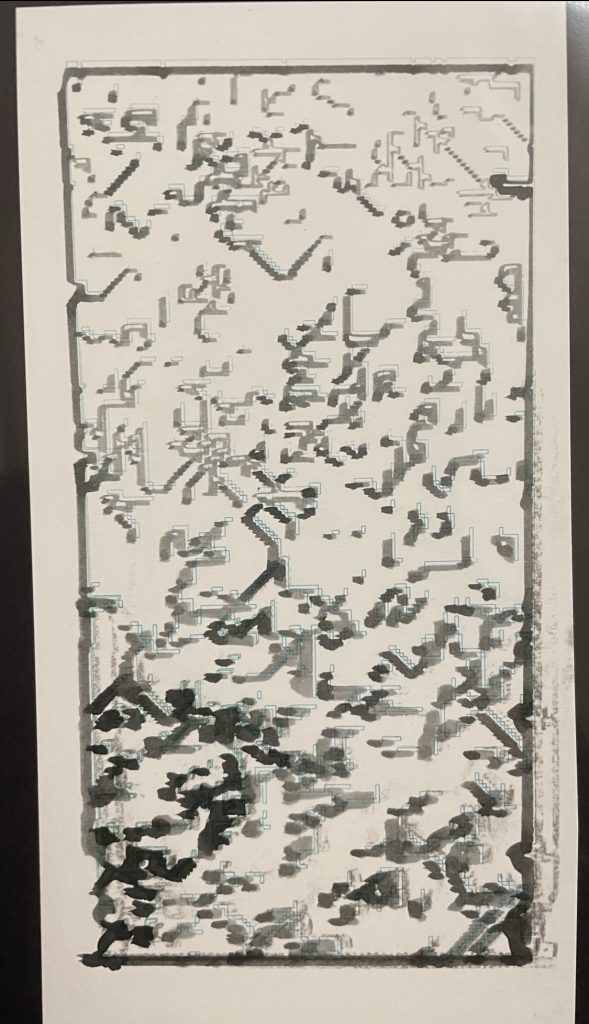
I was also interested in exploring different ways of manipulating these tiles. Here are two experiments I did:
In one I wanted to do almost a “where’s waldo” with WFC, so I created a 16×16 waldo tile in my tile maker in processing and then generating multiple tilings.
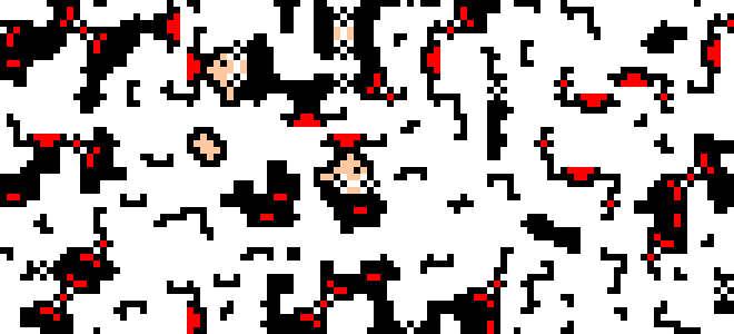
I sort of want to make this my wallpaper.
Anyways, I ended up not plotting it because I ran out of time. I also think this would look better at a larger scale, so think of this as a little swatch test.
Another thing I wanted to do was see if the original letter appeared in any of the produced tilings. But I also didn’t want to hand annotate/circle any letters I found, just because I thought that would be boring/time consuming imo.
So instead I found another time consuming way to identify letters, trying to implement OCR(Optical Character Recognition)!
I implemented it in python and it generated the following results.
Some examples:
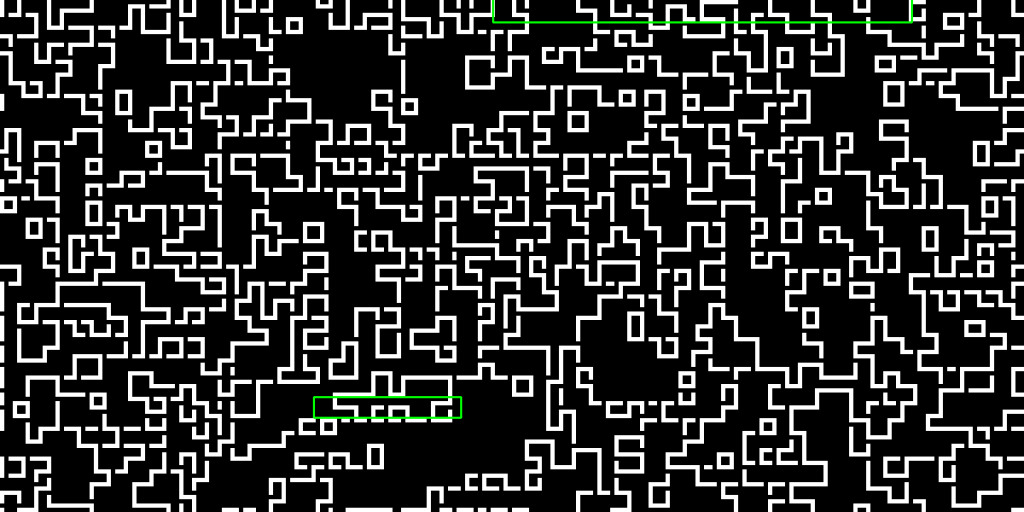
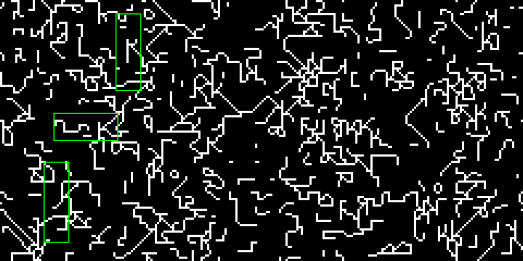
I think it was sort of interesting to uncover what the computer reads as “text”, but I ultimately didn’t plot any of them bc I didn’t think showing that part of the tile as a different color really added much + I didn’t have a lot of time.
Something interesting to note though…while generating these WFC patterns using the tiles I created, the letter R had the most contradictions I’ve ever seen. It was almost infuriating trying to get a single tiling to finish, because there was (like ~85% of the time) always a contradiction. I’m not too sure why exactly, maybe the diagonal bit of a “R” is prone to contradiction? But I also personally find the R’s the be the most visually appealing.
It looks itchy.