![[OLD FALL 2018] 15-104 • Introduction to Computing for Creative Practice](https://courses.ideate.cmu.edu/15-104/f2018/wp-content/uploads/2020/08/stop-banner.png)
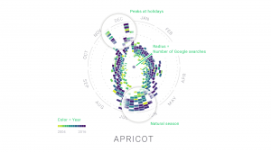
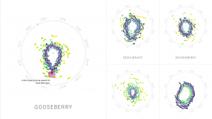
The Rhythm of Food, by Moritz Stefaner (2015) is a data visualization project that displays patterns of food seasonality based on Google search data over a span of twelve years. This project interested me because it visualizes a set of extensive data in a visually pleasing way through a radial pattern. While this representation is abstract, you can still see the patterns and peaks of food seasonality. The designer developed an algorithm that creates a radial “year clock” that represents food trends. The algorithm is set up so that the distance from the center represents relative search interest, the segments represent search interest in the weeks within the past 12 years, and the color represents the year. The creator implements his artistic sensibilities through color and rhythm. The way the trends are represented radially makes the project seem like a beautiful piece of art at first glance when it actually reflects real life data.