Austin Treu – Looking Outwards 07

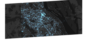
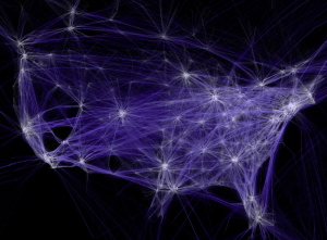
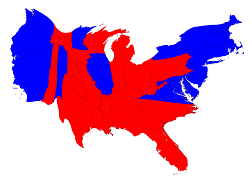
This is an example of a visualization of the 2016 electoral map. I find these fascinating for a variety of reasons, not only because it makes clear what the population distribution in the US is, but it also shows which states had the most influence over the result.

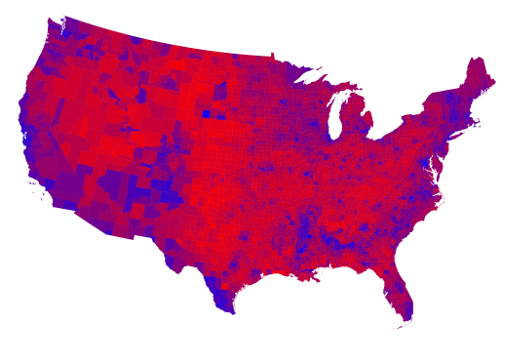
http://www-personal.umich.edu/~mejn/election/2016/

This site has a variety of population based maps that represent the spread in different fashions, by county and percentages of the vote and such. In looking at the county maps, especially the one shaped normally, I find it fascinating how this representation shows the widespread red and how compacted the blue is.

If you look at this map adjusted for population density, you can see this clearly because of how much larger the blue areas become.

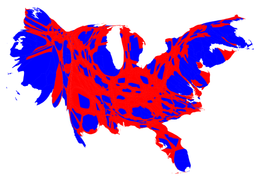
The implications of one voterbase being so widespread and the other being so condensed are many, but I’m not here to discuss politics other than remarking on these being interesting.

Robert Oh-Looking Outwards 07

Word Associations Visualization by Chris Harrison

For this Looking Outwards, I chose to study the word association art of Chris Harrison. I really admire this kind of art because I’ve taken multiple classes that show the importance of words and their similarities. This project shows which words are used more frequently with the two base words, “hot” and “cold”.  I really admire how simple and clear it is to look at this graph. You can see clearly which words are more frequently used with either of the base words.

In other to make this graph, Harrison went through many different processes. Words were bucketed into one of 25 different rays. Each of these represented a different tendency of use (ranging from 0 to 100% in 4% intervals). Words were sorted by decreasing frequency within each ray. Finally they rendered as many words as could fit onto the canvas.

You can see how methodological and clear the artist is through this piece. This art is really all about data and applying that data, and so I would claim that you can see Harrison’s logical artistic style in this art.


http://www.chrisharrison.net/index.php/Visualizations/WordAssociations

Nina Yoo – Looking Outwards- 07

Lev Manovich – The Exceptional and Everyday – 144 hours in Kyiv- 2014

Instagram users in the City

The project of 144 hours in Kyiv takes place in Kyiv, Ukraine where they had tracked instagram usage across the area during the revolution on February 17 –  22. Lev had teamed up with Jay Chow, Alise Tifentale, and Mehrdad Yazdani to execute an aesthetic visual that described the power of social media and how it effects everyday life. While in real life the city was abuzz especially in the square, online was different. Pictures of protesters clashing with police was right alongside with cute instagram pictures posted by other people. It made it seem as if the protest was just a part of everyday life and that was what Lev was trying to convey about how social media can turn serious issues into everyday life. I admire Lev for his ability to express this information in an aesthetic way where it almost seems like a virus is spreading around. Instead of having boring statistical numbers, he took an idea of “lights in the city” and transfered it to track instagram users which is both easy to understand and visually appealing.

Hannah Cai—Looking Outwards—07

https://www.creativeapplications.net/vvvv/melting-memories-drawing-neural-mechanisms-of-cognitive-control/

This project by Refik Anadol Studio caught my eye because it’s so beautiful and haunting—it really looks like something from a sci-fi movie. In reality, it’s a visualization of brain wave activity of participants who were asked to recall specific childhood memories. These memories weren’t mentioned; I’m really curious what they were. Even without that information though, the project still gives off a really nostalgic feeling.

I didn’t really understand the technical details behind the visualization, but the designer(s) seemed to have taken EEG data and input it into algorithms for 3d structures. While the concept behind that is really neat, I feel like the actual structures created would be very subjective based on the algorithm used, and I wish there was more context about the how one was translated into the other. I feel like this type of visualization has a lot of potential in research and education; I’d love to see a more concrete approach used to describe brain activity—for example, what different emotions look like, brain activity mapped to height of data points, etc. However, I do still think the end result of this project is really beautiful and innovative on its own.

JasonZhu-LookingOutwards-07


This is a screenshot of the data visualization chart for the many ways to die by Nathan Yau, It is titled How You Will Die and is published on FlowingData.com.

https://flowingdata.com/2016/01/19/how-you-will-die/
Created by Nathan Yau; Date Unknown.

I have long admired this project for several reasons. First and foremost it allows for the right amount of customization. Often times, data visualizations will overdo the interactivity component or not include it at all. This project is in the goldilocks zone of interactivity and customizability. I also very much admire how the information is presented. It takes a simple approach (using circles) to convey a complex amount of statistical data. Fascinating to say the least. I think this plays nicely into how Nathan Yau uses a very computational method visualization in his work. In many ways his artistic sensibilities are nested within the final product. As for the algorithms used, it seems to be various algorithms that pull from a statistical database.

Miranda-Luong-Looking-Outwards-07


Above: Rhythm of Food-Selected Animations sourced from Truth & Beauty’s website.

Google News Lab and Truth & Beauty‘s Rhythm of Food (uses Google search interest to reveal food trends over the years. At first, they compiled this data in a normal line graph specific for every kind of trend in food. However, realizing the potential to dig deeper and better analyze this data, they collected weekly Google Trends data for hundreds of dishes and ingredients, over twelve years and plotted the results on a one year clock. What I find intriguing is this decision to plot the data on a one year clock, considering they had collected 12 years worth of data. It seems their rationale was to harrow in and have viewers see the correlation between seasons and food trends, in addition of time, versus only seeing the difference over time. I admire their decision to do this because it took the extra step of thinking of a new way to visualize food trends that people are most familiar with. The changing of seasons is something that is very prominently linked to food trends, a hidden trend we didn’t realize in terms of data. In addition, the decision to shape and orient the graph in such a way similar to a clock is interesting as it reminds us of the cyclical nature of this data, while still effectively demonstrating the scale of the number of these searches. According to Truth & Beauty, the project was built using  ES2015, webpackreactMaterial UI, and d3 v4. The color scale used for the years is viridis.

Sophie Chen – Looking Outwards – 07

Melting Memories by Refik Anadol Studio

Melting Memories on display

Melting Memories is a series of multi-dimensional digital artworks that explore the materiality of remembering through different ways of representing EEG data collected on the neural mechanisms of cognitive control. What viewers experience are aesthetic interpretations of motor movements inside a human brain. I was immediately drawn to the level of abstraction of the human mind that this project was able to visually achieve. The Neuroscape Laboratory at the University of California, San Francisco gathers data and changes in brain wave activity which are the building blocks for the algorithms that the artists need. The team was able to use a composite design pattern to quickly iterate the project, and this way of working allowed them to explore many different complex functions while maintaining a modular graphics pipeline. I really admire the level of integration between data and visuals that this project was able to achieve.

Data capture & abstraction process

Justin Yook- Looking Outwards 07

Glimpse of the application visuals

Peak Spotting by Studio.NAND is an interactive application created for Deutsche Bahn, a railway company located in Berlin, Germany. It is a visual tool that allows Deutsche Bahn to manage their rail network by looking up to 100 days into the future. Specifically, tasks such as optimizing prices, train coordination, and providing better customer service. The program is run by machine learning algorithms that display data in an instant for the traffic managers. I think this application is interesting because it helps visualize and understand complicated issues, that might be hard for people to casually identify and resolve. The German rail network seems intricate and it can be easy for anyone to overlook details. One can see Studio.NAND’s artistic sensibilities from the simple design; the train routes, and the trains can be quickly checked.

Source: https://nand.io/projects/peak-spotting

Alexandra Kaplan – Looking Outwards – 7


Infographic containing the map of different regions as well as the phone call map.

The project on information visualization that caught my eye was a project created by the New York Times in 2011 called “Phone Call Cartography” in which researches from MIT, AT&T, and IBM compiled research about phone calls and where they are from/to. This data is then compiled into a map in different arcs each representing thousands of phone calls. I have always enjoyed looking at maps, so seeing such interesting data being the foundation of one is fascinating. For the algorithm, it seems like they assigned the data to different regions and had regions with more data be taller and bolder. I think that it is really cool that even without the normal geographic map of the United States, it is still possible to tell what cities are where as well as a general population of different areas. I would be interested in seeing a similar map for today, I wonder if there would be a similar number of phone calls, fewer, or greater.

Looking outwards 7 rrandell

http://www.aaronkoblin.com/project/flight-patterns/

This is a link to his website and here are some photos of his work below:

The piece that I have chosen for this data visualization looking outwards is called Flight Patterns by Aaron Koblin. I am particularly drawn to this piece because of how clearly you can see a map start to take place over the hundreds of thousands of flights in America. Not only is the data clear, but it is also strangely beautiful and ethereal– the individual flights serve as pieces of blue-ish light that light up the dark negative space. Aaron Koblin used FAA (Federal Aviation Administration) data and parsed and plotted it to represent the artwork that is shown on his website. He also used the ‘processing’ programming environment which is a coding language designed specifically for visual arts.