http://www.aaronkoblin.com/project/flight-patterns/
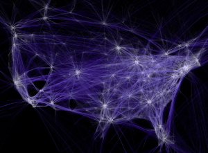
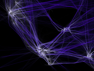
This is a link to his website and here are some photos of his work below:


The piece that I have chosen for this data visualization looking outwards is called Flight Patterns by Aaron Koblin. I am particularly drawn to this piece because of how clearly you can see a map start to take place over the hundreds of thousands of flights in America. Not only is the data clear, but it is also strangely beautiful and ethereal– the individual flights serve as pieces of blue-ish light that light up the dark negative space. Aaron Koblin used FAA (Federal Aviation Administration) data and parsed and plotted it to represent the artwork that is shown on his website. He also used the ‘processing’ programming environment which is a coding language designed specifically for visual arts.
![[OLD FALL 2018] 15-104 • Introduction to Computing for Creative Practice](wp-content/uploads/2020/08/stop-banner.png)