In lab we don’t have as much time to go over the creative implementation of code, but that doesn’t mean the class doesn’t value your creative efforts in your work! We will update the class gallery to showcase a few of the projects each week that we were particularly impressed by. Things that catch our eye are as follows:
- Clever use of code/elements/new functions (which makes it especially good to share to the class for everybody to learn)
- Strong graphic design
- Whimsical interaction
- Expressive motion
- Spunk and personality in a piece
Some pieces we were especially excited by for variable faces, and that we hope you are inspired by as well:
HYCAI | Arowana
Love that you were proactive in finding the Shear command (under the hood, it’s a matrix transformation)! It was cleverly applied to skew the the scales (notice that some of scales aren’t perfect half circles, and are in fact slanted), and the graphic design (everything from color combinations, to proportional silhouettes) was thoroughly considered.
KHUA
We love the derp. The dynamic wallpaper helped too. The piece has memorable style. The choice in hairstyle designs was thoughtfully considered to makes good use of the basic shapes.
MSLEE | “Bald is beautiful”
— we agree. Such interesting faces.
KAIZ1 | Deadpool
Such spunk! Such storytelling! This has humor and suggestive narrative all done through making the most out of a few elements. We appreciate your choice in character because it makes use of the circles in a way that not only makes visual sense, but expresses emotion.
ACFANG | Dancing Bird
the Dancing Bird piece follows a similar pattern of suggestive narrative; clicking through it makes it seem like the bird is dancing at the disco.
SUSIEL | Grumpy Snowman
We’re happy to see thoughtful use of transparency for shadows! But maybe an extra cast shadow at the snowman’s feet would’ve helped complete the picture/provide more contrast between snowman and background.
Transparency comes from the alpha value. The alpha value is the optional 4th parameter that goes with RGB. ex: fill(255,0,0,50) colors things red, but at 50% opacity.
JHU | Self Portrait
Intentional offset of elements makes for a delightful style. Creates a sense of depth with a suggested graphic 3D feel. Similarly —
JUNFANC | Bunny
junfanc was able to create a faux 3D rotation feel with the careful displacement of bunny features. A simple trick used for a nice effect
Xiaoying | Bears
Nice custom shapes! Glad to see that you are proactively looking through the p5 reference library. Strong graphic style.

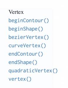
The custom shapes are done with the beginShape(), endShape(), and various vertex commands.
![[OLD FALL 2018] 15-104 • Introduction to Computing for Creative Practice](wp-content/uploads/2020/08/stop-banner.png)