![[OLD FALL 2018] 15-104 • Introduction to Computing for Creative Practice](https://courses.ideate.cmu.edu/15-104/f2018/wp-content/uploads/2020/08/stop-banner.png)
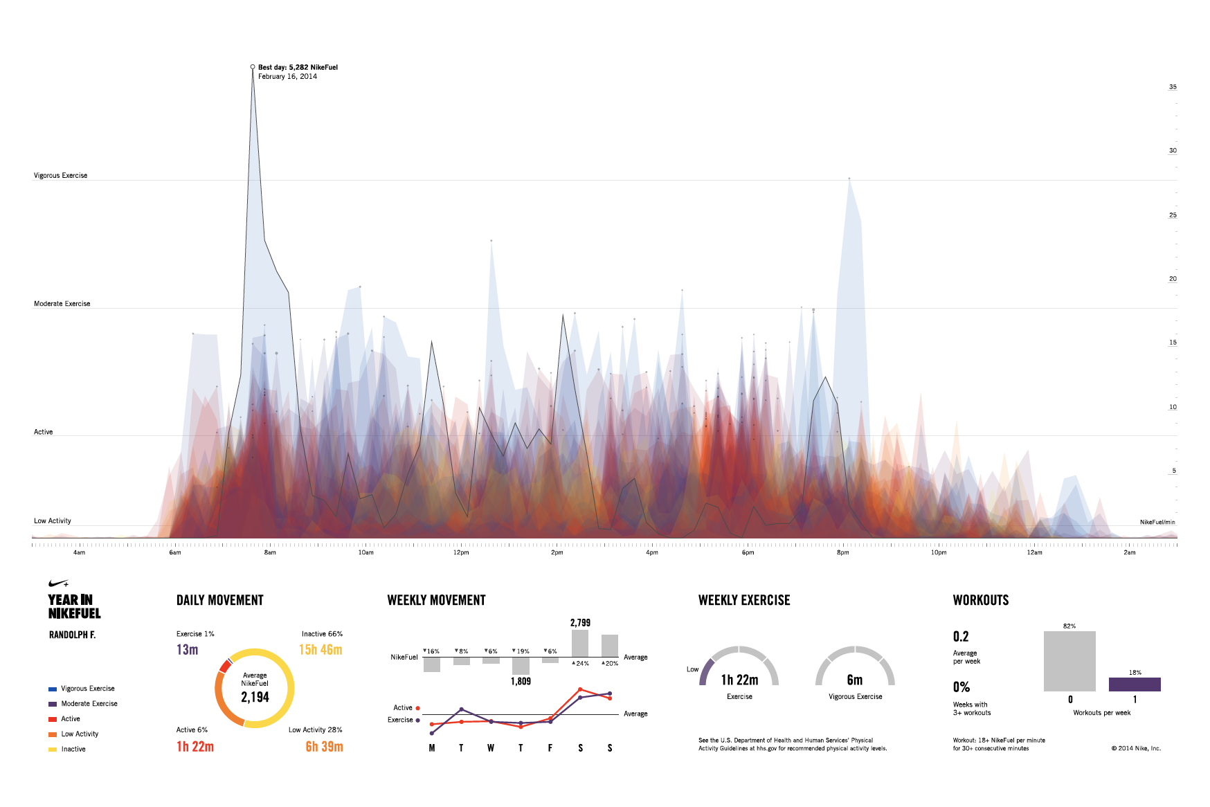
The above video shows the website “YEAR IN NIKEFUEL” built by Fathom for Nike+ FuelBand for users to view their personal physical activity patterns (couldn’t find exact year created) Link: https://vimeo.com/151097197
What I admire most about the various aspects of computation visualization information is how they bring so much convenience and assistance into our daily lives. The website that Fathom, a design agency, created in collaboration with Nike for Nike+ FuelBand users perfectly illustrates this. On this website, users are able to download and share posters with information of their daily movement for everyday of the year. Different colors are used to depict different levels of activities. Different concentrations of colors are also utilized to depict patterns and behaviors of activities. Unfortunately, I couldn’t find the algorithm and software that Fathom used to create the actual website, but the software that they used to create the model is Frame.
As someone who is having a hard time finding motivation to work out, I think this website is great for motivating those with low daily activities. Because of all the different usages (entertainment, easy access to various sources of information…etc.) that technology provides to us, most people today spend their time sitting in front of their TV or computer or scrolling away on their phone. Thus, they end up not “moving” around enough to build a healthy body. I really love how this app displays visually the differences of low and high areas of activities, reminding people of how their lifestyle is like as they can easily visualize it. The “sharing” aspect of the website also motivates people as others will be reminded or motivated to workout when they see their friends posting from YEAR IN NIKEFUEL.
The team’s choice of using the three primary colors (blue, red, and yellow) as the main theme colors for the website also helps to give the whole website a “simple” vibe that is user-friendly, which encourages people to try and experiment with the website. The various graphics that helps to organize information are also designed and considered so well that it minimizes distractions and helps users to understand the information right away. The graphics are designed so well that they seemed to be designed without effort. As a designer-in-training, I only realized how hard it is and how many things are needed to be considered when I entered the program of design at CMU. Thus, this is one of the many things that I am trying to learn from, which is why I admire this design from Fathom so much!
Link to YEAR IN NIKEFUEL website: https://yearinnikefuel.com