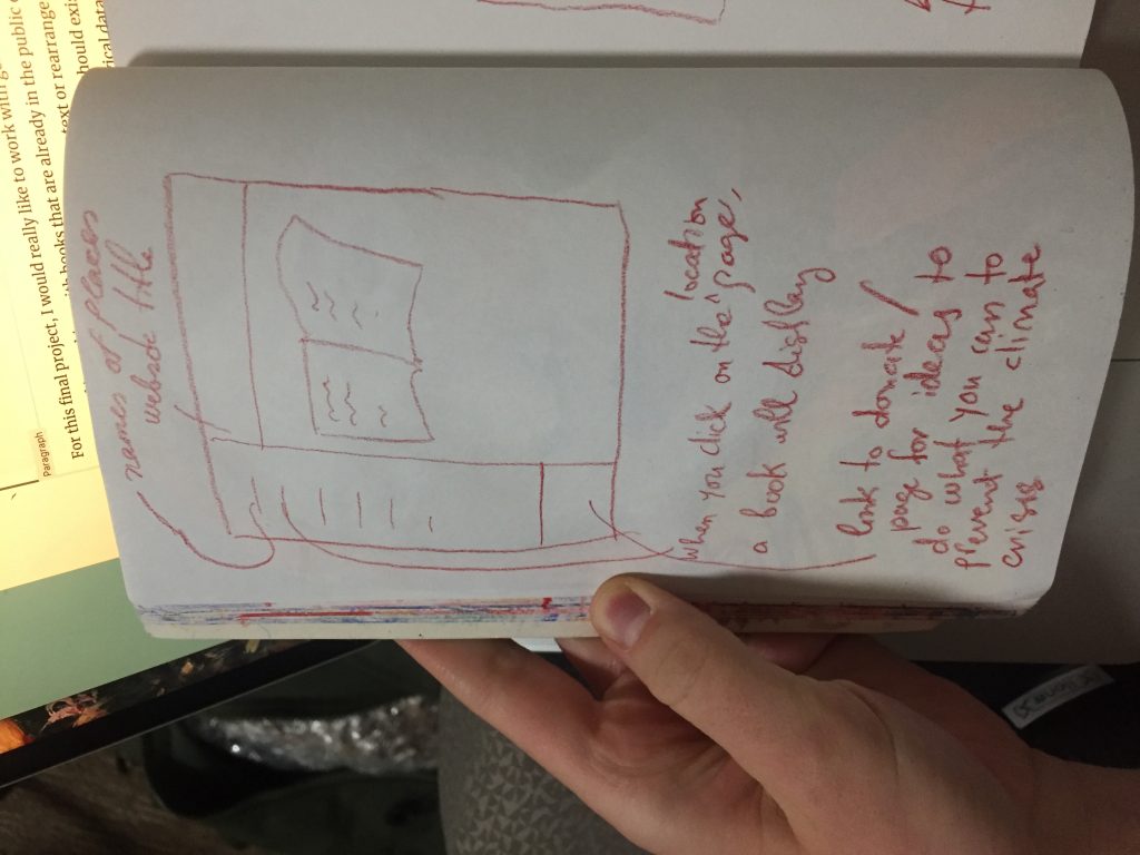
sketch of the text changing placement over time / pages Drawing of website in which the generative text is contained
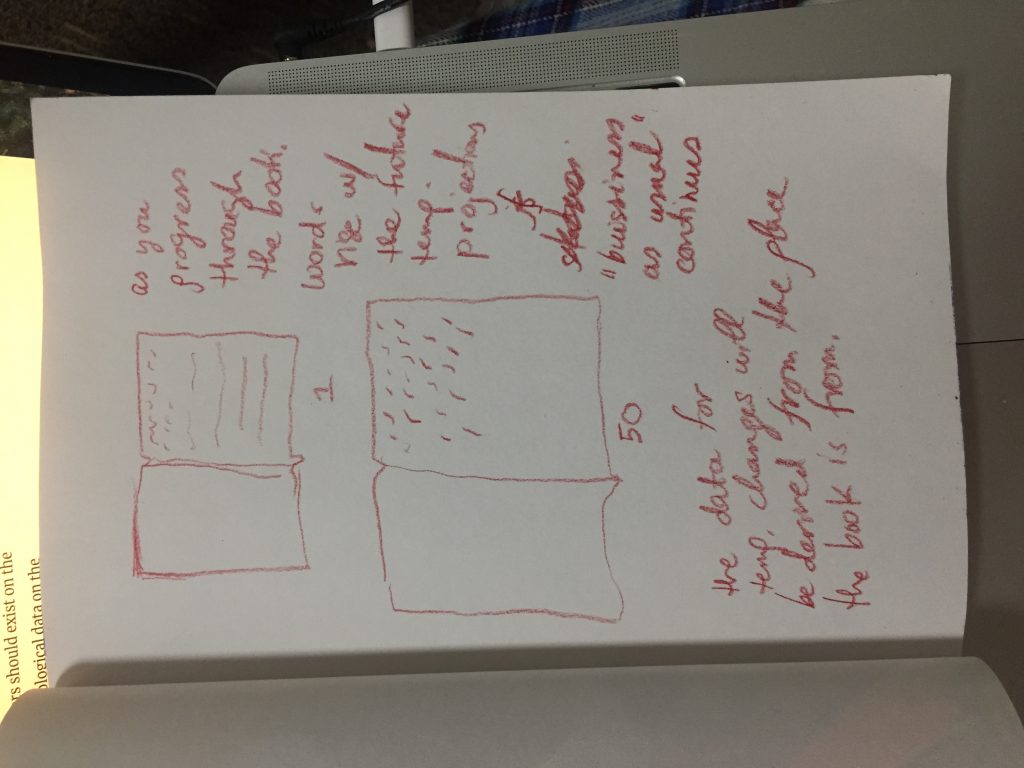
For this final project, I would really like to work with generative text. I am interested in working with books that are already in the public domain, and instead of using my program to generate new text or rearrange old text, I want to use my program to specify where the letters should exist on the page. I would like the letter placement to reflect ecological data on the rising temperatures due to the climate crisis. I would like to create a reconstruction of a cultural artifact / book where ever page signifies another year into the future, and the letters y placement slowly increases according to the amount of degrees the temperature in the place that book was written will rise. I am interested in the fragility of human existence and human culture, and how all of human memory and collective history is threatened by the climate crisis.. I want to display this vulnerability with this modified version of a book.
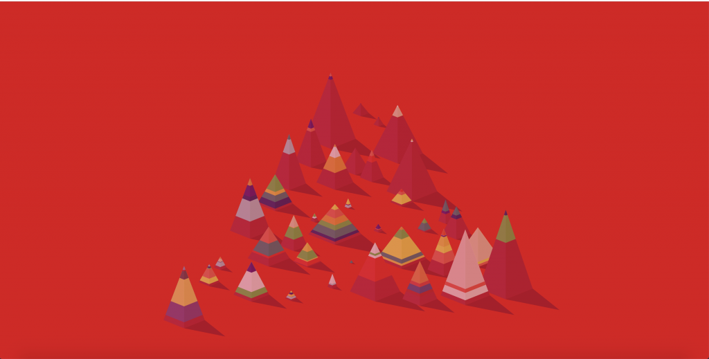
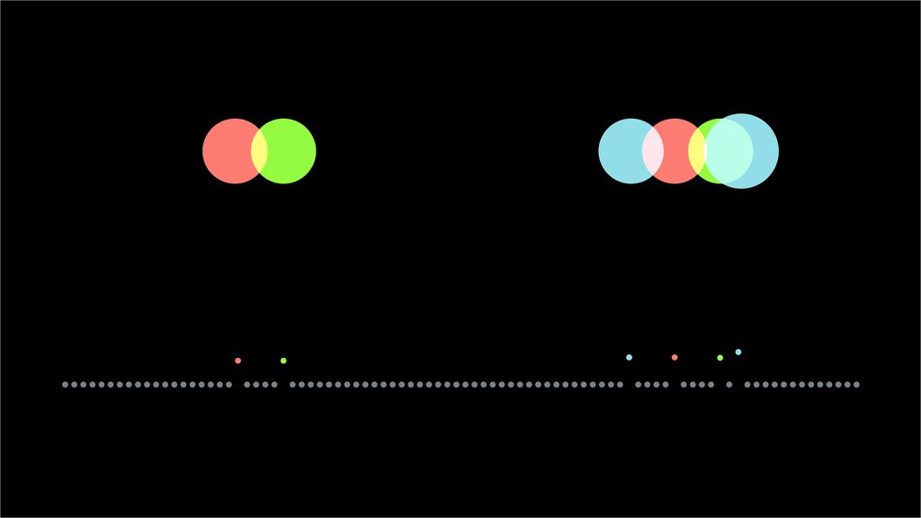
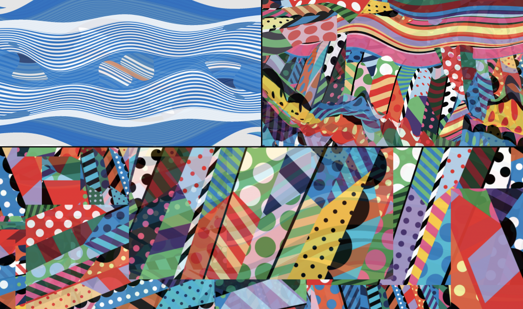
The projects I chose were Basecamp, 2014, by Leander Herzog and BZ_zoom_test_3, 2019, by Jonathan McCabe. The first is a number of pyramids that seem to have different layers of color dripping down from their peaks, and will retreat back into them and come back out corresponding with the changing background color. The second is a video of a picture with a lot of different shapes, patterns, and colors that is zoomed in on for minutes straight. It seems like the picture is infinite.
Similarities
Both use very bright and vibrant colors, with the pallets continuously changing as time goes on.
Differences
Basecamp uses shapes with sharp edges, while Zoom consists primarily of curves and malformed circles.
The first has very clear dividing lines between the different colors, whereas the second has gradients
The first is interactive while the pother is just a video for purely watching.
I admire their color use. The projects are just so pretty. I derive a lot of my enjoyment from them purely on their aesthetic appeals. I also like how they are essentially never ending. I know that the Zoom video technically ends, but it’s almost under the guise that it wont. This continuous change allows for the audience to be given something new, so they never really get bored. They will have to keep watching since there is always some new part of the piece to see.
For Basecamp, an overlooked opportunity could be to experiment more with color. For the most part, it seems the colors are the same, just switched around a little. Maybe they could correspond more with the background. If the background was one color, the shades on the pyramids could be its complementary, or they could shades of a color that contrast well with it. Anything to spice things up a bit. For the Zoom video, I think the picture is very pretty, be the video is only zooming in on a single point that the audience doesn’t get to choose, causing the surrounding image area to be ignored. Maybe the video could be turned into those ones where the audience can use their mouse to change what they’re looking at.
For my final project, I want to create generative placement of text letters based on data received from the projected temperature rise from different areas around the world. The data from the specific place which the classic book is from its fed into a program which determines its placement for each page of the book. Each page represents moving forward one year.
I was having trouble finding other artists who have worked with APIs to generate the placement of text, but I did find two artists whose work is of interest to me and relevant to my final project. The first is Georg Nees, who was an early pioneer of generative art. His piece, Gravel, provides a sort of visualization of the progressive instability I am envisioning for this work.
Gravel, by Georg Nees
Bleed, a design consulting firm also has some projects that involve generative text and processes based within nature that are interesting to me and relevant to my work. For example, as quoted in the Its Nice That article, “Bleed took the Albert Einstein quote “look deeper into nature, and you will understand everything better,” as a concept but also a tool so that every time a character from the sentence is typed, a sphere is formed using a certain amount of triangles.”
I am interested in how the movement and placement of typography could be conceptually linked to broader ideas of nature.
For my final project, I drew inspiration from motion graphic designers and my personal interest in graphic design. As an aspiring graphic designer, I have always been fascinated by moving logos. They are extremely attention-grabbing on the home page of a webpage. I want to create and design a looping animation /interactive logo. I think that I may even think about using the turtle for my animation??? I am not 100% set on my design but I plan on designing something with my initials, AC. Hopefully, I will be able to use this logo in my portfolio website!
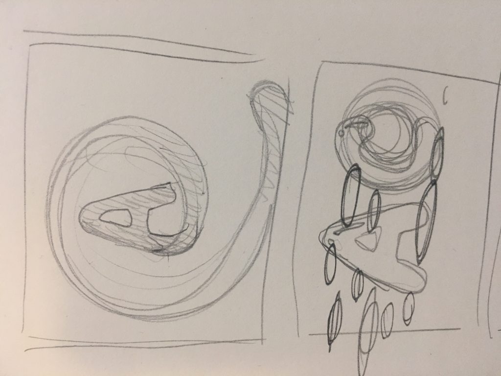
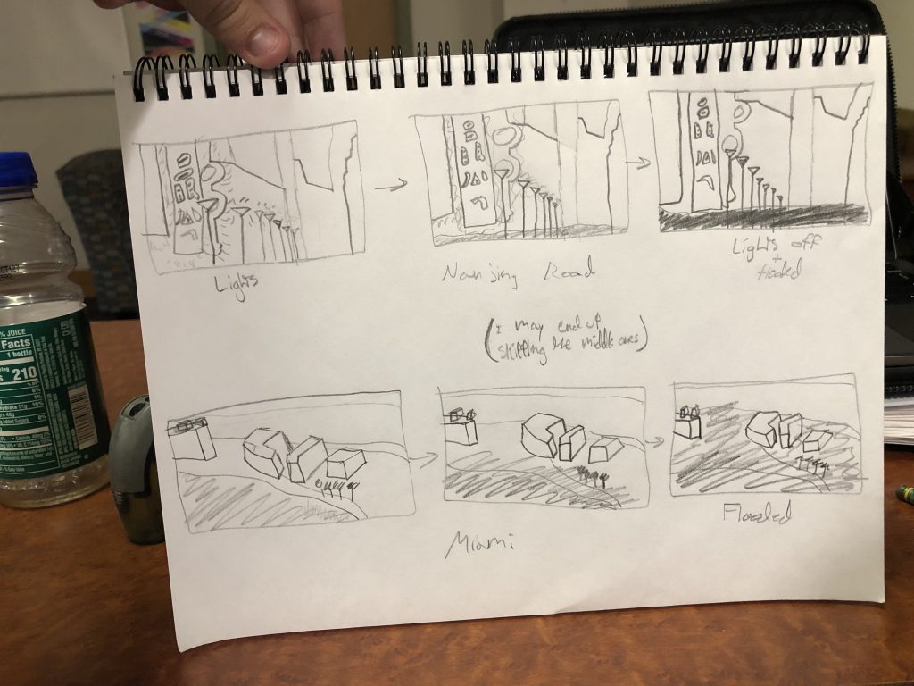
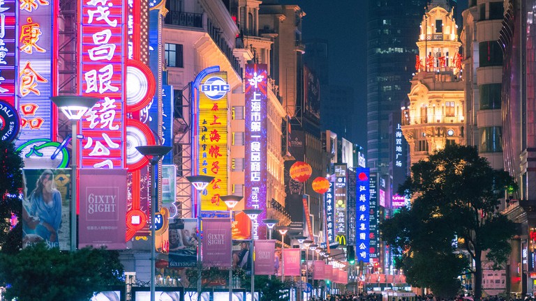
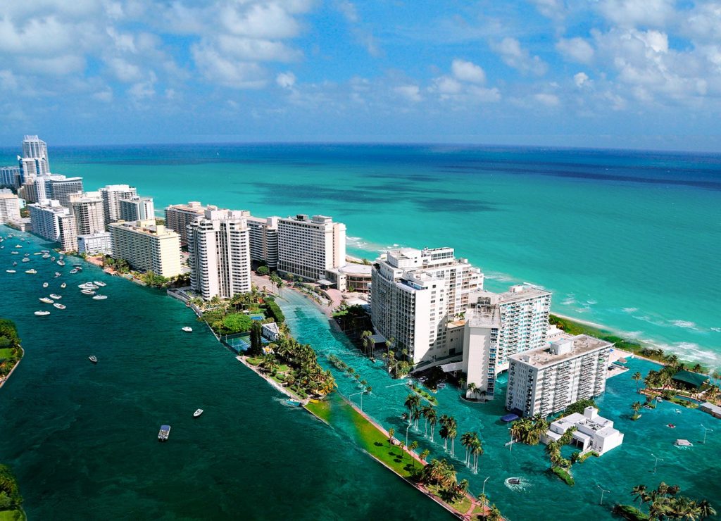
To get inspiration, I looked at the flood map for 2015, and was immediately shown areas of China. I saw Shanghai, and decided to look up landmarks in that area. A great one was the Nanjing Road, a very colorfully lit street. After looking at the Patatap video by Jono Brandel, I decided to do a project changing on a beat. It would start out with a hard coded version of the landmark, then on each beat it would change, showing the water level rising and landmark degrading and losing its beauty. The lights will all be grey/off, the ground not visible. I may or may not use multiple landmarks. Most likely I will. I want to have these landmarks be from around the world, basically showing how this affects many people and many different types of countries/states/areas. Other places threatened by flooding are Florida, parts of Vietnam, parts of Thailand, parts of Bangladesh, parts of Iraq, etc…
I don’t really know anyone in the class so I probably wont be collaborating.
Rough Draft of ProjectNanjing Road, ChinaMiami Beach, Florida
Dot Piano is a visual musical instrument that displays dots of different colors and sizes when keys on a computer keyboard are pressed. Each note is assigned a color and moves a certain direction according to how it was programmed. I really like all the tones sound well together and it visually looks beautiful too. For my final project, I wish to do something similar, but with sounds recur often in our daily lives (from the tech world) and the visual display will be associated through color and shape with the brand that owns the sound.
The Apple startup sound is one of the most iconic sounds for any Mac User as it is the first thing that greets the user along with the logo when you start up your computer. The history of the sound is a bit complex (it was also a pun that referenced the lawsuit between Apple Company and Apple Corps at the time) as it had several versions, but Jim Reekes, the Sound Designer for apple, created it after he decided that the Mac 2 sound program had a horrible sound (it used the tri-tone, the worst-sounding music interval according to Christianity and Jim Reekes), so he tweaked it to create Sosumi. I want to use Sosumi for my game, but I am not sure if I am allowed to since it is trademarked, but reading about the history that has shaped this iconic sound intrigued me to create a project that subtly embodies the age of technology.
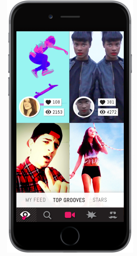
Scott Snibbe is a designer in interactive art, augmented reality, gesture – based interfaces, and digital video. His work has been acquired by multiple known companies like Facebook and New York MoMA. Snibbe started his career as an early developer for After Effects which was also acquired by Adobe. Two of his projects that I believe relate to my final project are two of his app designs; these are: Eyegroove and Bjork: Biophilia.
Example of what Eyegroove looks like to the user.
Eyegroove is an app that allows fans to create music videos and share them as a social network (very similar to tik tok). You could choose songs and create videos to the songs and then share them. Bjork, on the other hand, is considered the first “app album”. This app explores the relationships between music and natural configurations. Both of these apps let people interact via music as well as change the music or what the app is doing. I like that both of these projects change how people can respond to music, but I think they would be interesting if the user could also make their own music.
For this looking outwards blog post, I decided to explore other sound art and a mobile game. I decided to look into François Quévillon’s Algorithmic Drive and the mobile game Tap Tap Revolution.
I found François Quévillon’s sound project intriguing because it invited audience members to experience sound from a slightly skewed perspective. It explores upon the intersection of sound with the concept of the unpredictable nature of the world. The description “unpredictable nature” inspired me to explore the idea of how unpredictable fires can be and how unpredictable of an impact it could have on society.
Tap Tap Revolution uses the user’s tap response on the screen to produce certain sounds– in the game, songs. This concept inspired me because I wanted to conjoin user’s response to produce a sound.
These two projects are similar in the way that they depend on data to produce various sounds that explore the intersection of the data and a concept– unpredictable nature of the world and music respectively.
From these two projects and my childhood game– Pokemon– I decided to create an interactive game to demonstrate the unpredictable nature of the California fires and sounds accompanied with it.
Nick Taylor is the Head of 3D at MancsMachine London. He was a creative coder who now is fully committed to motion design. However, he still integrates generative design, algorithms, and proceduralism in his work. He codes with Vex, Python, Hava, GLSL, and C++.
Vapour is an extremely dynamic and colorful video. It is a code-based exploration of turbulent particle systems and vivid color transitions. This project was created for Intel and produced by Future Deluxe. Nick Taylor used generative artwork and mixed it with in-camera techniques and optical tricks. The result is a beautiful motion graphic that looks organic yet digital.
Joshua Davis is a digital artist, web designer, toy designer, and also motion graphic artist. He works at his own studio, Joshua Davis Studios Inc. (freelance?). This project is actually for Life Wtr and Super Bowl 51, featuring music from DJ Khaled and Bruno Mars. He uses processing, HYPE framework, GLSL, Minim/FFT+SVG to generate this colorful graphic video. The video is filled with colorful animations that hold the essence of the brand LIFEWTR.
screenshots from video
INSPIRATION: While both of these motion graphic artists have very different styles, they both seem to play with motion design for advertising. As an aspiring graphic designer who is also interested in video/motion, I find their projects intruiging and much more interesting than a 2D poster. Therefore, for my project, I want to create an interactive poster/logo.
NAND.Io – Raw Sensor DataLevels of excitement from biometric dataVisualization alongside driving experience
The two practices I drew inspiration from for the final project included innovative and dynamic information visualizations from Nand.io studio and Stefanie Posavec. The work of Nand.io studio seeks to capture the experience of driving through data, motion, and light. The forces at work within the movement of the Infiniti Q10 are translated abstractly into the diagrammatic explorations in dynamic data. Speed, heart rate, motion, and fluid dynamic shapes are consolidated into cohesive data sets then used to show the data.
Phantom Terrains
Stefanie Posavec’s project, Phantom Terrains, explores the physicality and the auditory presence of wireless networks through experimentally augmenting wireless networks within soundscapes. Network identifiers, data rates, and encryption modes are moved into sonic parameters, then associated with auditory representations.
![[OLD FALL 2019] 15-104 • Introduction to Computing for Creative Practice](https://courses.ideate.cmu.edu/15-104/f2019/wp-content/uploads/2020/08/stop-banner.png)