![[OLD FALL 2020] 15-104 • Introduction to Computing for Creative Practice](https://courses.ideate.cmu.edu/15-104/f2020/wp-content/uploads/2021/09/stop-banner.png)
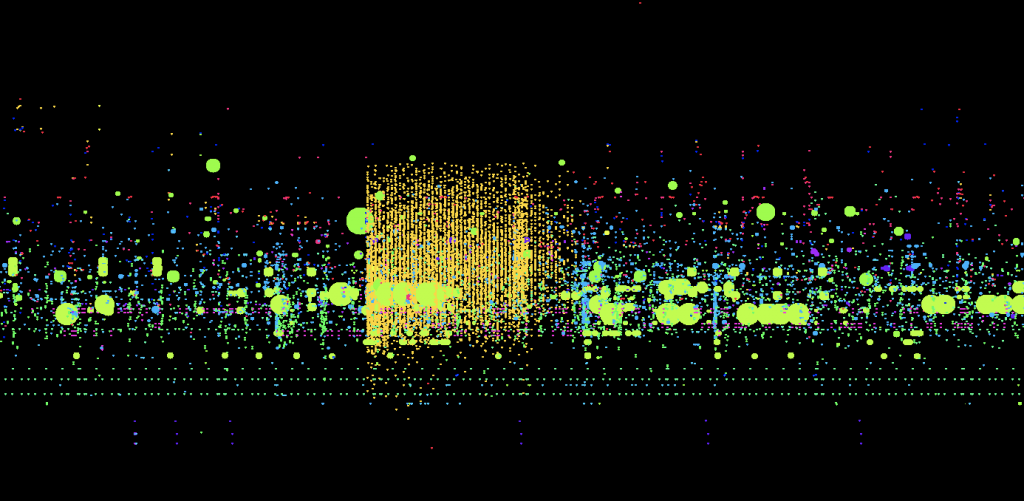
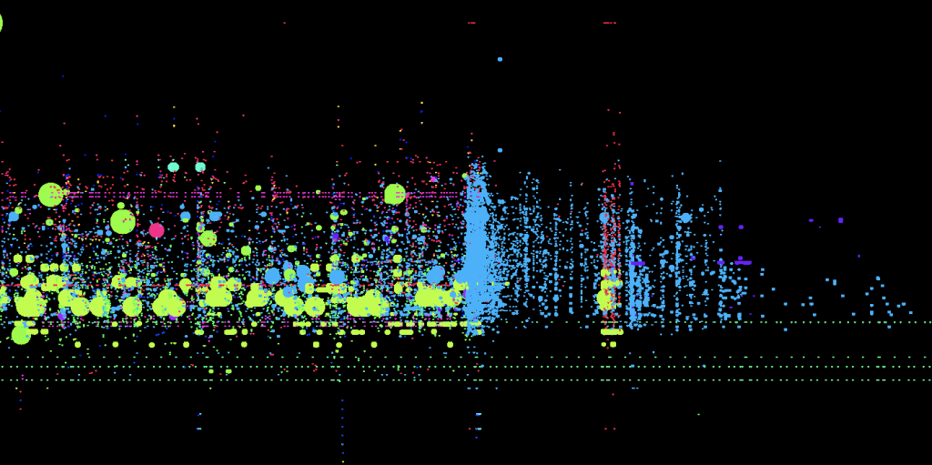
This week, I decided to look into the visualization of data on the NASDAQ Stock exchange. The different examples all represent a single minute of trade that occurs, the images on the top using a unique color to represent the trader, and the images on the bottom using unique colors to represent each stock. When there is a big grouping of the same color on the top, it means that the same trader is buying and selling stocks. If this occurs on the bottom, it means that a single stock is going through different transactions. The reason why I chose this project is because I thought it was really interesting to see how a very complicated topic like trading can be simplified and visualized with colors. I am in awe of how the creator broke down the system and found out the most efficient way to represent the concept. Not only does the visualization hold value and meaning, simply put, the project is very visually pleasing and engaging. It holds the viewer’s attention on the screen due to the movement and engagement, which is also useful to begin understanding the extent and depth of this project.