![[OLD FALL 2020] 15-104 • Introduction to Computing for Creative Practice](https://courses.ideate.cmu.edu/15-104/f2020/wp-content/uploads/2021/09/stop-banner.png)
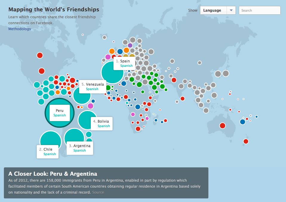
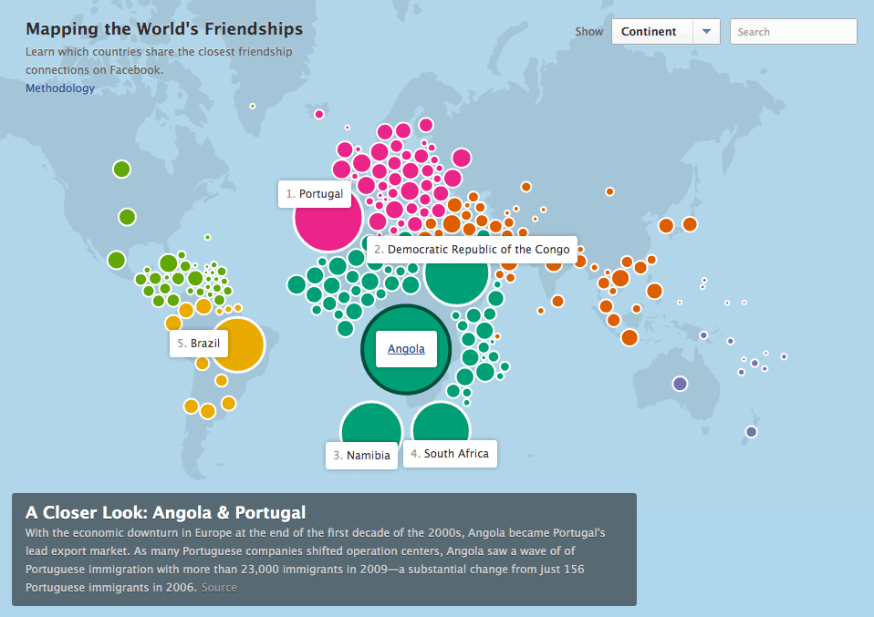
The work I chose is “Facebook: Mapping the World’s Friendships” by Stamen Designs published in June of 2020.
This project is incredibly interesting as it takes data on the interconnectedness of Facebook’s users and turns the data into clean cut visuals on a map to illustrate the world’s friendships.
The countries are sorted by a combination of how many facebook friendships there are between countries as will as the total number of facebook friendships within one county.
The data isn’t only intriguing, it is also informative. Surprisingly, you can see a lot of history within the data, such as where countries have been. If one country has occupied another you can see the connectedness through peoples friends on facebook which is extremely interesting.
I really admire this work as it condenses large quanities of data into an easily undersood visual that can tell you more than you would ever expect.