![[OLD FALL 2020] 15-104 • Introduction to Computing for Creative Practice](https://courses.ideate.cmu.edu/15-104/f2020/wp-content/uploads/2021/09/stop-banner.png)
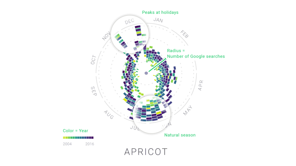
While I was looking through the list of recommended works, this one project by Moritz Stefaner stood out. Stefaner is an independent designer that specializes in data visualization. The project that stood out to me was “The Rhythm of Food,” which analyzes food seasonality. Using data from Google News Lab, they developed a new type of radial “year clock” graph that shows the seasonal trends of food. With the months spread evenly around the “clock”, viewers can easily distinguish when certain food items are popular in certain times of the year. We are able to see the general trend of any sort of food item and can search specifically for that item or browse food items based on seasonal popularity. The website “Rhythm of Food” showcase the findings and allow visitors to explore the data themselves. Personally, it was very fun and indulging to look through the numerous graphs. The project takes on food, an item very prominent in our lives and visualizes the data in a very appealing way.
Moritz Stefaner (Truth & Beauty): http://truth-and-beauty.net/projects/the-rhythm-of-food