![[OLD FALL 2020] 15-104 • Introduction to Computing for Creative Practice](https://courses.ideate.cmu.edu/15-104/f2020/wp-content/uploads/2021/09/stop-banner.png)
For this week’s topic, I looked at a chart relating to money- Trillions.
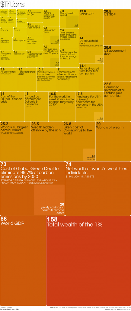
The author is David Macandless, and the source are from New York Times, Bloomberg, UNESCO,WorldBank,Forbes,World Health Organisation, Stanford Uni, Credit Suisse, etc.
Money is a very interesting topic but when the number gets huge, it is very hard to get a real feeling of the amount.
https://informationisbeautiful.net/visualizations/trillions-what-is-a-trillion-dollars/
In this chart, the author raised some very interesting(or not that interesting) topics about what money can do.
By comparing the size of different squares, it is easier to get the idea of how large a concept means or how much money to get one thing to be done.
Among all the topics and comparisons the author can make, those topics shown on the chart silently describe the author’s opinions about some social topics.Also the author secretly implies his/her opinion by gradually changing colors.
I think by visualizing data and deliberately representing data in a certain way, people are easier to get influenced because they tend to think data is object numbers.