![[OLD FALL 2020] 15-104 • Introduction to Computing for Creative Practice](https://courses.ideate.cmu.edu/15-104/f2020/wp-content/uploads/2021/09/stop-banner.png)
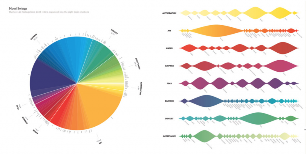
I chose Hayoon’s 7th Looking Outwards post to examine in greater detail. She highlighted the data visualization“We feel fine” project created by Jonathan Harris. Like Hayoon, I found the subject matter of emotion a really intriguing topic to visualize. I had just watched a lecture about the complexity and necessity of emotion as a consideration in design solutions earlier this semester; this made data visualization of this concept all more important in my eyes. I also took note of the extensive use of color to categorize information. Furthermore, I believe that the use of text and simple shapes was pretty ingenious at representing complex information, especially with a concept as abstract and conventionally-unquantifiable as emotion. It goes to show that smart design does not need to use the most groundbreaking techniques, but can instead solve the problem efficiently using what is available. I also thought it was a good design choice to incorporate photographs as a way to humanize and contextualize the data. In examining Hayoon’s interpretations of her chosen project, I was able to take a different approach to examining Harris’ insightful initiative.