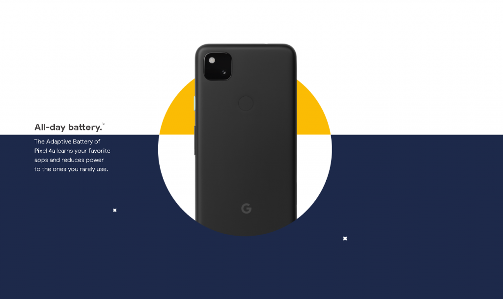
I saw this interactive experience this summer, as the Pixel 4a has just released. I was intrigued by the product page experience. I admire how it blends communicating information through high contrast shapes and scaleable objects. There’s no information on the page related to the creation of the site, but I’m sure the team of designers and developers behind it only had a matter of months to design the page, as Google has a frequent product release schedule. The whole experience blends from one section to the next, with lots of attention paid to details of opacity and object transitions. I’m not sure how it was made or if it was a custom-coded experience or off-the-shelf software. I think there’s a large precedent in the tech industry for needing smooth, seamless but memorable experiences on product launch pages, but they also need to communicate key information. I’m sure they were guided by Google’s brand identity and the previous work of their competitors, such as Apple’s product pages.
Product Page
No author or title found, Google Pixel 4a by Google.
![[OLD FALL 2020] 15-104 • Introduction to Computing for Creative Practice](../../../../wp-content/uploads/2021/09/stop-banner.png)