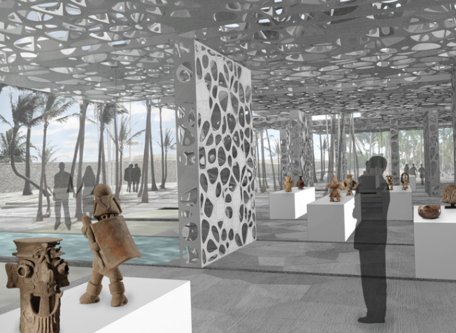
I admired the entry work by matsys for the Tulum Site Museum competition. I was fascinated by the creator’s ability to demonstrate depth within their works. With the inclusion of a person within their work, it was relatively easy to understand how large of a museum it would be. Immediately, I began seeing and thinking “that must be a window”, or “that must be a mirror.”
As far as the algorithms, it was never explicitly stated but I would assume that it was done through 3D rendering, with the implementation of layers to show how the rooms within the museum should be arranged. Based on matsys’ previous works, I can see how their artistic sensibilities are manifested in this work. Most of their works include a porous material/texture, and appear almost sponge-like. In the entry work for the Tulum Site Museum competition, the walls have many holes/empty spaces in them. It seems so sponge-like that it reminds me of coral reefs.

![[OLD FALL 2020] 15-104 • Introduction to Computing for Creative Practice](wp-content/uploads/2021/09/stop-banner.png)