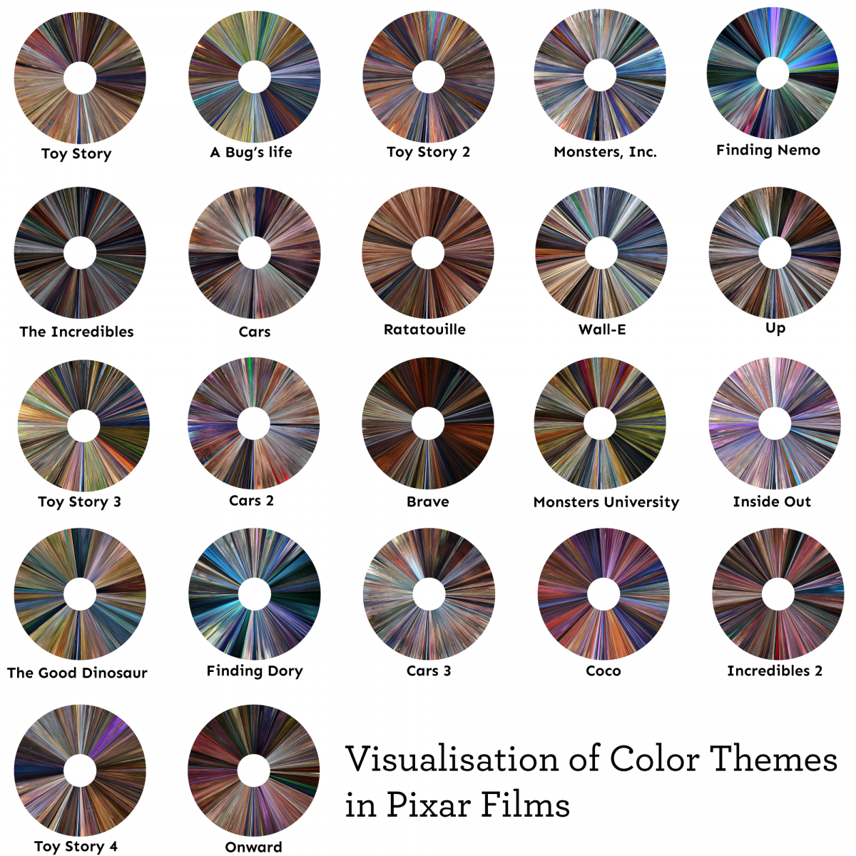
When I saw this assignment I immediately thought of the subreddit DataIsBeautiful. As I was scrolling through it, I found one that was very cool and interesting. It was a Visualizations of Color Themes in Pixar Films by redditor /keshava7 created about 4 months ago. I love Pixar films, and I’ve watched almost every one. Some of the older ones give me a great sense of nostalgia. Their visualization of data using Pixar films is very pretty, and I like how they are all shaped like disks. It reminds me of the old Blu Ray disks (although I also remember the older format of VHS). They created this visualization in Python by extracting 5000 frames per movie, and they compressed each frame into a pixel. They start each movie at 270 degrees and go clockwise, so the first frame of each movie starts at 270 degrees. There is another redditor /julekca who gives a more detailed description on how to do it, it makes me want to try it myself. It is very beautiful to see all the different colors of some of the films I watched as a child.
Here’s a link to the post:
![[OLD FALL 2020] 15-104 • Introduction to Computing for Creative Practice](wp-content/uploads/2021/09/stop-banner.png)
